Now that we have looked at an example of theoretical sampling distribution in action, we are now ready to witness one of the most far-reaching generalizations in the area of statistics. Named the Central Limit Theorem, it may be stated as follows: For a given population, finite, large, or infinite, whatever may be the shape of the frequency distribution, the graphical relation of X (the mean value of individual samples from the population, of which several need to be drawn) versus fX), the probability function (or relative frequency), approximates to be a normal distribution curve.
It is known that each one of the following factors renders the approximation closer to the ideal:
- The larger population, N
- The closer distribution of N to normal
- The larger number of elements in each sample, n
- The larger number of samples drawn
This theorem, like the normal distribution curve representing a large population of common significance, is empirical in nature, meaning it may be subjected to “experimentation.”
Equipped with the data in Table 17.3, though it is confined to the population of only six elements (4, 8, 12, 16, 20, 24), we are now ready for the experiment, namely, to plot a graph with numerical values of X1, X2, X3, . . . as abscissa and f(X1), f(X2), f(X3),… as corresponding ordinates. The result is shown in Figure 17.1. Though there are only nine points in the graph, some significant observations and remarks can be made.
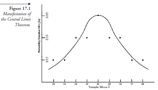
- The numerical value of f(x) is least toward both extremes of X; it is highest in the midspan of X. This is one of the characteristics of a normal distribution curve.
- Led by this fact, we attempt a bell-shaped curve among the nine points. Though the curve does not touch any one of the points, it is fairly close to The attempted curve is, thus, a good approximation to normal distribution. If there were more random variables, that is, more X values, made possible by a larger population of N, it would be reasonable to expect a closer fit among the points.
- Another feature to be noted in this graphical relation is as follows: the ordinates in the normal distribution of a large population show the number of discrete elements, expressed as positive integers, corresponding to the values of variable x. In contrast, we have here ordinates representing probability functions, each a fraction. In the normal distribution of population, all the ordinates corresponding to various “ranges” of x added together give the total number in the entire population, whereas the sum of all the ordinates in the present graph, however many they may be, gives the sum of all the probabilities together, which is 1.0.
The population we started with, namely, 4, 8, 12, 16, 20, and 24, with only one element of each value, if plotted for frequency distribution, yields a flat, horizontal straight line, far from the shape of a normal distribution curve. But the graphical relation X versus fx), derived from this same population, nonetheless approximates a normal distribution. This is the meaning of the Central Limit Theorem. This theorem, through the means of sampling as a process, serves as a link between the statistics of a given large (or infinite) population and its probability characteristics.
Source: Srinagesh K (2005), The Principles of Experimental Research, Butterworth-Heinemann; 1st edition.
4 Aug 2021
23 Oct 2019
5 Aug 2021
4 Aug 2021
5 Aug 2021
5 Aug 2021