Charts are a useful adjunct for the private investor because for once there is parity with the professionals. Both have access to the same information and it is the skill in interpreting the data that makes the difference. But just as there are swarms of people with their own pet theories on how to pick the winners, so there are fanatical chartists looking for the philosopher’s stone. Their greatest value is to focus the mind on the fact that in a market the correct price is what somebody is prepared to pay, so charts do provide a bit of discipline for private investors by making them concentrate on supply and demand, price and timing.
1. Lines
For successful predictions you have to be able to recognize the patterns that any of these lines follow; see Figure 10.1. There are the overall trends for instance – up, down or sideways – detectable by joining the peaks and troughs (or bar tips) of the fluctuating lines of prices. In a sideways market, when the price oscillates between two horizontal lines, a wise chartist waits for a ‘breakout’ signal when the price finally shows which way the market is now going to go.
One answer is not to worry if the share is taking a favourable longterm path. For instance, take a company with shares that are notoriously volatile – it may look like a sideways movement but the two trend lines are a long way apart. The price bounces up and down on rumour and gloom, or profit-taking and bargain-hunting, without any obvious longterm direction. For an alert investor, that can provide a nice little earner. Just examine when and by how much it tends to oscillate and keep hopping in at the bottom and out at the top. This is safer in largish companies, which also means the gains will not be enormous, so the deals have to be large enough to offset dealing costs.
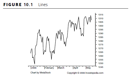
The chart patterns have graphic names to help. A ‘support area’ can be detected by the price dropping to but constantly rebounding from a specific price level, and there is an upward equivalent called a ‘resistance level’. If the market breaks through the established resistance level, chartists reckon the price will rise substantially to a new high, and similarly in reverse for breaking through a support level.
There are also ‘double tops’, which as you would expect have twin peaks and indicate an imminent drop, with a ‘double bottom’ being the upside-down equivalent, A ‘head and shoulders’ is a peak flanked by two smaller peaks and indicates the reversal of an upward trend, signalling an imminent fall. Understandably, a ‘reversed head and shoulders’ is the same thing upside down, forecasting a rise.
‘Flags’ are parallelograms with a mast down at least one side when a sharp change is followed by a sideways fluctuation within a narrow range. If the flag is preceded by a rise it is usually followed by another rise, and a fall is followed by a further fall.
‘Triangles’ are pretty self-explanatory. The share price oscillates through a steadily smaller range. When it finally breaks out of the pattern, the direction is said to be an indicator of the way it will move for a time.
If a share has been wobbling along for a long time between two constant limits, it is said to be in a ‘channel’ and once again, breaking out of it is normally an indication of the new direction the price is now likely to take.
When a short moving average, such as a rolling average of 20 days crosses a longer moving average of, say, 50 days upwards, it is called a ‘golden cross’. It promises a big price rise and is an even stronger indication if the two moving averages have been moving in parallel, as it indicates a reappraisal by the market. If the line crosses downwards it is called a ‘dead cross’ and presages a gloomy outlook.
A wealth of other patterns can be detected by the practised and imaginative chartist and they all provide some signal about the future direction of prices.
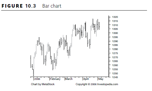
2. Bar charts
Bar charts have vertical lines with the top indicating the highest price traded at during the day, and the bottom representing the lowest price; see Figures 10.2 and 10.3. The closing price is shown by a short horizontal ledge on the right, and the opening price on the left. If the left opening price is lower than the close, the vertical bar is black (sometimes blue). A red bar signals the stock has gone down.

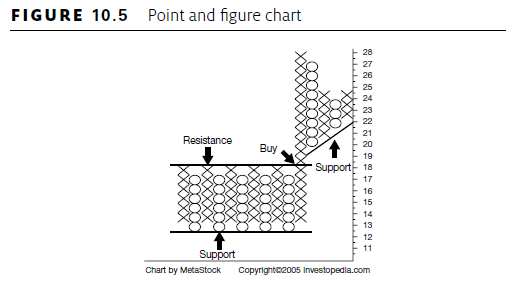
3. Point and figure
Point and figure charts, as shown in Figures 10.4 to 10.6, select an appropriate amount of price change that is worth recording, say 5p.
If the share rises by that, the chart shows an x; another rise of that amount and another x is stacked above the first and so on until the price changes direction. Then the chartist moves to the next column and one square down from the line of crosses puts an o. If it drops another 5p there will be another o beneath that and so on. A reversal starts a new line one square up with an x. The chart ignores time, though chartists usually put the number of the month of a new stack at the top and bottom – 1 for January, 2 for February, etc – and usually start a new year with a new stack.
4. Candlesticks
Another type of chart that has gained interest in recent years is the ‘candlestick’ (previously known as the more straightforward ‘bar chart’). It is much older than Dow’s theories, having been used by Japanese rice traders for centuries, but works on the same assumptions: price changes move in patterns that recur and hence are predictable. Despite a small but devoted following among some professionals, including currency traders, this is widely ignored by people discussing investment.


 The chart shows for each day the opening and closing prices, as well as the highest and lowest prices reached during the day (see Figures 10.7 to 10.9). Just as the Occidental charts have names for regular or significant patterns, so does this, but with an Oriental twist. There are things called ‘three black crows’ and ‘three advancing soldiers’, ‘shooting stars’, ‘morning stars’ and ‘evening stars’, ‘hanging man’, ‘hammers’, and so on. These charts show how trading went. So, for instance, if there is a lot of wick above the candle there must have been a rally during the day that failed to hold and will have discouraged traders. Conversely a length of wick dangling out of the bottom (called the ‘hammer’) shows that an abundance of sellers threatened to push the market down but there were more than enough buyers to offset them, so the market bounced off the bottom, which gives promise of further rises.
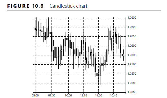
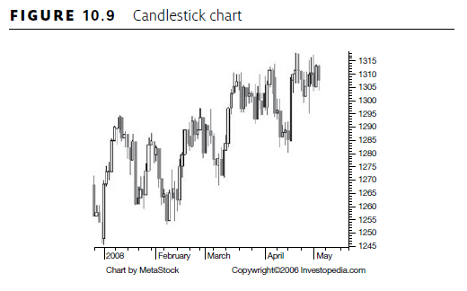
The wick of each candle runs from the low to the high that was reached. The wider body of the candle is between the opening and closing prices – if the closing price is lower than the opening the candle is black; if higher it is white (the original Japanese version used red for these).
Source: Becket Michael (2014), How the Stock Market Works: A Beginner’s Guide to Investment, Kogan Page; Fifth edition.
8 Jul 2021
7 Jul 2021
6 Jul 2021
28 Jan 2018
7 Jul 2021
7 Jul 2021