Introduction to Statistical Data Analysis

Statistics is basically a science that involves data collection, data interpretation and finally, data validation. Statistical data analysis is a procedure of performing various statistical operations. It is a kind of quantitative research, which seeks to quantify the data, and typically, applies some form of statistical analysis. Quantitative data basically involves descriptive data, such as survey data and observational data.

Statistical data analysis generally involves some form of statistical tools, which a layman cannot perform without having any statistical knowledge. There are various software packages to perform statistical data analysis. This software includes Statistical Package for the Social Sciences (SPSS), Stata soft, etc.

[blog_posts style=”push” col_spacing=”small” columns=”2″ columns__md=”1″ depth_hover=”2″ slider_nav_style=”simple” slider_bullets=”true” auto_slide=”8000″ ids=”8583,8579″ show_date=”false” excerpt_length=”0″ comments=”false” image_height=”56.25%” image_size=”original” image_hover=”zoom”]

[blog_posts style=”push” col_spacing=”small” columns=”3″ columns__md=”1″ depth_hover=”2″ slider_nav_style=”simple” slider_bullets=”true” auto_slide=”8000″ ids=”38973,8588,9046″ show_date=”false” excerpt_length=”0″ comments=”false” image_height=”56.25%” image_size=”original” image_hover=”zoom”]

Data in statistical data analysis consists of variable(s). Sometimes the data is univariate or multivariate. Depending upon the number of variables, the researcher performs different statistical techniques.

[title text=”Main contents” link_text=”See more from basic to advanced” link=”/category/methodology/quantitative-research/quantitative-research-methods/statistics-and-econometrics/”]

[blog_posts style=”normal” col_spacing=”xsmall” columns=”3″ columns__md=”1″ depth_hover=”2″ auto_slide=”5000″ cat=”241″ posts=”3″ offset=”117″ show_date=”false” excerpt_length=”25″ comments=”false” image_height=”60%” image_size=”original” image_hover=”zoom” text_align=”left”]

[blog_posts style=”normal” col_spacing=”xsmall” columns=”3″ columns__md=”1″ depth_hover=”2″ auto_slide=”6000″ cat=”241″ posts=”6″ offset=”111″ show_date=”false” excerpt_length=”25″ comments=”false” image_height=”60%” image_size=”original” image_hover=”zoom” text_align=”left”]

[blog_posts style=”normal” col_spacing=”xsmall” columns=”3″ columns__md=”1″ depth_hover=”2″ auto_slide=”7000″ cat=”241″ posts=”6″ offset=”105″ show_date=”false” excerpt_length=”25″ comments=”false” image_height=”60%” image_size=”original” image_hover=”zoom” text_align=”left”]

[blog_posts style=”normal” col_spacing=”xsmall” columns=”3″ columns__md=”1″ depth_hover=”2″ auto_slide=”8000″ cat=”241″ posts=”6″ offset=”99″ show_date=”false” excerpt_length=”25″ comments=”false” image_height=”60%” image_size=”original” image_hover=”zoom” text_align=”left”]

[blog_posts style=”normal” col_spacing=”xsmall” columns=”3″ columns__md=”1″ depth_hover=”2″ auto_slide=”5000″ cat=”241″ posts=”9″ offset=”90″ show_date=”false” excerpt_length=”25″ comments=”false” image_height=”60%” image_size=”original” image_hover=”zoom” text_align=”left”]

[blog_posts style=”normal” col_spacing=”xsmall” columns=”3″ columns__md=”1″ depth_hover=”2″ auto_slide=”6000″ cat=”241″ posts=”9″ offset=”81″ show_date=”false” excerpt_length=”25″ comments=”false” image_height=”60%” image_size=”original” image_hover=”zoom” text_align=”left”]

[blog_posts style=”normal” col_spacing=”xsmall” columns=”3″ columns__md=”1″ depth_hover=”2″ auto_slide=”7000″ cat=”241″ posts=”9″ offset=”72″ show_date=”false” excerpt_length=”25″ comments=”false” image_height=”60%” image_size=”original” image_hover=”zoom” text_align=”left”]

[blog_posts style=”normal” col_spacing=”xsmall” columns=”3″ columns__md=”1″ depth_hover=”2″ auto_slide=”8000″ cat=”241″ posts=”9″ offset=”63″ show_date=”false” excerpt_length=”25″ comments=”false” image_height=”60%” image_size=”original” image_hover=”zoom” text_align=”left”]

[row style=”small” class=”form-lien-he”]

[col span=”2″ span__sm=”12″]

[/col]
[col span=”4″ span__sm=”12″]

[button text=”Home” color=”secondary” style=”gloss” radius=”5″ depth=”2″ depth_hover=”3″ expand=”true” icon=”icon-star” icon_pos=”left” link=”https://phantran.net/”]

[/col]
[col span=”4″ span__sm=”12″]

[button text=”See basic to advanced” style=”gloss” radius=”5″ depth=”2″ depth_hover=”3″ expand=”true” icon=”icon-checkmark” icon_pos=”left” link=”/category/methodology/quantitative-research/quantitative-research-methods/statistics-and-econometrics/”]

[/col]
[col span=”2″ span__sm=”12″]

[/col]

[/row]

If the data in statistical data analysis is multiple in numbers, then several multivariates can be performed. These are factor statistical data analysis, discriminant statistical data analysis, etc. Similarly, if the data is singular in number, then the univariate statistical data analysis is performed. This includes t test for significance, z test, f test, ANOVA one way, etc.

The data in statistical data analysis is basically of 2 types, namely, continuous data and discreet data. The continuous data is the one that cannot be counted. For example, intensity of a light can be measured but cannot be counted. The discreet data is the one that can be counted. For example, the number of bulbs can be counted.

The continuous data in statistical data analysis is distributed under continuous distribution function, which can also be called the probability density function, or simply pdf.

The discreet data in statistical data analysis is distributed under discreet distribution function, which can also be called the probability mass function or simple pmf.

We use the word ‘density’ in continuous data of statistical data analysis because density cannot be counted, but can be measured. We use the word ‘mass’ in discreet data of statistical data analysis because mass cannot be counted.

There are various pdf’s and pmf’s in statistical data analysis. For example, Poisson distribution is the commonly known pmf, and normal distribution is the commonly known pdf.

These distributions in statistical data analysis help us to understand which data falls under which distribution. If the data is about the intensity of a bulb, then the data would be falling in Poisson distribution.

There is a major task in statistical data analysis, which comprises of statistical inference. The statistical inference is mainly comprised of two parts: estimation and tests of hypothesis.

Estimation in statistical data analysis mainly involves parametric data—the data that consists of parameters. On the other hand, tests of hypothesis in statistical data analysis mainly involve non parametric data— the data that consists of no parameters.

Applications of Statistics in Business and Economics

In today’s global business and economic environment, anyone can access vast amounts of statistical information. The most successful managers and decision makers understand the information and know how to use it effectively. In this section, we provide examples that illustrate some of the uses of statistics in business and economics.

[title text=”Main contents” link_text=”See more from basic to advanced” link=”/category/methodology/quantitative-research/quantitative-research-methods/statistics-and-econometrics/”]

[blog_posts style=”normal” col_spacing=”xsmall” columns=”3″ columns__md=”1″ depth_hover=”2″ auto_slide=”5000″ cat=”241″ posts=”3″ offset=”117″ show_date=”false” excerpt_length=”25″ comments=”false” image_height=”60%” image_size=”original” image_hover=”zoom” text_align=”left”]

[blog_posts style=”normal” col_spacing=”xsmall” columns=”3″ columns__md=”1″ depth_hover=”2″ auto_slide=”6000″ cat=”241″ posts=”6″ offset=”111″ show_date=”false” excerpt_length=”25″ comments=”false” image_height=”60%” image_size=”original” image_hover=”zoom” text_align=”left”]

[blog_posts style=”normal” col_spacing=”xsmall” columns=”3″ columns__md=”1″ depth_hover=”2″ auto_slide=”7000″ cat=”241″ posts=”6″ offset=”105″ show_date=”false” excerpt_length=”25″ comments=”false” image_height=”60%” image_size=”original” image_hover=”zoom” text_align=”left”]

[blog_posts style=”normal” col_spacing=”xsmall” columns=”3″ columns__md=”1″ depth_hover=”2″ auto_slide=”8000″ cat=”241″ posts=”6″ offset=”99″ show_date=”false” excerpt_length=”25″ comments=”false” image_height=”60%” image_size=”original” image_hover=”zoom” text_align=”left”]

[blog_posts style=”normal” col_spacing=”xsmall” columns=”3″ columns__md=”1″ depth_hover=”2″ auto_slide=”5000″ cat=”241″ posts=”9″ offset=”90″ show_date=”false” excerpt_length=”25″ comments=”false” image_height=”60%” image_size=”original” image_hover=”zoom” text_align=”left”]

[blog_posts style=”normal” col_spacing=”xsmall” columns=”3″ columns__md=”1″ depth_hover=”2″ auto_slide=”6000″ cat=”241″ posts=”9″ offset=”81″ show_date=”false” excerpt_length=”25″ comments=”false” image_height=”60%” image_size=”original” image_hover=”zoom” text_align=”left”]

[blog_posts style=”normal” col_spacing=”xsmall” columns=”3″ columns__md=”1″ depth_hover=”2″ auto_slide=”7000″ cat=”241″ posts=”9″ offset=”72″ show_date=”false” excerpt_length=”25″ comments=”false” image_height=”60%” image_size=”original” image_hover=”zoom” text_align=”left”]

[blog_posts style=”normal” col_spacing=”xsmall” columns=”3″ columns__md=”1″ depth_hover=”2″ auto_slide=”8000″ cat=”241″ posts=”9″ offset=”63″ show_date=”false” excerpt_length=”25″ comments=”false” image_height=”60%” image_size=”original” image_hover=”zoom” text_align=”left”]

[row style=”small” class=”form-lien-he”]

[col span=”2″ span__sm=”12″]

[/col]
[col span=”4″ span__sm=”12″]

[button text=”Home” color=”secondary” style=”gloss” radius=”5″ depth=”2″ depth_hover=”3″ expand=”true” icon=”icon-star” icon_pos=”left” link=”https://phantran.net/”]

[/col]
[col span=”4″ span__sm=”12″]

[button text=”See basic to advanced” style=”gloss” radius=”5″ depth=”2″ depth_hover=”3″ expand=”true” icon=”icon-checkmark” icon_pos=”left” link=”/category/methodology/quantitative-research/quantitative-research-methods/statistics-and-econometrics/”]

[/col]
[col span=”2″ span__sm=”12″]

[/col]

[/row]

1. Accounting

Public accounting firms use statistical sampling procedures when conducting audits for their clients. For instance, suppose an accounting firm wants to determine whether the amount of accounts receivable shown on a client’s balance sheet fairly represents the actual amount of accounts receivable. Usually the large number of individual accounts receivable makes reviewing and validating every account too time-consuming and expen­sive. As common practice in such situations, the audit staff selects a subset of the accounts called a sample. After reviewing the accuracy of the sampled accounts, the auditors draw a conclusion as to whether the accounts receivable amount shown on the client’s balance sheet is acceptable.

2. Finance

Financial analysts use a variety of statistical information to guide their investment recommendations. In the case of stocks, analysts review financial data such as price/ earnings ratios and dividend yields. By comparing the information for an individual stock with information about the stock market averages, an analyst can begin to draw a conclusion as to whether the stock is a good investment. For example, the average dividend yield for the S&P 500 companies for 2017 was 1.88%. Over the same period, the average dividend yield for Microsoft was 1.72% (Yahoo Finance). In this case, the statistical information on dividend yield indicates a lower dividend yield for Microsoft

3. Marketing

Electronic scanners at retail checkout counters collect data for a variety of marketing research applications. For example, data suppliers such as The Nielsen Company and IRI purchase point-of-sale scanner data from grocery stores, process the data, and then sell statistical summaries of the data to manufacturers. Manufacturers spend hundreds of thousands of dollars per product category to obtain this type of scanner data. Manufactur­ers also purchase data and statistical summaries on promotional activities such as special pricing and the use of in-store displays. Brand managers can review the scanner statistics and the promotional activity statistics to gain a better understanding of the relationship between promotional activities and sales. Such analyses often prove helpful in establishing future marketing strategies for the various products.

4. Production

Today’s emphasis on quality makes quality control an important application of statistics in production. A variety of statistical quality control charts are used to monitor the output of a production process. In particular, an x-bar chart can be used to monitor the average out­put. Suppose, for example, that a machine fills containers with 12 ounces of a soft drink. Periodically, a production worker selects a sample of containers and computes the average number of ounces in the sample. This average, or x-bar value, is plotted on an x-bar chart. A plotted value above the chart’s upper control limit indicates overfilling, and a plotted value below the chart’s lower control limit indicates underfilling. The process is termed “in control” and allowed to continue as long as the plotted x-bar values fall between the chart’s upper and lower control limits. Properly interpreted, an x-bar chart can help determine when adjustments are necessary to correct a production process.

5. Economics

Economists frequently provide forecasts about the future of the economy or some aspect of it. They use a variety of statistical information in making such forecasts. For instance, in forecasting inflation rates, economists use statistical information on such indicators as the Producer Price Index, the unemployment rate, and manufacturing capacity utilization. Often these statistical indicators are entered into computerized forecasting models that predict inflation rates.

6. Information Systems

Information systems administrators are responsible for the day-to-day operation of an organization’s computer networks. A variety of statistical information helps administra­tors assess the performance of computer networks, including local area networks (LANs), wide area networks (WANs), network segments, intranets, and other data communication systems. Statistics such as the mean number of users on the system, the proportion of time any component of the system is down, and the proportion of bandwidth utilized at various times of the day are examples of statistical information that help the system administrator better understand and manage the computer network.

Applications of statistics such as those described in this section are an integral part of this text. Such examples provide an overview of the breadth of statistical applications. To supplement these examples, practitioners in the fields of business and economics provided chapter-opening Statistics in Practice articles that introduce the material covered in each chapter. The Statistics in Practice applications show the importance of statistics in a wide variety of business and economic situations.

Source:  Anderson David R., Sweeney Dennis J., Williams Thomas A. (2019), Statistics for Business & Economics, Cengage Learning; 14th edition.

Types of Data

Data are the facts and figures collected, analyzed, and summarized for presentation and interpretation. All the data collected in a particular study are referred to as the data set for the study. Table 1.1 shows a data set containing information for 60 nations that participate in the World Trade Organization. The World Trade Organization encourages the free flow of international trade and provides a forum for resolving trade disputes.

1. Elements, Variables, and Observations

Elements are the entities on which data are collected. Each nation listed in Table 1.1 is an element with the nation or element name shown in the first column. With 60 nations, the data set contains 60 elements.

A variable is a characteristic of interest for the elements. The data set in Table 1.1 includes the following five variables:

  • WTO Status: The nation’s membership status in the World Trade Organization; this can be either as a member or an observer.
  • Per Capita Gross Domestic Product (GDP) ($): The total market value ($) of all goods and services produced by the nation divided by the number of people in the nation; this is commonly used to compare economic productivity of the nations.
  • Fitch Rating: The nation’s sovereign credit rating as appraised by the Fitch Group1; the credit ratings range from a high of AAA to a low of F and can be modified by + or —.
  • Fitch Outlook: An indication of the direction the credit rating is likely to move over the upcoming two years; the outlook can be negative, stable, or positive.

Measurements collected on each variable for every element in a study provide the data. The set of measurements obtained for a particular element is called an observation. Refer­ring to Table 1.1, we see that the first observation (Armenia) contains the following mea­surements: Member, 3615, BB-, and Stable. The second observation (Australia) contains the following measurements: Member, 49755, AAA, and Stable and so on. A data set with 60 elements contains 60 observations.

2. Scales of Measurement

Data collection requires one of the following scales of measurement: nominal, ordinal, interval, or ratio. The scale of measurement determines the amount of information con­tained in the data and indicates the most appropriate data summarization and statistical analyses.

When the data for a variable consist of labels or names used to identify an attribute of the element, the scale of measurement is considered a nominal scale. For example, referring to the data in Table 1.1, the scale of measurement for the WTO Status variable is nominal because the data “member” and “observer” are labels used to identify the status category for the nation. In cases where the scale of measurement is nominal, a numerical code as well as a nonnumerical label may be used. For example, to facilitate data collec­tion and to prepare the data for entry into a computer database, we might use a numerical code for the WTO Status variable by letting 1 denote a member nation in the World Trade Organization and 2 denote an observer nation. The scale of measurement is nominal even though the data appear as numerical values.

The scale of measurement for a variable is considered an ordinal scale if the data exhibit the properties of nominal data and in addition, the order or rank of the data is meaningful. For example, referring to the data in Table 1.1, the scale of measurement for  the Fitch Rating is ordinal because the rating labels, which range from AAA to F, can be rank ordered from best credit rating (AAA) to poorest credit rating (F). The rating letters provide the labels similar to nominal data, but in addition, the data can also be ranked or ordered based on the credit rating, which makes the measurement scale ordinal. Ordinal data can also be recorded by a numerical code, for example, your class rank in school.

The scale of measurement for a variable is an interval scale if the data have all the properties of ordinal data and the interval between values is expressed in terms of a fixed unit of measure. Interval data are always numerical. College admission SAT scores are an example of interval-scaled data. For example, three students with SAT math scores of 620, 550, and 470 can be ranked or ordered in terms of best performance to poorest performance in math. In addition, the differences between the scores are meaningful. For instance, student 1 scored 620 – 550 = 70 points more than student 2, while student 2 scored 550 – 470 = 80 points more than student 3.

The scale of measurement for a variable is a ratio scale if the data have all the properties of interval data and the ratio of two values is meaningful. Variables such as distance, height, weight, and time use the ratio scale of measurement. This scale requires that a zero value be included to indicate that nothing exists for the variable at the zero point. For example, con­sider the cost of an automobile. A zero value for the cost would indicate that the automobile has no cost and is free. In addition, if we compare the cost of $30,000 for one automobile to the cost of $15,000 for a second automobile, the ratio property shows that the first automo­bile is $30,000/$15,000 = 2 times, or twice, the cost of the second automobile.

3. Categorical and Quantitative Data

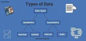
Data can be classified as either categorical or quantitative. Data that can be grouped by spe­cific categories are referred to as categorical data. Categorical data use either the nominal or ordinal scale of measurement. Data that use numeric values to indicate how much or how many are referred to as quantitative data. Quantitative data are obtained using either the interval or ratio scale of measurement.

A categorical variable is a variable with categorical data, and a quantitative variable is a variable with quantitative data. The statistical analysis appropriate for a particular variable depends upon whether the variable is categorical or quantitative. If the variable is categorical, the statistical analysis is limited. We can summarize categorical data by counting the num­ber of observations in each category or by computing the proportion of the observations in each category. However, even when the categorical data are identified by a numerical code, arithmetic operations such as addition, subtraction, multiplication, and division do not provide meaningful results. Section 2.1 discusses ways of summarizing categorical data.

Arithmetic operations provide meaningful results for quantitative variables. For example, quantitative data may be added and then divided by the number of observations to compute the average value. This average is usually meaningful and easily interpreted. In general, more alternatives for statistical analysis are possible when data are quantitative.

Section 2.2 and Chapter 3 provide ways of summarizing quantitative data.

4. Cross-Sectional and Time Series Data

For purposes of statistical analysis, distinguishing between cross-sectional data and time series data is important. Cross-sectional data are data collected at the same or approx­imately the same point in time. The data in Table 1.1 are cross-sectional because they describe the five variables for the 60 World Trade Organization nations at the same point in time. Time series data are data collected over several time periods. For example, the time series in Figure 1.1 shows the U.S. average price per gallon of conventional regular gasoline between 2012 and 2018. From January 2012 until June 2014, prices fluctuated be­tween $3.19 and $3.84 per gallon before a long stretch of decreasing prices from July 2014 to January 2015. The lowest average price per gallon occurred in January 2016 ($1.68). Since then, the average price appears to be on a gradual increasing trend.

Graphs of time series data are frequently found in business and economic publications. Such graphs help analysts understand what happened in the past, identify any trends over time, and project future values for the time series. The graphs of time series data can take on a variety of forms, as shown in Figure 1.2. With a little study, these graphs are usually easy to understand and interpret. For example, Panel (A) in Figure 1.2 is a graph that shows the Dow Jones Industrial Average Index from 2008 to 2018. Poor economic conditions caused a serious drop in the index during 2008 with the low point occurring in February 2009 (7062). After that, the index has been on a remarkable nine-year increase, reaching its peak (26,149) in January 2018.

The graph in Panel (B) shows the net income of McDonald’s Inc. from 2008 to 2017. The declining economic conditions in 2008 and 2009 were actually beneficial to McDonald’s as the company’s net income rose to all-time highs. The growth in McDonald’s net income showed that the company was thriving during the economic downturn as people were cutting back on the more expensive sit-down restaurants and seeking less-expensive alternatives offered by McDonald’s. McDonald’s net income continued to new all-time highs in 2010 and 2011, decreased slightly in 2012, and peaked in 2013. After three years of relatively lower net income, their net income increased to $5.19 billion in 2017.

Panel (C) shows the time series for the occupancy rate of hotels in South Florida over a one-year period. The highest occupancy rates, 95% and 98%, occur during the months of February and March when the climate of South Florida is attractive to tourists. In fact, January to April of each year is typically the high-occupancy season for South Florida hotels. On the other hand, note the low occupancy rates during the months of August to October, with the lowest occupancy rate of 50% occurring in September. High temperatures and the hurricane season are the primary reasons for the drop in hotel occupancy during this period.

Source:  Anderson David R., Sweeney Dennis J., Williams Thomas A. (2019), Statistics for Business & Economics, Cengage Learning; 14th edition.

Data Sources

Data can be obtained from existing sources, by conducting an observational study, or by conducting an experiment.

1. Existing Sources

In some cases, data needed for a particular application already exist. Companies maintain a va­riety of databases about their employees, customers, and business operations. Data on employee salaries, ages, and years of experience can usually be obtained from internal personnel records. Other internal records contain data on sales, advertising expenditures, distribution costs, inventory levels, and production quantities. Most companies also maintain detailed data about their custom­ers. Table 1.2 shows some of the data commonly available from internal company records.

Organizations that specialize in collecting and maintaining data make available sub­stantial amounts of business and economic data. Companies access these external data sources through leasing arrangements or by purchase. Dun & Bradstreet, Bloomberg, and Dow Jones & Company are three firms that provide extensive business database services to clients. The Nielsen Company and IRI built successful businesses collecting and process­ing data that they sell to advertisers and product manufacturers.

Data are also available from a variety of industry associations and special interest organiza­tions. The U.S. Travel Association maintains travel-related information such as the number of tourists and travel expenditures by states. Such data would be of interest to firms and individ­uals in the travel industry. The Graduate Management Admission Council maintains data on test scores, student characteristics, and graduate management education programs. Most of the data from these types of sources are available to qualified users at a modest cost.

The Internet is an important source of data and statistical information. Almost all com­panies maintain websites that provide general information about the company as well as data on sales, number of employees, number of products, product prices, and product spec­ifications. In addition, a number of companies, including Google, Yahoo, and others, now specialize in making information available over the Internet. As a result, one can obtain access to stock quotes, meal prices at restaurants, salary data, and an almost infinite variety of information. Some social media companies such as Twitter provide application program­ming interfaces (APIs) that allow developers to access large amounts of data generated by users. These data can be extremely valuable to companies who want to know more about how existing and potential customers feel about their products.

Government agencies are another important source of existing data. For instance, the web­site DATA.GOV was launched by the U.S. government in 2009 to make it easier for the public to access data collected by the U.S. federal government. The DATA.GOV website includes more than 150,000 data sets from a variety of U.S. federal departments and agencies, but there are many other federal agencies who maintain their own websites and data repositories. Table 1.3 lists selected governmental agencies and some of the data they provide. Figure 1.3 shows the home page for the DATA.GOV website. Many state and local governments are also now providing data sets online. As examples, the states of California and Texas maintain open data portals at data.ca.gov and data.texas.gov, respectively. New York City’s open data website is opendata.cityofnewyork.us, and the city of Cincinnati, Ohio, is at data.cincinnati-oh.gov.

2. Observational Study

In an observational study we simply observe what is happening in a particular situation, record data on one or more variables of interest, and conduct a statistical analysis of the resulting data. For example, researchers might observe a randomly selected group of cus­tomers that enter a Walmart supercenter to collect data on variables such as the length of time the customer spends shopping, the gender of the customer, the amount spent, and so on. Statistical analysis of the data may help management determine how factors such as the length of time shopping and the gender of the customer affect the amount spent.

As another example of an observational study, suppose that researchers were interested in investigating the relationship between the gender of the CEO for a Fortune 500 company and the performance of the company as measured by the return on equity (ROE). To obtain data, the researchers selected a sample of companies and recorded the gender of the CEO and the ROE for each company. Statistical analysis of the data can help determine the relationship between performance of the company and the gender of the CEO. This exam­ple is an observational study because the researchers had no control over the gender of the CEO or the ROE at each of the companies that were sampled.

Surveys and public opinion polls are two other examples of commonly used observa­tional studies. The data provided by these types of studies simply enable us to observe opinions of the respondents. For example, the New York State legislature commissioned a telephone survey in which residents were asked if they would support or oppose an in­crease in the state gasoline tax in order to provide funding for bridge and highway repairs. Statistical analysis of the survey results will assist the state legislature in determining if it should introduce a bill to increase gasoline taxes.

3. Experiment

The key difference between an observational study and an experiment is that an experiment is conducted under controlled conditions. As a result, the data obtained from a well-designed experiment can often provide more information as compared to the data obtained from exist­ing sources or by conducting an observational study. For example, suppose a pharmaceutical company would like to learn about how a new drug it has developed affects blood pressure. To obtain data about how the new drug affects blood pressure, researchers selected a sample of individuals. Different groups of individuals are given different dosage levels of the new drug, and before and after data on blood pressure are collected for each group. Statistical analysis of the data can help determine how the new drug affects blood pressure.

The types of experiments we deal with in statistics often begin with the identification of a particular variable of interest. Then one or more other variables are identified and controlled so that data can be obtained about how the other variables influence the primary variable of interest.

4. Time and Cost Issues

Anyone wanting to use data and statistical analysis as aids to decision making must be aware of the time and cost required to obtain the data. The use of existing data sources is desirable when data must be obtained in a relatively short period of time. If important data are not readily available from an existing source, the additional time and cost involved in obtaining the data must be taken into account. In all cases, the decision maker should consider the contribution of the statistical analysis to the decision-making process. The cost of data acquisition and the subsequent statistical analysis should not exceed the savings generated by using the information to make a better decision.

5. Data Acquisition Errors

Managers should always be aware of the possibility of data errors in statistical studies. Us­ing erroneous data can be worse than not using any data at all. An error in data acquisition occurs whenever the data value obtained is not equal to the true or actual value that would be obtained with a correct procedure. Such errors can occur in a number of ways. For example, an interviewer might make a recording error, such as a transposition in writing the age of a 24-year-old person as 42, or the person answering an interview question might misinterpret the question and provide an incorrect response.

Experienced data analysts take great care in collecting and recording data to ensure that errors are not made. Special procedures can be used to check for internal consistency of the data. For instance, such procedures would indicate that the analyst should review the ac­curacy of data for a respondent shown to be 22 years of age but reporting 20 years of work experience. Data analysts also review data with unusually large and small values, called outliers, which are candidates for possible data errors. In Chapter 3 we present some of the methods statisticians use to identify outliers.

Errors often occur during data acquisition. Blindly using any data that happen to be available or using data that were acquired with little care can result in misleading informa­tion and bad decisions. Thus, taking steps to acquire accurate data can help ensure reliable and valuable decision-making information.

Source:  Anderson David R., Sweeney Dennis J., Williams Thomas A. (2019), Statistics for Business & Economics, Cengage Learning; 14th edition.

Descriptive Statistics

Most of the statistical information in the media, company reports, and other publications consists of data that are summarized and presented in a form that is easy for the reader to understand. Such summaries of data, which may be tabular, graphical, or numerical, are referred to as descriptive statistics.

Refer to the data set in Table 1.1 showing data for 60 nations that participate in the World Trade Organization. Methods of descriptive statistics can be used to summarize these data.

For example, consider the variable Fitch Outlook, which indicates the direction the nation’s credit rating is likely to move over the next two years. The Fitch Outlook is recorded as being negative, stable, or positive. A tabular summary of the data showing the number of nations with each of the Fitch Outlook ratings is shown in Table 1.4. A graphical summary of the same data, called a bar chart, is shown in Figure 1.4. These types of summaries make the data easier to interpret. Referring to Table 1.4 and Figure 1.4, we can see that the majority of Fitch Outlook credit ratings are stable, with 73.3% of the nations having this rating. More nations have a negative outlook (20%) than a positive outlook (6.7%).

A graphical summary of the data for the quantitative variable Per Capita GDP in Table 1.1, called a histogram, is provided in Figure 1.5. Using the histogram, it is easy to see that Per Capita GDP for the 60 nations ranges from $0 to $80,000, with the highest concentration between $0 and $10,000. Only one nation had a Per Capita GDP exceeding $70,000.

In addition to tabular and graphical displays, numerical descriptive statistics are used to summarize data. The most common numerical measure is the average, or mean. Using the data on Per Capita GDP for the 60 nations in Table 1.1, we can compute the average by adding Per Capita GDP for all 60 nations and dividing the total by 60. Doing so provides an average Per Capita GDP of $21,279. This average provides a measure of the central tendency, or central location of the data.

There is a great deal of interest in effective methods for developing and presenting descriptive statistics.

Source:  Anderson David R., Sweeney Dennis J., Williams Thomas A. (2019), Statistics for Business & Economics, Cengage Learning; 14th edition.

Statistical Inference

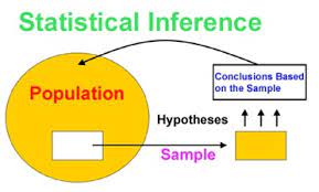
Many situations require information about a large group of elements (individuals, compa­nies, voters, households, products, customers, and so on). But, because of time, cost, and other considerations, data can be collected from only a small portion of the group. The larger group of elements in a particular study is called the population, and the smaller group is called the sample. Formally, we use the following definitions.

The process of conducting a survey to collect data for the entire population is called a census. The process of conducting a survey to collect data for a sample is called a sample survey. As one of its major contributions, statistics uses data from a sample to make estimates and test hypotheses about the characteristics of a population through a process referred to as statistical inference.

As an example of statistical inference, let us consider the study conducted by Rogers Industries. Rogers manufactures lithium batteries used in rechargeable electronics such as laptop computers and tablets. In an attempt to increase battery life for its products, Rogers has developed a new solid-state lithium battery that should last longer and be safer to use. In this case, the population is defined as all lithium batteries that could be produced using the new solid-state technology. To evaluate the advantages of the new battery, a sample of 200 batteries manufactured with the new solid-state technology were tested. Data collected from this sample showed the number of hours each battery lasted before needing to be recharged under controlled conditions. See Table 1.5.

Suppose Rogers wants to use the sample data to make an inference about the average hours of battery life for the population of all batteries that could be produced with the new solid-state technology. Adding the 200 values in Table 1.5 and dividing the total by 200 provides the sample average battery life: 18.84 hours. We can use this sample result to estimate that the average lifetime for the batteries in the population is 18.84 hours. Figure 1.6 provides a graphical summary of the statistical inference process for Rogers Industries.

Whenever statisticians use a sample to estimate a population characteristic of interest, they usually provide a statement of the quality, or precision, associated with the estimate. For the Rogers Industries example, the statistician might state that the point estimate of the average battery life is 18.84 hours ± .68 hours. Thus, an interval estimate of the average battery life is 18.16 to 19.52 hours. The statistician can also state how confident he or she is that the interval from 18.16 to 19.52 hours contains the population average.

Source:  Anderson David R., Sweeney Dennis J., Williams Thomas A. (2019), Statistics for Business & Economics, Cengage Learning; 14th edition.

Data Analytics

Because of the dramatic increase in available data, more cost-effective data storage, faster computer processing, and recognition by managers that data can be extremely valuable for understanding customers and business operations, there has been a dramatic increase in data-driven decision making. The broad range of techniques that may be used to support data-driven decisions comprise what has become known as analytics.

Analytics is the scientific process of transforming data into insight for making better decisions. Analytics is used for data-driven or fact-based decision making, which is often seen as more objective than alternative approaches to decision making. The tools of analyt­ics can aid decision making by creating insights from data, improving our ability to more accurately forecast for planning, helping us quantify risk, and yielding better alternatives through analysis.

Analytics can involve a variety of techniques from simple reports to the most advanced optimization techniques (algorithms for finding the best course of action). Analytics is now generally thought to comprise three broad categories of techniques. These categories are descriptive analytics, predictive analytics, and prescriptive analytics.

Descriptive analytics encompasses the set of analytical techniques that describe what has happened in the past. Examples of these types of techniques are data queries, reports, descriptive statistics, data visualization, data dash boards, and basic what-if spreadsheet models.

Predictive analytics consists of analytical techniques that use models constructed from past data to predict the future or to assess the impact of one variable on another.

For example, past data on sales of a product may be used to construct a mathematical model that predicts future sales. Such a model can account for factors such as the growth trajectory and seasonality of the product’s sales based on past growth and seasonal patterns. Point-of-sale scanner data from retail outlets may be used by a packaged food manufacturer to help estimate the lift in unit sales associated with coupons or sales events. Survey data and past purchase behavior may be used to help predict the market share of a new product. Each of these is an example of predictive analytics. Linear regression, time series analysis, and forecasting models fall into the category of predictive analytics; these techniques are discussed later in this text. Simulation, which is the use of probability and statistical computer models to better understand risk, also falls under the category of predictive analytics.

Prescriptive analytics differs greatly from descriptive or predictive analytics. What distinguishes prescriptive analytics is that prescriptive models yield a best course of action to take. That is, the output of a prescriptive model is a best decision. Hence, prescriptive analytics is the set of analytical techniques that yield a best course of action. Optimization models, which generate solutions that maximize or minimize some objective subject to a set of constraints, fall into the category of prescriptive models. The airline industry’s use of revenue management is an example of a prescriptive model. The airline industry uses past purchasing data as inputs into a model that recommends the pricing strategy across all flights that will maximize revenue for the company.

How does the study of statistics relate to analytics? Most of the techniques in descriptive and predictive analytics come from probability and statistics. These include descriptive statistics, data visualization, probability and probability distributions, sampling, and predictive modeling, including regression analysis and time series forecasting. Each of these techniques is discussed in this text. The increased use of ana­lytics for data-driven decision making makes it more important than ever for analysts and managers to understand statistics and data analysis. Companies are increasingly seeking data savvy managers who know how to use descriptive and predictive models to make data-driven decisions.

At the beginning of this section, we mentioned the increased availability of data as one of the drivers of the interest in analytics. In the next section we discuss this explosion in available data and how it relates to the study of statistics.

Source:  Anderson David R., Sweeney Dennis J., Williams Thomas A. (2019), Statistics for Business & Economics, Cengage Learning; 14th edition.

Big Data and Data Mining

With the aid of magnetic card readers, bar code scanners, and point-of-sale terminals, most organizations obtain large amounts of data on a daily basis. And, even for a small local restaurant that uses touch screen monitors to enter orders and handle billing, the amount of data collected can be substantial. For large retail companies, the sheer volume of data collected is hard to conceptualize, and figuring out how to effectively use these data to improve profitability is a challenge. Mass retailers such as Walmart and Amazon capture data on 20 to 30 million transactions every day, telecommunication companies such as Orange S.A. and AT&T generate over 300 million call records per day, and Visa processes 6800 payment transactions per second or approximately 600 million transactions per day.

In addition to the sheer volume and speed with which companies now collect data, more complicated types of data are now available and are proving to be of great value to businesses. Text data are collected by monitoring what is being said about a com­pany’s products or services on social media such as Twitter. Audio data are collected from service calls (on a service call, you will often hear “this call may be monitored for quality control”). Video data are collected by in-store video cameras to analyze shop­ping behavior. Analyzing information generated by these nontraditional sources is more complicated because of the complex process of transforming the information into data that can be analyzed.

Larger and more complex data sets are now often referred to as big data. Although there does not seem to be a universally accepted definition of big data, many think if it as a set of data that cannot be managed, processed, or analyzed with commonly available software in a reasonable amount of time. Many data analysts define big data by referring to the three v’s of data: volume, velocity, and variety. Volume refers to the amount of available data (the typical unit of measure for is now a terabyte, which is 1012 bytes); velocity refers to the speed at which data is collected and processed; and variety refers to the different data types.

The term data warehousing is used to refer to the process of capturing, storing, and maintaining the data. Computing power and data collection tools have reached the point where it is now feasible to store and retrieve extremely large quantities of data in seconds. Analysis of the data in the warehouse may result in decisions that will lead to new strate­gies and higher profits for the organization. For example, General Electric (GE) captures a large amount of data from sensors on its aircraft engines each time a plane takes off or lands. Capturing these data allows GE to offer an important service to its customers; GE monitors the engine performance and can alert its customer when service is needed or a problem is likely to occur.

The subject of data mining deals with methods for developing useful decision-making information from large databases. Using a combination of procedures from statistics, math­ematics, and computer science, analysts “mine the data” in the warehouse to convert it into useful information, hence the name data mining. Dr. Kurt Thearling, a leading practitioner in the field, defines data mining as “the automated extraction of predictive information from (large) databases.” The two key words in Dr. Thearling’s definition are “automated” and “predictive.” Data mining systems that are the most effective use automated procedures to extract information from the data using only the most general or even vague queries by the user. And data mining software automates the process of uncovering hidden predictive information that in the past required hands-on analysis.

The major applications of data mining have been made by companies with a strong con­sumer focus, such as retail businesses, financial organizations, and communication compa­nies. Data mining has been successfully used to help retailers such as Amazon determine one or more related products that customers who have already purchased a specific product are also likely to purchase. Then, when a customer logs on to the company’s website and purchases a product, the website uses pop-ups to alert the customer about additional products that the customer is likely to purchase. In another application, data mining may be used to identify customers who are likely to spend more than $20 on a particular shopping trip. These customers may then be identified as the ones to receive special email or regular mail discount offers to encourage them to make their next shopping trip before the discount termination date.

Data mining is a technology that relies heavily on statistical methodology such as multiple regression, logistic regression, and correlation. But it takes a creative inte­gration of all these methods and computer science technologies involving artificial intelligence and machine learning to make data mining effective. A substantial invest­ment in time and money is required to implement commercial data mining software packages developed by firms such as Oracle, Teradata, and SAS. The statistical concepts introduced in this text will be helpful in understanding the statistical methodology used by data mining software packages and enable you to better understand the statistical information that is developed.

Because statistical models play an important role in developing predictive models in data mining, many of the concerns that statisticians deal with in developing statistical mod­els are also applicable. For instance, a concern in any statistical study involves the issue of model reliability. Finding a statistical model that works well for a particular sample of data does not necessarily mean that it can be reliably applied to other data. One of the common statistical approaches to evaluating model reliability is to divide the sample data set into two parts: a training data set and a test data set. If the model developed using the training data is able to accurately predict values in the test data, we say that the model is reliable. One advantage that data mining has over classical statistics is that the enormous amount of data available allows the data mining software to partition the data set so that a model de­veloped for the training data set may be tested for reliability on other data. In this sense, the partitioning of the data set allows data mining to develop models and relationships and then quickly observe if they are repeatable and valid with new and different data. On the other hand, a warning for data mining applications is that with so much data available, there is a danger of overfitting the model to the point that misleading associations and cause/effect conclusions appear to exist. Careful interpretation of data mining results and additional testing will help avoid this pitfall.

Source:  Anderson David R., Sweeney Dennis J., Williams Thomas A. (2019), Statistics for Business & Economics, Cengage Learning; 14th edition.

Computers and Statistical Analysis

Statisticians use computer software to perform statistical computations and analyses. For example, computing the average time until recharge for the 200 batteries in the Rogers Industries example (see Table 1.5) would be quite tedious without a computer. End-of-chapter appendixes cover the step-by-step procedures for using Microsoft Excel and the statistical package JMP to implement the statistical techniques presented in the chapter.

Special data manipulation and analysis tools are needed for big data, which was de­scribed in the previous section. Open-source software for distributed processing of large data sets such as Hadoop, open-source programming languages such as R and Python, and commercially available packages such as SAS and SPSS are used in practice for big data.

Source:  Anderson David R., Sweeney Dennis J., Williams Thomas A. (2019), Statistics for Business & Economics, Cengage Learning; 14th edition.

Ethical Guidelines for Statistical Practice

Ethical behavior is something we should strive for in all that we do. Ethical issues arise in statistics because of the important role statistics plays in the collection, analysis, presenta­tion, and interpretation of data. In a statistical study, unethical behavior can take a variety of forms including improper sampling, inappropriate analysis of the data, development of misleading graphs, use of inappropriate summary statistics, and/or a biased interpretation of the statistical results.

As you begin to do your own statistical work, we encourage you to be fair, thorough, objective, and neutral as you collect data, conduct analyses, make oral presentations, and present written reports containing information developed. As a consumer of statistics, you should also be aware of the possibility of unethical statistical behavior by others. When you see statistics in the media, it is a good idea to view the information with some skepticism, always being aware of the source as well as the purpose and objectivity of the statistics provided.

The American Statistical Association, the nation’s leading professional organization for statistics and statisticians, developed the report “Ethical Guidelines for Statistical Practice”2 to help statistical practitioners make and communicate ethical decisions and assist students in learning how to perform statistical work responsibly. The report con­tains 52 guidelines organized into eight topic areas: Professional Integrity and Account­ability; Integrity of Data and Methods; Responsibilities to Science/Public/Funder/Client; Responsibilities to Research Subjects; Responsibilities to Research Team Colleagues; Responsibilities to Other Statisticians or Statistics Practitioners; Responsibilities Regarding Allegations of Misconduct; and Responsibilities of Employers Including Organizations, Individuals, Attorneys, or Other Clients Employing Statistical Practitioners.

One of the ethical guidelines in the Professional Integrity and Accountability area ad­dresses the issue of running multiple tests until a desired result is obtained. Let us consider an example. In Section 1.5 we discussed a statistical study conducted by Rogers Indus­tries involving a sample of 200 lithium batteries manufactured with a new solid-state technology. The average battery life for the sample, 18.84 hours, provided an estimate of the average lifetime for all lithium batteries produced with the new solid-state technol­ogy. However, since Rogers selected a sample of batteries, it is reasonable to assume that another sample would have provided a different average battery life.

Suppose Rogers’s management had hoped the sample results would enable them to claim that the average time until recharge for the new batteries was 20 hours or more. Sup­pose further that Rogers’s management decides to continue the study by manufacturing and testing repeated samples of 200 batteries with the new solid-state technology until a sample mean of 20 hours or more is obtained. If the study is repeated enough times, a sample may eventually be obtained—by chance alone—that would provide the desired result and enable Rogers to make such a claim. In this case, consumers would be misled into thinking the new product is better than it actually is. Clearly, this type of behavior is unethical and represents a gross misuse of statistics in practice.

Several ethical guidelines in the responsibilities and publications and testimony area deal with issues involving the handling of data. For instance, a statistician must account for all data considered in a study and explain the sample(s) actually used. In the Rogers Industries study the average battery life for the 200 batteries in the original sample is 18.84 hours; this is less than the 20 hours or more that management hoped to obtain. Sup­pose now that after reviewing the results showing a 18.84 hour average battery life, Rogers discards all the observations with 18 or less hours until recharge, allegedly because these batteries contain imperfections caused by startup problems in the manufacturing process. After discarding these batteries, the average lifetime for the remaining batteries in the sample turns out to be 22 hours. Would you be suspicious of Rogers’s claim that the battery life for its new solid-state batteries is 22 hours?

If the Rogers batteries showing 18 or less hours until recharge were discarded to simply provide an average lifetime of 22 hours, there is no question that discarding the batteries with 18 or fewer hours until recharge is unethical. But, even if the discarded batteries con­tain imperfections due to startup problems in the manufacturing process—and, as a result, should not have been included in the analysis—the statistician who conducted the study must account for all the data that were considered and explain how the sample actually used was obtained. To do otherwise is potentially misleading and would constitute unethi­cal behavior on the part of both the company and the statistician.

A guideline in the shared values section of the American Statistical Association report states that statistical practitioners should avoid any tendency to slant statistical work toward predetermined outcomes. This type of unethical practice is often observed when unrepresentative samples are used to make claims. For instance, in many areas of the country smoking is not permitted in restaurants. Suppose, however, a lobbyist for the tobacco industry interviews people in restaurants where smoking is permitted in order to estimate the percentage of people who are in favor of allowing smoking in restaurants. The sample results show that 90% of the people interviewed are in favor of allowing smoking in restaurants. Based upon these sample results, the lobbyist claims that 90% of all people who eat in restaurants are in favor of permitting smoking in restaurants. In this case we would argue that only sampling persons eating in restaurants that allow smoking has biased the results. If only the final results of such a study are reported, readers unfamiliar with the details of the study (i.e., that the sample was collected only in restaurants allowing smoking) can be misled.

The scope of the American Statistical Association’s report is broad and includes ethical guidelines that are appropriate not only for a statistician, but also for consumers of statistical information. We encourage you to read the report to obtain a better perspective of ethical issues as you continue your study of statistics and to gain the background for determining how to ensure that ethical standards are met when you start to use statistics in practice.

Source:  Anderson David R., Sweeney Dennis J., Williams Thomas A. (2019), Statistics for Business & Economics, Cengage Learning; 14th edition.

Summarizing Data for a Categorical Variable

1. Frequency Distribution

We begin the discussion of how tabular and graphical displays can be used to summarize categorical data with the definition of a frequency distribution.

FREQUENCY DISTRIBUTION

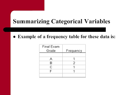
A frequency distribution is a tabular summary of data showing the number (frequency) of observations in each of several nonoverlapping categories or classes.

Let us use the following example to demonstrate the construction and interpretation of a frequency distribution for categorical data. Coca-Cola, Diet Coke, Dr. Pepper, Pepsi, and Sprite are five popular soft drinks. Assume that the data in Table 2.1 show the soft drink selected in a sample of 50 soft drink purchases.

To develop a frequency distribution for these data, we count the number of times each soft drink appears in Table 2.1. Coca-Cola appears 19 times, Diet Coke appears 8 times, Dr. Pepper appears 5 times, Pepsi appears 13 times, and Sprite appears 5 times. These counts are summarized in the frequency distribution in Table 2.2.

This frequency distribution provides a summary of how the 50 soft drink purchases are distributed across the five soft drinks. This summary offers more insight than the original data shown in Table 2.1. Viewing the frequency distribution, we see that Coca- Cola is the leader, Pepsi is second, Diet Coke is third, and Sprite and Dr. Pepper are tied for fourth. The frequency distribution summarizes information about the popularity of the five soft drinks.

2. Relative Frequency and Percent Frequency Distributions

A frequency distribution shows the number (frequency) of observations in each of several nonoverlapping classes. However, we are often interested in the proportion, or percentage, of observations in each class. The relative frequency of a class equals the fraction or proportion of observations belonging to a class. For a data set with n observations, the relative frequency of each class can be determined as follows:

The percent frequency of a class is the relative frequency multiplied by 100.

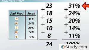
A relative frequency distribution gives a tabular summary of data showing the relative frequency for each class. A percent frequency distribution summarizes the percent frequency of the data for each class. Table 2.3 shows a relative frequency distribution and a percent frequency distribution for the soft drink data. In Table 2.3 we see that the relative frequency for Coca-Cola is 19/50 = .38, the relative frequency for Diet Coke is 8/50 = .16, and so on. From the percent frequency distribution, we see that 38% of the purchases were Coca-Cola, 16% of the purchases were Diet Coke, and so on. We can also note that 38% + 26% + 16% = 80% of the purchases were for the top three soft drinks.

3. Bar Charts and Pie Charts

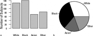
A bar chart is a graphical display for depicting categorical data summarized in a frequency, relative frequency, or percent frequency distribution. On one axis of the chart (usually the hor­izontal axis), we specify the labels that are used for the classes (categories). A frequency, rel­ative frequency, or percent frequency scale can be used for the other axis of the chart (usually the vertical axis). Then, using a bar of fixed width drawn above each class label, we extend the length of the bar until we reach the frequency, relative frequency, or percent frequency of the class. For categorical data, the bars should be separated to emphasize the fact that each category is separate. Figure 2.1 shows a bar chart of the frequency distribution for the 50 soft drink purchases. Note how the graphical display shows Coca-Cola, Pepsi, and Diet Coke to be the most preferred brands. We can make the brand preferences even more obvious by creat­ing a sorted bar chart as shown in Figure 2.2. Here, we sort the soft drink categories: highest frequency on the left and lowest frequency on the right.

The pie chart provides another graphical display for presenting relative frequency and percent frequency distributions for categorical data. To construct a pie chart, we first draw a circle to represent all the data. Then we use the relative frequencies to subdivide the circle into sectors, or parts, that correspond to the relative frequency for each class. For example, because a circle contains 360 degrees and Coca-Cola shows a relative frequency of .38, the sector of the pie chart labeled Coca-Cola consists of .38(360) = 136.8 degrees. The sector of the pie chart labeled Diet Coke consists of .16(360) = 57.6 degrees. Similar calculations for the other classes yield the pie chart in Figure 2.3. The numerical values shown for each sector can be frequencies, relative frequencies, or percent frequencies. Although pie charts are common ways of visualizing data, many data visualization experts do not recommend their use because people have difficulty perceiving differences in area. In most cases, a bar chart is superior to a pie chart for displaying categorical data.

Numerous options involving the use of colors, shading, legends, text font, and three-dimensional perspectives are available to enhance the visual appearance of bar and pie charts. However, one must be careful not to overuse these options because they may not enhance the usefulness of the chart. For instance, consider the three-dimensional pie chart for the soft drink data shown in Figure 2.4. Compare it to the charts shown in Figures 2.1-2.3. The three-dimensional perspective shown in Figure 2.4 adds no new understanding. The use of a legend in Figure 2.4 also forces your eyes to shift back and forth between the key and the chart. Most readers find the sorted bar chart in Figure 2.2 much easier to interpret because it is obvious which soft drinks have the highest frequencies.

In general, pie charts are not the best way to present percentages for comparison. In Section 2.5 we provide additional guidelines for creating effective visual displays.

Source:  Anderson David R., Sweeney Dennis J., Williams Thomas A. (2019), Statistics for Business & Economics, Cengage Learning; 14th edition.

Summarizing Data for a Quantitative Variable

As defined in Section 2.1, a frequency distribution is a tabular summary of data showing the number (frequency) of observations in each of several nonoverlapping categories or classes. This definition holds for quantitative as well as categorical data. However, with quantitat­ive data we must be more careful in defining the nonoverlapping classes to be used in the frequency distribution.

For example, consider the quantitative data in Table 2.4. These data show the time in days required to complete year-end audits for a sample of 20 clients of Sanderson and Clifford, a small public accounting firm. The three steps necessary to define the classes for a frequency distribution with quantitative data are

  1. Determine the number of nonoverlapping classes.
  2. Determine the width of each class.
  3. Determine the class limits.

Let us demonstrate these steps by developing a frequency distribution for the audit time data in Table 2.4.

Number of Classes Classes are formed by specifying ranges that will be used to group the data. As a general guideline, we recommend using between 5 and 20 classes. For a small number of data items, as few as five or six classes may be used to summarize the data. For a larger number of data items, a larger number of classes are usually required. The goal is to use enough classes to show the variation in the data, but not so many classes that some contain only a few data items. Because the number of data items in Table 2.4 is relatively small (n = 20), we chose to develop a frequency distribution with five classes.

Width of the Classes The second step in constructing a frequency distribution for quant­itative data is to choose a width for the classes. As a general guideline, we recommend that the width be the same for each class. Thus the choices of the number of classes and the width of classes are not independent decisions. A larger number of classes means a smaller class width, and vice versa. To determine an approximate class width, we begin by identifying the largest and smallest data values. Then, with the desired number of classes specified, we can use the following expression to determine the approximate class width.

The approximate class width given by equation (2.2) can be rounded to a more convenient value based on the preference of the person developing the frequency distribution. For example, an approximate class width of 9.28 might be rounded to 10 simply because 10 is a more convenient class width to use in presenting a frequency distribution.

For the data involving the year-end audit times, the largest data value is 33 and the smal­lest data value is 12. Because we decided to summarize the data with five classes, using equation (2.2) provides an approximate class width of (33 – 12)/5 = 4.2. We therefore decided to round up and use a class width of five days in the frequency distribution.

In practice, the number of classes and the appropriate class width are determined by trial and error. Once a possible number of classes is chosen, equation (2.2) is used to find the approximate class width. The process can be repeated for a different number of classes. Ultimately, the analyst uses judgment to determine the combination of the number of classes and class width that provides the best frequency distribution for summarizing the data.

For the audit time data in Table 2.4, after deciding to use five classes, each with a width of five days, the next task is to specify the class limits for each of the classes.

Class limits Class limits must be chosen so that each data item belongs to one and only one class. The lower class limit identifies the smallest possible data value assigned to the class. The upper class limit identifies the largest possible data value assigned to the class.

In developing frequency distributions for categorical data, we did not need to specify class limits because each data item naturally fell into a separate class. But with quantitative data, such as the audit times in Table 2.4, class limits are necessary to determine where each data value belongs.

Using the audit time data in Table 2.4, we selected 10 days as the lower class limit and 14 days as the upper class limit for the first class. This class is denoted 10-14 in Table 2.5. The smallest data value, 12, is included in the 10-14 class. We then selected 15 days as the lower class limit and 19 days as the upper class limit of the next class. We continued defin­ing the lower and upper class limits to obtain a total of five classes: 10-14, 15-19, 20-24, 25-29, and 30-34. The largest data value, 33, is included in the 30-34 class. The difference between the lower class limits of adjacent classes is the class width. Using the first two lower class limits of 10 and 15, we see that the class width is 15 – 10 = 5.

With the number of classes, class width, and class limits determined, a frequency distri­bution can be obtained by counting the number of data values belonging to each class. For example, the data in Table 2.4 show that four values—12, 14, 14, and 13—belong to the 10-14 class. Thus, the frequency for the 10-14 class is 4. Continuing this counting process for the 15-19, 20-24, 25-29, and 30-34 classes provides the frequency distribution in Table 2.5. Using this frequency distribution, we can observe the following:

  1. The most frequently occurring audit times are in the class of 15-19 days. Eight of the 20 audit times belong to this class.
  2. Only one audit required 30 or more days.

Other conclusions are possible, depending on the interests of the person viewing the frequency distribution. The value of a frequency distribution is that it provides insights about the data that are not easily obtained by viewing the data in their original unorganized form.

Class Midpoint In some applications, we want to know the midpoints of the classes in a frequency distribution for quantitative data. The class midpoint is the value halfway between the lower and upper class limits. For the audit time data, the five class midpoints are 12, 17, 22, 27, and 32.

1. Relative Frequency and Percent Frequency Distributions

We define the relative frequency and percent frequency distributions for quantitative data in the same manner as for categorical data. First, recall that the relative frequency is the proportion of the observations belonging to a class. With n observations,

The percent frequency of a class is the relative frequency multiplied by 100.

Based on the class frequencies in Table 2.5 and with n = 20, Table 2.6 shows the relative frequency distribution and percent frequency distribution for the audit time data. Note that .40 of the audits, or 40%, required from 15 to 19 days. Only .05 of the audits, or 5%, required 30 or more days. Again, additional interpretations and insights can be obtained by using Table 2.6.

2. Dot Plot

One of the simplest graphical summaries of data is a dot plot. A horizontal axis shows the range for the data. Each data value is represented by a dot placed above the axis. Figure 2.5 is the dot plot for the audit time data in Table 2.4. The three dots located above 18 on the horizontal axis indicate that an audit time of 18 days occurred three times. Dot plots show the details of the data and are useful for comparing the distribution of the data for two or more variables.

3. Histogram

A common graphical display of quantitative data is a histogram. This graphical display can be prepared for data previously summarized in either a frequency, relative frequency, or per­cent frequency distribution. A histogram is constructed by placing the variable of interest on the horizontal axis and the frequency, relative frequency, or percent frequency on the vertical axis. The frequency, relative frequency, or percent frequency of each class is shown by draw­ing a rectangle whose base is determined by the class limits on the horizontal axis and whose height is the corresponding frequency, relative frequency, or percent frequency.

Figure 2.6 is a histogram for the audit time data. Note that the class with the greatest frequency is shown by the rectangle appearing above the class of 15-19 days. The height of the rectangle shows that the frequency of this class is 8. A histogram for the relative or percent frequency distribution of these data would look the same as the histogram in Figure 2.6 with the exception that the vertical axis would be labeled with relative or percent frequency values.

As Figure 2.6 shows, the adjacent rectangles of a histogram touch one another. Unlike a bar graph, a histogram contains no natural separation between the rectangles of adjacent classes. This format is the usual convention for histograms. Because the classes for the audit time data are stated as 10-14, 15-19, 20-24, 25-29, and 30-34, one-unit spaces of 14 to 15, 19 to 20, 24 to 25, and 29 to 30 would seem to be needed between the classes. These spaces are eliminated when constructing a histogram. Eliminating the spaces between classes in a histogram for the audit time data helps show that all values between the lower limit of the first class and the upper limit of the last class are possible.

One of the most important uses of a histogram is to provide information about the shape, or form, of a distribution. Figure 2.7 contains four histograms constructed from relative frequency distributions. Panel A shows the histogram for a set of data moderately skewed to the left. A histogram is said to be skewed to the left if its tail extends farther to the left. This histogram is typical for exam scores, with no scores above 100%, most of the scores above 70%, and only a few really low scores. Panel B shows the histogram for a set of data moderately skewed to the right. A histogram is said to be skewed to the right if its tail extends farther to the right. An example of this type of histogram would be for data such as housing prices; a few expensive houses create the skewness in the right tail.

Panel C shows a symmetric histogram. In a symmetric histogram, the left tail mirrors the shape of the right tail. Histograms for data found in applications are never perfectly symmetric, but the histogram for many applications may be roughly symmetric. Data for SAT scores, heights and weights of people, and so on lead to histograms that are roughly symmetric. Panel D shows a histogram highly skewed to the right. This histogram was con­structed from data on the amount of customer purchases over one day at a women’s apparel store. Data from applications in business and economics often lead to histograms that are skewed to the right. For instance, data on housing prices, salaries, purchase amounts, and so on often result in histograms skewed to the right.

4. Cumulative Distributions

A variation of the frequency distribution that provides another tabular summary of quanti­tative data is the cumulative frequency distribution. The cumulative frequency distribu­tion uses the number of classes, class widths, and class limits developed for the frequency distribution. However, rather than showing the frequency of each class, the cumulative frequency distribution shows the number of data items with values less than or equal to the upper class limit of each class. The first two columns of Table 2.7 provide the cumulative frequency distribution for the audit time data.

To understand how the cumulative frequencies are determined, consider the class with the description “less than or equal to 24.” The cumulative frequency for this class is simply the sum of the frequencies for all classes with data values less than or equal to 24. For the frequency distribution in Table 2.5, the sum of the frequencies for classes 10-14, 15-19, and 20-24 indicates that 4 + 8 + 5 = 17 data values are less than or equal to 24. Hence, the cumulative frequency for this class is 17. In addition, the cumulative frequency distri­bution in Table 2.7 shows that four audits were completed in 14 days or less and 19 audits were completed in 29 days or less.

As a final point, we note that a cumulative relative frequency distribution shows the proportion of data items, and a cumulative percent frequency distribution shows the percentage of data items with values less than or equal to the upper limit of each class. The cumulative relative frequency distribution can be computed either by summing the relative frequencies in the relative frequency distribution or by dividing the cumulative frequencies by the total number of items. Using the latter approach, we found the cumulative relative frequencies in column 3 of Table 2.7 by dividing the cumulative frequencies in column 2 by the total number of items (n = 20). The cumulative percent frequencies were again computed by multiplying the relative frequencies by 100. The cumulative relative and percent frequency distributions show that .85 of the audits, or 85%, were completed in 24 days or less, .95 of the audits, or 95%, were completed in 29 days or less, and so on.

5. Stem-and-Leaf Display

A stem-and-leaf display is a graphical display used to show simultaneously the rank order and shape of a distribution of data. To illustrate the use of a stem-and-leaf display, con­sider the data in Table 2.8. These data result from a 150-question aptitude test given to 50 individuals recently interviewed for a position at Haskens Manufacturing. The data indic­ate the number of questions answered correctly.

To develop a stem-and-leaf display, we first arrange the leading digits of each data value to the left of a vertical line. To the right of the vertical line, we record the last digit for each data value. Based on the top row of data in Table 2.8 (112, 72, 69, 97, and 107), the first five entries in constructing a stem-and-leaf display would be as follows:

For example, the data value 112 shows the leading digits 11 to the left of the line and the last digit 2 to the right of the line. Similarly, the data value 72 shows the leading digit 7 to the left of the line and last digit 2 to the right of the line. Continuing to place the last digit of each data value on the line corresponding to its leading digit(s) provides the following:

With this organization of the data, sorting the digits on each line into rank order is simple. Doing so provides the stem-and-leaf display shown here.

The numbers to the left of the vertical line (6, 7, 8, 9, 10, 11, 12, 13, and 14) form the stem, and each digit to the right of the vertical line is a leaf. For example, consider the first row with a stem value of 6 and leaves of 8 and 9.

This row indicates that two data values have a first digit of 6. The leaves show that the data values are 68 and 69. Similarly, the second row

indicates that six data values have a first digit of 7. The leaves show that the data values are 72, 73, 73, 75, 76, and 76.

To focus on the shape indicated by the stem-and-leaf display, let us use a rectangle to contain the leaves of each stem. Doing so, we obtain the following:

Rotating this page counterclockwise onto its side provides a picture of the data that is sim­ilar to a histogram with classes of 60-69, 70-79, 80-89, and so on.

Although the stem-and-leaf display may appear to offer the same information as a histo­gram, it has two primary advantages.

  1. The stem-and-leaf display is easier to construct by hand.
  2. Within a class interval, the stem-and-leaf display provides more information than the histogram because the stem-and-leaf shows the actual data.

Just as a frequency distribution or histogram has no absolute number of classes, neither does a stem-and-leaf display have an absolute number of rows or stems. If we believe that our original stem-and-leaf display condensed the data too much, we can easily stretch the display by using two or more stems for each leading digit. For example, to use two stems for each leading digit, we would place all data values ending in 0, 1, 2, 3, and 4 in one row and all values ending in 5, 6, 7, 8, and 9 in a second row. The following stretched stem-and-leaf display illustrates this approach.

Note that values 72, 73, and 73 have leaves in the 0-4 range and are shown with the first stem value of 7. The values 75, 76, and 76 have leaves in the 5-9 range and are shown with the second stem value of 7. This stretched stem-and-leaf display is similar to a frequency distribution with intervals of 65-69, 70-74, 75-79, and so on.

The preceding example showed a stem-and-leaf display for data with as many as three digits. Stem-and-leaf displays for data with more than three digits are possible. For example, consider the following data on the number of hamburgers sold by a fast-food restaurant for each of 15 weeks.

1565       1852         1644         1766        1888         1912        2044         1812

1790       1679         2008         1852        1967         1954        1733

A stem-and-leaf display of these data follows.

Note that a single digit is used to define each leaf and that only the first three digits of each data value have been used to construct the display. At the top of the display we have specified Leaf unit = 10. To illustrate how to interpret the values in the display, consider the first stem, 15, and its associated leaf, 6. Combining these numbers, we obtain 156. To reconstruct an approximation of the original data value, we must multiply this number by 10, the value of the leaf unit. Thus, 156 X 10 = 1560 is an approximation of the original data value used to construct the stem-and-leaf display. Although it is not possible to recon­struct the exact data value from this stem-and-leaf display, the convention of using a single digit for each leaf enables stem-and-leaf displays to be constructed for data having a large number of digits. For stem-and-leaf displays where the leaf unit is not shown, the leaf unit is assumed to equal 1.

Source:  Anderson David R., Sweeney Dennis J., Williams Thomas A. (2019), Statistics for Business & Economics, Cengage Learning; 14th edition.

Summarizing Data for Two Variables Using Tables

Thus far in this chapter, we have focused on using tabular and graphical displays to summarize the data for a single categorical or quantitative variable. Often a manager or decision maker needs to summarize the data for two variables in order to reveal the relationship—if any—between the vari­ables. In this section, we show how to construct a tabular summary of the data for two variables.

1. Crosstabulation

A crosstabulation is a tabular summary of data for two variables. Although both variables can be either categorical or quantitative, crosstabulations in which one variable is cate­gorical and the other variable is quantitative are just as common. We will illustrate this latter case by considering the following application based on data from Zagat’s Restaurant Review. Data showing the quality rating and the typical meal price were collected for a sample of 300 restaurants in the Los Angeles area. Table 2.9 shows the data for the first 10 restaurants. Quality rating is a categorical variable with rating categories of good, very good, and excellent. Meal price is a quantitative variable that ranges from $10 to $49.

A crosstabulation of the data for this application is shown in Table 2.10. The label shown in the margins of the table define the categories (classes) for the two variables. In the left margin, the row labels (good, very good, and excellent) correspond to the three rating categories for the quality rating variable. In the top margin, the column labels ($10-19, $20-29, $30-39, and $40-49) show that the meal price data have been grouped into four classes. Because each restaurant in the sample provides a quality rating and a meal price, each restaurant is associated with a cell appearing in one of the rows and one of the columns of the crosstabulation. For example, Table 2.9 shows restaurant 5 as having a very good quality rating and a meal price of $33. This restau­rant belongs to the cell in row 2 and column 3 of the crosstabulation shown in Table 2.10. In constructing a crosstabulation, we simply count the number of restaurants that belong to each of the cells.

Although four classes of the meal price variable were used to construct the crosstab­ulation shown in Table 2.10, the crosstabulation of quality rating and meal price could have been developed using fewer or more classes for the meal price variable. The issues involved in deciding how to group the data for a quantitative variable in a crosstabulation are similar to the issues involved in deciding the number of classes to use when construct­ing a frequency distribution for a quantitative variable. For this application, four classes of meal price were considered a reasonable number of classes to reveal any relationship between quality rating and meal price.

In reviewing Table 2.10, we see that the greatest number of restaurants in the sample (64) have a very good rating and a meal price in the $20-29 range. Only two restaurants have an excellent rating and a meal price in the $10-19 range. Similar interpretations of the other frequencies can be made. In addition, note that the right and bottom margins of the crosstabulation provide the frequency distributions for quality rating and meal price separately. From the frequency distribution in the right margin, we see that data on quality ratings show 84 restaurants with a good quality rating, 150 restaurants with a very good quality rating, and 66 restaurants with an excellent quality rating. Similarly, the bottom margin shows the frequency distribution for the meal price variable.

Dividing the totals in the right margin of the crosstabulation by the total for that column provides a relative and percent frequency distribution for the quality rating variable.

From the percent frequency distribution we see that 28% of the restaurants were rated good, 50% were rated very good, and 22% were rated excellent.

Dividing the totals in the bottom row of the crosstabulation by the total for that row provides a relative and percent frequency distribution for the meal price variable.

Note that the values in the relative frequency column do not add exactly to 1.00 and the values in the percent frequency distribution do not add exactly to 100; the reason is that the values be­ing summed are rounded. From the percent frequency distribution we see that 26% of the meal prices are in the lowest price class ($10-19), 39% are in the next higher class, and so on.

The frequency and relative frequency distributions constructed from the margins of a crosstabulation provide information about each of the variables individually, but they do not shed any light on the relationship between the variables. The primary value of a crosstabulation lies in the insight it offers about the relationship between the variables. A review of the crosstabulation in Table 2.10 reveals that restaurants with higher meal prices received higher quality ratings than restaurants with lower meal prices.

Converting the entries in a crosstabulation into row percentages or column percentages can provide more insight into the relationship between the two variables. For row percentages, the results of dividing each frequency in Table 2.10 by its corresponding row total are shown in Table 2.11. Each row of Table 2.11 is a percent frequency distribution of meal price for one of the quality rating categories. Of the restaurants with the lowest quality rating (good), we see that the greatest percentages are for the less expensive restaurants (50% have $10-19 meal prices and 47.6% have $20-29 meal prices). Of the restaurants with the highest quality rating (excellent), we see that the greatest percentages are for the more expensive restaurants (42.4% have $30-39 meal prices and 33.4% have $40-49 meal prices). Thus, we continue to see that restaurants with higher meal prices received higher quality ratings.

Crosstabulations are widely used to investigate the relationship between two variables.

In practice, the final reports for many statistical studies include a large number of crosstabulations. In the Los Angeles restaurant survey, the crosstabulation is based on one categorical variable (quality rating) and one quantitative variable (meal price). Crosstabulations can also be developed when both variables are categorical and when both variables are quantitative. When quantitative variables are used, however, we must first create classes for the values of the variable. For instance, in the restaurant example we grouped the meal prices into four classes ($10-19, $20-29, $30-39, and $40-49).

2. Simpson’s Paradox

The data in two or more crosstabulations are often combined or aggregated to produce a sum­mary crosstabulation showing how two variables are related. In such cases, conclusions drawn from two or more separate crosstabulations can be reversed when the data are aggregated into a single crosstabulation. The reversal of conclusions based on aggregate and unaggregated data is called Simpson’s paradox. To provide an illustration of Simpson’s paradox we consider an example involving the analysis of verdicts for two judges in two different courts.

Judges Ron Luckett and Dennis Kendall presided over cases in Common Pleas Court and Municipal Court during the past three years. Some of the verdicts they rendered were appealed. In most of these cases the appeals court upheld the original verdicts, but in some cases those verdicts were reversed. For each judge a crosstabulation was developed based upon two variables: Verdict (upheld or reversed) and Type of Court (Common Pleas and Municipal). Suppose that the two crosstabulations were then combined by aggregating the type of court data. The resulting aggregated crosstabulation contains two variables: Verdict (upheld or reversed) and Judge (Luckett or Kendall). This crosstabulation shows the num­ber of appeals in which the verdict was upheld and the number in which the verdict was reversed for both judges. The following crosstabulation shows these results along with the column percentages in parentheses next to each value.

A review of the column percentages shows that 86% of the verdicts were upheld for Judge Luckett, while 88% of the verdicts were upheld for Judge Kendall. From this ag­gregated crosstabulation, we conclude that Judge Kendall is doing the better job because a greater percentage of Judge Kendall’s verdicts are being upheld.

The following unaggregated crosstabulations show the cases tried by Judge Luckett and Judge Kendall in each court; column percentages are shown in parentheses next to each value.

From the crosstabulation and column percentages for Judge Luckett, we see that the ver­dicts were upheld in 91% of the Common Pleas Court cases and in 85% of the Municipal Court cases. From the crosstabulation and column percentages for Judge Kendall, we see that the verdicts were upheld in 90% of the Common Pleas Court cases and in 80% of the Municipal Court cases. Thus, when we unaggregate the data, we see that Judge Luckett has a better record because a greater percentage of Judge Luckett’s verdicts are being upheld in both courts. This result contradicts the conclusion we reached with the aggregated data crosstabulation that showed Judge Kendall had the better record. This reversal of conclu­sions based on aggregated and unaggregated data illustrates Simpson’s paradox.

The original crosstabulation was obtained by aggregating the data in the separate crosstabu­lations for the two courts. Note that for both judges the percentage of appeals that resulted in re­versals was much higher in Municipal Court than in Common Pleas Court. Because Judge Luckett tried a much higher percentage of his cases in Municipal Court, the aggregated data favored Judge Kendall. When we look at the crosstabulations for the two courts separately, however, Judge Luck­ett shows the better record. Thus, for the original crosstabulation, we see that the type of court is a hidden variable that cannot be ignored when evaluating the records of the two judges.

Because of the possibility of Simpson’s paradox, realize that the conclusion or interpretation may be reversed depending upon whether you are viewing unaggregated or aggregated crosstabulation data. Before drawing a conclusion, you may want to investig­ate whether the aggregated or unaggregated form of the crosstabulation provides the better insight and conclusion. Especially when the crosstabulation involves aggregated data, you should investigate whether a hidden variable could affect the results such that separate or unaggregated crosstabulations provide a different and possibly better insight and conclusion.

Source:  Anderson David R., Sweeney Dennis J., Williams Thomas A. (2019), Statistics for Business & Economics, Cengage Learning; 14th edition.

Summarizing Data for Two Variables Using Graphical Displays

In the previous section we showed how a crosstabulation can be used to summarize the data for two variables and help reveal the relationship between the variables. In most cases, a graphical display is more useful for recognizing patterns and trends in the data.

In this section, we introduce a variety of graphical displays for exploring the relationships between two variables. Displaying data in creative ways can lead to powerful insights and al­low us to make “common-sense inferences” based on our ability to visually compare, contrast, and recognize patterns. We begin with a discussion of scatter diagrams and trendlines.

1. Scatter Diagram and Trendline

A scatter diagram is a graphical display of the relationship between two quantitative vari­ables, and a trendline is a line that provides an approximation of the relationship. As an illus­tration, consider the advertising/sales relationship for an electronics store in San Francisco.

On 10 occasions during the past three months, the store used weekend television commercials to promote sales at its stores. The managers want to investigate whether a relationship exists between the number of commercials shown and sales at the store during the following week. Sample data for the 10 weeks with sales in hundreds of dollars are shown in Table 2.14.

Figure 2.8 shows the scatter diagram and the trendline[1] for the data in Table 2.14. The num­ber of commercials (x) is shown on the horizontal axis and the sales (y) are shown on the verti­cal axis. For week 1, x = 2 and y = 50. A point with those coordinates is plotted on the scatter diagram. Similar points are plotted for the other nine weeks. Note that during two of the weeks one commercial was shown, during two of the weeks two commercials were shown, and so on.

The scatter diagram in Figure 2.8 indicates a positive relationship between the number of commercials and sales. Higher sales are associated with a higher number of commercials.

The relationship is not perfect in that all points are not on a straight line. However, the general pattern of the points and the trendline suggest that the overall relationship is positive.

Some general scatter diagram patterns and the types of relationships they suggest are shown in Figure 2.9. The top left panel depicts a positive relationship similar to the one for the number of commercials and sales example. In the top right panel, the scatter diagram shows no apparent relationship between the variables. The bottom panel depicts a negative relationship where y tends to decrease as x increases.

2. Side-by-Side and Stacked Bar Charts

In Section 2.1 we said that a bar chart is a graphical display for depicting categorical data summarized in a frequency, relative frequency, or percent frequency distribution. Side-by-side bar charts and stacked bar charts are extensions of basic bar charts that are used to display and compare two variables. By displaying two variables on the same chart, we may better understand the relationship between the variables.

A side-by-side bar chart is a graphical display for depicting multiple bar charts on the same display. To illustrate the construction of a side-by-side chart, recall the application involving the quality rating and meal price data for a sample of 300 restaurants located in the Los Angeles area. Quality rating is a categorical variable with rating categories of good, very good, and excellent. Meal price is a quantitative variable that ranges from $10 to $49. The crosstabulation displayed in Table 2.10 shows that the data for meal price were grouped into four classes: $10-19, $20-29, $30-39, and $40-49. We will use these classes to construct a side-by-side bar chart.

Figure 2.10 shows a side-by-side chart for the restaurant data. The color of each bar indicates the quality rating (light blue = good, medium blue = very good, and dark blue = excellent). Each bar is constructed by extending the bar to the point on the vertical axis that represents the frequency with which that quality rating occurred for each of the meal price categories. Placing each meal price category’s quality rating frequency adjacent to one another allows us to quickly determine how a particular meal price category is rated. We see that the lowest meal price category ($10-$19) received mostly good and very good ratings, but very few excellent ratings. The highest price category ($40-49), however, shows a much different result. This meal price category received mostly excellent ratings, some very good ratings, but no good ratings.

Figure 2.10 also provides a good sense of the relationship between meal price and quality rating. Notice that as the price increases (left to right), the height of the light blue bars decreases and the height of the dark blue bars generally increases. This indicates that as price increases, the quality rating tends to be better. The very good rating, as expected, tends to be more prominent in the middle price categories as indicated by the dominance of the middle bar in the moderate price ranges of the chart.

Stacked bar charts are another way to display and compare two variables on the same display. A stacked bar chart is a bar chart in which each bar is broken into rectangular segments of a different color showing the relative frequency of each class in a manner sim­ilar to a pie chart. To illustrate a stacked bar chart we will use the quality rating and meal price data summarized in the crosstabulation shown in Table 2.10.

We can convert the frequency data in Table 2.10 into column percentages by dividing each element in a particular column by the total for that column. For instance, 42 of the 78 restaurants with a meal price in the $10-19 range had a good quality rating. In other words, (42/78)100 or 53.8% of the 78 restaurants had a good rating. Table 2.15 shows the column percentages for each meal price category. Using the data in Table 2.15 we constructed the stacked bar chart shown in Figure 2.11. Because the stacked bar chart is based on percent­ages, Figure 2.11 shows even more clearly than Figure 2.10 the relationship between the vari­ables. As we move from the low price category ($10-19) to the high price category ($40-49), the length of the light blue bars decreases and the length of the dark blue bars increases.

Source:  Anderson David R., Sweeney Dennis J., Williams Thomas A. (2019), Statistics for Business & Economics, Cengage Learning; 14th edition.

Data Visualization: Best Practices in Creating Effective Graphical Displays

Data visualization is a term used to describe the use of graphical displays to summarize and present information about a data set. The goal of data visualization is to communicate as effectively and clearly as possible, the key information about the data. In this section, we provide guidelines for creating an effective graphical display, discuss how to select an appropriate type of display given the purpose of the study, illustrate the use of data dash­boards, and show how the Cincinnati Zoo and Botanical Garden uses data visualization techniques to improve decision making.

1. Creating Effective Graphical Displays

The data presented in Table 2.16 show the forecasted or planned value of sales ($1000s) and the actual value of sales ($1000s) by sales region in the United States for Gustin Chemical for the past year. Note that there are two quantitative variables (planned sales and actual sales) and one categorical variable (sales region). Suppose we would like to develop a graphical display that would enable management of Gustin Chemical to visualize how each sales region did relative to planned sales and simultaneously enable management to visualize sales performance across regions.

Figure 2.12 shows a side-by-side bar chart of the planned versus actual sales data. Note how this bar chart makes it very easy to compare the planned versus actual sales in a region, as well as across regions. This graphical display is simple, contains a title, is well labeled, and uses distinct colors to represent the two types of sales. Note also that the scale of the vertical axis begins at zero. The four sales regions are separated by space so that it is clear that they are distinct, whereas the planned versus actual sales values are side-by-side for easy comparison within each region. The side-by-side bar chart in Figure 2.12 makes it easy to see that the Southwest region is the lowest in both planned and actual sales and that the Northwest region slightly exceeded its planned sales.

Creating an effective graphical display is as much art as it is science. By following the general guidelines listed below you can increase the likelihood that your display will effectively convey the key information in the data.

  • Give the display a clear and concise title.
  • Keep the display simple. Do not use three dimensions when two dimensions are sufficient.
  • Clearly label each axis and provide the units of measure.
  • If color is used to distinguish categories, make sure the colors are distinct.
  • If multiple colors or line types are used, use a legend to define how they are used and place the legend close to the representation of the data.

2. Choosing the Type of Graphical Display

In this chapter we discussed a variety of graphical displays, including bar charts, pie charts, dot plots, histograms, stem-and-leaf plots, scatter diagrams, side-by-side bar charts, and stacked bar charts. Each of these types of displays was developed for a spe­cific purpose. In order to provide guidelines for choosing the appropriate type of graph­ical display, we now provide a summary of the types of graphical displays categorized by their purpose. We note that some types of graphical displays may be used effectively for multiple purposes.

2.1. Displays Used to Show the Distribution of Data

  • Bar Chart—Used to show the frequency distribution and relative frequency distribu­tion for categorical data
  • Pie Chart—Used to show the relative frequency and percent frequency for categori­cal data; generally not preferred to the use of a bar chart
  • Dot Plot—Used to show the distribution for quantitative data over the entire range of the data
  • Histogram—Used to show the frequency distribution for quantitative data over a set of class intervals
  • Stem-and-Leaf Display—Used to show both the rank order and shape of the distribu­tion for quantitative data

2.2. Displays Used to Make Comparisons

  • Side-by-Side Bar Chart—Used to compare two variables
  • Stacked Bar Charts—Used to compare the relative frequency or percent frequency of two categorical variables

2.3. Displays Used to Show Relationships

  • Scatter diagram—Used to show the relationship between two quantitative variables
  • Trendline—Used to approximate the relationship of data in a scatter diagram

3. Data Dashboards

One of the most widely used data visualization tools is a data dashboard. If you drive a car, you are already familiar with the concept of a data dashboard. In an automobile, the car’s dashboard contains gauges and other visual displays that provide the key information that is important when operating the vehicle. For example, the gauges used to display the car’s speed, fuel level, engine temperature, and oil level are critical to ensure safe and efficient operation of the automobile. In some new vehicles, this information is even displayed visually on the windshield to provide an even more effective display for the driver. Data dashboards play a similar role for managerial decision making.

A data dashboard is a set of visual displays that organizes and presents information that is used to monitor the performance of a company or organization in a manner that is easy to read, understand, and interpret. Just as a car’s speed, fuel level, engine temperature, and oil level are important information to monitor in a car, every business has key perfor­mance indicators (KPIs) that need to be monitored to assess how a company is performing. Examples of KPIs are inventory on hand, daily sales, percentage of on-time deliveries, and sales revenue per quarter. A data dashboard should provide timely summary information (potentially from various sources) on KPIs that is important to the user, and it should do so in a manner that informs rather than overwhelms its user.

To illustrate the use of a data dashboard in decision making, we will discuss an applica­tion involving the Grogan Oil Company. Grogan has offices located in three cities in Texas: Austin (its headquarters), Houston, and Dallas. Grogan’s Information Technology (IT) call center, located in the Austin office, handles calls from employees regarding computer-re­lated problems involving software, Internet, and email issues. For example, if a Grogan employee in Dallas has a computer software problem, the employee can call the IT call center for assistance.

The data dashboard shown in Figure 2.13 was developed to monitor the performance of the call center. This data dashboard combines several displays to monitor the call center’s KPIs. The data presented are for the current shift, which started at 8:00 a.m. The stacked bar chart in the upper left-hand corner shows the call volume for each type of problem (software, Internet, or email) over time. This chart shows that call volume is heavier during the first few hours of the shift, calls concerning email issues appear to decrease over time, and volume of calls regarding software issues are highest at midmorning.

The bar chart in the upper right-hand corner of the dashboard shows the percentage of time that call center employees spent on each type of problem or were idle (not working on a call). These top two charts are important displays in determining optimal staffing levels. For instance, knowing the call mix and how stressed the system is, as measured by percentage of idle time, can help the IT manager make sure that enough call center em­ployees are available with the right level of expertise.

The side-by-side bar chart titled “Call Volume by Office” shows the call volume by type of problem for each of Grogan’s offices. This allows the IT manager to quickly identify if there is a particular type of problem by location. For example, it appears that the office in Austin is reporting a relatively high number of issues with email. If the source of the problem can be identified quickly, then the problem for many might be resolved quickly. Also, note that a relatively high number of software problems are coming from the Dallas office. The higher call volume in this case was simply due to the fact that the Dallas office is currently installing new software, and this has resulted in more calls to the IT call center. Because the IT manager was alerted to this by the Dallas office last week, the IT manager knew there would be an increase in calls coming from the Dallas office and was able to increase staffing levels to handle the expected increase in calls.

For each unresolved case that was received more than 15 minutes ago, the bar chart shown in the middle left-hand side of the data dashboard displays the length of time that each of these cases has been unresolved. This chart enables Grogan to quickly monitor the key problem cases and decide whether additional resources may be needed to resolve them. The worst case, T57, has been unresolved for over 300 minutes and is actually left over from the previous shift. Finally, the histogram at the bottom shows the distribution of the time to resolve the problem for all resolved cases for the current shift.

The Grogan Oil data dashboard illustrates the use of a dashboard at the operational level. The data dashboard is updated in real time and used for operational decisions such as staffing levels. Data dashboards may also be used at the tactical and strate­gic levels of management. For example, a logistics manager might monitor KPIs for on-time performance and cost for its third-party carriers. This could assist in tactical decisions such as transportation mode and carrier selection. At the highest level, a more strategic dashboard would allow upper management to quickly assess the financial health of the company by monitoring more aggregate financial, service level, and capac­ity utilization information.

The guidelines for good data visualization discussed previously apply to the individual charts in a data dashboard, as well as to the entire dashboard. In addition to those guide­lines, it is important to minimize the need for screen scrolling, avoid unnecessary use of color or three-dimensional displays, and use borders between charts to improve readability. As with individual charts, simpler is almost always better.

4. Data Visualization in Practice: Cincinnati Zoo and Botanical Garden

The Cincinnati Zoo and Botanical Garden, located in Cincinnati, Ohio, is the second oldest zoo in the world. In order to improve decision making by becoming more data- driven, management decided they needed to link together the different facets of their business and provide nontechnical managers and executives with an intuitive way to better understand their data. A complicating factor is that when the zoo is busy, man­agers are expected to be on the grounds interacting with guests, checking on operations, and anticipating issues as they arise or before they become an issue. Therefore, being able to monitor what is happening on a real-time basis was a key factor in deciding what to do. Zoo management concluded that a data visualization strategy was needed to address the problem.

Because of its ease of use, real-time updating capability, and iPad compatibility, the Cincinnati Zoo decided to implement its data visualization strategy using IBM’s Cognos advanced data visualization software. Using this software, the Cincinnati Zoo developed the data dashboard shown in Figure 2.14 to enable zoo management to track the following key performance indicators:

  • Item Analysis (sales volumes and sales dollars by location within the zoo)
  • Geo Analytics (using maps and displays of where the day’s visitors are spending their time at the zoo)
  • Customer Spending
  • Cashier Sales Performance
  • Sales and Attendance Data versus Weather Patterns
  • Performance of the Zoo’s Loyalty Rewards Program

An iPad mobile application was also developed to enable the zoo’s managers to be out on the grounds and still see and anticipate what is occurring on a real-time basis. The Cincinnati Zoo’s iPad data dashboard, shown in Figure 2.15, provides managers with access to the following information:

  • Real-time attendance data, including what “types” of guests are coming to the zoo
  • Real-time analysis showing which items are selling the fastest inside the zoo
  • Real-time geographical representation of where the zoo’s visitors live

Having access to the data shown in Figures 2.14 and 2.15 allows the zoo managers to make better decisions on staffing levels within the zoo, which items to stock based upon weather and other conditions, and how to better target its advertising based on geodemographics.

The impact that data visualization has had on the zoo has been significant. Within the first year of use, the system has been directly responsible for revenue growth of over $500,000, increased visitation to the zoo, enhanced customer service, and reduced marketing costs.

Source:  Anderson David R., Sweeney Dennis J., Williams Thomas A. (2019), Statistics for Business & Economics, Cengage Learning; 14th edition.

Measures of Location

1. Mean

Perhaps the most important measure of location is the mean, or average value, for a variable. The mean provides a measure of central location for the data. If the data are for a sample, the mean is denoted by x; if the data are for a population, the mean is denoted by the Greek letter m.

In statistical formulas, it is customary to denote the value of variable x for the first observation by x1, the value of variable x for the second observation by x2, and so on. In general, the value of variable x for the ,th observation is denoted by x,. For a sample with n observations, the formula for the sample mean is as follows.

In the preceding formula, the numerator is the sum of the values of the n observations. That is,

To illustrate the computation of a sample mean, let us consider the following class size data for a sample of five college classes.

We use the notation x1, x2, x3, x4, x5 to represent the number of students in each of the five classes.

Hence, to compute the sample mean, we can write

The sample mean class size is 44 students.

To provide a visual perspective of the mean and to show how it can be influenced by extreme values, consider the dot plot for the class size data shown in Figure 3.1. Treating the horizontal axis used to create the dot plot as a long narrow board in which each of the dots has the same fixed weight, the mean is the point at which we would place a fulcrum or pivot point under the board in order to balance the dot plot. This is the same principle by which a see-saw on a playground works, the only difference being that the see-saw is pivoted in the middle so that as one end goes up, the other end goes down. In the dot plot we are locating the pivot point based upon the location of the dots. Now consider what happens to the balance if we increase the largest value from 54 to 114. We will have to move the fulcrum under the new dot plot in a positive direction in order to reestablish balance. To determine how far we would have to shift the fulcrum, we simply compute the sample mean for the revised class size data.

Thus, the mean for the revised class size data is 56, an increase of 12 students. In other words, we have to shift the balance point 12 units to the right to establish balance under the new dot plot.

Another illustration of the computation of a sample mean is given in the following situation. Suppose that a college placement office sent a questionnaire to a sample of business school graduates requesting information on monthly starting salaries. Table 3.1 shows the collected data. The mean monthly starting salary for the sample of 12 business college graduates is computed as

Equation (3.1) shows how the mean is computed for a sample with n observations. The formula for computing the mean of a population remains the same, but we use different notation to indicate that we are working with the entire population. The number of observations in a population is denoted by N and the symbol for a population mean is μ.

2. Weighted Mean

In the formulas for the sample mean and population mean, each x, is given equal impor­tance or weight. For instance, the formula for the sample mean can be written as follows:

This shows that each observation in the sample is given a weight of 1/n. Although this practice is most common, in some instances the mean is computed by giving each obser­vation a weight that reflects its relative importance. A mean computed in this manner is referred to as a weighted mean. The weighted mean is computed as follows:

When the data are from a sample, equation (3.3) provides the weighted sample mean. If the data are from a population, m replaces X and equation (3.3) provides the weighted population mean.

As an example of the need for a weighted mean, consider the following sample of five purchases of a raw material over the past three months.

Note that the cost per pound varies from $2.80 to $3.40, and the quantity purchased varies from 500 to 2750 pounds. Suppose that a manager wanted to know the mean cost per pound of the raw material. Because the quantities ordered vary, we must use the formula for a weighted mean. The five cost-per-pound data values are X4 = 3.00, X2= 3.40, X3 = 2.80, X4 = 2.90, and X5 = 3.25. The weighted mean cost per pound is found by weighting each cost by its corresponding quantity. For this example, the weights are w1 = 1200, w2 = 500, w3 = 2750, w4 = 1000, and w5 = 800. Based on equation (3.3), the weighted mean is calculated as follows:

Thus, the weighted mean computation shows that the mean cost per pound for the raw material is $2.96. Note that using equation (3.1) rather than the weighted mean formula in equation (3.3) would provide misleading results. In this case, the sample mean of the five cost-per-pound values is (3.00 + 3.40 + 2.80 + 2.90 + 3.25)/5 = 15.35/5 = $3.07, which overstates the actual mean cost per pound purchased.

The choice of weights for a particular weighted mean computation depends upon the application. An example that is well known to college students is the computation of a grade point average (GPA). In this computation, the data values generally used are 4 for an A grade, 3 for a B grade, 2 for a C grade, 1 for a D grade, and 0 for an F grade. The weights are the number of credit hours earned for each grade. In other weighted mean computations, quantities such as pounds, dollars, or volume are frequently used as weights. In any case, when observations vary in importance, the analyst must choose the weight that best reflects the importance of each observation in the determination of the mean.

3. Median

The median is another measure of central location. The median is the value in the middle when the data are arranged in ascending order (smallest value to largest value). With an odd number of observations, the median is the middle value. An even number of observa­tions has no single middle value. In this case, we follow convention and define the median as the average of the values for the middle two observations. For convenience the definition of the median is restated as follows.

Let us apply this definition to compute the median class size for the sample of five college classes. Arranging the data in ascending order provides the following list.

32 42 46 46 54

Because n = 5 is odd, the median is the middle value. Thus the median class size is 46 students. Even though this data set contains two observations with values of 46, each observation is treated separately when we arrange the data in ascending order.

Suppose we also compute the median starting salary for the 12 business college gradu­ates in Table 3.1. We first arrange the data in ascending order.

Because n = 12 is even, we identify the middle two values: 5890 and 5920. The median is the average of these values.

The procedure we used to compute the median depends upon whether there is an odd number of observations or an even number of observations. Let us now describe a more conceptual and visual approach using the monthly starting salary for the 12 business college graduates. As before, we begin by arranging the data in ascending order.

5710 5755 5850 5880 5880 5890 5920 5940 5950 6050 6130 6325

Once the data are in ascending order, we trim pairs of extreme high and low values until no further pairs of values can be trimmed without completely eliminating all the data. For instance, after trimming the lowest observation (5710) and the highest observation (6325) we obtain a new data set with 10 observations.

We then trim the next lowest remaining value (5755) and the next highest remaining value (6130) to produce a new data set with eight observations.

Continuing this process, we obtain the following results.

At this point no further trimming is possible without eliminating all the data. So, the median is just the average of the remaining two values. When there is an even number of observations, the trimming process will always result in two remaining values, and the av­erage of these values will be the median. When there is an odd number of observations, the trimming process will always result in one final value, and this value will be the median. Thus, this method works whether the number of observations is odd or even.

Although the mean is the more commonly used measure of central location, in some sit­uations the median is preferred. The mean is influenced by extremely small and large data values. For instance, suppose that the highest paid graduate (see Table 3.1) had a starting salary of $15,000 per month. If we change the highest monthly starting salary in Table 3.1 from $6325 to $15,000 and recompute the mean, the sample mean changes from $5940 to $6663. The median of $5905, however, is unchanged, because $5890 and $5920 are still the middle two values. With the extremely high starting salary included, the median provides a better measure of central location than the mean. We can generalize to say that whenever a data set contains extreme values, the median is often the preferred measure of central location.

4. Geometric Mean

The geometric mean is a measure of location that is calculated by finding the nth root of the product of n values. The general formula for the geometric mean, denoted Xg, follows.

The geometric mean is often used in analyzing growth rates in financial data. In these types of situations the arithmetic mean or average value will provide misleading results.

To illustrate the use of the geometric mean, consider Table 3.2, which shows the per­centage annual returns, or growth rates, for a mutual fund over the past 10 years. Suppose we want to compute how much $100 invested in the fund at the beginning of year 1 would be worth at the end of year 10. Let’s start by computing the balance in the fund at the end of year 1. Because the percentage annual return for year 1 was -22.1%, the balance in the fund at the end of year 1 would be

$100 – .221($100) = $100(1 – .221) = $100(.779) = $77.90

We refer to .779 as the growth factor for year 1 in Table 3.2. We can compute the balance at the end of year 1 by multiplying the value invested in the fund at the beginning of year 1 times the growth factor for year 1: $100(.779) = $77.90.

The balance in the fund at the end of year 1, $77.90, now becomes the beginning bal­ance in year 2. So, with a percentage annual return for year 2 of 28.7%, the balance at the end of year 2 would be

$77.90 + .287($77.90) = $77.90(1 + .287) = $77.90(1.287) = $100.2573

Note that 1.287 is the growth factor for year 2. And, by substituting $100(.779) for $77.90 we see that the balance in the fund at the end of year 2 is

$100(.779)(1.287) = $100.2573

In other words, the balance at the end of year 2 is just the initial investment at the begin­ning of year 1 times the product of the first two growth factors. This result can be gen­eralized to show that the balance at the end of year 10 is the initial investment times the product of all 10 growth factors.

$100[(.779)(1.287)(1.109)(1.049)(1.158)(1.055)(.630)(1.265)(1.151)(1.021)] =
$100(1.334493) = $133.4493

So,  a $100 investment in the fund at the beginning of year 1 would be worth $133.4493 at the end of year 10. Note that the product of the 10 growth factors is 1.334493. Thus, we can compute the balance at the end of year 10 for any amount of money invested at the beginning of year 1 by multiplying the value of the initial investment times 1.334493. For instance, an initial investment of $2500 at the beginning of year 1 would be worth $2500(1.334493) or approximately $3336 at the end of year 10.

What was the mean percentage annual return or mean rate of growth for this invest­ment over the 10-year period? The geometric mean of the 10 growth factors can be used to answer to this question. Because the product of the 10 growth factors is 1.334493, the geometric mean is the 10th root of 1.334493 or

The geometric mean tells us that annual returns grew at an average annual rate of (1.029275 – 1)100% or 2.9275%. In other words, with an average annual growth rate of 2.9275%, a $100 investment in the fund at the beginning of year 1 would grow to $100(1.029275)10 = $133.4493 at the end of 10 years.

It is important to understand that the arithmetic mean of the percentage annual returns does not provide the mean annual growth rate for this investment. The sum of the 10 an­nual percentage returns in Table 3.2 is 50.4. Thus, the arithmetic mean of the 10 percentage annual returns is 50.4/10 = 5.04%. A broker might try to convince you to invest in this fund by stating that the mean annual percentage return was 5.04%. Such a statement is not only misleading, it is inaccurate. A mean annual percentage return of 5.04% corresponds to an average growth factor of 1.0504. So, if the average growth factor were really 1.0504, $100 invested in the fund at the beginning of year 1 would have grown to $100(1.0504)10 = $163.51 at the end of 10 years. But, using the 10 annual percentage returns in Table 3.2, we showed that an initial $100 investment is worth $133.45 at the end of 10 years. The broker’s claim that the mean annual percentage return is 5.04% grossly overstates the true growth for this mutual fund. The problem is that the sample mean is only appropriate for an additive process. For a multiplicative process, such as applications involving growth rates, the geometric mean is the appropriate measure of location.

While the applications of the geometric mean to problems in finance, investments, and banking are particularly common, the geometric mean should be applied any time you want to determine the mean rate of change over several successive periods. Other common applications include changes in populations of species, crop yields, pollution levels, and birth and death rates. Also note that the geometric mean can be applied to changes that occur over any number of successive periods of any length. In addition to annual changes, the geometric mean is often applied to find the mean rate of change over quarters, months, weeks, and even days.

5. Mode

Another measure of location is the mode. The mode is defined as follows.

To illustrate the identification of the mode, consider the sample of five class sizes.

The only value that occurs more than once is 46. Because this value, occurring with a frequency of 2, has the greatest frequency, it is the mode. As another illustration, consider the sample of starting salaries for the business school graduates. The only monthly starting salary that occurs more than once is $5880. Because this value has the greatest frequency, it is the mode.

Situations can arise for which the greatest frequency occurs at two or more different values. In these instances more than one mode exist. If the data contain exactly two modes, we say that the data are bimodal. If data contain more than two modes, we say that the data are multimodal. In multimodal cases the mode is almost never reported because listing three or more modes would not be particularly helpful in describing a location for the data.

6. Percentiles

A percentile provides information about how the data are spread over the interval from the smallest value to the largest value. For a data set containing n observations, the pth percentile divides the data into two parts: approximately p% of the observations are less than the pth percentile, and approximately (100 – p)% of the observations are greater than the pth percentile.

Colleges and universities frequently report admission test scores in terms of per­centiles. For instance, suppose an applicant obtains a score of 630 on the math portion of an admission test. How this applicant performed in relation to others taking the same test may not be readily apparent from this score. However, if the score of 630 corresponds to the 82nd percentile, we know that approximately that 82% of the applicants scored lower than this individual and approximately 18% of the applicants scored higher than this individual.

To calculate the pth percentile for a data set containing n observations, we must first arrange the data in ascending order (smallest value to largest value). The smallest value is in position 1, the next smallest value is in position 2, and so on. The location of the pth percentile, denoted Lp, is computed using the following equation:

Once we find the position of the value of the pth percentile, we have the information we need to calculate the pth percentile.

To illustrate the computation of the pth percentile, let us compute the 80th percentile for the starting salary data in Table 3.1. We begin by arranging the sample of 12 starting salaries in ascending order.

The position of each observation in the sorted data is shown directly below its value. For in­stance, the smallest value (5710) is in position 1, the next smallest value (5755) is in position 2, and so on. Using equation (3.5) with p = 80 and n = 12, the location of the 80th percentile is

The interpretation of L80 = 10.4 is that the 80th percentile is 40% of the way between the value in position 10 and the value in position 11. In other words, the 80th percentile is the value in position 10 (6050) plus .4 times the difference between the value in position 11 (6130) and the value in position 10 (6050). Thus, the 80th percentile is

80th percentile = 6050 + .4(6130 – 6050) = 6050 + .4(80) = 6082

Let us now compute the 50th percentile for the starting salary data. With p = 50 and n = 12, the location of the 50th percentile is

With L50 = 6.5, we see that the 50th percentile is 50% of the way between the value in position 6 (5890) and the value in position 7 (5920). Thus, the 50th percentile is

50th percentile = 5890 + .5(5920 – 5890) = 5890 + .5(30) = 5905

Note that the 50th percentile is also the median.

7. Quartiles

It is often desirable to divide a data set into four parts, with each part containing approxi­mately one-fourth, or 25%, of the observations. These division points are referred to as the quartiles and are defined as follows.

Q1 = first quartile, or 25th percentile

Q2 = second quartile, or 50th percentile (also the median)

Q3 = third quartile, or 75th percentile

Because quartiles are specific percentiles, the procedure for computing percentiles can be used to compute the quartiles.

To illustrate the computation of the quartiles for a data set consisting of n observa­tions, we will compute the quartiles for the starting salary data in Table 3.1. Previously we showed that the 50th percentile for the starting salary data is 5905; thus, the second quartile (median) is Q2 = 5905. To compute the first and third quartiles, we must find the 25th and 75th percentiles. The calculations follow.

For Q1

The first quartile, or 25th percentile, is .25 of the way between the value in position 3 (5850) and the value in position 4 (5880). Thus,

The third quartile, or 75th percentile, is .75 of the way between the value in position 9 (5950) and the value in position 10 (6050). Thus,

Q3 = 5950 + .75(6050 – 5950) = 5950 + .75(100) = 6025

The quartiles divide the starting salary data into four parts, with each part containing 25% of the observations.

We defined the quartiles as the 25th, 50th, and 75th percentiles and then we computed the quartiles in the same way as percentiles. However, other conventions are sometimes used to compute quartiles, and the actual values reported for quartiles may vary slightly de­pending on the convention used. Nevertheless, the objective of all procedures for comput­ing quartiles is to divide the data into four parts that contain equal numbers of observations.

Source:  Anderson David R., Sweeney Dennis J., Williams Thomas A. (2019), Statistics for Business & Economics, Cengage Learning; 14th edition.

Measures of Variability

In addition to measures of location, it is often desirable to consider measures of variability, or dispersion. For example, suppose that you are a purchasing agent for a large manufacturing firm and that you regularly place orders with two different suppliers. After several months of operation, you find that the mean number of days required to fill orders is 10 days for both of the suppliers. The histograms summarizing the number of working days required to fill orders from the suppliers are shown in Figure 3.2. Although the mean number of days is 10 for both suppliers, do the two suppliers demonstrate the same degree of reliability in terms of making deliveries on schedule? Note the dispersion, or variability, in delivery times indicated by the histograms. Which supplier would you prefer?

For most firms, receiving materials and supplies on schedule is important. The 7- or 8-day deliveries shown for J.C. Clark Distributors might be viewed favorably; however, a few of the slow 13- to 15-day deliveries could be disastrous in terms of keeping a work­force busy and production on schedule. This example illustrates a situation in which the variability in the delivery times may be an overriding consideration in selecting a supplier. For most purchasing agents, the lower variability shown for Dawson Supply, Inc., would make Dawson the preferred supplier.

We turn now to a discussion of some commonly used measures of variability.

1. Range

The simplest measure of variability is the range.

Let us refer to the data on starting salaries for business school graduates in Table 3.1. The largest starting salary is 6325 and the smallest is 5710. The range is 6325 – 5710 = 615.

Although the range is the easiest of the measures of variability to compute, it is sel­dom used as the only measure. The reason is that the range is based on only two of the observations and thus is highly influenced by extreme values. Suppose the highest paid graduate received a starting salary of $15,000 per month. In this case, the range would be 15,000 – 5710 = 9290 rather than 615. This large value for the range would not be especially descriptive of the variability in the data because 11 of the 12 starting salaries are closely grouped between 5710 and 6130.

2. Interquartile Range

A measure of variability that overcomes the dependency on extreme values is the interquartile range (IQR). This measure of variability is the difference between the third quartile, Q3, and the first quartile, Q1. In other words, the interquartile range is the range for the middle 50% of the data.

For the data on monthly starting salaries, the quartiles are Q3 = 6000 and Q1 = 5865.

Thus, the interquartile range is 6000 – 5865 = 135.

3. Variance

The variance is a measure of variability that utilizes all the data. The variance is based on the difference between the value of each observation (xi) and the mean. The difference between each xi and the mean (X for a sample, m for a population) is called a deviation about the mean. For a sample, a deviation about the mean is written (xi – X); for a popu­lation, it is written (x;. – m). In the computation of the variance, the deviations about the mean are squared.

If the data are for a population, the average of the squared deviations is called the population variance. The population variance is denoted by the Greek symbol s2. For a population of N observations and with m denoting the population mean, the definition of the population variance is as follows.

In most statistical applications, the data being analyzed are for a sample. When we compute a sample variance, we are often interested in using it to estimate the population variance s2. Although a detailed explanation is beyond the scope of this text, it can be shown that if the sum of the squared deviations about the sample mean is divided by n – 1, and not n, the resulting sample variance provides an unbiased estimate of the population variance. For this reason, the sample variance, denoted by s2, is defined as follows.

To illustrate the computation of the sample variance, we will use the data on class size for the sample of five college classes as presented in Section 3.1. A summary of the data, including the computation of the deviations about the mean and the squared deviations about the mean, is shown in Table 3.3. The sum of squared deviations about the mean is S(xi – X )2 = 256. Hence, with n – 1 = 4, the sample variance is

Before moving on, let us note that the units associated with the sample variance often cause confusion. Because the values being summed in the variance calculation, (X – X)2, are squared, the units associated with the sample variance are also squared. For instance, the sample variance for the class size data is s2 = 64 (students)2. The squared units associated with variance make it difficult to develop an intuitive under­standing and interpretation of the numerical value of the variance. We recommend that you think of the variance as a measure useful in comparing the amount of variability for two or more variables. In a comparison of the variables, the one with the largest variance shows the most variability. Further interpretation of the value of the variance may not be necessary.

As another illustration of computing a sample variance, consider the starting sala­ries listed in Table 3.1 for the 12 business school graduates. In Section 3.1, we showed that the sample mean starting salary was 5940. The computation of the sample variance (s2 = 27,440.91) is shown in Table 3.4.

In Tables 3.3 and 3.4 we show both the sum of the deviations about the mean and the sum of the squared deviations about the mean. For any data set, the sum of the deviations about the mean will always equal zero. Note that in Tables 3.3 and 3.4, S(xt – X) = 0.

The positive deviations and negative deviations cancel each other, causing the sum of the deviations about the mean to equal zero.

4. Standard Deviation

The standard deviation is defined to be the positive square root of the variance. Following the notation we adopted for a sample variance and a population variance, we use s to de­note the sample standard deviation and s to denote the population standard deviation. The standard deviation is derived from the variance in the following way.

Recall that the sample variance for the sample of class sizes in five college classes is s2 = 64. Thus, the sample standard deviation is s = V64 = 8. For the data on starting salaries, the sample standard deviation is s = √27,440.91 = 165.65.

What is gained by converting the variance to its corresponding standard deviation? Recall that the units associated with the variance are squared. For example, the sample variance for the starting salary data of business school graduates is s[1] [2] [3] = 27,440.91 (dol­lars).2 Because the standard deviation is the square root of the variance, the units of the variance, dollars squared, are converted to dollars in the standard deviation. Thus, the stan­dard deviation of the starting salary data is $165.65. In other words, the standard deviation is measured in the same units as the original data. For this reason the standard deviation is more easily compared to the mean and other statistics that are measured in the same units as the original data.

5. Coefficient of Variation

In some situations we may be interested in a descriptive statistic that indicates how large the standard deviation is relative to the mean. This measure is called the coefficient of variation and is usually expressed as a percentage.

For the class size data, we found a sample mean of 44 and a sample standard deviation of 8. The coefficient of variation is [(8/44) x 100]% = 18.2%. In words, the coefficient of variation tells us that the sample standard deviation is 18.2% of the value of the sam­ple mean. For the starting salary data with a sample mean of 3940 and a sample standard deviation of 165.65, the coefficient of variation, [(165.65/5940) X 100]% = 2.8%, tells us the sample standard deviation is only 2.8% of the value of the sample mean. In general, the coefficient of variation is a useful statistic for comparing the variability of variables that have different standard deviations and different means.

Source:  Anderson David R., Sweeney Dennis J., Williams Thomas A. (2019), Statistics for Business & Economics, Cengage Learning; 14th edition.

Measures of Distribution Shape, Relative Location, and Detecting Outliers

We have described several measures of location and variability for data. In addition, it is often important to have a measure of the shape of a distribution. In Chapter 2 we noted that a histogram provides a graphical display showing the shape of a distribution. An important numerical measure of the shape of a distribution is called skewness.

1. Distribution Shape

Figure 3.3 shows four histograms constructed from relative frequency distributions. The histograms in Panels A and B are moderately skewed. The one in Panel A is skewed to the left; its skewness is -.85. The histogram in Panel B is skewed to the right; its skewness is + .85. The histogram in Panel C is symmetric; its skewness is zero. The histogram in Panel D is highly skewed to the right; its skewness is 1.62. The formula used to compute skewness is somewhat complex.1 However, the skewness can easily be computed using statistical software. For data skewed to the left, the skewness is negative; for data skewed to the right, the skewness is positive. If the data are symmet­ric, the skewness is zero.

For a symmetric distribution, the mean and the median are equal. When the data are positively skewed, the mean will usually be greater than the median; when the data are negatively skewed, the mean will usually be less than the median. The data used to con­struct the histogram in Panel D are customer purchases at a women’s apparel store. The mean purchase amount is $77.60 and the median purchase amount is $59.70. The rela­tively few large purchase amounts tend to increase the mean, while the median remains unaffected by the large purchase amounts. The median provides the preferred measure of location when the data are highly skewed.

2. z-Scores

In addition to measures of location, variability, and shape, we are also interested in the relative location of values within a data set. Measures of relative location help us determine how far a particular value is from the mean.

By using both the mean and standard deviation, we can determine the relative location of any observation. Suppose we have a sample of n observations, with the values denoted by xv x2, . . . , xn. In addition, assume that the sample mean, X, and the sample standard deviation, 5, are already computed. Associated with each value, xt, is another value called its z-score. Equation (3.12) shows how the z-score is computed for each x;.

The z-score is often called the standardized value. The z-score, zt, can be interpreted as the number of standard deviations xi is from the mean X. For example, z1 = 1.2 would indicate that x1 is 1.2 standard deviations greater than the sample mean. Similarly, z2 = -.5 would indicate that x2 is .5, or 1/2, standard deviation less than the sample mean. A z-score greater than zero occurs for observations with a value greater than the mean, and a z-score less than zero occurs for observations with a value less than the mean. A z-score of zero indicates that the value of the observation is equal to the mean.

The z-score for any observation can be interpreted as a measure of the relative location of the observation in a data set. Thus, observations in two different data sets with the same z-score can be said to have the same relative location in terms of being the same number of standard deviations from the mean.

The z-scores for the class size data from Section 3.1 are computed in Table 3.5. Recall the previously computed sample mean, x = 44, and sample standard deviation, s = 8. The z-score of -1.50 for the fifth observation shows it is farthest from the mean; it is 1.50 stan­dard deviations below the mean. Figure 3.4 provides a dot plot of the class size data with a graphical representation of the associated z-scores on the axis below.

3. Chebyshev’s Theorem

Chebyshev’s theorem enables us to make statements about the proportion of data values that must be within a specified number of standard deviations of the mean.

Some of the implications of this theorem, with z = 2, 3, and 4 standard deviations, follow.

  • At least .75, or 75%, of the data values must be within z = 2 standard deviations of the mean.
  • At least .89, or 89%, of the data values must be within z = 3 standard deviations of the mean.
  • At least .94, or 94%, of the data values must be within z = 4 standard deviations of the mean.

For an example using Chebyshev’s theorem, suppose that the midterm test scores for 100 students in a college business statistics course had a mean of 70 and a standard devia­tion of 5. How many students had test scores between 60 and 80? How many students had test scores between 58 and 82?

For the test scores between 60 and 80, we note that 60 is two standard deviations below the mean and 80 is two standard deviations above the mean. Using Chebyshev’s theorem, we see that at least .75, or at least 75%, of the observations must have values within two standard de­viations of the mean. Thus, at least 75% of the students must have scored between 60 and 80.

For the test scores between 58 and 82, we see that (58 – 70)/5 = -2.4 indicates 58 is 2.4 standard deviations below the mean and that (82 – 70)/5 = +2.4 indicates 82 is 2.4 standard deviations above the mean. Applying Chebyshev’s theorem with z =4, we have

At least 82.6% of the students must have test scores between 58 and 82.

4. Empirical Rule

One of the advantages of Chebyshev’s theorem is that it applies to any data set regardless of the shape of the distribution of the data. Indeed, it could be used with any of the distribu­tions in Figure 3.3. In many practical applications, however, data sets exhibit a symmetric mound-shaped or bell-shaped distribution like the one shown in blue in Figure 3.5. When the data are believed to approximate this distribution, the empirical rule can be used to determine the percentage of data values that must be within a specified number of standard deviations of the mean.

For example, liquid detergent cartons are filled automatically on a production line. Filling weights frequently have a bell-shaped distribution. If the mean filling weight is 16 ounces and the standard deviation is .25 ounces, we can use the empirical rule to draw the following conclusions.

  • Approximately 68% of the filled cartons will have weights between 15.75 and 16.25 ounces (within one standard deviation of the mean).
  • Approximately 95% of the filled cartons will have weights between 15.50 and
  • ounces (within two standard deviations of the mean).
  • Almost all filled cartons will have weights between 15.25 and 16.75 ounces (within three standard deviations of the mean).

Can we use this information to say anything about how many filled cartons will:

  • weigh between 16 and 16.25 ounces?
  • weigh between 15.50 and 16 ounces?
  • weigh less than 15.50 ounces?
  • weigh between 15.50 and 16.25 ounces?

If we recognize that the normal distribution is symmetric about its mean, we can answer each of the questions in the previous list, and we will be able to determine the following:

  • Since the percentage of filled cartons that will weigh between 15.75 and 16.25 is approximately 68% and the mean 16 is at the midpoint between 15.75 and 16.25, the percentage of filled cartons that will weigh between 16 and 16.25 ounces is approxi­mately (68%)/2 or approximately 34%.
  • Since the percentage of filled cartons that will weigh between 15.50 and 16.50 is approximately 95% and the mean 16 is at the midpoint between 15.50 and 16.50, the percentage of filled cartons that will weigh between 15.50 and 16 ounces is approxi­mately (95%)/2 or approximately 47.5%.
  • We just determined that the percentage of filled cartons that will weigh between
  • and 16 ounces is approximately 47.5%. Since the distribution is symmetric about its mean, we also know that 50% of the filled cartons will weigh below 16 ounces. Therefore, the percentage of filled cartons with weights less than
  • ounces is approximately 50% – 47.5% or approximately 2.5%.
  • We just determined that approximately 47.5% of the filled cartons will weigh be­tween 15.50 and 16 ounces, and we earlier determined that approximately 34% of the filled cartons will weigh between 16 and 16.25 ounces. Therefore, the percentage of filled cartons that will weigh between 15.50 and 16.25 ounces is approximately 47.5% + 34% or approximately 81.5%.

In Chapter 6 we will learn to work with noninteger values of z to answer a much broader range of these types of questions.

5. Detecting Outliers

Sometimes a data set will have one or more observations with unusually large or unusually small values. These extreme values are called outliers. Experienced statisticians take steps to identify outliers and then review each one carefully. An outlier may be a data value that has been incorrectly recorded. If so, it can be corrected before further analysis. An outlier may also be from an observation that was incorrectly included in the data set; if so, it can be removed. Finally, an outlier may be an unusual data value that has been recorded cor­rectly and belongs in the data set. In such cases it should remain.

Standardized values (z-scores) can be used to identify outliers. Recall that the empiri­cal rule allows us to conclude that for data with a bell-shaped distribution, almost all the data values will be within three standard deviations of the mean. Hence, in using z-scores to identify outliers, we recommend treating any data value with a z-score less than -3 or greater than +3 as an outlier. Such data values can then be reviewed for accuracy and to determine whether they belong in the data set.

Refer to the z-scores for the class size data in Table 3.5. The z-score of -1.50 shows the fifth class size is farthest from the mean. However, this standardized value is well within the – 3 to + 3 guideline for outliers. Thus, the z-scores do not indicate that outliers are present in the class size data.

Another approach to identifying outliers is based upon the values of the first and third quartiles (Q1 and Q3) and the interquartile range (IQR). Using this method, we first com­pute the following lower and upper limits:

Lower Limit = Q1 — 1.5(IQR)

Upper Limit = Q3 + 1.5(IQR)

An observation is classified as an outlier if its value is less than the lower limit or greater than the upper limit. For the monthly starting salary data shown in Table 3.1, Q1 = 5857.5, Q3 = 6025, IQR = 167.5, and the lower and upper limits are

Lower Limit = Q1 — 1.5(IQR) = 5857.5 — 1.5(167.5) = 5606.25

Upper Limit = Q3 + 1.5(IQR) = 6025 + 1.5(167.5) = 6276.25

Looking at the data in Table 3.1, we see that there are no observations with a starting salary less than the lower limit of 5606.25. But, there is one starting salary, 6325, that is greater than the upper limit of 6276.25. Thus, 6325 is considered to be an outlier using this alter­nate approach to identifying outliers.

Source:  Anderson David R., Sweeney Dennis J., Williams Thomas A. (2019), Statistics for Business & Economics, Cengage Learning; 14th edition.

Five-Number Summaries and Boxplots

Summary statistics and easy-to-draw graphs based on summary statistics can be used to quickly summarize large quantities of data. In this section we show how five-number sum­maries and boxplots can be developed to identify several characteristics of a data set.

1. Five-Number Summary

In a five-number summary, five numbers are used to summarize the data:

  1. Smallest value
  2. First quartile (Q1)
  3. Median (Q2)
  4. Third quartile (Q3)
  5. Largest value

To illustrate the development of a five-number summary, we will use the monthly starting salary data shown in Table 3.1. Arranging the data in ascending order, we obtain the following results.

5710 5755 5850 5880 5880 5890 5920 5940 5950 6050 6130 6325

The smallest value is 5710 and the largest value is 6325. We showed how to compute the quartiles (Q1 = 5857.5; Q2 = 5905; and Q3 = 6025) in Section 3.1. Thus, the five-number summary for the monthly starting salary data is

5710        5857.5        5905        6025        6325

The five-number summary indicates that the starting salaries in the sample are between 5710 and 6325 and that the median or middle value is 5905; and, the first and third quar­tiles show that approximately 50% of the starting salaries are between 5857.5 and 6025.

2. Boxplot

A boxplot is a graphical display of data based on a five-number summary. A key to the development of a boxplot is the computation of the interquartile range, IQR = Q3 – Q1. Figure 3.6 shows a boxplot for the monthly starting salary data. The steps used to construct the boxplot follow.

  1. A box is drawn with the ends of the box located at the first and third quartiles. For the salary data, Q1 = 5857.5 and Q2 = 6025. This box contains the middle 50% of the data.
  2. A vertical line is drawn in the box at the location of the median (5905 for the salary data).
  3. By using the interquartile range, IQR = Q3 – Q1, limits are located at 1.5(IQR) below Q1 and 1.5(IQR) above Q3. For the salary data, IQR = Q3 – Q1 = 6025 – 5857.5 = 167.5. Thus, the limits are 5857.5 – 1.5(167.5) = 5606.25 and 6025 + 1.5(167.5) = 6276.25. Data outside these limits are considered
  4. The horizontal lines extending from each end of the box in Figure 3.6 are called The whiskers are drawn from the ends of the box to the smallest and largest values inside the limits computed in step 3. Thus, the whiskers end at salary values of 5710 and 6130.
  5. Finally, the location of each outlier is shown with a small asterisk. In Figure 3.6 we see one outlier, 6325.

In Figure 3.6 we included lines showing the location of the upper and lower limits. These lines were drawn to show how the limits are computed and where they are located. Although the limits are always computed, generally they are not drawn on the boxplots. Figure 3.7 shows the usual appearance of a boxplot for the starting salary data.

3. Comparative Analysis Using Boxplots

Boxplots can also be used to provide a graphical summary of two or more groups and facilitate visual comparisons among the groups. For example, suppose the placement office decided to conduct a follow-up study to compare monthly starting salaries by the graduate’s major: accounting, finance, information systems, management, and marketing. The major and starting salary data for a new sample of 111 recent business school graduates are shown in the data set in the file MajorSalaries, and Figure 3.8 shows the boxplots corresponding to each major. Note that major is shown on the horizontal axis, and each boxplot is shown vertically above the corresponding major. Displaying boxplots in this manner is an excellent graphical tech­nique for making comparisons among two or more groups.

What interpretations can you make from the boxplots in Figure 3.8? Specifically, we note the following:

  • The higher salaries are in accounting; the lower salaries are in management and marketing.
  • Based on the medians, accounting and information systems have similar and higher median salaries. Finance is next, with management and marketing showing lower median salaries.
  • High salary outliers exist for accounting, finance, and marketing majors.

Can you think of additional interpretations based on these boxplots?

Source:  Anderson David R., Sweeney Dennis J., Williams Thomas A. (2019), Statistics for Business & Economics, Cengage Learning; 14th edition.

Measures of Association Between Two Variables

Thus far we have examined numerical methods used to summarize the data for one vari­able at a time. Often a manager or decision maker is interested in the relationship between two variables. In this section we present covariance and correlation as descriptive measures of the relationship between two variables.

We begin by reconsidering the application concerning an electronics store in San Fran­cisco as presented in Section 2.4. The store’s manager wants to determine the relationship be­tween the number of weekend television commercials shown and the sales at the store during the following week. Sample data with sales expressed in hundreds of dollars are provided in Table 3.6. It shows 10 observations (n = 10), one for each week. The scatter diagram in Fig­ure 3.9 shows a positive relationship, with higher sales (y) associated with a greater number of commercials (x). In fact, the scatter diagram suggests that a straight line could be used as an approximation of the relationship. In the following discussion, we introduce covariance as a descriptive measure of the linear association between two variables.

1. Covariance

This formula pairs each xt with a yt. We then sum the products obtained by multiplying the deviation of each xt from its sample mean X by the deviation of the corresponding yt from its sample mean y; this sum is then divided by n – 1.

To measure the strength of the linear relationship between the number of commercials x and the sales volume y in the San Francisco electronics store problem, we use equation (3.13) to compute the sample covariance. The calculations in Table 3.7 show the computa­tion of S(x – X)(yt – y). Note that X = 30/10 = 3 and y = 510/10 = 51. Using equation (3.13), we obtain a sample covariance of

The formula for computing the covariance of a population of size N is similar to equation (3.13), but we use different notation to indicate that we are working with the entire population.

In equation (3.14) we use the notation mx for the population mean of the variable x and my for the population mean of the variable y. The population covariance sxy is defined for a population of size N.

2. Interpretation of the Covariance

To aid in the interpretation of the sample covariance, consider Figure 3.10. It is the same as the scatter diagram of Figure 3.9 with a vertical dashed line at X = 3 and a horizontal dashed line at y = 51. The lines divide the graph into four quadrants. Points in quadrant I correspond to xt greater than X and yt greater than y, points in quadrant II correspond to xt less than x and yt greater than y, and so on. Thus, the value of (xt – x)(yt – y) must be positive for points in quadrant I, negative for points in quadrant II, positive for points in quadrant III, and negative for points in quadrant IV.

If the value of sxy is positive, the points with the greatest influence on sxy must be in quadrants I and III. Hence, a positive value for sxy indicates a positive linear association between x and y; that is, as the value of x increases, the value of y increases. If the value of sxy is negative, however, the points with the greatest influence on sxy are in quadrants II and IV. Hence, a negative value for sxy indicates a negative linear association between x and y; that is, as the value of x increases, the value of y decreases. Finally, if the points are evenly distributed across all four quadrants, the value of sxy will be close to zero, indicating no linear association between x and y. Figure 3.11 shows the values of sxy that can be expected with three different types of scatter diagrams.

Referring again to Figure 3.10, we see that the scatter diagram for the San Francisco electronics store follows the pattern in the top panel of Figure 3.11. As we should expect, the value of the sample covariance indicates a positive linear relationship with sxy = 11.

From the preceding discussion, it might appear that a large positive value for the covariance indicates a strong positive linear relationship and that a large negative value indicates a strong negative linear relationship. However, one problem with using covariance as a measure of the strength of the linear relationship is that the value of the covariance depends on the units of measurement for x and y. For example, suppose we are interested in the relationship between height x and weight y for individuals. Clearly the strength of the relationship should be the same whether we measure height in feet or inches. Measuring the height in inches, however, gives us much larger numerical values for (x; – X) than when we measure height in feet. Thus, with height measured in inches, we would obtain a larger value for the numerator S(xt – X)

(y – y) in equation (3.13)—and hence a larger covariance—when in fact the relationship does not change. A measure of the relationship between two variables that is not affected by the units of measurement for x and y is the correlation coefficient.

3. Correlation Coefficient

For sample data, the Pearson product moment correlation coefficient is defined as follows.

Equation (3.15) shows that the Pearson product moment correlation coefficient for sam­ple data (commonly referred to more simply as the sample correlation coefficient) is com­puted by dividing the sample covariance by the product of the sample standard deviation of x and the sample standard deviation of y.

Let us now compute the sample correlation coefficient for the San Francisco electronics store. Using the data in Table 3.6, we can compute the sample standard deviations for the two variables:

Now, because s = 11, the sample correlation coefficient equals

The formula for computing the correlation coefficient for a population, denoted by the Greek letter p(rho, pronounced “row”), follows.

The sample correlation coefficient rxy provides an estimate of the population correlation coefficient pxy.

4. Interpretation of the Correlation Coefficient

First let us consider a simple example that illustrates the concept of a perfect positive linear relationship. The scatter diagram in Figure 3.12 depicts the relationship between x and y based on the following sample data.

The straight line drawn through each of the three points shows a perfect linear relation­ship between x and y. In order to apply equation (3.15) to compute the sample correlation we must first compute s, sx, and sy. Some of the computations are shown in Table 3.8. Using the results in this table, we find

Thus, we see that the value of the sample correlation coefficient is 1.

In general, it can be shown that if all the points in a data set fall on a positively sloped straight line, the value of the sample correlation coefficient is +1; that is, a sample correla­tion coefficient of +1 corresponds to a perfect positive linear relationship between x and y. Moreover, if the points in the data set fall on a straight line having negative slope, the value of the sample correlation coefficient is — 1; that is, a sample correlation coefficient of — 1 corresponds to a perfect negative linear relationship between x and y.

Let us now suppose that a certain data set indicates a positive linear relationship be­tween x and y but that the relationship is not perfect. The value of rxy will be less than 1, indicating that the points in the scatter diagram are not all on a straight line. As the points deviate more and more from a perfect positive linear relationship, the value of rxy becomes smaller and smaller. A value of rxy equal to zero indicates no linear relationship between x and y, and values of rxy near zero indicate a weak linear relationship.

For the data involving the San Francisco electronics store, rxy = .93. Therefore, we con­clude that a strong positive linear relationship occurs between the number of commercials and sales. More specifically, an increase in the number of commercials is associated with an increase in sales.

In closing, we note that correlation provides a measure of linear association and not necessarily causation. A high correlation between two variables does not mean that changes in one variable will cause changes in the other variable. For example, we may find that the quality rating and the typical meal price of restaurants are positively correlated. However, simply increasing the meal price at a restaurant will not cause the quality rating to increase.

Source:  Anderson David R., Sweeney Dennis J., Williams Thomas A. (2019), Statistics for Business & Economics, Cengage Learning; 14th edition.