Since e-business systems are often customer- or employee-facing systems, the importance of human-computer interaction is high in the design of web applications. Referring to web-site design, Nigel Bevan says:
Unless a web site meets the needs of the intended users it will not meet the needs of the organization providing the web site. Web site development should be user-centred, evaluating the evolving design against user requirements. (Bevan, 1999a)
Noyes and Baber (1999) explain that user-centred design involves more than user interface design. It can be conceived of as centring on the human, but surrounded concentrically by factors that affect usability such as user interface, computers, workplace and the environment. Here we will be specifically looking at the user interface.
User-centred design starts with understanding the nature and variation within the user groups. According to Bevan (1999a), issues to consider include:
- Who are the important users?
- What is their purpose in accessing the site?
- How frequently will they visit the site?
- What experience and expertise do they have?
- What nationality are they? Can they read English?
- What type of information are they looking for?
- How will they want to use the information: read it on the screen, print it or download it?
- What type of browsers will they use? How fast will their communication links be?
- How large a screen/window will they use, with how many colours?
Box 11.2 gives a modern perspective on mistakes companies continue to make with their web sites and suggests how companies can be persuaded to invest in usability initiatives.
Before we study best practice in user-centred design, it should be noted that usability and accessibility are only one part of the overall experience which determines a visitor’s experience. In Chapter 5, in the section on the contribution of branding as part of the Product element of the mix, we explained how it is important to provide a promise of what the online representation of the brand will deliver to customers. The concept of online brand promise is closely related to that of delivering online customer experience. In this chapter, we will explore different practical actions that companies can take to create and maintain satisfactory online experiences. An indication of the effort required to produce a customercentric online presence is given by Alison Lancaster, at the time the head of marketing and catalogues at John Lewis Direct and currently Marketing Director at Charles Tyrrwhit (www.ctshirts.co.uk), who says:
A good site should always begin with the user. Understand who the customer is, how they use the channel to shop, and understand how the marketplace works in that category. This includes understanding who your competitors are and how they operate online. You need continuous research, feedback and usability testing to continue to monitor and evolve the customer experience online. Customers want convenience and ease of ordering. They want a site that is quick to download, well-structured and easy to navigate.
You can see that creating effective online experiences is a challenge since there are many practical issues to consider which we present in Figure 11.8. This is based on a diagram by de Chernatony (2001) who suggested that delivering the online experience promised by a brand requires delivering rational values, emotional values and promised experience (based on rational and emotional values). The factors that influence the online customer experience can be presented in a pyramid form of success factors as is shown in Figure 11.8 (the different success factors reflect current best-practice and differ from those of de Cher- natony). The diagram also highlights the importance of delivering service quality online, as has been indicated by Trocchia and Janda (2003).
Research by Christodoulides et al. (2006) has tested the importance of a range of indicators of online brand equity for online retail and service companies. This analysis was performed across these five dimensions of brand equity assessed by asking the questions which are listed below since they provide an excellent framework which can be applied to assess and benchmark the quality of brand experience for different types of web site:

- Emotional connection
Q1:I feel related to the type of people who are [X]’s customers
Q2:I feel like [X] actually cares about me
Q3:1 feel as though [X] really understands me
- Online experience
Q4: [X]’s web site provides easy-to-follow search paths
Q5:I never feel lost when navigating through [X] ’s web site
Q6:I was able to obtain the information I wanted without any delay
- Responsive service nature
Q7: [X] is willing and ready to respond to customer needs
Q8: [X]’s web site gives visitors the opportunity to ‘talk back’ to [X]
- Trust
Q9: I trust [X] to keep my personal information safe Q10: I feel safe in my transactions with [X]
- Fulfilment
Q11: I got what I ordered from [X]’s web site
Q12: The product was delivered by the time promised by [X]
Usability
Usability is a key concept within user-centred design that is applied to the analysis and design for a range of products which defines how easy they are to use. The British Standards
Institute ISO Standard: Human-centred Design Processes for Interactive Systems (1999) defines usability as the:
extent to which a product can be used by specified users to achieve specified goals with effectiveness, efficiency and satisfaction in a specified context of use.
You can see how the concept can be readily applied to web-site design – web visitors often have defined goals such as finding particular information or completing an action such as booking a flight or viewing an account balance.
In Jakob Nielsen’s classic book, Designing Web Usability (Nielsen, 2000b), he describes usability as follows:
An engineering approach to website design to ensure the user interface of the site is learn- able, memorable, error free, efficient and gives user satisfaction. It incorporates testing and evaluation to ensure the best use of navigation and links to access information in the shortest possible time. A companion process to information architecture.
In practice, usability involves two key project activities. Expert reviews are often performed at the beginning of a redesign project as a way of identifying problems with a previous design. Usability testing involves:
- Identifying representative users of the site and typical tasks;
- Asking them to perform specific tasks such as finding a product or completing an order;
- Observing what they do and how they succeed.
For a site to be successful, the user tasks or actions need to be completed:
- Effectively – web usability specialists measure task completion, for example, only 3 out of 10 visitors to a web site may be able to find a telephone number or other piece of information.
- Efficiently – web usability specialists also measure how long it takes to complete a task on site, or the number of clicks it takes.
Jakob Nielsen explains the imperative for usability best in his ‘Usability 101’ (www.useit.com/ alertbox/20030825.html). He says:
On the Web, usability is a necessary condition for survival. If a website is difficult to use, people leave. If the homepage fails to clearly state what a company offers and what users can do on the site, people leave. If users get lost on a website, they leave. If a website’s information is hard to read or doesn’t answer users’ key questions, they leave. Note a pattern here?
For these reasons, Nielsen suggests that around 10% of a design project budget should be spent on usability, but often actual spend is significantly less.
Evaluating designs
A test of effective design for usability is, according to Bevan (1999b), dependent on three areas:
- Effectiveness – can users complete their tasks correctly and completely?
- Productivity (efficiency) – are tasks completed in an acceptable length of time?
- Satisfaction – are users satisfied with the interaction?
See Chapter 12 for further discussion of how the user interface can be created.
1. Use-case analysis
The use-case method of process analysis and modelling was developed in the early 1990s as part of the development of object-oriented techniques. It is part of a methodology known as ‘Unified Modelling Language’ (UML) that attempts to unify the approaches that preceded it such as the Booch, OMT and Objectory notations. Jacobsen et al. (1994) give an accessible introduction and describe how object modelling can be applied to workflow analysis.
Persona and scenario analysis
Web-site designers and marketers use a similar model to the use-case for web-site design favoured by system analysts and designers, but using different terminology. Marketers create web design personas for typical site visitors; this is a powerful technique for influencing the planning of online campaigns and the usability and customer-centricity of a web site. Forrester (2005) researched the use of personas and found that ethnographic researchers averaged 21 interviews with typical users per project to create with an average of between four and eight personas and this cost between $47,000 and $500,000! Examples included Ford which uses three buyer personas at Ford.com. Their ‘primary persona’ ‘Marie’ – just beginning car shopping process, hasn’t settled on brand, doesn’t know about cars and needs help. Staples.com has seven personas for shoppers and Microsoft had seven for Windows XP.
Personas are essentially a ‘thumbnail’ description of a type of person. They have been used for a long time in research for segmentation and advertising, but in recent years have also proved effective for improving web-site design by companies that have applied this technique.
Customer scenarios are developed for different personas. Patricia Seybold in the book The Customer Revolution (Seybold and Marshak, 2001) explains them as follows:
A customer scenario is a set of tasks that a particular customer wants or needs to do in order to accomplish his or her desired outcome.
You will see that scenarios can be developed for each persona. For an online bank, scenarios might include:
- New customer – opening an online account
- Existing customer – transferring an account online
- Existing customer – finding an additional product.
Each scenario is split up into a series of steps or tasks before the scenario is completed. These steps can be best thought of as a series of questions a visitor asks. By identifying questions web-site designers identify the different information needs of different customer types at different stages in the buying process.
The use of scenarios is a simple, but very powerful web design technique that is still relatively rare in web-site design. They can also be used when benchmarking competitor sites as part of situation analysis.
The customer persona/scenario approach has the benefits of:
- Fostering customer-centricity;
- Identifies detailed information needs and steps required by customers;
- Can be used to both test existing web-site designs or prototypes and to devise new designs;
- Can be used to compare and test the strength and clarity of communication of proposition on different web sites.
- Can be linked to specific marketing outcomes required by site owners.
The following are some guidelines and ideas on what can be included when developing a persona. The start or end point is to give each persona a name. The detailed stages are:
- Build personal attributes into personas:
- Demographic: age, sex, education, occupation and for B2B, company size, position in buying unit
- Psychographic: goals, tasks, motivation
- Webographics: web experience (months), usage location (home or work), usage platform (dial-up, broadband), usage frequency, favourite sites.
- Remember that personas are only models of characteristics and environment.
- Design targets
- Stereotypes
- Three or four usually suffice to improve general usability, but more are needed for specific behaviours
- Choose one primary persona which if satisfied, means others are likely to be satisfied.
- Different scenarios can be developed for each persona as explained further below. Write three or four, for example:
- Information-seeking scenario (leads to site registration)
- Purchase scenario – new customer (leads to sale)
- Purchase scenario – existing customer (leads to sale).
Once different personas have been developed that are representative of key site-visitor types or customer types, a primary persona is sometimes identified. Wodtke (2002) says:
Your primary persona needs to be a common user type who is both important to the business success of the product and needy from a design point of view – in other words, a beginner user or a technologically challenged one.
She also says that secondary personas can also be developed such as super-users or complete novices. Complementary personas are those that don’t fit into the main categories which display unusual behaviour. Such complementary personas help ‘out-of-box thinking’ and offer choices or content that may appeal to all users.
For another example of the application of personas, see the mini case study about paint manufacturer Dulux which uses personas to design its site and to integrate with offline media campaigns.
Stages in use-case analysis
The following stages are identified by Schneider and Winters (1998) for analysis using the use-case method.
- Identify actors
Actors are those objects which are involved in using or interacting with a system. They are not part of the system. The obvious actors are the users of a system. In a customer service application the actors may be a customer and the customer service person at the company. When performing process analysis to define use-cases we ask questions such as ‘Who are the actors for this process?’, ‘What services do these actors provide?’, ‘What are the actors’ tasks?’ and ‘What changes do they make to the status of the overall process?’. Actors are typically application users such as customers and employers. They may add information to the system or receive it through reporting facilities. Note that an employee who has several roles such as a manager role and an administrator role would be represented by two different actors.
Schneider and Winters (1998) point out that other actors include software and hardware control devices that change the state of the process and external systems that interface with the system under consideration. These are effectively human actors who have been automated through other systems that interface with the current system under consideration. Actors are denoted using the straightforward approach shown in Figure 11.10.

- Identify use-cases
Use-cases are the different things users of a system want it to perform. These can be described as activities or tasks that are part of a dialogue between an actor and the system. They summarize the requirements of a system from each actor since they describe the functionality that will be provided by the system. Common use-cases are:
-
- Starting up, shutting down or amending a system.
- Adding or amending information on a system. Examples include placing an e-commerce order or recording a complaint via e-mail.
- Using a system for reporting or decision support.
Some use-cases for a B2C company are shown in Figure 11.10.
Bevan (1999b) also notes the importance of defining key scenarios of use, which is consistent with the use-case approach described above. This stage, often known as ‘knowledge elicitation’, involves interviewing users and asking them to talk through their current or preferred way of working. Once the scenarios have been established, card sorting techniques, as described by Noyes and Baber (1999), can be used. They describe how after interviewing users, typical tasks or actions were written down on cards. These were then used to identify the sequence of actions users required from a menu system. They explain that the menu system devised was quite different from that envisaged by the software engineers. Card sorting techniques can also be used to check through that no stages have been missed during the talk-through – a walk-through of the cards is performed. Talk-throughs do not require a physical set-up but walk-throughs do, in the form of a series of cards or use of a prototype of the system.
- Relate actors to use-cases
Figure 11.10 also shows how actors relate to use-cases. It can be used to identify responsibilities and check for missing activities. For example, ‘Check order status’ is a use-case that is missing and the company would have to discuss whether it was acceptable for a customer service rep to place an order for a customer who was complaining about a particular product.
- Develop use-case scenarios
A detailed scenario is then developed to detail the different paths of events and activities for each use-case. The primary scenario describes the typical case where nothing goes wrong. The use-case includes detail of activities or functions, what happens when there is an alternative or decision, or if there is an error. Pre-conditions for entering and post-conditions for exiting the use-case are also specified.
Figure 11.11 shows a primary scenario for the complete e-commerce purchase cycle. A more detailed primary scenario for the particular use-case ‘Register’ written from the point of view of the customer actor from Figure 11.12 is as follows:
Pre-condition: A user is active on the web site.
Scenario: Register.
Basic path:
- Use-case starts when customer presses ‘register’.
- Customer enters name, postal address and e-mail.
- The post/zip code and e-mail address (@ symbol) will be checked for validity after entry and the user prompted if there is an error.
- The customer will select ‘submit’.
- The system will check all fields are present and the customer information will be passed to the CRM system.
- A redirect page will be displayed to thank the customer for registering and provide an option to return to the home page, and the use-case ends.
Post-condition: The customer details have been saved.
Alternative paths: The customer can cancel at stages 2 to 4 before pressing ‘submit’ and the use-case ends.


It can be seen that by stating the use-case in this way different issues can be clarified. After the primary scenario is complete, second or alternative scenarios can be developed and added to the primary scenarios as alternatives. For the register scenario, cancel is a secondary scenario; others could include error conditions such as whether the postcode is invalid.
Figure 11.13 illustrates an e-commerce site with clear menu options which is consistent with use-case analysis.
2. Designing the information architecture
Rosenfeld and Morville (2002) emphasize the importance of information architecture to an effective web-site design; they say:
It is important to recognize that every information system, be it a book or an intranet, has an information architecture. ‘Well developed’ is the key here, as most sites don’t have a planned information architecture at all. They are analogous to buildings that weren’t architected in advance. Design decisions reflect the personal biases of designers, the space doesn’t scale over time, technologies drive the design and not the other way around.
In their book, Rosenfeld and Morville give alternative definitions of an information architecture. They say it is:
- The combination of organization, labelling, and navigation schemes within an information system.
- The structural design of an information space to facilitate task completion and intuitive access to content.
- The art and science of structuring and classifying web sites and intranets to help people find and manage information.
- An emerging discipline and community of practice focused on bringing principles of design and architecture to the digital landscape.
Essentially, in practice, creation of an information architecture involves creating a plan to group information logically – it involves creating a site structure which is often represented as a site map. Note, though, that whole books have been written on information architecture, so this is necessarily a simplification! A well developed information architecture is very important to usability since it determines navigation options. It is also important to search engine optimization (Chapter 9), since it determines how different types of content that users may search for are labelled and grouped.
A planned information architecture is essential to large-scale web sites such as transactional e-commerce sites, media owner sites and relationship-building sites that include a large volume of product or support documentation. Information architectures are less important to small-scale web sites and brand sites, but even here, the principles can be readily applied and can help make the site more visible to search engines and usable.
The benefits of creating an information architecture include:
- A defined structure and categorization of information will support user and organization goals, i.e. it is a vital aspect of usability.
- It helps increase ‘flow’ on the site – a user’s mental model of where to find content should mirror that of the content on the web site.
- Search engine optimization – a higher listing in the search rankings can often be used through structuring and labelling information in a structured way.
- Applicable for integrating offline communications – offline communications such as ads or direct mail can link to a product or campaign landing page to help achieve direct response, sometimes known as ‘web response’. A sound URL strategy as explained in Chapter 8 can help this.
- Related content can be grouped to measure the effectiveness of a web site as part of design for analysis which is also explained below.
2.1. Card sorting
Using card sorting is a way users can become actively involved in the development process of information architecture.
Card sorting is a useful approach since web sites are frequently designed from the perspective of the designer rather than the information user, leading to labels, subject grouping and categories that are not intuitive to the user. Card sorting or web classification should categorize web objects (e.g. documents) in order to facilitate information task completion or information goals the user has set.
Robertson (2003) explains an approach to card sorting which identifies the following questions when using card sorting to aid the process of modelling web classification systems:
- Do the users want to see the information grouped by: subject, task, business or customer groupings, or type of information?
- What are the most important items to put on the main menu?
- How many menu items should there be, and how deep should it go?
- How similar or different are the needs of the users throughout the organization?
Selected groups of users or representatives will be given index cards with the following written on them depending on the aim of the card sorting process:
- Types of documents
- Organizational key words and concepts
- Document titles
- Descriptions of documents
- Navigation labels.
The user groups may then be asked to:
- Group together cards that they feel relate to each other;
- Select cards that accurately reflect a given topic or area;
- Organize cards in terms of hierarchy – high-level terms (broad) to low-level terms.
At the end of session the analyst must take the cards away and map the results into a spreadsheet to find out the most popular terms, descriptions and relationships. If two or more different groups are used the results should be compared and reasons for differences should be analysed.
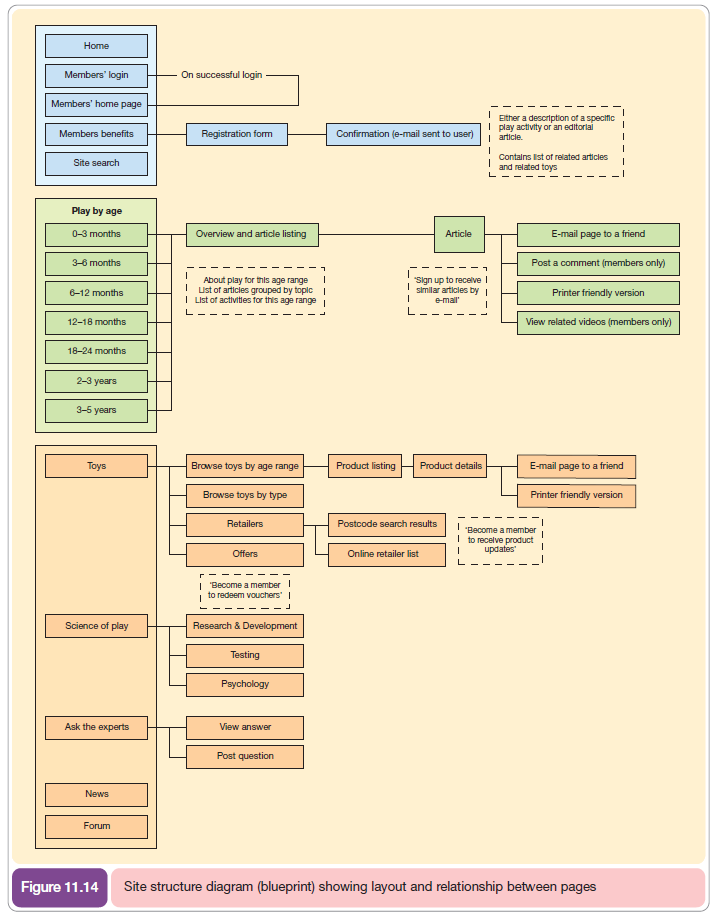
2.2. Blueprints
According to Rosenfeld and Morville (2002), blueprints
Show the relationships between pages and other content components, and can be used to portray organization, navigation and labelling systems.
They are often thought of, and referred to, as site maps or site structure diagrams and have much in common with these, except that they are used as a design device clearly showing grouping of information and linkages between pages, rather than a page on the web site to assist navigation.
Refer to Figure 11.14 for an example of a site structure diagram for a toy manufacturer web site which shows the groupings of content and an indication of the process of task completion also.
2.3. Wireframes
A related technique to blueprints is wireframes, which are used by web designers to indicate the eventual layout of a web page. Figure 11.15 shows that the wireframe is so called because it just consists of an outline of the page with the ‘wires’ of content separating different areas of content or navigation shown by white space.
Wodtke (2002) describes a wireframe (sometimes known as a ‘schematic’) as:
a basic outline of an individual page, drawn to indicate the elements of a page, their relationships, and their relative importance.
A wireframe will be created for all types of similar page groups, identified at the blueprint (site map) stage of creating the information architecture.
Blueprints illustrate how the content of a web site is related and navigated while a wireframe focuses on individual pages; with a wireframe the navigation focus becomes where it will be placed on the page.
The process of reviewing wireframes is sometimes referred to as ‘storyboarding’, although the term is often applied to reviewing creative ideas rather than formal design alternative. Early designs are drawn on large pieces of paper, or mock-ups are produced using a drawing or paint program.
At the wireframe stage, emphasis is not placed on use of colour or graphics, which will be developed in conjunction with branding or marketing teams and graphic designers and integrated into the site towards the end of the wireframe process.
According to Chaffey and Wood (2005), the aim of a wireframe will be to:
- Integrate consistently available components on the web page (e.g. navigation, search boxes);
- Order and group key types of components together;
- Develop a design that will focus the user on to core messages and content;
- Make correct use of white space to structure the page;
- Develop a page structure that can be easily re-used by other web designers.

Common wireframe or template features you may come across are:
- Navigation in columns on left or right and at top or bottom.
- Header areas and footer areas.
- ‘Slots’ or ‘portlets’ – these are areas of content such as an article or list of articles placed in boxes on the screen. Often slots will be dynamically populated from a content management system.
Slots on the home page may be used to:
- Summarize the online value proposition
- Show promotions
- Recommend related products
- Feature news, etc.
- Contain ads.
Wireframes are then transformed into physical site design page templates which are now created using standardized cascading style sheets (CSS) which enable a standard look and feel to be enforced across different sections of the site. It is useful for managers to understand the principles of CSS since this enables great flexibility within design decisions.
The standards body W3C (www.w3.org) defines cascading style sheets (CSS) as
a simple mechanism for adding style (e.g. fonts, colors, spacing) to Web documents.
CSS enables different style elements to be controlled across an entire site or section of site. Style elements that are commonly controlled include:
- Typography
- Background colour and images
- Borders and margins.
A style sheet consists of a series of rules that controls the way selected elements should be displayed. For example:
body { font-family: Verdana, Arial, Helvetica, Sans Serif, Sans; font- size: 0.7em; text-align:center; margin: 0; background-color: white; color: black; }
In this example, the HTML ‘body’ tag is the selector and the required style for text is defined between the curly brackets is the declaration.
The benefits of CSS are:
- Bandwidth – pages download faster after initial page load since style definitions only need to be downloaded once as a separate file, not for each page;
- More efficient development – through agreeing site style and implementing in CSS as part of page templates, it is more efficient to design a site;
- Reduces updating and maintenance time – presentational markup is stored in one place separate from the content, making it quicker to update the site globally with less scope for errors;
- Increased interoperability – by adhering to W3C recommendations helps with support of multiple browsers;
- Increases accessibility – users can more readily configure the way a site looks or sounds using browsers and other accessibility support tools. Site is more likely to render on a range of access platforms like PDAs and smartphones and appear well formatted on printers.
3. Customer orientation
A well designed site will have been developed to achieve customer orientation or customer- centricity. This involves the difficult task of trying to provide content and services to appeal to a wide range of audiences. For a B2B company the three main types of audience are customers, other companies and organizations, and staff. The detailed breakdown of these audiences is illustrated in Figure 11.16. Visit the Dell web site (www.dell.com) to see how Dell segments its customer base on the home page into:
- Small office and home users
- Small businesses
- Medium businesses
- Large businesses
- Corporates
- Government organizations.
Think about how well this approach works. What would be your reaction to being classified as a mere small business or home owner? Do you think this is a valid approach? A similar approach, by Microsoft, is to offer specialized content for IS managers to help them in their investment decisions. Is a more straightforward product-centric structure to the web site appropriate?
As well as customer segments, designers also need to take into account variations in the backgrounds of visitors to the site. These can be thought of as four different types of familiarity:

- Familiarity with the Internet – are short cuts provided for those familiar with the Internet? And for novices is there help to lead them through your site? As we saw in Chapter 4, users have different levels of familiarity with the web and this should be accommodated within web site designs.
- Familiarity with organization – for customers who do not know the organization, content is needed to explain who the company is and demonstrate credibility through ‘About Us’ options and customer testimonials.
- Familiarity with organization’s products – even existing customers may not know the full range of your product offering.
- Familiarity with your site – site maps, search and help options are not just ‘nice to have’ options for an e-commerce site, because you may lose potential customers if they cannot be helped when they are lost.
Jakob Nielsen (2000a) says this about novice users:
Web users are notoriously fickle: they take one look at a home page and leave after a few seconds if they can’t figure it out. The abundance of choice and the ease of going elsewhere puts a huge premium on making it extremely easy to enter a site.
But he notes that we also need to take account of experts. He says we may eventually move to interfaces where the average site visitor gets a simplified design that is easy to learn and loyal users get an advanced design that is more powerful. But, for now, ‘in-depth content and advanced information should be added to sites to provide the depth expected by experts’.
The principles of customer orientation can be extended from the design of the site to the tactics that are used to deliver services via a web site, as explained through Activity 11.4.
4. Elements of site design
Once the requirements of the user are established we can turn our attention to the design of the human-computer interface. Nielsen (2000b) structures his book on web usability according to three main areas, which can be interpreted as follows:
- Site design and structure – the overall structure of the site.
- Page design – the layout of individual pages.
- Content design – how the text and graphic content on each page is designed.
4.1. Site design and structure
The structures created by designers for web sites will vary greatly according to their audience and the site’s purpose, but we can make some general observations about design and structure. We will review the factors designers consider in designing the style, organization and navigation schemes for the site.
Site style
An effective web-site design will have a style that is communicated through use of colour, images, typography and layout. This should support the way a product is positioned or its brand.
Site personality
The style elements can be combined to develop a personality for a site. We could describe site personalities in the same way we can describe people, such as ‘formal’ or ‘fun’. This personality has to be consistent with the needs of the target audience. A business audience often requires detailed information and prefers an information-intensive style such as that of the Cisco site (www.cisco.com). A consumer site is usually more graphically intensive. Before the designers pass on their creative designs to developers, they also need to consider the constraints on the user experience, such as screen resolution and colour depth, the browser used and download speed. The list of constraints which must be tested is illustrated in Chapter 12.
Rosen and Purinton (2004) have assessed the relative importance of design factors which influence a consumer (based on questionnaires of a group of students). They believe there are some basic factors that determine the effectiveness of an e-commerce site. They group these factors as follows:
- Coherence – simplicity of design, easy to read, use of categories (for browsing products or topics), absence of information overload, adequate font size, uncrowded presentation;
- Complexity – different categories of text;
- Legibility – use of ‘mini home page’ on every subsequent page, same menu on every page, site map.
You can see that these authors suggest that simplicity in design is important. Another example of research into web site design factors supports the importance of design. Fogg et al. (2003) asked students to review sites to assess the credibility of different suppliers based on the web site design. They considered these factors most important:

However, it should be borne in mind that such generalizations can be misleading based on the methodology used. Reported behaviour (e.g. through questionnaires or focus groups) may be quite different from actual observed behaviour.
Site organization
In their book on information architectures for the web, Rosenfeld and Morville (2002) identify several different information organization schemes. These can be applied for different aspects of e-commerce sites, from the whole site through to different parts of the site. Rosenfeld and Morville (2002) identify the following information organization schemes:
- Exact. Here information can be naturally indexed. If we take the example of books, these can be alphabetical – by author or title; chronological – by date; or for travel books, for example, geographical – by place. Information on an e-commerce site may be presented alphabetically, but this is not suitable for browsing.
- Ambiguous. Here the information requires classification; again taking the examples of books, the Dewey decimal system is an ambiguous classification scheme since the librarians classify books into arbitrary categories. Such an approach is common on an e-commerce site since products and services can be classified in different ways. Other ambiguous information organization schemes that are commonly used on web sites are where content is broken down by topic, by task or by audience. The use of metaphors is also common; a metaphor is where the web site corresponds to a familiar real-world situation. The Microsoft Windows Explorer, where information is grouped according to Folders, Files and Trash, is an example of a real-world metaphor. The use of the shopping basket metaphor is widespread within e-commerce sites. It should be noted, though, that Nielsen (2000b) believes that metaphors can be confusing if the metaphor is not understood immediately or is misinterpreted.
- Hybrid. Here there will be a mixture of organization schemes, both exact and ambiguous. Rosenfeld and Morville (2002) point out that using different approaches is common on web sites but this can lead to confusion, because the user is not clear what mental model is being followed. We can say that it is probably best to minimize the number of information organization schemes.
Site navigation schemes
Devising a site that is easy to use is critically dependent on the design of the site navigation scheme. Hoffman and Novak (1997) stress the importance of the concept of‘flow’ in governing site usability. ‘Flow’ essentially describes how easy it is for the users to find the information they need as they move from one page of the site to the next, but it also includes other interactions such as filling in on-screen forms. Rettie (2001) summarizes the meaning of flow in an online context and gives guidelines on how this concept can be used to enhance the visitor experience. The concept of flow can be better understood by considering the statements describing flow used originally by Csikszentmihalyi and more recently by Rettie’s research to test for a flow experience on a web site:
- My mind isn’t wandering. I am not thinking of something else. I am totally involved in what I am doing. My body feels good. I don’t seem to hear anything. The world seems to be cut off from me. I am less aware of myself and my problems.
- My concentration is like breathing. I never think of it. I am really oblivious to my surroundings after I really get going. I think that the phone could ring, and the doorbell could ring, or the house burn down or something like that. When I start, I really do shut out the whole world. Once I stop, I can let it back in again.
- I am so involved in what I am doing, I don’t see myself as separate from what I am doing.
Rettie (2001) suggests that the following factors limit flow: long download times, delays to download plug-ins, long registration forms, limited stimulation, boring sites, slow responses, sites which are not intuitive, navigation links that fail, challenge greater than skill and irrelevant advertising. Conversely, reversing these factors can improve flow: quick download times, alternative versions (e.g. text and graphics), automatic completion of forms, opportunities for interaction, rapid responses, navigation which creates choices, predictable navigation for control, segmentation by Internet experience.
Most navigation systems are based upon a hierarchical site structure. When creating the structure, designers have to compromise between the two approaches shown in Figure 11.17. The narrow and deep approach has the benefit of fewer choices on each page, making it easier for the user to make their selection, but more clicks are required to reach a particular piece of information. The broad and shallow approach requires fewer clicks to reach the same piece of information, but the design of the screen potentially becomes cluttered. Figure 11.17(a) depicts the narrow and deep approach and Figure 11.17(b) the broad and shallow approach. Note that in these cases the approaches are appropriate for the non-technical and technical audiences respectively. A rule of thumb is that site designers should ensure it only takes three clicks to reach any piece of information on a site. This implies the use of a broad and shallow approach on most large sites. This may also be beneficial for SEO purposes. Lynch and Horton (1999) recommend a broad and shallow approach and note that designers should not conceive of a single home page where customers arrive on the site, but of different home pages according to different audience types. Each of the pages in the second row of Figure 11.15(b) could be thought of as an example of a home page which the visitors can bookmark if the page appeals to them. Nielsen (2000b) points out that many users will not arrive on the home page, but may be referred from another site or according to a print or TV advert to a particular page such as www.b2b.com/jancomp. He calls this process ‘deep linking’ and site designers should ensure that navigation and context are appropriate for users arriving on these pages.
As well as compromises on depth of links within a site it is also necessary to compromise on the amount of space devoted to menus. Nielsen (2000c) points out that some sites devote so much space to navigation bars that the space available for content is limited. Nielsen (2000c) suggests that the designer of navigation systems should consider the following information that a site user wants to know:

- Where am I? The user needs to know where they are on the site and this can be indicated by highlighting the current location and clear titling of pages. Chaffey et al. (2009) refer to this as Consistency of menu locations on different pages is also required to aid cognition. Users also need to know where they are on the web. This can be indicated by a logo, which by convention is at the top or top left of a site.
- Where have I been? This is difficult to indicate on a site, but for task-oriented activities such as purchasing a product, the display can show the user that they are at the nth stage of an operation, such as making a purchase.
- Where do I want to go? This is the main navigation system which gives options for future operations.
To answer these questions, clear succinct labelling is required. Widely used standards such as Home, Main page, Search, Find, Browse, FAQ, Help and About Us are preferable. But for other particular labels it is useful to have what Rosenfeld and Morville (2002) call ‘scope notes’ – an additional explanation. These authors also argue against the use of iconic labels or pictures without corresponding text since they are open to misinterpretation and take longer to process.
Since using the navigation system may not enable the user to find the information they want rapidly, alternatives have to be provided by the site designers. These alternatives include search, advanced search, browse and site map facilities. Whatis.com (www.whatis.com) illustrates these features well.
4.2. Page design
The page design involves creating an appropriate layout for each page. The main elements of a particular page layout are the title, navigation and content. Standard content such as copyright may be added to every page as a footer. Issues in page design include:
- Page elements. The proportion of page devoted to content compared to all other content such as headers, footers and navigation elements. The location of these elements also needs to be considered. It is conventional for the main menu to be at the top or on the left. The use of a menu system at the top of the browser window enables more space for content below.
- The use of frames. This is generally discouraged for the reasons given in Chapter 12.
- Resizing. A good page layout design should allow for the user to change the size of text or work with different monitor resolutions.
- Consistency. Page layout should be similar for all areas of the site unless more space is required, for example for a discussion forum or product demonstration. Standards of colour and typography can be enforced through cascading style sheets.
- Printing. Layout should allow for printing or provide an alternative printing format.
4.3. Content design
Copywriting for the web is an evolving art form, but many of the rules for good copywriting are as for any medium. Common errors we see on web sites are:
- too much knowledge assumed of the visitor about the company, its products and services;
- using internal jargon about products, services or departments – using undecipherable acronyms.
Web copywriters also need to take account of the user reading the content on-screen. Approaches to deal with the limitations imposed by the customer using a monitor include:
- writing more concisely than in brochures;
- chunking or breaking text into units of 5-6 lines at most; this allows users to scan rather than read information on web pages;
- using lists with headline text in larger font;
- never including too much on a single page, except when presenting lengthy information such as a report which may be easier to read on a single page;
- using hyperlinks to decrease page sizes or help achieve flow within copy, either by linking to sections further down a page or linking to another page.
Hofacker (2001) describes five stages of human information processing when a web site is being used. These can be applied to both page design and content design to improve usability and help companies get their message across to consumers. Each of the five stages summarized in Table 11.6 acts as a hurdle, since if the site design or content is too difficult to process, the customer cannot progress to the next stage. It is useful to consider the stages in order to minimize the difficulties.

Using these layers we can map content across different access levels to produce a site which is integrated across the needs of its audiences. This also relates to the section on security since different access levels may be given for different information.
5. Web accessibility
Web accessibility is another core requirement for web sites. It is about allowing all users of a web site to interact with it regardless of disabilities they may have or the web browser or platform they are using to access the site. The visually impaired are the main audience that designing an accessible web site can help. However, increased usage of mobile or wireless access devices such as personal digital assistants (PDAs) and GPRS or 3G phones also make consideration of accessibility important.
The quote below shows the importance of the accessibility to a visually impaired user of a web site who uses a screen-reader which reads out the navigation options and content on a web site.
For me being online is everything. It’s my hi-fi, it’s my source of income, it’s my supermarket, it’s my telephone. It’s my way in.
(Lynn Holdsworth, screen-reader user, web developer and programmer, RNIB,www.rnib.org.uk)
Remember that many countries now have specific accessibility legislation to which web site owners are subject. This is often contained within disability and discrimination acts. In the UK, the relevant act is the Disability and Discrimination Act (DDA) 1995. Recent amendments to the DDA makes it unlawful to discriminate against disabled people in the way in which a company recruits and employs people, provides services or provides education. Providing services is the part of the law that applies to web site design. Providing accessible web sites is a requirement of Part II of the Disability and Discrimination Act published in 1999 and required by law from 2002. In the 2002 code of practice there is a legal requirement for web sites to be accessible. This is most important for sites which provide a service; for example the code of practice gives this example:
An airline company provides a flight reservation and booking service to the public on its website. This is a provision of a service and is subject to the Act.
Although there is a moral imperative for accessibility, there is also a business imperative to encourage companies to make their web sites accessibile. The main arguments in favour of accessibility are:
- Number of visually impaired people – in many countries there are millions of visually impaired people varying from ‘colour blind’ to partially sighted to blind.
- Number of users of less popular browsers or variation in screen display resolution. Microsoft Internet Explorer is now the dominant browser, but there are less well known browsers which have a loyal following amongst the visually impaired (for example screen-readers and Lynx, a text-only browser) and early adopters (for example Mozilla Firefox, Safari and Opera). If a web site does not display well in these browsers, then you may lose these audiences. Complete Activity 11.5 to review how much access has varied since this book was published.
- More visitors from natural listings of search engines. Many of the techniques used to make sites more usable also assist in search engine optimization. For example, clearer navigation, text alternatives for images and site maps can all help improve a site’s position in the search engine rankings.
- Legal requirements. In many countries it is a legal requirement to make web sites accessible. For example, the UK has a Disability Discrimination Act that requires this. The requirements of these laws are described in more detail later in this topic.

Guidelines for creating accessible web sites are produced by the governments of different countries and non-government organizations such as charities. Internet standards organizations such as the World Wide Web Consortium have been active in promoting guidelines for web accessibility through its Website Accessibility Initiative (WAI), see www.w3.org/WAI. It describes common accessibility problems as:
images without alternative text; lack of alternative text for imagemap hot-spots; misleading use of structural elements on pages; uncaptioned audio or undescribed video; lack of alternative information for users who cannot access frames or scripts; tables that are difficult to decipher when linearized; or sites with poor color contrast.
A fuller checklist for acessibility compliance for web site design and coding using HTML is available from theWorldWideWeb Consortium (www.w3.org/TR/WCAG10/full-checklist.html).
There are three different priority levels which it describes as follows:
- Priority 1 (Level A). AWeb content developer must satisfy this checkpoint. Otherwise, one or more groups will find it impossible to access information in the document. Satisfying this checkpoint is a basic requirement for some groups to be able to useWeb documents.
- Priority 2 (Level AA). A Web content developer should satisfy this checkpoint. Otherwise, one or more groups will find it difficult to access information in the document. Satisfying this checkpoint will remove significant barriers to accessingWeb documents.
- Priority 3 (Level AAA). AWeb content developer may address this checkpoint. Otherwise, one or more groups will find it somewhat difficult to access information in the document. Satisfying this checkpoint will improve access toWeb documents.
So, for many companies the standard is to meet Priority 1 and Priority 2 or 3 where practical.
Some of the most important Priority 1 elements are indicated by these ‘Quick Tips’ from theWAI:
- Images and animations. Use alt tags to describe the function of each visual.
- Image maps. Use the client-side map and text for hotspots.
- Multimedia. Provide captioning and transcripts of audio, and descriptions of video.
- Hypertext links. Use text that makes sense when read out of context. For example, avoid ‘click here’.
- Page organization. Use headings, lists and consistent structure. Use CSS for layout and style where possible.
- Graphs and charts. Summarize or use the longdesc attribute.

- Scripts, applet and plug-ins. Provide alternative content in case active features are inaccessible or unsupported.
- Frames. Use the noframes element and meaningful titles.
- Tables.Make line-by-line reading sensible. Summarize.
- Check your work.Validate.Use the tools, checklist and guidelines at www.w3.org/TR/WCAG.
Figure 11.18 is an example of an accessible site which still meets brand and business objectives while supporting accessibility through resizing of screen resolution, text resizing and alternative image text.
One of the benefits of accessibility requirements is that it helps web site owners and web agencies consider the variation in platforms used to access web sites.
Source: Dave Chaffey (2010), E-Business and E-Commerce Management: Strategy, Implementation and Practice, Prentice Hall (4th Edition).
I am glad to be one of many visitors on this great web site (:, thankyou for posting.
I like this web site so much, saved to my bookmarks.