The fifth of the seven tools is the scatter diagram. It is the simplest of the seven and one of the most useful. The scatter diagram is used to determine the correlation (relationship) between two characteristics (variables). Suppose you have an idea that there is a relationship between automobile fuel consumption and the rate of speed at which people drive. To prove, or disprove, such an assumption, you could record data on a scatter diagram that has miles per gallon (mpg) on the y-axis and miles per hour (mph) on the x-axis; mpg and mph are the two characteristics.
Examination of the scatter diagram of Figure 15.22 shows that the aggregate of data points contains a slope down and to the right. This is correlation, and it supports the thesis that the faster cars travel, the more fuel they use. Had the slope been upward to the right, as it actually appears to be (for three of the four cars) between 20 and 30 mph, the correlation would have suggested that the faster you travel, the better the fuel mileage. Suppose, however, that the data points did not form any recognizable linear or elliptical pattern but were simply in a disorganized configuration. This would suggest that there is no correlation between speed and fuel consumption.

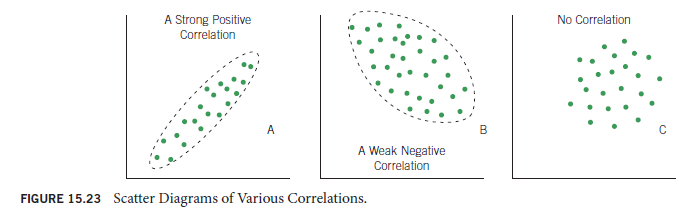
Figure 15.23 is a collection of scatter diagrams illustrating strong positive correlation (Diagram A), weak negative correlation (Diagram B), and no correlation (Diagram C). To be classified as a strong correlation, the data points must be tightly grouped in a linear pattern. The more loosely grouped, the less correlation, and, therefore, the term weak correlation. When a pattern has no discernible linear component, it is said to show no correlation.
Scatter diagrams are useful in testing the correlation between process factors and characteristics of product flowing out of the process. Suppose you want to know whether conveyor speed has an effect on solder quality in a machine soldering process. You could set up a scatter diagram with conveyor speed on the x-axis and solder rejects or nonconformities on the y-axis. By plotting sample data as the conveyor speed is adjusted, you can construct a scatter diagram to tell whether a correlation exists.
In this case, Figure 15.24 suggests that the correlation is a curve, with rejects dropping off as speed is initially raised but then increasing again as the conveyor speed continues to increase. This is not atypical of process factors that have optimum operating points. In the case of the conveyor, moving too slowly allows excess heat to build up, causing defects. So increasing speed naturally produces better results, until the speed increases to the point where insufficient preheating increases the number of defects. Figure 15.24, then, not only reveals a correlation, but also suggests that there is an optimum conveyor speed, operation above or below which will result in increased product defects.
It is also possible to determine a correlation between two process factors. If your manufacturing process includes the washing of parts in a cleaning agent and you are interested in reducing the time the parts are in the cleaning tank, you might want to know whether the temperature of the solution is correlated with the time it takes to get the parts thoroughly clean. The scatter diagram could have temperature of the cleaning agent on one axis and time to clean on the other. By adjusting the temperature of the solution and plotting the cleaning time, a scatter diagram will reveal any existing correlation.

Assume that the scatter diagram shows a discernible slope downward to the right, as in Figure 15.25. This shows that over the temperature range tested, there is a correlation between cleaning solution temperature and cleaning time. With this information, you might be able to reduce the cycle time of the product. Cycle time in manufacturing is basically elapsed time from the start of your build process until the product is finished. Cycle time is becoming more important as manufacturers adopt world-class techniques to compete in the global marketplace. If you can find a safe, cost-effective way to raise the cleaning agent temperature to some more efficient level, and in the process shorten the cycle (or perhaps maintain the cycle and do a better job of cleaning), doing so might provide a competitive advantage.
Not all scatter diagrams require that special tests be run to acquire raw data. The data are frequently readily available in a computer. Few companies would have to record new data to determine whether a correlation exists between the day of the week and employee performance. Such data are often available from the day-to-day inspection reports. In fact, where people are involved, it is advisable to use existing data rather than collecting new data to be sure that the data were not influenced by the test itself. Imagine people being told they were to be part of a test to determine whether their performance was as good on Friday or Monday as the rest of the week. This knowledge would undoubtedly affect their performance.

Source: Goetsch David L., Davis Stanley B. (2016), Quality Management for organizational excellence introduction to total Quality, Pearson; 8th edition.
Yay google is my queen helped me to find this outstanding internet site! .