The run chart is straightforward, and the control chart is a much more sophisticated outgrowth of it. Therefore, the two are usually thought of together as a single tool. Both can be very powerful and effective for the tracking and control of processes, and they are fundamental to the improvement of processes.
1. Run Charts
The run chart records the output results of a process over time. The concept is strikingly simple, and, indeed, it has been used throughout modern times to track performance of everything from AAA membership to zwieback production. Because one axis (usually the x-axis) represents time, the run chart can provide an easily understood picture of what is happening in a process as time goes by. That is, it will cause trends to “jump” out at you. For this reason, the run chart is also referred to as a trend chart.
Consider as an example a run chart set up to track the percentage of product that is defective for a process that makes ballpoint pens. These are inexpensive pens, so production costs must be held to a minimum. On the other hand, many competitors would like to capture our share of the market, so we must deliver pens that meet the expectations of our customers—as a minimum. A sampling system is set up that requires a percentage of the process output to be inspected. From each lot of 1,000 pens, 50 will be inspected. If more than one pen from each sample of 50 is found defective, the whole lot of 1,000 will be inspected. In addition to scrapping the defective pens, we will attempt to discover why the defects were there in the first place and to eliminate the cause. Data from the sample will be plotted on a run chart. Because we anticipate improvements to the process as a result of this effort, the run chart will be ideal to show whether we are succeeding.
The run chart of Figure 15.26 is the result of sample data for 21 working days. The graph clearly shows that significant improvement in pen quality was made during the 21 working days of the month. The trend across the month was toward better quality (fewer defects). The most significant improvements came at the 12th day and the 17th day as causes for defects were found and corrected.

The chart can be continued indefinitely to keep us aware of performance. Is it improving, staying the same, or losing ground? Scales may have to change for clarity. For example, if we consistently found all samples with defects below 2%, it would make sense to change the y-axis scale to 0 to 2%. Longer term charts would require changing from daily to weekly or even monthly plots.
Performance was improved during the first month of the pen manufacturing process. The chart shows positive results. What cannot be determined from the run chart, however, is what should be achieved. Assuming we can hold at two defective pens out of 100, we still have 20,000 defective pens out of a million. Because we are sampling only 5% of the pens produced, we can assume that 19,000 of these find their way into the hands of customers—the very customers our competition wants to take away from us. So it is important to improve further. The run chart will help, but a more powerful tool is needed.
2. Control Charts
The problem with the run chart and, in fact, many of the other tools is that it does not help us understand whether the variation is the result of special causes—things such as changes in the materials used, machine problems, lack of employee training—or common causes that are purely random. Not until Dr. Walter Shewhart made that distinction in the 1920s was there a real chance of improving processes through the use of statistical techniques. Shewhart, then an employee of Bell Laboratories, developed the control chart to separate the special causes from the common causes.4
In evaluating problems and finding solutions for them, it is important to distinguish between special causes and common causes. Figure 15.27 shows a typical control chart. Data are plotted over time, just as with a run chart; the difference is that the data stay between the upper control limit (UCL) and the lower control limit (LCL) while varying about the centerline or average only so long as the variation is the result of common causes (i.e., statistical variation). Whenever a special cause (nonstatistical cause) impacts the process, one of two things will happen: Either a plot point will penetrate UCL or LCL, or there will be a “run” of several points in a row above or below the average line. When a penetration or a lengthy run appears, this is the control chart’s signal that something is wrong that requires immediate attention.
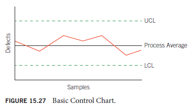
As long as the plots stay between the limits and don’t congregate on one side or the other of the process average line, the process is in statistical control. If either of these conditions is not met, then we can say that the process is not in statistical control or simply is “out of control”—hence the name of the chart.
If you understand that it is the UCL, LCL, and process average lines added to the run chart that make the difference, you may wonder how those lines are set. The positioning of the lines cannot be arbitrary. Nor can they merely reflect what you want out of the process, for example, based on a specification. Such an approach won’t help separate common causes from special causes, and it will only complicate attempts at process improvement. UCL, LCL, and process average must be determined by valid statistical means. Determination of UCL, LCL, and process average is fully covered in Chapter 18, which is dedicated to the use of control charts in statistical process control.
All processes have built-in variability. A process that is in statistical control will still be affected by its natural random variability. Such a process will exhibit the normal distribution of the bell curve. The more finely tuned the process, the less deviation from the process average and the narrower the bell curve. (Refer to Figure 15.19, Histogram A and Histogram B.) This is at the heart of the control chart and is what makes it possible to define the limits and process average.
Control charts are the appropriate tool to monitor processes. The properly used control chart will immediately alert the operator to any change in the process. The appropriate response to that alert is to stop the process at once, preventing the production of defective product. Only after the special cause of the problem has been identified and corrected should the process be restarted. Having eliminated a problem’s root cause, that problem should never recur. (Anything less, however, and it is sure to return eventually.) Control charts also enable continual improvement of processes. When a change is introduced to a process that is operated under statistical process control charts, the effect of the change will be immediately seen. You know when you have made an improvement. You also know when the change is ineffective or even detrimental. This validates effective i mprovements, which you will retain. This is enormously difficult when the process is not in statistical control because the process instability masks the results, good or bad, of any changes deliberately made.
To learn more about statistical process control and control charts, study Chapter 18.
Source: Goetsch David L., Davis Stanley B. (2016), Quality Management for organizational excellence introduction to total Quality, Pearson; 8th edition.
I am pleased that I noticed this blog, just the right info that I was looking for! .