In decision making, data needed for problem solving are not available always. Problem solving in the sphere of management calls for collaboration among people from different departments. Hard data are usually scarce and available data are likely to be highly subjective. In such cases, it is necessary to go beyond an analytical approach and to use a design approach for problem solving. The new seven tools used for this design approach have proved useful in areas such as product quality improvement, cost reduction, new product development and policy deployment. They are beneficial to the top-and-middle management in an organization for strategic planning, goal setting and problem solving.7 However, these are not replacements for the old seven tools.
In 1976, the Union of Japanese Scientists and Engineers (JUSE) realised the need for tools to promote innovation, communicate information and successfully plan major projects. A team researched and developed the seven new quality control tools, often called the seven management and planning (MP) tools, or simply the seven management tools. Though all the tools were not new, some novel methods were used to collect and promote them.
A committee for developing QC tools, affiliated with the Osaka Base QC course ofJUSE, was set up in April 1972 with the aim of developing QC techniques for use by managerial level and staff. The committee headed by Yoshinobu Nayatani met regularly. In January 1977, the committee announced the results of its research in the form of a new set of methods called “the seven new QC tools.” The seven new tools are:
- Affinity diagram, otherwise known as the KJ method, was developed by Jiro Kawakita.
- Relations diagram is derived from the cause-and-effect diagram. It shows cause- and-effect relationships and helps to analyse the natural links between different aspects of a complex situation.
- Systematic or tree diagram is an adaptation of the functional analysis system technique (FAST) in value engineering.
- Matrix diagram is an adaptation of the “feasibility ranking method matrix” in value engineering.
- Matrix data analysis is based on the multivariate analysis method.
- Arrow diagram is a derivative of the programme evaluation and review technique (PERT) and critical path methodology (CPM) techniques.
- Process decision program chart (PDPC) diagram is adapted from operations research methods.
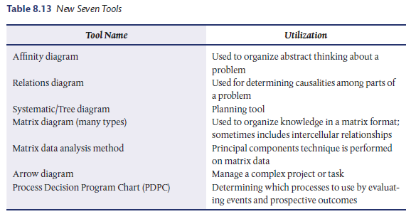
Table 8.13 lists the new seven tools.8 These tools enable the complete analysis and understanding of a problem. While not essential, these tools can be used in the order shown from the top to bottom of the table to move from a more abstract analysis (affinity) to the explicit details provided by arrow diagrams. These tools can also be combined with the seven statistical tools.
1. Affinity Diagram
The affinity diagram, created in the 1960s by Japanese anthropologist Jiro Kawakita, is also known as the KJ method. The affinity diagram organizes a large number of language data (ideas, opinions, issues) into their natural relationships. This method taps a team’s creativity and intuition.
Steps for creating an affinity diagram: The brainstormed list needs to be sorted to create an affinity diagram. Ideas acquired through brainstorming need to be moved into affinity sets and groups of related ideas need to be created. As you sort ideas:
- Rapidly group ideas that seem to belong together.
- It isn’t important to define why they belong together.
- Clarify ideas that are not clear.
- Copy an idea into more than one affinity set, if appropriate.
- Look for small sets. Should they belong in a larger group?
- Do large sets need to be broken down more precisely?
- When most of the ideas have been sorted, you can start to enter titles for each affinity set.
Using the affinity diagram as a team: It is relatively simple to try out using affinity diagrams yourself using the steps mentioned above. Figure 8.16 is an affinity diagram that shows the reason for substandard customer service. Use the steps shown below to do this.
- Gather a team; make sure the right people are on the team, i.e. ensure that the team has common goals and interests.
- Discuss and select a specific problem area. For example, lack of productivity.

- Have each member jot down as many contributing factors to the selected problem as possible on a post-it note.
- Post the note on a board and begin as a team to logically group the notes.
- Name the logically selected groups.
- Have a period of quiet reflection and permit any team member to move any note to any other desired group.
- Discuss the changes. Iterate these last two steps until a steady state is reached.
- Next, analyse the different groupings and decide which things to focus on in the remaining tools.
Use of affinity diagram: Affinity diagrams can be used:
- When you are confronted with many facts or ideas in apparent chaos
- When issues seem too large and complex to grasp
- When group consensus is necessary
2. Relations Diagram
It is also termed as an inter-relationship diagram or a digraph or even a network diagram.
The relations diagram depicts cause-and-effect relationships. The process of creating a relations diagram helps a group analyse the natural links between the different aspects of a complex situation.
Steps in constructing a relations diagram: The following steps can be used to construct a relations diagram:
- State the issue or problem clearly. Write it on a card and stick it in the centre of a board.
- Determine the factors related to the issue. Most frequently, these will be the headers from a previously completed affinity diagram. Place cards containing these factors in a circle around the issue card.
- Determine if cause-effect relationships exist between any of the cards. If so, draw an arrow from the “cause” card to the “effect” card. Do this for all cause-effect relationships that you can find.
- Analyse the relationships. Cards that have most arrows going from them tend to be root causes. Cards that have most arrows going to them are root effects.
Relations diagrams specify the relationships among things. More specifically, these diagrams are used to map and analyse problems where causes of the problem have complex interrelationships. In contrast to the Ishikawa diagram in which all causes of a problem are assumed to be hierarchically decomposable, the relations diagram promotes the discovery of a relationship among causes. This indicates that a single factor might influence two or more factors.
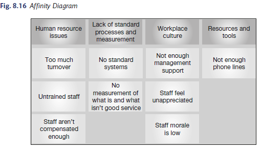
Example: Figure 8.17 represents the results of a team brainstorming session that identified 10 major issues involved in developing an organization’s quality plan.
Uses of relations diagrams: The main uses of relations diagrams are:
- Identifying key or driver issues from a list of important issues.
- Identifying the most important problems for resolution when the number of problems exceeds the resources available to solve all of them.
- Identifying the root cause of existing problems.
- Identifying key factors needed to make a decision when there is insufficient information available to make a data-driven decision.
3. Systematic or Tree Diagram
The tree diagram, also known as systematic diagram, tree analysis and analytical tree, is a technique for mapping out a full range of paths and tasks that need to be formulated in order to achieve a primary goal and related subgoals. Such a diagram not only reveals the magnitude of the problem but also helps to arrive at methods that can be pursued to achieve the results. In other words, it serves the purpose of developing the essential means to achieve an objective or goal. The systematic diagram method searches for the most appropriate and effective means of accomplishing given objectives. Systematic diagrams can be divided into two types:
- The constituent-component-analysis diagram breaks down the main subject into its basic elements and depicts their relationships to the objectives and means of obtaining those objectives.
- The plan-development diagram systematically shows the means and procedures necessary to successfully implement a given plan.
The systematic diagram is the application of a method originally developed for function analysis in value engineering. The main advantages of tree diagrams are as follows:
- They allow a system of strategies for solving a problem or means of achieving an objective to be developed systematically and logically, making it less likely that any essential items are omitted.
- They facilitate agreement among group members. They are extremely convincing since they identify and clearly display the strategies for solving a problem.
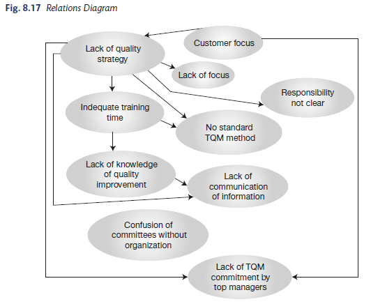
Example: A hotel restaurant manager, concerned at low patronage figures and various vague complaints, wanted to identify the factors that affected the satisfaction of her customers so that areas for improvement might be identified. She decided to use a tree diagram to find a basic set of factors, which when taken together would cover all areas.
The tree generated is shown in Figure 8.18. A selection of customers were asked to review the diagram to test the result and it was revised accordingly. Measures were then derived from the leaves and a simple process of measurement was set in place. At the end of each month, a project was set up to improve the poorest score of the previous month. Over time, the average score gradually went up, and the restaurant became more popular.
Uses of a systematic diagram: A systematic diagram can be used:
- To develop a sequence of steps that form the solution to a problem.
- When it is known that the implementation of some task will be a complex sequence.
- When serious consequences can occur as the result of missing a key step in implementing the solution to a problem.
4. Matrix Diagram
The matrix diagram is also termed as a matrix or a matrix chart. It shows the relationship between two, three or four groups of information. It can also provide information about the relationship such as its strength and the roles played by various individuals or measurements.
A matrix diagram consists of a number of columns and rows whose intersections are checked to find out the nature and strength of the problem. This helps us to arrive at key ideas and analyse the relationship or its absence at the intersection, thereby assisting in finding an effective way of pursuing the problem-solving method. This enables the conception of ideas on twodimensional relationship bases. The intersection points are also called “idea conception points.” The matrix diagram method clarifies the problematic spots through multi-dimensional thinking. This method identifies corresponding elements involved in a problem situation or event. These elements are arranged in rows and columns on a chart that shows the presence or absence of relationships among collected pairs of elements. Effective problem solving is facilitated at the intersection points. Matrix diagrams are commonly used in quality function deployment (please refer the section on QFD in the book) and is a roof-shaped matrix.
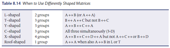
Six differently shaped matrices are possible—L, T, Y, X, C and roof-shaped—depending on how many groups must be compared. Table 8.14 summarizes when to use each type of matrix. Figure 8.19 shows the frequently used matrix diagram symbols, and Figure 8.20 shows the different types of matrix diagrams.
- An L-shaped matrix: It relates two groups of items to each other (or one group to itself ).
- A T-shaped matrix: It relates three groups of items. Groups B and C are each related to A. Groups B and C are not related to each other.
- A Y-shaped matrix: It relates three groups of items. Each group is related to the other two in a circular fashion.
- A C-shaped matrix: It relates three groups of items simultaneously in 3-D.
- An X-shaped matrix: It relates four groups of items. Each group is related to two others in a circular fashion.
- A roof-shaped matrix: It relates one group of items to itself. It is usually used along with an L or T-shaped matrix.


Steps in constructing a matrix diagram: The following steps can be used to construct a matrix diagram:
- Determine the factors that are important for making a correct selection or assignment.
- Select the type of matrix to be used. L-shaped matrices are used for comparing two factors; T-shaped are used for comparing three factors with direct and indirect relationships; Y-shaped are used to compare three factors showing direct relationships only.
- Select the relationship symbols to be used.
- Complete the proper matrix using the appropriate factors and symbols.
- Examine the matrix and draw the appropriate conclusion.
Industrial applications of a matrix diagram: Matrix diagrams can be used for the following:
- It is often used in deploying quality requirements into counterpart (engineering) characteristics and then into production requirements.
- To establish idea conception points for the development and improvement of system products.
- Achieve quality deployment in product materials.
- Establish and strengthen the quality assurance system by linking certified levels of quality with various control functions.
- Reinforce and improve the efficiency of the quality evaluation system.
- Pursue the causes of non-conformities in the manufacturing process.
- Establish strategies about the mix of products to send to the market by evaluating the relationships between the products and market situations.
5. Matrix Data Analysis
It is a complex mathematical technique for analysing matrices, often replaced in this list by the similar prioritization matrix. A prioritization matrix is an L-shaped matrix that uses pair wise comparisons of a list of options to a set of criteria in order to choose the best option(s). It is one of the most rigorous, careful and time consuming of decision-making tools.
Matrix data analysis is a multivariate analysis technique also known as “principal component analysis.” This technique quantifies and arranges data presented in a matrix diagram to find more general indicators that would differentiate and give clarity to large amounts of complexly intertwined information. This will help us to visualize and obtain an insight into the situation.
This diagram is used when the matrix chart does not provide sufficiently detailed information. This is the only method within the seven new tools that is based on data analysis and gives numerical results.
Characteristics of the matrix data analysis diagram:
- The matrix analysis method qualifies and arranges matrix diagram data so that the information is easy to visualize and comprehend.
- The relationships between the elements shown in a matrix diagram are quantified by obtaining numerical data for intersection cells.
- This is the only numerical analysis method among the seven new QC tools. The results of this technique, however, are presented in diagram form.
- One major technique that this method also utilizes is known as principal components analysis.
Uses of the matrix data analysis diagram:
- Analyse production processes where factors are complexly intertwined
- Analyse causes of non-conformities that involve a large volume of data
- Grasp the desired quality level indicated by the results of a market survey
- Classify sensory characteristics systematically
- Accomplish complex quality evaluations
- Analyse curvilinear data
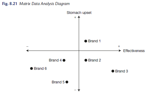
Example: Figure 8.21 provides the results of an investigation into the effectiveness of different brands of medication used to cure an upset stomach. Brands 2 and 3 are effective and do not cause an upset stomach, whereas brand 1 is effective but causes an upset stomach. Brands 4, 5 and 6 are not effective.
6. Arrow Diagram
This is also termed as activity network diagram, network diagram, activity chart, node diagram, and critical path method (CPM) chart.
The arrow diagram shows the required order of tasks in a project or process, the best schedule for the entire project and potential scheduling and resource problems and their solutions. The arrow diagram lets you calculate the “critical path” of the project. This is the flow of critical steps where delays will affect the timing of the entire project and where the addition of resources can speed up the project.
Steps in constructing an arrow diagram: The following steps can be used to construct an arrow diagram.
- Select a team that is knowledgeable about the project, its tasks and subtasks.
- Record all the tasks and subtasks necessary for the completion of the project.
- Sequence the tasks.
- Assign the time duration for each task.
- Calculate the shortest possible implementation time schedule using the critical path method.
- Calculate the earliest start and finish time for each task.
- Locate tasks with slack (extra) time and calculate total slack.
- Update the schedule as the project is being completed.
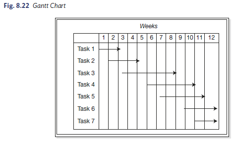
Example: The Gantt chart shown in Figure 8.22 has been used for many years to permit visualization and scheduling of parallel activities. In Figure 8.22, tasks are listed on the right side of the diagram. The time during which the tasks are scheduled are shown by the extent of the arrows in the diagram. The abscissa in this example might be weeks or months. In contrast, the arrow diagram attaches the name of each task to a node and shows the times between the tasks. Parallelism is easily seen and, moreover, disconnects in time are easily observed so that delays can be identified and plans can be altered to achieve the minimum time from start to completion of the process.
Applications of arrow diagrams: Arrow diagrams can be used to:
- To understand and manage a complex project or task.
- To understand and manage a project that is of major importance to the organization, where the consequences of late completion are severe.
- To understand and manage a project in which multiple activities must take place and be managed simultaneously.
- To explain the project status to others.
- Implement plans for new product development and its follow up.
- Develop product improvement plans and follow up activities.
- Establish daily plans for experimental trials and follow up activities.
- Establish daily plans for increases in production and their follow up activities.
- Synchronize the preceding plans for QC activities.
- Develop plans for a facility move and for monitoring follow up.
- Implement a periodic facility maintenance plan and its follow up.
- Analyse a manufacturing process and draw up plans for improved efficiency.
- Plan and follow up QC inspections and diagnostic tests.
- Plan and follow up QC conferences and QC circle conferences.
Box 8.2 discusses the role of network analysis in project management.
7. Process Decision Program Chart (PDPC)
The process decision program chart (PDPC) is a very useful and powerful method to overcome a problem or achieve a goal that is not familiar9 All the conceivable events or contingencies that can occur in the implementation stage can be mapped out using the PDPC.
Feasible counter measures to overcome these problems can also be arrived at.
Characteristics of a PDPC: The main characteristics are:
- The PDPC diagram is a simple graphical tool, which can be used to mitigate risk in virtually any undertaking.
- The PDPC method helps determine which processes to use to obtain desired results by evaluating the progress of events and the variety of conceivable outcomes.
- Implementation plans do not always progress as anticipated. When problems, technical or otherwise arise, solutions are frequently not apparent.
- The PDPC method, in response to these kinds of problems, anticipates possible outcomes and prepares countermeasures that will lead to the best possible solution.
- It establishes an implementation plan for management by objectives.
- It establishes an implementation plan for technology-development themes.
- It establishes a policy of forecasting and responding in advance to major events predicted in the system.
- Implement countermeasures to minimize non-conformities in the manufacturing process to set up and select adjustment measures for the negotiating process.
Box 8.2 Network Analysis
Network analysis plays a key role in project management. Planning, scheduling and control of a project becomes much easier by analysing a network. A network is a graphical depiction of activities and events. Program evaluation and review technique (PERT) and critical path method (CPM) represent the two well-known network analysis techniques used to assist managers in planning and controlling large and complex projects such as construction projects, research and development projects, etc.
PERT was first used to help coordinate the activities in the development of the Polaris missile system. CPM was developed by the DuPont and the Univac Division of Remington Rand Corporation as a device to control the maintenance of chemical plants.
CPM is a deterministic technique, frequently used in the construction industry to help organize and schedule those activities that together constitute a given construction project. The main difference between PERT and CPM is the method in which activity times are handled. In using CPM, one assumes the activity times are known with certainty (deterministic activity times).
PERT is probabilistic in nature and allows for uncertainty and statistical variation in activity times (stochastic activity times). This is used more in research and development projects. Nevertheless, PERT and CPM are closely related (CPM may be a special case of PERT). Some of the projects that are subject to analysis by either technique are (1) construction projects, (2) planning and launching a new product, (3) a turnaround in an oil refinery (or other maintenance projects), (4) installing and debugging a computer system, (5) scheduling ship construction and repairs, (6) manufacture and assembly of large job-lot operations, (7) missile countdown procedures, (8) end-of-the month closing of accounting records, (9) development of a new drug and (10) research and development projects. Source Adapted from www.pertcpm.com, accessed June 2016.
Steps in constructing a PDPC chart10:
- Select a team that is familiar with the process and possible contingencies. Typically, this will be a group that has been close to the effort or a similar effort.
- Determine the flow of the activities of the plan and place them on a flow chart or sequence.
- Construct a tree diagram, placing prerequisite activities in a time sequence. This can be done either using a horizontal or vertical format.
- At each step, ask, “what could go wrong here?” and place that contingency on the chart.
- Determine plausible explanations/solutions to each problem identified above and place the solution on the chart. An example of PDPC given in Figure 8.23 shows the process that can help secure a contract.

Uses of a PDPC chart:
- To explore all of the possible contingencies that could occur in the implementation of any new or untried plan that has risks involved.
- To implement a plan that is complex and the consequences of failure are serious.
- To implement a plan in which there is generally a time constraint for implementing a plan so that insufficient time is available to deal with contingent problems as they occur.
Source: Poornima M. Charantimath (2017), Total Quality Management, Pearson; 3rd edition.
I have been surfing online greater than three hours lately, but I never discovered any fascinating article like yours. It’s beautiful value enough for me. In my view, if all web owners and bloggers made excellent content material as you probably did, the net might be much more useful than ever before.