Some of the advances offered by web-based questionnaires are the enhancements that can be made to the ways in which the questions are asked, material displayed and responses recorded. Such enhancements include:
- drag and drop;
- page turning;
- magnifying;
- highlighting;
- virtual shopping.
It has been shown that online questionnaires that utilize techniques such as these, that enhance the experience for respondents and engage them better, lead to fewer breaking off during the survey for reasons unrelated to speed of download, and a greater willingness to participate in future surveys (Reid, Morden and Reid, 2007). Thus such enhancements are to the benefit of both the respondent and the researcher.
1. Drag and drop
With drag and drop, items can be organized by the respondent into response boxes. This makes the technique suitable for a range of questions, including associating brands with image dimensions, grouping of similarly perceived attributes, and rating brands, products or statements on a scale.
Reid, Morden and Reid (2007) compared responses to a series of attitude statements asked as five-point scales shown as radio buttons with a drag and drop technique, where each statement on a ‘card’ was dragged by the respondent into one of the five response areas. They found that the drag and drop technique resulted in fewer mid-point or neutral answers, mainly with an increase in negative answers, and less flat-lining. Using drag and drop for this type of question would therefore appear to improve both the respondents’ experience, so maintaining their engagement better, and the quality of the data.
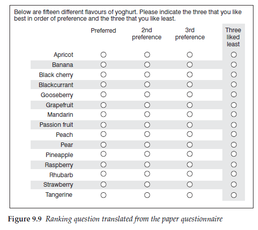
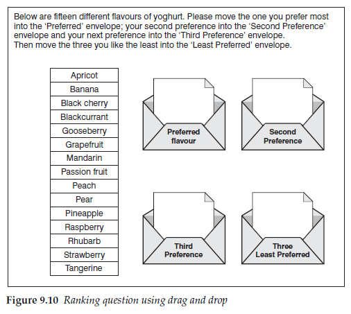
For an example of improving the respondent experience we shall look again at the question in Figure 4.3, where respondents were asked to rank order their three preferred yoghurt flavours and the three least liked from a list of 15. Translated directly on to the screen using radio buttons the question looks something like Figure 9.9.
The screen is a mass of radio buttons and does not look at all enticing. With drag and drop, however, the question can be asked similarly to Figure 9.10. The screen is now more attractive and the engagement of the respondent improved by making the task simpler.
Card sorting as a data collection technique has long been used in face- to-face interviews, but drag and drop programs make them simple to execute. The Q sort technique described in Chapter 5 is one that transfers readily to online questionnaires, as are other specialist sorting techniques such as repertory grid sorting.
2. Page turning
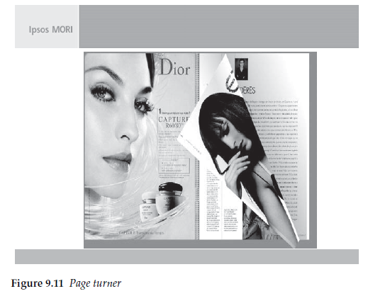
Some of the techniques can be used to increase the sense of reality for the respondent, or at least to decrease the artificiality of the interview. One such technique is the page turner, which many leading agencies include in their tool kit. This enables ‘pages’ to be moved on and back by ‘grabbing one of the corners with the cursor and folding it over, simulating page turning in a magazine or newspaper. Figure 9.11, from Ipsos MORI, shows a simulated magazine that the respondent has been asked to look through. In the illustration the right hand page is in the process of being turned as if the reader is progressing through the magazine. If the respondent wants to turn back, in order to look again at a previous page, then the technique works equally well. The purpose is to improve the verisimilitude of the experience in order to help respondents react more closely to the way that they would if it was a real magazine.
3. Magnifier
When respondents look at magazines or press ads on screen the text is frequently too small to be easily readable. A common technique to assist respondents is to use a magnifier. Figure 9.12 shows an example from TNS.
In Figure 9.13, the respondent has moved the magnifying glass over the particular piece of text of interest in order to be able to read it better. These types of techniques have come to be expected by respondents who see them being used elsewhere.
4. Highlighter
Some of the techniques allow us to ask questions in completely new ways that were previously either not possible or impractical.
Using highlighter pens to indicate text or visuals within an ad has always been possible in qualitative research, but the difficulty of both collecting and analysing this data from large numbers of respondents has prohibited its use in quantitative research. On screen, though, respondents can be asked to highlight sections of text or graphics relatively easily. The number of times a section of text or a graphic is highlighted can then be counted. So it is now possible to use highlighting to count the frequency for each part of the text or graphic for any designated response, such as what particularly catches their eye, or delights them or annoys them, or whatever the questionnaire writer asks.
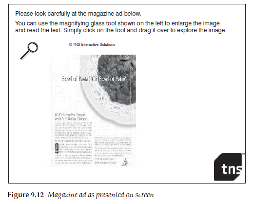
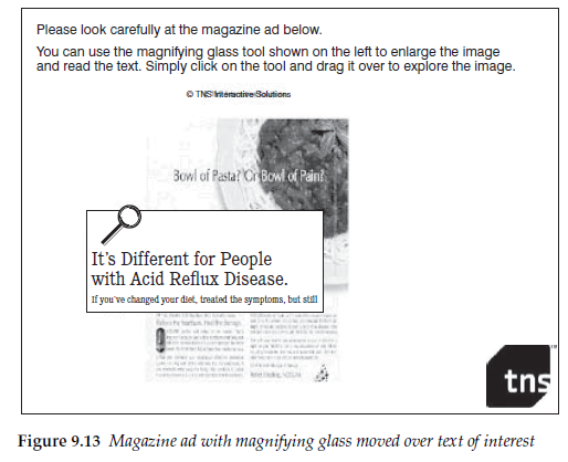
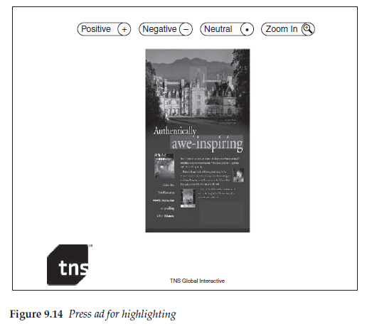
Figure 9.14 shows a page containing a press ad where respondents are being asked to highlight parts of it depending on whether they feel positive about it, negative or neutral. Clicking on the appropriate button at the top of the page and then on a part of the ad causes that part to change colour.
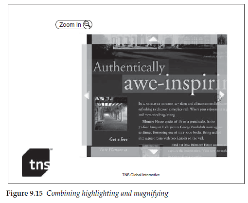
In Figure 9.15 the highlighting feature has been combined with a zoom to allow the respondent to read the detailed body text more easily.
This technique allows heat maps to be displayed, responding to the frequency with which each section has been selected for each purpose asked about.
Highlighting need not be restricted to questions about advertisements. It can also be used for example with maps to determine where respondents would or would not want to live, or where they went on holiday, or where they live and work. This is a technique that really is open to the creativity of the questionnaire writer.
5. Brand prompts
It is relatively straightforward with electronic questionnaires to incorporate logos or pack shots as stimuli for brand recognition or brand image questions. The use of these as prompts has already been discussed in Chapter 7. However, it is worth reiterating here that different visual prompts will produce different responses, because electronic questionnaires present the opportunity to use graphical and pictorial displays far more easily and readily than is possible with paper questionnaires.
Adding brand logos or pack shots may be thought to be a good way of obtaining greater respondent involvement. Including such displays will often, though, change the data that is collected. Brand awareness data may change because:
- Respondents are better able to distinguish between similar brands or brand variants.
- They do not recognize the pack from the picture used.
- It reminds them of another brand with a similar looking pack.
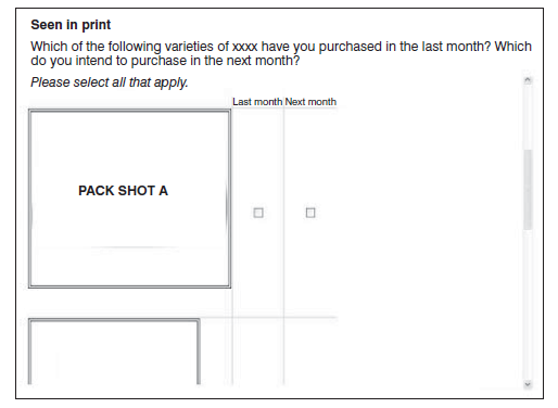
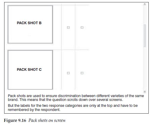
The larger the pack shot as it appears on screen, the less likelihood there is for confusion. However, the larger the pack shots, the greater likeli-hood there is that the respondent will have to scroll to see them all. It is better to avoid scrolling with this type of question. The aim should be to have all brands visible to the respondent at the same time in order to allow them to discriminate properly between them (see Figure 9.16).
With image questions data will also often change between questions asked using a verbal descriptor and those asked using logos or pack shots. This should not be surprising as much effort will have gone into the logo or pack design to ensure that it conveys messages and brand cues to the viewer, which are hence prompting the respondent on these attributes. It can be hypothesized that for a grocery product, the brand image collected using only verbal prompts represents the image that exists in the respondents’ minds in the absence of any prompts, that is at home, before going shopping, whereas the image obtained using pack shots is that which the respondent has when seeing it on the supermarket shelf.
In an experiment carried out by the author, in a brand image association question, 36 out of 85 brand-image association scores changed significantly when pack shots were used instead of brand names.
6. Colour cues
Another temptation with electronic questionnaires, particular online, is to use colour to enhance the appearance of the page and make the appearance more attractive to respondents.
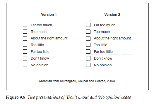
Great care, though, must be taken with the use of colour. The highlighting of particular answer codes must always be avoided. Also different colours can have different subconscious associations, which may themselves vary depending on the context. Thus blue can suggest ‘cold’ and red ‘warmth’, but red coupled with green can mean ‘stop’ with green meaning ‘go’. That colour can affect how people respond to a question has been demonstrated by, for example, Tourangeau, Couper and Conrad (2007). In experiments they showed that the use of colour in scales had a noticeable impact on responses in the absence of verbal or numerical cues, and hypothesized that, in this context, colour provides cues to respondents. Although following in importance behind verbal and numeric labels the implication is clearly that the use of colour must be treated with care.
7. Simulated shopping
One technique that combines a new way of collecting data with offering respondents a task that is interesting for them to complete is the simulated shopping technique. Originally developed for use with CAPI, this approach is now widely used online.
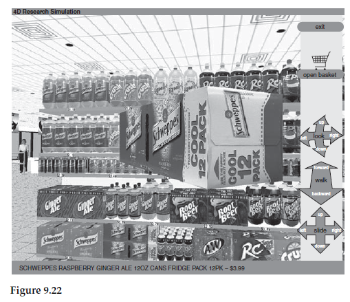
In this technique, supermarket shelves are simulated and packs displayed. This creates opportunities to simulate a presentation, as it would appear in a store, with different numbers of facings for different products, as an attempt to better reproduce the actual in-store choice situation.
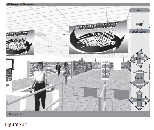
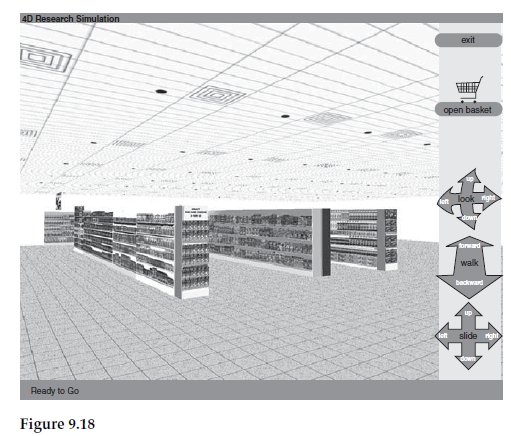
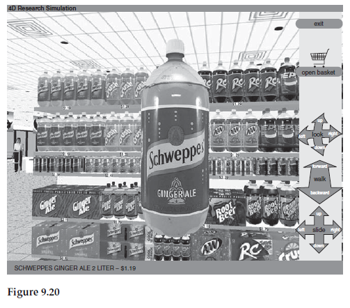
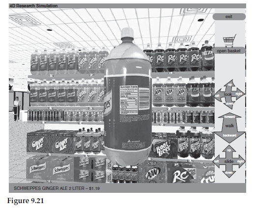
Respondents can be asked to simulate their choice process. Or they can be asked to find a particular product with the time taken to find it automatically recorded. Three-dimensional pack simulations can be shown and rotated by the respondent, whilst questions are asked about them.
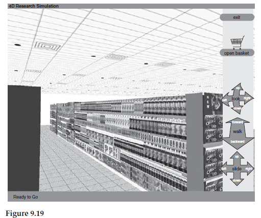
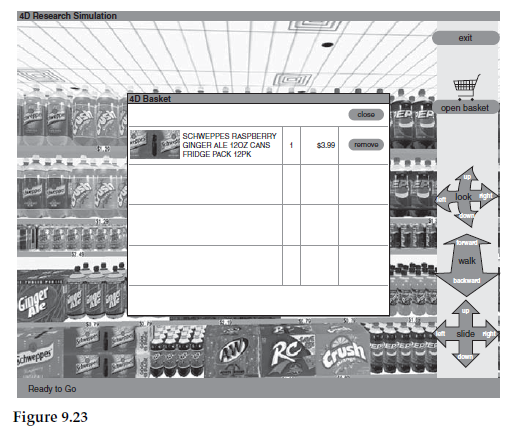
Illustrated in Figures 9.17 to 9.23 is the 4D Research Simulation from Advanced Simulations LLC of Atlanta, Georgia. This shows a series of screen shots from a program that allows respondents to simulate a shopping trip on the computer screen. The respondent can enter the store, approach the aisles, scan the shelves, pick up items, turn them to read the labels for nutritional or other information, and decide whether or not to purchase. The predominant colouring of the store can be changed to simulate each respondent’s regular supermarket.
Electronic, particularly web-based online, questionnaires provide the possibility of showing improved stimuli, of offering new ways of measuring consumer response, and making the process more interesting and involving for the respondent. The appropriateness of both the enhancement techniques and the way in which the questionnaire is presented should, though, be considered in relation to the subject and the target audience. A questionnaire linked to a website for teenage girls would be different from one intended for an older target group; something intended as entertainment would look different from a scientific investigation (Couper, 2000).
8. Keeping respondents on-side
With a self-completion questionnaire it is much easier for a respondent to stop answering and drop out of the survey than where there is an interviewer who will try to ensure that the interview is completed. It is therefore important to avoid frustrating respondents, as that is likely to increase the probability of their discontinuing or breaking off.
One such frustration is slow loading times between pages. This can occur because the questionnaire contains too many advanced features for the download speed available to the respondent’s computer. This is particularly the case where the respondent is connected to the internet via a dial-up modem, or has a slow computer or uncommon configuration (Reid, Morden and Reid, 2007). Thus you need to be aware of the probable mix of respondents’ connection types and hardware before deciding which features you include in the questionnaire.
Another consequence of different hardware and software configurations is that what respondents see on their screens may not match what the researcher sees when writing the questionnaire. The researcher or script writer is likely to have up-to-date equipment, probably more advanced than the majority of the respondents if they are consumers. (Business respondents are more likely to have similar equipment to the researcher.) It is frustrating for these respondents if the formatting of the questionnaire that they see is wrong, with text and response boxes out of line, or screens difficult to read. The researcher must again ensure that the questionnaire as written will appear intelligible to all respondents or that will be another cause of breaking off.
Careful design can improve the experience for the respondents, reduce errors, retain the respondents through to the end of the questionnaire, and help make sure that they are happy to complete further questionnaires in the future. However, over-enhancement can lead to problems with download times and the way the questions are seen on screen for respondents with slower equipment. A balance therefore has to be struck in order to get the most out of the available techniques.
Source: Brace Ian (2018), Questionnaire Design: How to Plan, Structure and Write Survey Material for Effective Market Research, Kogan Page; 4th edition.
20 Aug 2021
20 Aug 2021
20 Aug 2021
20 Aug 2021
20 Aug 2021
20 Aug 2021