1. WHEN NOT TO USE GRAPHS
In the previous chapter, we discussed certain types of data that should not be tabulated. They should not be turned into graphs either. Basically, graphs are pictorial tables.
The point is this. Certain types of data, particularly the sparse type or the type that is monotonously repetitive, do not need to be brought together in either a table or a graph. The facts are still the same: Preparing and printing an illustration can be time-consuming and expensive, and you should consider illustrating your data only if the result is a real service to the reader.
This point bears repeating because many authors, especially those who are still beginners, think that a table, graph, or chart somehow adds importance to the data. Thus, in the search for credibility, there is a tendency to convert a few data elements into an impressive-looking graph or table. Don’t do it. Your more experienced peers and most journal editors will not be fooled; they will soon deduce that (for example) three of the four curves in your graph are simply the standard conditions and that the meaning of the fourth curve could have been stated in just a few words. Attempts to dress up scientific data are usually doomed to failure.
If there is only one curve on a proposed graph, can you describe it in words? Possibly only one value is really meaningful, either a maximum or a minimum; the rest is window dressing. If you determined, for example, that the optimum pH value for a particular reaction was pH 8.1, it would probably be sufficient to state something like, “Maximum yield was obtained at pH 8.1.” If you determined that maximum growth of an organism occurred at 37°C, a simple statement to that effect is better economics and better science than a graph showing the same thing.
If the choice is not graph versus text but graph versus table, your choice might relate to whether you want to impart to readers exact numerical values or simply a picture of the trend or shape of the data. Rarely, there might be a reason to present the same data in both a table and a graph, the first presenting the exact values and the second showing a trend not otherwise apparent. Most editors would resist this obvious redundancy, however, unless the reason for it was compelling.
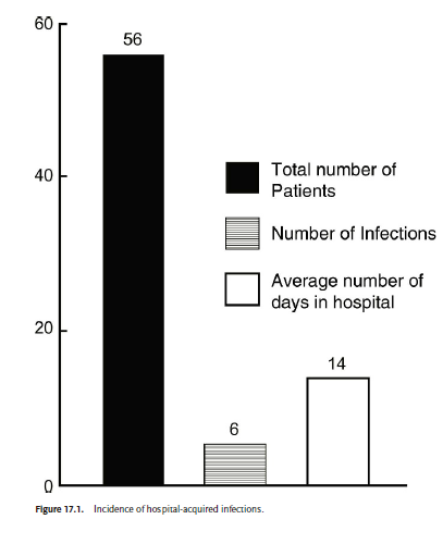
An example of an unneeded bar graph is shown in Fig. 17.1. This figure could be replaced by one sentence in the text: “Among the test group of 56 patients who were hospitalized for an average of 14 days, 6 acquired infections.”
When is a graph justified? There are no clear rules, but let us examine some indications for their effective use.
2. WHEN TO USE GRAPHS
Graphs resemble tables as a means of presenting data in an organized way. In fact, the results of many experiments can be presented either as tables or as graphs. How do we decide which is preferable? This is often a difficult decision. A good rule might be this: If the data show pronounced trends, making an interesting picture, use a graph. If the numbers just sit there, with no exciting trend in evidence, a table should be satisfactory (and perhaps easier and cheaper for you to prepare). Tables are also preferred for presenting exact numbers.
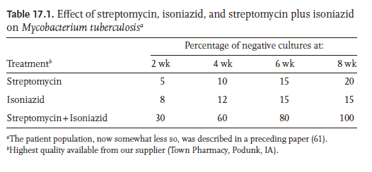
Examine Table 17.1 and Fig. 17.2, both of which record exactly the same data. Either format would be acceptable for publication, but Fig. 17.2 clearly seems superior to Table 17.1. In the figure, the synergistic action of the two- drug combination is immediately apparent. Thus, the reader can quickly grasp the significance of the data. It also appears from the graph that streptomycin is more effective than is isoniazid, although its action is somewhat slower; this aspect of the results is not readily apparent from the table.
3. HOW TO PREPARE GRAPHS
Early editions of this book included rather precise directions for using graph paper, India ink, lettering sets, and the like. Graphs had been prepared with these materials and by these techniques for generations.
Today we prepare graphs by computer. However, the principles of producing good graphs have not changed. The sizes of the letters and symbols, for example, must be chosen so that the final published graph in the journal is clear and readable.
The size of the lettering must be based on the anticipated reduction that will occur in the publishing process. This factor can be especially important if you are combining two or more graphs into a single illustration. Remember: Text that is easy to read on a large computer screen may become illegible when reduced to the width of a journal column.
Each graph should be as simple as possible. “The most common disaster in illustrating is to include too much information in one figure. Too much information in an illustration confuses and discourages the viewer” (Briscoe 1996).
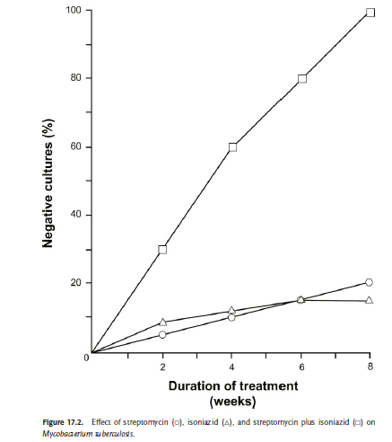
Figure 17.3 is a nice graph. The lettering is large enough to read easily. It is boxed, rather than two-sided (compare with Figure 17.2), making it a bit easier to estimate the values on the right-hand side of the graph. The scribe marks point inward rather than outward.
If your paper contains two or more graphs that are most meaningful when viewed together, consider grouping them in a single illustration. To maximize readability, place the graphs above and below each other rather than side by side. For example, in a two-column journal, placing three graphs in an “above and below” arrangement allows each graph to be one or two columns in width. If the graphs appear side by side, each can average only one third of a page wide.
Whether or not you group graphs in such a composite arrangement, be consistent from graph to graph. For example, if you are comparing interventions, keep using the same symbol for the same intervention. Also be consistent in other aspects of design. Both conceptually and aesthetically, the graphs in your paper should function as a set.
Do not extend the ordinate or the abscissa (or the explanatory wording) beyond what the graph demands. For example, if your data points range between 0 and 78, your topmost index number should be 80. You might feel a tendency to extend the graph to 100, a nice round number; this urge is especially difficult to resist if the data points are percentages, for which the natural range is 0 to 100. Resist this urge, however. If you do not, parts of your graph will be empty; worse, the live part of your graph will then be restricted in dimension, because you have wasted perhaps 20 percent or more of the width (or height) with empty white space.
In the preceding example (data points ranging from 0 to 78), your reference numbers should be 0, 20, 40, 60, and 80. You should use short index lines at each of these numbers and also at the intermediate 10s (10, 30, 50, 70). Obviously, a reference stub line halfway between 0 and 20 could only be 10. Thus, you need not letter the 10s, and you can then use larger lettering for the 20s, without squeezing. By using such techniques, you can make graphs simple and effective instead of cluttered and confusing.
4. SYMBOLS AND LEGENDS
If there is a space in the graph itself, use it to present the key to the symbols. In the bar graph (Figure 17.1), the shadings of the bars would have been a bit difficult to define in the legend; given as a key, they need no further definition (and any additional typesetting, proofreading, and expense are avoided).
If you must define the symbols in the figure legend, you should use only those symbols that are considered standard and that are widely available. Perhaps the most standard symbols are open and closed circles, triangles, and squares (o, A, □, •, ▲, ■). If you have just one curve, use open circles for the reference points; use open triangles for the second, open squares for the third, closed circles for the fourth, and so on. If you need more symbols, you probably have too many curves for one graph, and you should consider dividing it into two. Different types of connecting lines (solid, dashed) can also be used. But do not use different types of connecting lines and different symbols.
As to the legends, they should normally be provided on a separate page, not at the bottom or top of the illustrations themselves. The main reason is that the two portions commonly are processed separately during journal production. Consult the instructions to authors of your target journal regarding this matter and other requirements for graphs.
5. A FEW MORE TIPS ON GRAPHS
Design graphs, like tables, to be understandable without the text. For example, use meaningful designations (not just numbers) to identify groups. And refer to each graph as soon as readers are likely to want to see it. Do not leave readers trying to visualize your findings by sketching them on a napkin—only to find three pages later that a graph displays them.
Use graphs that depict your findings fairly and accurately. For example, do not adapt the scales on the axes to make your findings seem more striking than they are. With rare exceptions, avoid beginning a scale at anything other than zero. And if you interrupt a scale line to condense a graph, make the interruption obvious. Also, if the standard deviation is the appropriate way to show the variability in your data, do not substitute the standard error of the mean, which might make the data seem more consistent than it is.
Note that some journals (mainly the larger and wealthier ones) redraw graphs and some other types of figures to suit their own format. Whether or not a journal will do so, prepare your graphs well. Doing so will help make your findings and their value clear and will help show the care with which you do your work.
Source: Gastel Barbara, Day Robert A. (2016), How to Write and Publish a Scientific Paper, Greenwood; 8th edition.
I really enjoy studying on this web site, it contains fantastic blog posts. “Words are, of course, the most powerful drug used by mankind.” by Rudyard Kipling.
I am always searching online for ideas that can aid me. Thx!