Mechanically, connected-line plots (graph twoway connect) are just scatterplots in which the points are connected by line segments. Line plots (graph twoway line) show the line segments without markers for the scatterplot points. Both belong to Stata’s versatile graph twoway family, which can be overlaid in any combinations. The scatterplot options that control axis labeling and markers work much the same with connected-line and line plots as well. Further options control width, pattern, color and other characteristics of the lines themselves.
Connected-line and line plots tend to have different uses than scatterplots. For example, they serve well to graph changes in a variable over time. To illustrate, we return to dataset Arctic9.dta, which contains 33 years of Arctic sea ice and temperature observations.
A line plot of area against year depicts the reduction in September sea ice area over these years, and makes an abrupt drop in 2007 particularly apparent (Figure 3.13).

Figure 3.14 offers a more elaborate time plot, adding a second line for sea ice extent (the area covered by at least 15% ice). We label the x axis from 1980 to 2010 in 5-year increments (xlabel(1980(5)2010) but suppress the x-axis title because “Year” is obvious, and unnecessarily wastes data space. The y axis extends down to zero, a possible state of some interest to Arctic observers. Y axis labels go from 0 to 8 in increments of 1, with grid lines including the minimum (0) and maximum (8) labeled values: ylabel(0(1)8, grid gmin gmax).
. graph twoway line area extent year, xlabel(1980(5)2010) xtitle(“”)
lwidth(medium medthick) lpattern(solid dash)
legend(row(2) ring(0) position(9)
label(1 “Area”) label(2 “Extent”) order(2 1))
ylabel (0 (1) 8, grid gmin gmax) ytitle ( “Million km{superscript: 2} “)
title(“Arctic sea ice, September 1979’=char(150)’2011”)
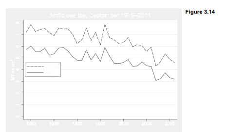
The first-named y variable in the Figure 3.14 command (area) is graphed with a line of medium width and solid pattern. The second y variable (extent) is graphed with a heavier line of medium-thick (medthick) width and dashed pattern. legend() options simplify the labels in the legend, and place extent first corresponding to its higher position in the graph.
Ice area and extent are measured in millions of square kilometers. The ytitle(“Million km{superscript:2}”) option displays this as “Million km2 ”. Type help graph text for more about controlling text attributes in graphs. Figure 3.7 gave some other examples.
Another typographical trick in Figure 3.14 is more subtle: the years 1979-2011 in the title are separated by an n-dash (-) rather than a hyphen (-). The n-dash is a standard character that does not appear on your keyboard, but is identified by the ASCII code 150. The title option for Figure 3.14 inserted ASCII character 150 between 1979 and 2011 by writing 1979’=char(150)’2011. Note the use of left and right single quotes.
Figure 3.15 employs the n-dash along with two other ASCII characters in a time plot where the two y variables have different scales and are graphed together using overlays. For this example we overlay a line plot of area vs. year with a connected-line plot (connect, which combines the features of scatter with line) of Arctic temperature vs. year. The graph shows September sea ice declining as annual Arctic air temperatures rise; the two variables influence each other, and both reflect larger changes originating outside of the Arctic.
. graph twoway line area year, ylabel(0(1)6) yline(0)
ytitle(“Ice area, million km’=char(178)'”)
|| connect tempN year, yaxis(2) ylabel(-1(1)2, axis(2)) msymbol(+)
ytitle(“Arctic temperature anomaly, ‘=char(186)’C”, axis(2))
|| , xlabel(1980(5)2010) xtitle(“”)
legend(row(2) ring(0) position(6)
label(1 “Ice area”) label(2 “Temperature”) order(1 2))
title(“Arctic September sea ice and annual temperature,
1979’=char(150)’2011″, size(medium))

In Figure 3.15, Arctic temperature anomaly is assigned to yaxis(2), which is the right-hand y axis. Temperature values are marked as plus signs (msymbol(+)). A legend inside the data region at 6 o’clock position identifies the two variables. Instead of using {superscripts} to write km2 on the left-handy axis (as was done earlier in Figure 3.14), Figure 3.15 uses ASCII character 178 — which also is a superscript 2 but looks slightly better. On the right-hand y axis, ASCII character 186 provides the degree symbol for °C.
How do we know that character 150 is an n-dash, character 186 a degree symbol, and so forth? Figure 3.16 gives a table of ASCII codes, drawn by a convenient utility named asciiplot. This is not part of Stata but written in Stata’s programming language by geographical statistician Nicholas Cox. Type findit asciiplot for instructions on how to download and install this program, which makes the table in Figure 3.16 available whenever you type asciiplot.
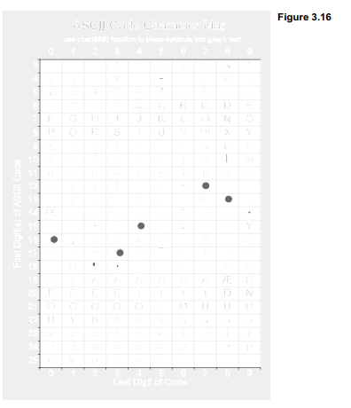
Figure 3.15 illustrated the simplest connect style, in which data points are connected by straight line segments. Other connect choices are listed below. The default straight lines correspond to connect(direct) or connect(l). For more details, see help connectstyle.

Source: Hamilton Lawrence C. (2012), Statistics with STATA: Version 12, Cengage Learning; 8th edition.
3 Oct 2022
26 Sep 2022
3 Oct 2022
3 Oct 2022
3 Oct 2022
23 Sep 2022