The June 2011 Granite State Poll included six questions related to global warming or climate change. Several questions were factual, but one (warmop) asked what you personally believe.
Which of the following three statements do you personally believe?
Climate change is happening now, caused mainly by human activities.
Climate change is happening now, but caused mainly by natural forces.
Climate change is NOT happening now.
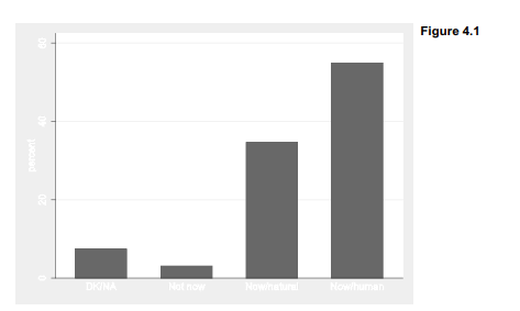
Interviewers rotated the order of response choices to avoid possible bias. About 55% agree that climate change is happening, now, caused mainly by human activities. Others think the changes have mainly natural causes (35%). Few believe that climate change is not happening now (3%).

The svy: tab command applies weights according to the specification declared earlier by svyset. ci requests confidence intervals for the weighted percentages, shown as lower and upper bounds (lb and ub). Based on this sample, we are 95% confident that between 50.11% and 59.58% of New Hampshire adults believe that human activities are changing the climate.
Stata’s native graph types are not ideal for viewing categorical-variable distributions such as those in the table above. Fortunately, a user-written program named catplot, introduced in a Stata Journal article (Cox 2004b), does this job quite well. You can obtain the ado-files for catplot easily from the Web by typing
. findit catplot
and following the links to install them on your computer. (The findit command works for hundreds of other user-written programs as well.) Once it is installed, typing help catplot will show the command’s syntax and options. Figure 4.1 contains a simple catplot bar chart of warmop. Although catplot does not accept pweights, specifying [aweights = censuswt] in this command will have the same visual effect so that bar heights correspond to the svy: tab percentages.
. catplot bar warmop [aweight = censuswt], percent
Bar charts with value labels often are easier to read in a horizontal-bar (hbar) format, particularly when we have many bars. Figure 4.2 shows a horizontal version including a title and better axis label, suitable for a report or presentation on the survey results. We also label the bars so that weighted percentages can be read directly from the graph; these are the same numbers found by svy: tab above.

How do climate change beliefs relate to other variables in the survey, such as respondent education (educ)? We could answer such questions through a two-way tabulation, . svy: tab warmop educ, col percent

In the example above we asked for column percentages, because the column variable (educ) forms the independent variable for this analysis. About 69% of those with postgraduate degrees, 55% of college graduates, and 42% with some college or technical school personally believe that climate change is happening now, due mainly to human activities. The design-weighted F test for this table confirms that the relationship between climate belief and education is statistically significant (p = .0102).
Figure 4.3 shows a catplot of warmop responses by education, giving the same weighted percentages. The percent(educ) option calls for percentages within categories of educ. We also place the title( ) as a sub-option within by( ) in order to get a single title for the whole graph. You can experiment to see what happens without these options.

Source: Hamilton Lawrence C. (2012), Statistics with STATA: Version 12, Cengage Learning; 8th edition.
26 Sep 2022
26 Sep 2022
30 Sep 2022
1 Oct 2022
29 Sep 2022
23 Sep 2022