Scatterplots belong to a broad family called twoway graphs. Stata’s basic scatterplot command has the form
. graph twoway scatter y x
where y is the vertical or y-axis variable, and x is the horizontal or x-axis one. (The initial graph twoway part of this command is optional, but kept here to emphasize a family connection that becomes important later on.) For example, again using the Nations2.dta dataset, we could plot life (life expectance) against school (mean years of schooling), with the result shown in Figure 3.8. Each point in Figure 3.8 represents one nation.

As with histograms, we can use xlabel, xtitle, ylabel and so forth to control x or y axis labels, titles etc. As with box plots, scatterplots also allow control of the shape, color, size, labeling and other attributes of markers. Figure 3.8 employs the default markers, which are solid circles. The same effect would result if we included the option msymbol(O). Other possibilities include msymbol(Th) (large hollow triangles), msymbol(d) (small diamonds), msymbol(+) (plus signs) or msymbol(i) (invisible symbols, handy for some purposes). Type help scatter for a complete list of markers and other options.
The mcolor option controls marker colors. For example, the command
. graph twoway scatter waste metro, msymbol(S) mcolor(purple)
would produce a scatterplot in which the symbols are large purple squares. Type help colorstyle for a list of available colors, which can also apply to bars, lines, text and other elements of any Stata graph.
One interesting possibility with scatterplots is to make symbol size (area) proportional to a third variable, thereby giving the data points different visual weight. For example, we might redraw the scatterplot of life against school, but make the symbol size reflect each country’s population (pop). This is done in Figure 3.9, using the [fweight=rar«fime] or frequency weight feature. Hollow circles, msymbol(Oh), provide a suitable shape.

Frequency weights are useful with some other graph types as well. Weighting can be a deceptively complex topic because weights come in several types and have different meanings in different contexts. For an overview of weighting in Stata, type help weight.
A key feature of Stata’s graph twoway family is that we can overlay two or more graphs to build more complex images. For example, to draw a scatterplot of life against school, with hollow circles as marker symbols, we would type
. graph twoway scatter life school, msymbol(Oh)
Simple regression lines (lfit) are a different twoway type. To see the line for life regressed on school, with a line of medium-thick width, type
. lfit life school, lwidth(medthick)
But often, we want to see the scatterplot and regression line together. That is accomplished by overlaying the lfit graph on top of the scatter graph using one command with || (“pipes”) to indicate the overlay. The command below is shown as two lines, but it should be typed as one physical line.
. graph twoway scatter life school, msymbol(Oh)
|| lfit life school, lwidth(medthick)
Finally, if we have certain options that should apply to the image as a whole, these can be placed in the command after a final ||. Figure 3.10 does this. The general options include not only ylabel, xlabel and xtick but also specify some details about the legend.

The legend option in Figure 3.10 specifies three things:
col(1) The legend should have just one column, and hence two rows.
ring(0) The legend is placed within the plot region, instead of outside it. A legend outside the plot region crowds the data into a smaller space.
position(11) The legend goes at the 11 o’clock position, which in this graph happens to be empty of data.
Placing a legend within the plot region but not over any actual data is a nice trick if we can manage it. By experimenting with defaults or other placements, you can see for yourself how this works. Consult legend_options under help twoway options for many more ways to control the position, contents and appearance of legends.
Figure 3.11 takes these ideas a step further in a graph with three overlays, one of them another twoway type: lfitci, meaning linear regression with confidence intervals. The lfitci graph is specified first, then two scatterplots are placed on top of that so we see their points over the gray confidence bands. If we specified lfitci last, the confidence bands would paint over some scatterplot points.
. graph twoway lfitci life school, lwidth(medthick)
|| scatter life school, msymbol(Th)
|| scatter life school if school > 8 & life < 55, msymbol(S) mlabel(country)
|| , ylabel(45(5)85) xlabel(2(2)12) xtick(1(2)13)
legend(col(1) ring(0) position(11) label(3 “Life expectancy”) order(3 2 1))
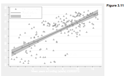
By default, lfitci shows confidence bands for the conditional mean of y, rather than for individual predicted values. Stata refers to standard errors for the conditional mean as “standard deviation of prediction” or stdp, so the default in Figure 3.11 is equivalent to typing
graph twoway lfitci life school, stdp
Standard errors for individual predicted values are termed “standard deviation of forecast” or stdf. To see the wider confidence bands for individual predictions, we could have typed instead
graph twoway lfitci life school, stdf
The other two plots in Figure 3.11 are both scatterplots, illustrating how to label (or plot with different symbols) certain selected observations. Identifying two outliers is accomplished here by drawing one ordinary scatterplot with all the data, and hollow triangles as markers:
|| scatter life school, msymbol(Th)
Then we overlay that with a second scatterplot (the third plot in this image) restricted by an if qualifier to countries for which mean schooling is greater than 8 years and life expectancy is greater than 55. Only two countries at lower right meet this criterion. They are plotted as solid squares (drawn over the triangles) and labeled with country names. Botswana and South Africa turn out to be the nations with this unusual combination of good education but poor life expectancy, which makes them stand apart from the up-to-right trend that characterizes most other nations.
|| scatter life school if school > 8 & life < 55, msymbol(S) mlabel(co«nhy)
The overall options for Figure 3.11 specify x axis labels and tick marks, and also control the legend. Again we give the legend one column, and place it at 11 o’clock within the plot region. The label for the third y variable in the legend is specified as “Life expectancy” instead of the much longer variable label that would be used by default.
legend(col(1) ring(0) position(11) label(3 “Life expectancy”)
The legend() option ends with an order(3 2 1) suboption specifying that we want the legend items to be in order 3-2-1. This is not quite as simple as it appears because to Stata’s way of thinking our three overlaid plots in Figure 3.11 actually involve four variables that could be in the legend. Given numbers by their sequence in the initial graph twoway command, these are (1) the 95% confidence interval, (2) the fitted values or linear regression predictions, (3) life expectancy for the full dataset, our first overlaid scatterplot, and (4) life expectancy for just Botswana and South Africa, our second overlaid scatterplot. By specifying order(3 2 1) we asked for the legend in Figure 3.11 which lists (3) first, (2) second and (1) last — and leaves (4) out, because it is not mentioned in the order() suboption. Thus, the order() suboption controls not only what order variables appear in the legend, but whether they appear at all.
Scatterplot matrices are not twoway plot types and cannot be overlaid with other graphs, but they involve multiple scatterplots that follow the same marker symbol conventions. Figure 3.12 shows a scatterplot matrix for five variables from Nations2.dta.
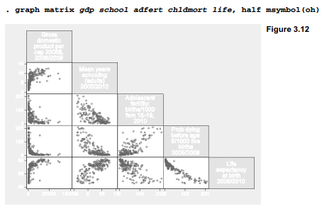
A scatterplot matrix is the visual counterpart to a correlation matrix, which can prove useful in multivariate analysis. They provide a compact display of relationships between a number of variable pairs, allowing the analyst to scan for signs of nonlinearity, outliers or clustering that might affect statistical modeling. Nonlinear relationships involving gdp (per capita Gross Domestic Product) stand out prominently in Figure 3.12, giving a warning we would not see from the correlation matrix alone.
The half option specified that Figure 3.12 should include only the lower triangular part of the matrix. The upper triangular part is symmetrical and basically redundant. msymbol(o) called for small circles as markers, just as we might with a scatterplot. Control of the axes is more complicated, because there are as many axes as variables; type help graph matrix for details.
When the variables of interest include one dependent or effect variable, and several independent or cause variables, it helps to list the dependent variable last in the graph matrix command’s variable list. That results in a neat row of dependent-versus-independent variable (y vs. x) graphs across the bottom row of the matrix. The last-named or bottom-row variable in Figure 3.12, life (life expectancy), is analyzed as a dependent variable in Chapters 7 and 8.
Source: Hamilton Lawrence C. (2012), Statistics with STATA: Version 12, Cengage Learning; 8th edition.
30 Sep 2022
29 Sep 2022
29 Sep 2022
26 Sep 2022
28 Sep 2022
23 Sep 2022