On any given day, a stock price can do one of three things: close higher, close lower, or remain unchanged from the previous day’s close. If a closing price is above its previous close, it is considered to be advancing, or an advance. Similarly, a stock that closes below the previous day’s close is a declining stock, or a decline. A stock that closes at the exact price it closed the day before is called unchanged.
Prior to July 2000, all less than one dollar (or point) changes in common stock prices were in fractions based on the pre-Revolutionary practice of cutting Spanish Doubloons into eighths to make change. By February 2001, the old system of quarters, eighths, and sixteenths was replaced with the decimal system. The use of decimals may have affected some historic relationships. The resulting smaller bid-ask spreads may have reduced the number of stocks that are unchanged at the day’s end.
Advance/decline data is called the breadth of the stock market. The indicators we focus on in this section measure the internal strength of the market by considering whether stocks are gaining or losing in price. In this section, we consider the cumulative breadth line, the advance-decline ratio, the breadth differences, and the breadth thrust.
Before we begin looking more closely at these particular indicators, we must, however, mention a change that has recently occurred. Since 2000, the parameters of many breadth indicators thought to provide accurate signals have changed significantly. Applying standards that had excellent records for identifying stock market reversals now proves to be less than satisfactory. There is likely more than one reason for this sudden change, and some reasons are unknown.
One factor that has caused the old parameters to change is the proliferation on the New York Stock Exchange of ETFs, bond funds, real estate investment trusts (REITs), preferred shares, and American depository receipts (ADRs) of foreign stocks. These do not represent domestic operating companies and, therefore, are not directly subject to the level of corporate economic activity. They are subject to a variety of influences not necessarily connected with the stock market, which means they are not reflecting the market’s traditional discounting mechanism.
Another possible factor is the implementation of the aforementioned decimalization. Many of the indicators using advances and declines are calculated as they were before decimalization even though their optimal parameters may have changed. Another possibility, one more likely, is that the aberrant indicators were tested mostly during the long bull market from 1982 through 2000 or later during the recent bull market from 2009 through today (2015). The important lesson for the technical analyst, however, is that indicators do not remain the same. Parameters for known indicators change over time and with structural changes in the markets. The analyst must frequently test indicators and make appropriate adjustments in the types and parameters used.
1. The Breadth Line or Advance-Decline Line
The breadth line, also known as the advance-decline line, is one of the most common and best ways of measuring breadth and internal market strength. This line is the cumulative sum of advances minus declines. The standard formula for the breadth line is as follows:
![]()
On days when the number of advancing stocks exceeds the number of declining stocks, the breadth line will rise. On days when more stocks are declining than advancing, the line will fall.
A breadth line can be constructed for any index, industry group, exchange, or basket of stocks. In addition to being calculated using daily data, it can be calculated weekly or for any other period for which breadth data is available. It is not often applicable to the commodity markets where baskets or indices of commodities rarely are traded, although this is changing with the advent of the Commodities Research Bureau (CRB), Goldman Sachs, and Dow Jones futures index markets.
Ordinarily, the plot of the breadth line should roughly replicate the stock market averages. In other words, when the stock market averages are rising, the breadth line should rise. This indicates that a market rally is associated with the majority of the stocks rising.
The importance to technical analysts of the breadth line is the time when it fails to replicate the averages and, thus, diverges. For example, if the stock market average is rising but the advance-decline line is falling, only a few stocks are fueling the rally, but the majority of stocks are either not participating or declining in value.
Analysts point to several reasons why breadth divergence might not be as powerful of an indicator in the future as it has been in the past. The first reason is the previously discussed proliferation of nonoperating company listings. To deal with the issue of the bias from including stocks that do not represent ownership in operating companies, technical analysts often use only those breadth figures from common stocks that represent companies that actually produce a product or a service. For example, the New York Stock Exchange also reports breadth statistics for only common stocks, disregarding the numerous mutual funds, preferred stocks, and so on. This additional breadth information is available daily in most financial newspapers. The breadth line derived from this list of common stocks generally has been more reliable than the one including all stocks.
However, a major change recently occurred in the way the NYSE reports breadth statistics for common stocks. Beginning in February 2005, the NYSE decided to include only those stocks with three or fewer letters in their stock symbols and those that are included in the NYSE Composite Index, its common stock list. Because of this change, figures since that decision will be incompatible with the prior figures.
Instead of relying on the publicly available statistics, proprietary breadth statistics also are available on a subscription basis. For example, Lowry’s Reports, Inc. (www.lowrysreports.com) calculates proprietary breadth statistics that eliminate all the preferred stocks, ADRs, closed-end mutual funds, REITs, and others representing nonproductive companies.
Another difficulty with the breadth has arisen since the year 2000 according to Colby (2003) and others using data up through 2000. Trading rules used with the publicly available breadth statistics before then, despite the known problems with the types of stocks listed, showed relatively attractive results. However, using those same rules since the year 2000, we find much less attractive results in many of these indicators. Indeed, the difference is so large and consistent throughout the trading methods mentioned by Colby that it could not be attributed to the trading rules themselves or to problems connected with optimizing. The difference between then and more recently must have to do with a change in background, character, leadership, or historic relationships.
Why this change? The most obvious economic change is that of the decoupling of the stock market from long-term interest rates. From the Great Depression of the 1930s to the last decade of the previous century, the business cycle was characterized by the bond market and the stock market reaching bottoms at roughly the same time, and the bond market reaching peaks earlier than the stock market reached peaks. In the late 1990s, this business-cycle relationship broke down, switching to almost the exact opposite relationship, whereby the bond market tended to trend oppositely from the stock market. Because the breadth statistics include a large number of interest-related stocks that are not included in the popular averages, this change in relationship may be the cause for the difference in trading rules using breadth, giving the breadth line more strength at tops and more weakness at bottoms.
In the Nasdaq, a cumulative breadth line constructed of only Nasdaq stocks advances, declines, and unchanged has been declining at least since 1983 (earlier figures are difficult to obtain), and even when looked at over shorter periods it seems to have a very strong negative bias. This negative bias is likely due to the “survivor effect,” whereby from 1996 to 2015, stocks listed on the Nasdaq declined from 6,136 to 3,005. The loss of issues from the list suggests that a large number of listings went broke during that time and were trending downward even when the larger survivors were advancing and were unavailable during the rebound in stock prices from 2009 through 2015. The Nasdaq index is a capitalization-weighted index where the survivors have considerable influence on price but little influence on breadth. This weighting bias implies that a Nasdaq breadth line is useless as a divergence indicator in its absolute form and must be analyzed instead for changes in acceleration rather than direction.
Several indicators using the advance-decline line concept appear in the classic technical analysis literature. Although these indicators have not performed well in recent market conditions, it is important for the student of technical analysis to be aware of these traditional indicators because they may become productive sometime in the future.
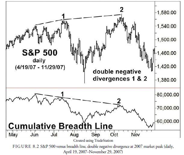
2. Double Negative Divergence
When the averages are reaching new price highs and the breadth line is not, a negative divergence is occurring (see Figure 8.1). This signals weak market internals and that the market uptrend is in a late phase and may soon end. In 1926, Colonel Leonard P. Ayres (1940) of the Cleveland Trust Company was one of the first to calculate a breadth line and the first to notice the importance of a negative breadth divergence from the averages. His theory was that highly capitalized stocks influence the averages, while the breadth line includes all stocks regardless of capitalization. Sometimes at the end of a bull market, the large stocks continue to rise, and the smaller stocks begin to falter.

Other market analysts, such as James F. Hughes (Merrill, Stocks and Commodities Magazine V6: 9, p. 354—355), argued that the rise in interest rates accompanying an economic expansion reflected in the stock market causes the interest-related stocks—such as utilities, which have large capital borrowing costs and of which there are many—to falter and, thus, causes the breadth line to lose momentum. Regardless of the cause, since May 1928, when a negative breadth divergence warned of the 1929 crash more than a year later, the observance of a negative divergence has invariably signaled an impending stock market top.
Although a negative divergence signals a market top, a primary stock market top can occur without a divergence. In other words, a breadth divergence is not necessary for a market peak. The peaks in 1937 and 1980, for example, occurred without a breadth divergence. After a sizable, lengthy advance, participants should be on guard and use a breadth divergence to help spot a potential market reversal. However, an analyst should not be adamant about requiring a breadth divergence to occur prior to a market peak.
At market bottoms, especially those that are characterized by climactic price action, a positive divergence in the cumulative breadth line rarely has been reliable in signaling a major reversal upward. However, there have been positive breadth divergences on either tests of major lows or so-called secondary lows that were useful signals of increasing market strength.
A characteristic of the breadth line that the analyst needs to recognize is that there is a downward bias to the line. Therefore, a new cumulative breadth line—one that has no relationship to the previous breadth line— begins once the market reaches a major low. For example, calculating a historical cumulative breadth line for the NYSE data resulted in an all-time peak in 1959. Although the cumulative breadth line never reached the same 1959 level for 40 years, there was a considerable rise in the market averages through 2000. This does not indicate a very large negative divergence over a 40-year time span, although some might argue that the 20072009 decline of more than 50% was a generational correction worthy of such a divergence. For our purposes, however, the cumulative breadth line, for divergence analysis, starts again once a major decline has occurred. When the market declines into a major low, one of the four-year plus varieties (see Chapter 9, “Temporal Patterns and Cycles”), analysis of the cumulative breadth line begins anew, and the line has no relationship to the peak of the previous major market cycle. It is as if a major decline wipes out the history of past declines, and the market then begins a new breadth cycle and new history.
A negative divergence, although not being required, has been the most successful method over the past 50 or more years for warning of a major market top. As with most indicators, different technicians use the breadth indicators in slightly different ways. For example, James F. Hughes, who published a market letter in the 1930s, learned of the breadth divergence concept from Col. Ayres (Harlow, 1968; Hughes, 1951). He used the negative breadth divergences as a major input to his stock market forecasting. Hughes required that at least two consecutive negative breadth divergences, called double divergences (see Figure 8.1), must occur before a major top was signaled. This requirement prevented mistakes in forecasting from the appearance of a single minor divergence that could later be nullified by a new high in both the averages and the breadth line. Often, more than two divergences occur at major market tops.
When the double breadth divergence warning occurs, it traditionally signals an actual market price peak within a year. Beginning with 1987, for example, a double breadth divergence correctly anticipated the 1987 crash when the breadth line peaked in April 1987, and five months later, in September, the market peaked and then collapsed. The breadth line peaked in the fall of 1989 followed by a peak in the average in July 1990. The most recent breadth peak signaled by a double breadth divergence was the 2007 peak in breadth and the 2008 peak in the averages, as shown in Figure 8.2, that foretold the coming stock market collapse in 20082009. The lag between the divergence and the final low is not constant, but the theory of a double divergence warning of a major market decline is still valid.
3. Traditional Advance-Decline Methods That No Longer Are Profitable
Over the past ten years the market has changed, rendering the old methods of using moving averages and reversals as signals no longer reliable. Consider the following evidence that traditional advance-decline methods are no longer profitable:
- Advance-decline line moving average—Colby mentions this as a profitable method prior to 2000. It is calculated by calculating a 30-day moving average of both the Standard & Poor’s 500 and the breadth line. When both the index and the line are above their moving averages, the market is bought, and vice versa, when they are both below their moving averages. In testing this thesis, we found that the 30-day moving average period peaked in profitability in 1998 and by 2000 was bankrupt. Its performance has continued to be negative since then. The optimal moving average value was 2 days, which produced 4,645 roundtrip trades in the 50 years and was less profitable than the buy-and-hold.
- One-day change in advance-decline line—The simplest signal occurs when the advance- decline line changes direction in one day. However, in looking back 50 years, we found this method peaked in February 2002 and did not begin profiting until 2009. Using an optimization program, we found that reversals after 75 days proved the most profitable but only beginning in 2003 and still producing an annual return less than the buy-and-hold.
This is useful information in that it warns students of the markets that the methods of analysis are fluid, are constantly changing, and should be thoroughly tested before being implemented in an investment plan.
John Stack, in an interview with Technical Analysis of Stocks & Commodities (Hartle, 1994) mentions using an index that compares the breadth line and a major market index. His purpose is to reduce the necessity of looking at an overlay of an indicator on the price chart to discern when a divergence has occurred. Instead, he calculates an index that tells whether breadth is improving or diverging from the market index and, thus, whether a warning of impending trouble is developing. Arthur Merrill (1990) also devised a numerical method to determine the relative slope of the breadth line versus a market index. By following the slope over time, we can calculate periods in which the breadth line is gaining or losing momentum. The advantageous aspect of this type of indicator is that it also measures the relative momentum when prices are declining.
Box 8.2 What is an Oscillator?
At times, you will see us referring to a particular indicator as an oscillator. Oscillators are indicators that are designed to determine whether a market is “overbought” or “oversold.” Usually, an oscillator will be plotted at the bottom of a graph, below the price action, as shown in Figure 8.3. As the name implies, an oscillator is an indicator that goes back and forth within a range. Overbought and oversold conditions (the market extremes) are indicated by the extreme values of the oscillator. In other words, as the market moves from overbought, to fairly valued, to oversold, the value of the oscillator moves from one extreme to the other. Different oscillator indicators have different ranges in which they vary. Often, the oscillator will be scaled to range from 100 to -100 or 1 to -1 (called bounded), but it can also be open ended (unbounded).

4. Advance-Decline Line to Its 32-Week Simple Moving A verage
Analysts have developed several variations of using the advance-decline line. One method is to compare it with its own moving average to give buy and sell signals for the market and, thus, create an oscillator. Ned Davis Research, Inc. used a ratio of the NYSE advance-decline line to its 32-week simple moving average. It found that from 1965 to 2010 when the ratio rises above 1.04, the per annum increase in stock prices as measured by the NYSE Composite Index was 19.3%, and when it declined below 0.97, the stock market declined 11.2% per annum. This oscillator is pictured in Figure 8.3.
5. Breadth Differences
Indicators using breadth differences are calculated as the net of advances minus declines, either with the resulting sign or with an absolute number. The primary problem with using breadth differences is that the number of issues traded has expanded over time. For example, in the 40-year time period from 1960 to 2000, the number of issues on the New York Stock Exchange doubled from 1,528 issues to 3,083 issues. By 2015, the number had increased to 3,287 issues. More issues means larger potential differences between the number of advances and declines. Any indicator using differences must, therefore, have its parameters periodically adjusted for the increase in issues traded. Examples of useful indicators using breadth differences are listed next.
Box 8.3 What is an Equity Line?
An equity line is a graph of a potential account value beginning at any time adjusted for each successive trade profit or loss. It is used to measure the success of a trading system.
Ideally, each trade is profitable and adds to the value of the account each time a trade is closed.
Any deviation from the ideal line is a sign of drawdown, volatility, or account loss, all of which are unavoidable problems with any trading or investment system. For profitable systems, the equity line should rise from left to right with a minimum number of corrections.
For more information about equity lines, see Chapter 22, “System Design and Testing.”
6. McClellan Oscillator
In 1969, Sherman and Marian McClellan developed the McClellan Oscillator. This oscillator is the difference between two exponential moving averages of advances minus declines. The two averages are an exponential equivalent to a 19-day and 39-day moving average. Extremes in the oscillator occur at the +100 or + 150 and -100 or -150 levels, indicating respectively an overbought and oversold stock market.
The rationale for this oscillator is that in intermediate-term overbought and oversold periods, shorter moving averages tend to rise faster than longer-term moving averages. However, if the investor waits for the moving average to reverse direction, a large portion of the price move has already taken place. A ratio of two moving averages is much more sensitive than a single average and will often reverse direction coincident to, or before, the reverse in prices, especially when the ratio has reached an extreme.
Mechanical signals occur either in exiting one of these extreme levels or in crossing the zero line. A test of the zero crossing by the authors for the period May 1995 to May 2015, to see if the apparent changes in the breadth statistics had any effect on the oscillator, proved to be unprofitable. A test of crossing the +100 and – 100 levels proved to be unprofitable as well largely because these extremes were not always met. Divergences at market tops and bottoms were informative. The first overbought level in the McClellan Oscillator often indicates the initial stage of an intermediate-term stock market rise rather than a top. Subsequently, a rise that is accompanied by less breadth momentum and, thus, a lower peak in the oscillator is suspect. At market bottoms, the opposite appears to be true and reliable. Finally, trend lines can be drawn between successive lows and highs that, when penetrated, often give excellent signals similar to trend line penetrations in prices.
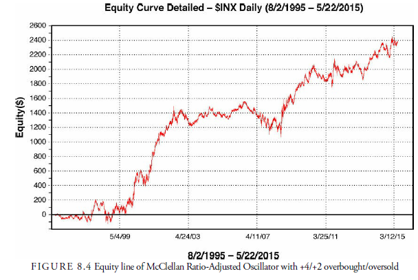
7. McClellan Ratio-Adjusted Oscillator
Because he recognized that the use of advances minus declines alone can be influenced by the number of issues traded, McClellan devised a ratio to adjust and to replace the old difference calculation. This ratio is the net of advances minus declines divided by the total of advances plus declines. As the number of issues changes, the divisor will adjust the ratio accordingly. This ratio is usually multiplied by 1,000 to make it easier to read. The adjusted ratio is then calculated using the same exponential moving averages as in the earlier version of the oscillator.
In a study of the usefulness of this oscillator, we optimized the possible overbought and oversold levels and found that +4/+2 was the best level. This produced over the period August 1995-May 2015 a 404.4% return for the period over a buy-and-hold profit of 262.9%. The annual rate of return was 8.17%. Figure 8.4 shows the equity line for this study.
8. McClellan Summation Index
The McClellan summation index is a measure of the area under the curve of the McClellan Oscillator. It is calculated by accumulating the daily McClellan Oscillator figures into a cumulative index. The McClellans found that the index has an average range of 2,000 and added 1,000 points to the index such that it now oscillates generally between 0 and 2,000; neutral is at 1,000. Originally, the summation index was calculated with the differences between advances and declines, but to eliminate the effect of increased number of issues, the adjusted ratio is now used. This is called the ratio-adjusted summation index (RASI). It has zero as its neutral level and generally oscillates between +500 and -500, which the McClellans consider to be overbought and oversold, respectively. Although no mechanical signals are suggested, the McClellans have mentioned that overbought readings are usually followed by a short correction that is followed by new highs. A failure to reach above the overbought level is a negative divergence and, thus, a sign that a market top is forming. Colby reports that only on the long side do intermediate-term signals profit (with an average holding of 172 days) given when the summation index changes direction.
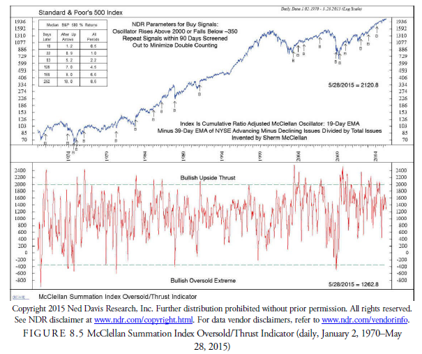
Ned Davis Research, Inc., uses an overbought/oversold thrust-type signal to identify buy levels in the McClellan Summation Index (see Figure 8.5). A thrust buy signal occurs when an oscillator noticeably exceeds its boundaries and rises or falls by a larger amount than usual. The parameters are above 2,000 or below -350. Either signal is valid. The logic is that at a major market price bottom, the steep decline to the bottom is usually a panic and causes an extreme oversold condition. However, coming off the bottom, the market usually rebounds strongly, having formed a “V” pattern, and the upside motion, a thrust, is the greatest time to buy. The best case is when an oversold signal is followed within a short time by an overbought signal. This occurred at the major lows in 1970, 1974, and 2009.
9. Plurality Index
This index is calculated by taking the 25-day sum of the absolute difference between advances and declines. Because the calculation accounts only for the net amount of change independent of the directional sign, it is always a positive number. The stock market has a tendency to decline rapidly and rise slowly. Therefore, high numbers in the plurality index are usually a sign of an impending market bottom, and lower numbers suggest an impending top. Most signals have been reliable only on the long side because lower readings can occur early in an advance and give premature signals. Traditionally, the signal levels for this indicator were 12,000 and 6,000, but the increase in the number of issues has made these signal numbers obsolete (Colby, 2003). Colby uses a long-term (324-day) Bollinger Band (see Chapter 14, “Moving Averages”) breakout of the upper two standard deviations for buys and below two standard deviations for a sell to close. This method produced admirable results and has continued to do so since 2000. There are few signals, and a 15- or 30-day time stop should be used for longs only.
One additional suggestion for eliminating the effect of the increase in the number of issues listed over time is to use the McClellan ratio method of dividing the numerator by the sum of the advances and declines. Thus, the 25-day plurality index raw number becomes the absolute value of the advances minus declines divided by the sum of the advances and declines. This can then be summed over 25 days. The authors attempted to optimize the ratio Plurality Index over a period of 20 years. Although results of 7% to 8% annual returns were possible, the drawdowns in the hypothetical portfolio were greater than 50%, making the indicator useless for most analysts.
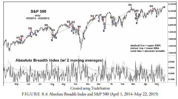
10. Absolute Breadth Index
Whereas the Hughes breadth oscillator uses a ratio of the raw difference between advances and declines divided by the total issues traded, the absolute breadth index uses the absolute difference of the advances minus declines divided by the total issues traded. Thus, the index is always a positive number. By experiment, Colby (2003) found that from 1932 to 2000, a profitable signal was generated when this index crossed the previous day’s 2-day exponential moving average plus 81%. His report for longs only, which were held for an average of 13 days, only beat the buy-and-hold by 35.1% over the entire 68-year period, without commissions or slippage. Ned Davis Research, Inc., found a 9.1% annual gain versus a buy-and-hold gain of 8.3% per annum in long trades only between February 1977 and May 2015 using a thrust-style 10-day moving average in a thrust-style oscillator signal. Because the crossing of moving averages is often different with buys and short sales, instead of using only one moving average, the authors experimented with and optimized a system similar to the Colby’s method using two moving averages: one for buys and one for short-sales. The outcome (see Figure 8.6) was moderately favorable with a 505.8% return over the buy-and-hold return of 279.8% for 20 years and a 9.10% annual return with only a 4% drawdown. The parameters were 4 days for the short-sale moving average and 48 days for the buys with an add-on to both of 63%.
11. Unchanged Issues Index
The unchanged issues index uses a ratio of the number of unchanged stocks to the total traded. The theory behind it is that during periods of high directional activity, the number of unchanged declines. Unfortunately, with the decimalization of the stock quotes, the number of unchanged has declined, and the ratio now appears to have almost no predictive power. Testing this indicator, we have found negative results in almost all instances since April 2000.
Instead of using the difference between daily or weekly advances and declines, which can be overly influenced by the increase or decrease in the number of issues listed, breadth ratios use a ratio between various configurations of advances, declines, and unchanged to develop trading indicators and systems for the markets. Using ratios has the advantage of reducing any long-term bias in the breadth statistics. These ratios usually project short-term market directional changes and are of little value for the long-term investor. They have also changed character and reliability since the year 2000.
12. Advance-Decline Ratio
This ratio is determined by dividing the number of advances by the number of declines. The ratio or its components are then smoothed over some specific time to dampen the oscillations. Using daily breadth statistics between 1947 and 2000, Ned Davis Research, Inc., found 30 buy signals were generated when the ratio of ten-day advances to ten-day declines exceeded 1.91. These signals averaged a 17.9% return over the following year. In only one of the 30 instances did the signal fail, and the loss then was only 5.6%. The authors decided to again use two signal lines and optimized the Advance-Decline ratio (see Figure 8.7). We constructed an average of all the advances and an average of all the declines and then divided the advance average by the decline average. Two signal lines were established for buys and short sales. The optimized result over a period of 20 years was a 429.0% return versus a 279.7% return for buy-and-hold. The annual rate of return was 8.51%, but the maximum drawdown was more than 37%, making the system one that most traders would not suffer through.

Colby (2003) reports that taking a one-day advance-decline ratio and buying the Dow Jones Industrial Average (DJIA) when the ratio crossed above 1.018 and selling it when the ratio declined below 1.018, in the period from March 1932 to August 2000, would have turned $100 into $884,717,056, assuming no commissions, slippage, or dividends. Turnover, of course, would have been excessive—an average of one trade every 3.47 days—but the results were excellent for both longs and shorts. We tested this system for the period from April 1995 to May 2015 and found that until February 2002, the results were still credible. However, since 2002, the equity line has collapsed. This negates, for now, the one-day method of trading the advance- decline ratio.
13. Breadth Thrust
A thrust is when a deviation from the norm is sufficiently large to be noticeable and when that deviation signals either the end of an old trend or the beginning of a new trend.
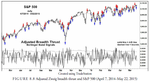
Martin Zweig devised the most common breadth thrust indicator, calculating a ten-day simple moving average of advances divided by the sum of advances and declines. Traditionally, the long-only signal levels in this oscillator were to buy when the index rose above 0.659 and sell when it declined below 0.366. With these limits, however, this method has not had profitable signals since 1994. In optimizing the calculation, we found that rather than using the horizontal line for a buy signal, a standard deviation band about a moving average of the advance/decline ratio, as defined earlier, gave relatively good performance but with a substantial drawdown. This testing and optimizing method is better than the horizontal line because the moving average drifts with the longer trend and thus adjusts for other factors affecting the ratio’s trend. As of this writing the average is 39 days, and the two standard deviation multipliers are 1.15 and 0.32 (see Figure 8.8). The return from the best model was 521.7% versus the buy-and-hold return of 272.8% for 20 years. The annual rate of return was 9.25%, even with the 18.3% drawdown. Again, these changes are excellent examples of why the analyst must frequently review the reliability of any indicator being used. When the best of the best is subpar, it usually is a method that can be avoided.
14. Summary of Breadth In dicators
It appears that since 1995, a period of longer-term volatility in stock prices, the breadth indictors for shortterm signals that had previously had admirable records mostly failed. These failures are why technical analysts must constantly test and review their indicators. Many changes occur in the marketplace, both structurally—as, for example, the change to decimalization and the inclusion of many nonproducing stocks in the breadth statistics—and marketwise—as, for example, the disconnection between stock prices and interest rates. No indicator remains profitable forever, both because of these internal changes and because of the overuse by technical analysts who recognize their value. Apparently, the best remaining breadth usage is the old Ayres- Hughes double negative divergence analysis and the breadth thrust. They have had minimal failures for more than 60 years. Before an indicator is used in practice, however, it must be tested objectively. No indicator should be used just because it has demonstrated positive results in the immediate past.
Source: Kirkpatrick II Charles D., Dahlquist Julie R. (2015), Technical Analysis: The Complete Resource for Financial Market Technicians, FT Press; 3rd edition.
I think this internet site has some rattling superb info for everyone : D.