Mixture modeling is a type of modeling where data is divided into subgroups and classified. Using a Bayesian analysis, all data that is unclassified will then be assigned to a group based on the existing criteria of the data that has already been assigned. For instance, let’s say we are trying to classify the type of academic student for a master’s program admission. We want to know what criteria we can use to predict if an applicant will be a good student.To do this, we have to create some “training data”. We have 100 students that have already gone through the program, and at graduation they were classified as either “Excellent”, “Average”, or “Below Average”. Next, we need to see what categories or criteria we can observe before a potential student starts the program that can help us understand the likelihood a student will be clas- sified as Excellent, Average, or Below Average. The master’s program director thinks there are three criteria that can help project how successful an applicant would be in the master’s program. These three criteria are GPA from their undergraduate degree, what they scored on the GMAT test, and what letter grade they received on the principles of finance course in their undergraduate degree. Again, we are examining criteria that could help classify a student before given admittance.The goal is to avoid admitting “Below Average” students. In our train- ing data, we will need to input the GPA, GMAT, and finance scores for each student that has been classified.

Figure 10.15 Mixture Model Data With Classifications in SPSS
Let’s say we get 50 new applicants for the program.We will need the GPA, GMAT, and finance score for each of these applicants as well.The first thing we need to do is to create a unique id for each applicant and enter the decision criteria (GPA, GMAT, finance score) in a separate row for each applicant. Next, we will create a column at the end of the data labeled “Studenttype”. After entering the 50 new applicants, we will bring in the 100 students used as “training” information. This group will look exactly the same as the applicants in format, except they will have a classifi- cation as Excellent, Average, or Below Average in the “Studenttype” field.The 50 new applicants will have no classification at this point. Ultimately, we want AMOS to run a Bayesian analysis and code the 50 new students as either an Excellent, Average, or Below Average Student.
After getting your training data and new data in SPSS, you are ready to go to AMOS. In AMOS, you are going to create three groups.You will have a group for each category or clas- sification of student (Excellent, Average, and Below Average).You will then need to read in the data for each group. The different classifications will often be in one file, so you will need to select the grouping variable and find the column name the classifications are in (Studenttype is this example). After that, you can select the “Group Value” and choose the classification for each group. See Figure 10.16. On this data file window, make sure to click “Allow non-numeric data” and “Assign cases to groups”; otherwise, AMOS cannot read the classification of each data row. As well, you want AMOS to assign unlabeled data to a group with mixture modeling. If you do not select these, you will get an error message.

Figure 10.16 Reading in Data Files for Each Classification in Mixture Model
Next, you need to drag in all the predictor variables into the AMOS graphics window and draw a covariance between all the variables.With mixture modeling you need to constrain (1) the variances of constructs; and (2) the covariances between constructs to be equal across all the groups. In a construct you just dragged into AMOS, right click and go to Object Proper- ties. In the parameters tab at the top, go to the variance field and label it “v1”. Make sure the “All groups” button is checked as well in the Object Properties window. This will label the variance the exact same across the groups as “v1”. You will then go and uniquely label each variance for every variable, repeating the same process as the variable labeled “v1”. Next, you will go to the covariances (right click and go to Object Properties) and uniquely name each covariance, again making sure the “All groups” option is checked. This will constrain all your groups (classifications) to be equal in regard to variance and covariance.

Figure 10.17 Labeling Variances in Object Properties Window
Here is what your model should look like after all the constraints have been applied.
Figure 10.18 Labeled Mixture Model in AMOS
Now select the Bayesian Analysis button ![]() , and you will see a pop-up window appear. Using the training data, the analysis will start sampling your training data multiple times over to determine the probability of your unclassified data fitting into a classification group. Initially, the Bayesian window will have a red frowny face at the top, which means the Bayesian estimation is not ready.When that red face turns to a yellow smiling face, your estimation is ready to be interpreted.
, and you will see a pop-up window appear. Using the training data, the analysis will start sampling your training data multiple times over to determine the probability of your unclassified data fitting into a classification group. Initially, the Bayesian window will have a red frowny face at the top, which means the Bayesian estimation is not ready.When that red face turns to a yellow smiling face, your estimation is ready to be interpreted.
The Bayesian window will provide a lot descriptives about your classifications.There is a tab at the top of the window that will allow you to see the information for each group.You can see the “Average” student has a mean GMAT score of 552, a GPA of 3.21, and an average finance score of 2.99 on a 1-to-4 scale. As well, the analysis will give you the maximum and minimum score to classify as an “Average” student. In the Below Average group, the initial results show that students that have a GPA less than a 2.50 and a score under 500 on the GMAT have a high probability of being classified as a below average student.

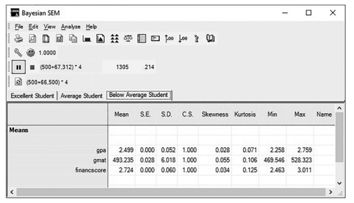
Figure 10.19 Bayesian Estimation for Average and Below Average Students
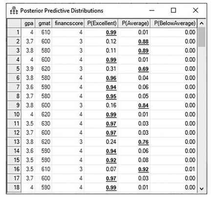
Figure 10.20 Posterior Predictions for Each Classification
To see how the Bayesian analysis classified the new applicants, you need to look at the pos-terior predictions ![]() .When you click on this button, you will initially see the rows blinking with changing numbers, but after a few seconds the numbers will stabilize. In this window, you will see the probability for each student to be classified as excellent, average, or below average. In our data set, the first 50 rows were our new applicants. In the posterior prediction, those rows now have a prediction for each student.
.When you click on this button, you will initially see the rows blinking with changing numbers, but after a few seconds the numbers will stabilize. In this window, you will see the probability for each student to be classified as excellent, average, or below average. In our data set, the first 50 rows were our new applicants. In the posterior prediction, those rows now have a prediction for each student.
For instance, the student in row 5 had an 69% probability of being an average student and a 31% probability of being an excellent student. This student also had a relative zero probability of being a below average student. While these probabilities are nice, I find that looking at how the posterior prediction is graphed will give you more context to that probability prediction. If we double click into student 5’s “excellent” prediction of 31%, AMOS will show us more information about this prediction in a graphical form. See Figure 10.21. The graphic shows that the mean prediction is 31%, but if you examine the left-hand side of the graph, there is a large frequency of predictions that note this student has an even smaller probability of being an excellent student. The probability predictions are skewed to the left, or specifically, that there is a smaller likelihood of this student being classified as excellent at the end of the program. The graph gives us more context to the prediction and also lets us know what probability had the highest frequency. You can view a graph of any probability in posterior prediction by simply double clicking on the value. Ultimately, the probability derived from the Bayesian analysis is only as good as the training data. If your training data is biased or flawed, the posterior prediction will most certainly be flawed, too.
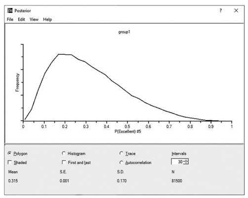
Figure 10.21 Graphical Representation of Posterior Prediction for Student Number 5
With mixture models, you can also let AMOS classify all the data (with no training data). In this example, you would set up three groups in AMOS.When you read in the data for each group, you will choose a specified classification column even though it is blank. In this exam- ple, let’s choose the column “Studenttype” as in the previous example, except now there are no classifications in the column. AMOS will just list the values for this column as “cluster” and a number.
With no training data, AMOS will try to classify each student into a category/cluster based on the Bayesian analysis. In essence, AMOS is clustering the data into three groups.

Figure 10.22 Reading in the Data File for Mixture Model With No Classifications in the Data
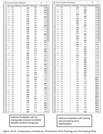
After you read in the data for each group, the analysis is exactly the same steps as the example when we used the training data. When you get to the posterior prediction, you will see three clusters and the probability of each candidate falling into a cluster. In Fig- ure 10.23, I have included a posterior prediction that had training data and one that had no training data and how AMOS clustered the data into three groups.You can see that AMOS correctly predicted some students, but others are classified differently when there is no training data. For example, the student in row 13 is considered a 24% probability of being an Excellent student with the training data included and the same student is classified as a 4% probability of being in the Excellent group when no training data is included and AMOS assigns the groups. Ultimately, having training data will lead to better predictions in the end.
With the Bayesian analysis, AMOS is using a stream of random numbers that depend on the “seed number”. AMOS will change the seed number every time you run the analysis. Sub- sequently, when you run your analysis and then run it again, you might get slightly different answers because of those different seed numbers. To combat this so that you can get the same results even if you run the analysis again, you need to use the same seed number.To do this, you need to go to the “Tools” option on the menu bar at the top of AMOS, and then select “Seed Manager”. A pop-up window will appear and show you the current seed and the seed number for the last four analyses run. The default in AMOS is for the “Increment the current seed by 1” option. If you change this option to “Always use the same seed”, this will use the same seed so you can get the exact same results when you run the analysis again. Similarly, if another researcher wants to know what seed you used, you can go into this window and see the exact seed number used. If you want to specify the seed number, you can go to the “Current seed” option and hit the “Change” button and input a specific seed number. The seed number has no significance on what number you choose. It is just a starting point for AMOS to use in the Bayesian analysis.

Figure 10.24 Seed Manager Window Along With List of Seeds Used
Source: Thakkar, J.J. (2020). “Procedural Steps in Structural Equation Modelling”. In: Structural Equation Modelling. Studies in Systems, Decision and Control, vol 285. Springer, Singapore.
27 Mar 2023
29 Mar 2023
20 Sep 2022
27 Mar 2023
30 Mar 2023
20 Sep 2022