Like bar chart patterns, patterns in one-box point and figure charts are not precise and require an experienced analyst to interpret. This is likely another reason why they have lost their popularity to the three- box version. Being imprecise also means that performance figures for patterns are almost impossible to determine. No one has done the research into interpreting one-box point and figure patterns as Bulkowski has in bar charts, so we are left with much conjecture and a difficult methodology.
One-box chart analysis focuses on consolidation areas, as do most chart methods, and attempts to determine the next directional move and by how much that move will likely carry. The one advantage of the one-box method is called the count, a means of anticipating the expected price move by measuring the width of an observed price base. We cover the count later in this chapter. In point and figure analysis, as in bar chart analysis, observation and analysis of patterns is largely subjective and based on the experience of the analyst. Like fundamental analysis, the experience of the analyst is the key to success.
1. Consolidation Area on the One-Box Chart (Also “Congestion Area”)
As we know from bar chart analysis, a consolidation area is a sideways movement in prices that interrupts or reverses a trend. It is during this period of nontrending action that patterns develop to signal the new direction once a breakout occurs and potentially the extent or target price for the new directional price moves. In point and figure, a consolidation area serves the same purpose. Various patterns have been recognized over the past that inform the analyst what is likely to occur in the future.
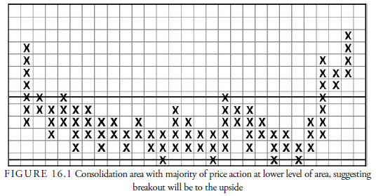
One observation, for example, is that when price changes occur more frequently at the lower level of a consolidation area, the odds favor a breakout to the upside. The converse is true when price changes occur frequently at the upper level of consolidation. Because one-box charts plot so much information, the consolidation areas are often very wide, being made up of many smaller price oscillations, just as in a bar chart. The important point in analyzing point and figure charts is to consider the consolidation area as a whole and ignore the smaller separate parts. The analyst must determine where the price change work has been done, either in the lower or upper level of the area, and place more emphasis on recent work than on past price changes. Figure 16.1 is an example of a one-box reversal chart with price action predominately in the lower level of the consolidation and a subsequent breakout upward.
2. Trend Lines in One-Box Charts
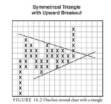
Trend lines are drawn on a one-box reversal chart just as they are on a bar chart, connecting highs to highs and lows to lows. These lines frequently outline standard patterns that we have seen in bar chart analysis, such as triangles, rectangles, broadening formations, wedges, and even flags and pennants. The same type of analysis used with bar charts can be applied to one-box reversal charts. Figure 16.2, for example, shows a one-box reversal chart with a triangle formed by two trend lines.
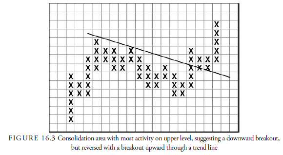
In consolidation areas, the one exception to the rule about where the majority of price changes occur, suggesting the direction of the breakout, is when a trend line is penetrated in the opposite direction from that which is developing as the most likely. Figure 16.3 shows an example of a consolidation area with the most recent and majority of action occurring at the upper end of the area, suggesting a breakout downward. However, this suggestion was negated when prices broke above the trend line.
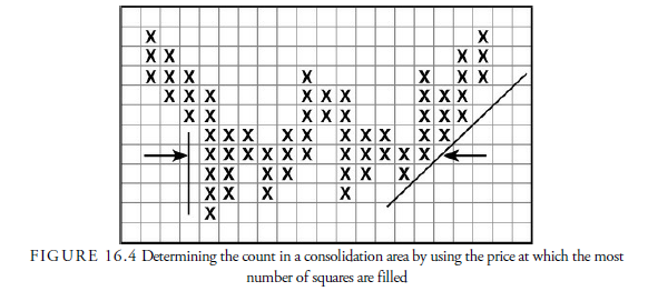
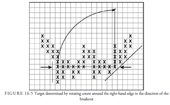
The count is calculated by counting the squares across a consolidation area. As shown in Figure 16.4, the price level in the consolidation area that has the most squares filled is used for the count. The count includes all squares along a horizontal price line from the left to the right of the consolidation area, including any blank squares that might occur. When each side of the consolidation is a vertical line of some proportion, called a wall, the determination of where to locate the horizontal line from which the count is determined is relatively easy. In most cases, a wall does not exist, however, and the analyst must judge along what price line in the consolidation the most number of filled squares occur. Figure 16.4 shows a consolidation with the left side being a wall that is relatively easy to determine, the right side with a more difficult configuration, and where the count might be applied. When the consolidation is irregular, the analyst must determine from experience with counts what the best price level to use would be.
The count determines the approximate extent of the next move. There appears to be a direct relationship between the width of a consolidation and the vertical extent of the next rise or decline. The count is one of the most valuable features of the one-box method. The three-point method also has a count, but it is far less accurate, presumably because the three-point chart fails to represent the complete flow of prices.
Generally, the count is more accurate in those stocks and commodities with a wide public following. From the count, the analyst can estimate whether the next move will be small or large and can determine risk-reward relationships to help in deciding whether to act on the breakout signal.
Normally, the longer the consolidation area, the more difficult it is to establish a count because of the many smaller rallies and declines within the base area that obscure the real beginning and end of the consolidation area. Often a good starting point is the absolute high or low of the area, but sometimes the price has been consolidating for a while before these levels are reached. There are no definite rules for establishing the count, and academics have a fit over this because the count cannot then be analyzed and evaluated. Nevertheless, despite the count’s problems, the width of the consolidation area does seem to have a relationship with the eventual distance of the next price move, and any reasonable estimate will have some value.
Once the count is determined, the distance of the count is then added to the right-hand square with the last entry in the consolidation area. This is the standard method, although there are variations. The result is as if the count line was rotated upward or downward around the last square in the count (see Figure 16.5). The resulting price level projected from the distance of the count is the objective for the next price move. It is surprising how accurate this method can be, but, of course, it should never be depended upon solely. Other factors such as market direction, change in supply or demand, or other informational changes can affect the eventual price target. It is only an approximation.
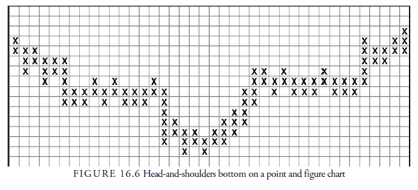
3. Head-and-Shoulders Pattern
Many of the patterns observed in bar charts also occur in one-box charts. The most common is the head and shoulders pattern (see Figure 16.6), but the rounded, double, and triple formations are also seen. The implications of these patterns are the same as in bar charts, except that with the ability of the count to estimate a price target, the patterns are more easily assessed for reward versus risk. One-box reversal charts also have a few patterns of their own.
4. The Fulcrum
The fulcrum is a distinctive one-box reversal chart pattern. Indeed, some analysts call all reversal patterns fulcrum, just as they call continuation patterns “semi-catapults.” The fulcrum is easily recognized, occurs at both tops and bottoms, and gives a reliable count because distinct walls usually contain it. Common characteristics in the fulcrum bottom (see Figure 16.7) are the following:
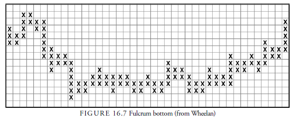
- A downward trend entering the consolidation area
- Sideways price activity near the low of the downward trend
- A “mid-fulcrum” rally of short duration and around 15% amplitude that sometimes is mistaken for the beginning of a larger move
- A testing of the earlier lows with some more sideways price activity
- A “catapult” rally above the mid-fulcrum rally
All these variables can vary, of course, but the general pattern is easily recognized. DeVilliers mentioned three types of fulcrums, and Wheelan mentioned eight tops and eight bottoms. Occasionally, more than one mid-fulcrum rally occurs, and the test can occasionally break below the initial sideways price action without damaging the implications of the formation. Two fulcrums side by side is called a compound fulcrum, and a compound fulcrum with the second fulcrum lower than the first is called a delayed-ending fulcrum. These formations are more powerful than the single fulcrum once completed with the catapult breakout. Being familiar with these fulcrum patterns, an analyst can spot similar patterns even in bar charts.
5. Action Points
We have looked at the characteristics of the one-box point and figure chart. How can this information be used to help us trade stocks? In his pamphlet, Wheelan outlines the conditions that constitute ideal buying and selling points. When all the following appear in the one-box point and figure chart, the ideal buying situation exists:
- The technical position of the market is favorable.
- A clear and broad fulcrum appears after an extended downward trend.
- The bottom of the fulcrum fulfills the maximum count from the previous top.
- The bottom of the fulcrum occurs at a major support area.
- The catapult occurs coincidently with the breaking of a downward trend line from within the fulcrum or from the previous top.
- The catapult occurs at a price level that has little or no resistance immediately above.
The ideal selling point occurs when all the criteria are reversed.
Source: Kirkpatrick II Charles D., Dahlquist Julie R. (2015), Technical Analysis: The Complete Resource for Financial Market Technicians, FT Press; 3rd edition.
8 Jul 2021
7 Jul 2021
7 Jul 2021
8 Jul 2021
7 Jul 2021
7 Jul 2021