The point and figure chart records price data using a different technique than line, bar, and candlestick charts. At first, it may appear that the construction of these charts is somewhat tedious. In addition, these kinds of charts are rarely published or discussed in the popular financial news. Because many of the point and figure charts are constructed using intraday trading data, use of these charts was historically limited to professional analysts who had access to intraday data. However, with some practice, you will see that point and figure chart construction is not that difficult and provides an interesting and accurate method of price analysis.
Point and figure charts account for price change only. Volume is excluded; and although time can be annotated on the chart, it is not integral to the chart. The original point and figure charts took prices directly from the tape as they were reported in the “Fitch Sheets” and by services prepared especially for point and figure plotting, such as Morgan, Rogers, and Roberts. Most of these services were put out of business by the computer and the use of the three-box reversal charts. The reading of each stock or commodity trade by trade was a laborious process. Today, few services provide the data to plot one-point reversal charts.
The origin of point and figure charts is unknown, but we know they were used at the time of Charles Dow around the late nineteenth century. Some have thought that “point” came from the direction of the entries on the chart, pointing either up or down, but more likely “point” refers to the location of the price plot, which at first was just a pencil-point mark. “Figure” comes from the ability to figure from the points the target price.
Construction of a point and figure chart is simple because only prices are used. Even then, only the prices that meet the “box” size and “reversal” size are included. Finally, the chart reflects the high and low of the period, whenever it is important. Many technicians believe that the high and low of the day are important numbers determined by supply and demand. In fact, they believe these numbers are more significant than the opening or closing prices, which occur at single, arbitrary moments in time.
As with all the charting methods, different analysts use variations of point and figure charting to best meet their particular needs. We begin our discussion of point and figure chart construction by looking at the oldest method, referred to as the one-point reversal point and figure method. Further information about these one-point reversal charts can be found in reprints of Alexander Whelan’s Study Helps in Point and Figure Technique.
1. One-Box (Point) Reversal
All point and figure charts are plotted on graph paper with squares that form a grid. There should be enough squares to include a significant period of trading activity. Early charts had a special outline around the rows ending in 0 and 5, just for clarity. As with the other types of charts, we will plot price on the vertical axis, but the bottom axis is not time scaled with the point and figure graph.
A point and figure chart is posted when a market price either reverses in direction by the amount of each square or continues in the same direction as the immediately preceding box. Figure 11.12 shows a one-box reversal point and figure chart of AAPL from April 28 through May 29, 2015. In this example, one box is equal to H point or dollar. A reversal requires the price to reverse in direction by H point, the amount of a box. Had the box been worth 3 points, the reversal would have required a 3-point reversal to reverse. A reversal is recorded in the column to the right of the operating column. For example, in AAPL, if the last price recorded in a column was in a rising column (an X) at 125 and the price declined to 124.50, the plot (an O) would be placed in the next column to the right at 124.50. To record a new entry, the price must have traveled through the imaginary line either above or below the box. Each price is recorded in this manner as it travels up and down the box scale, and eventually a series of patterns evolve that can be analyzed. Instead of declining to 124.50 in the example, if the price had risen to 125.50, a box size above the last plotted box, an X would be placed in the 125.50 box, the next higher box, because the trend is still upward. This could continue until a reversal from one of the boxes by H point occurred. If the price rises to 125.45, it is not recorded in the next higher box because it did not break the upper line of the box at 125.50. Likewise, if the price then declined H point from the 125.45 to 124.95, it would not be recorded because it did not break the lower bound of the next lower 124.5 box.

Box 11.4 How to Construct a Point and Figure Chart
The best way to learn to read a point and figure graph is to walk through an example of how this type of graph is constructed. Let us begin by taking a series of price changes in a stock of 43.95, 44.10, 44.3, 44.15, 44.5, 44.7, 44.9, 44.85, 44.95, 45.00, 45.05, 44.4, and 43.9.
Each square (now called a “box”) on the graph paper will represent one point in the price. In point and figure charting, the plot is made only when the actual price of the box is touched or traded through. In this example, 43 would not be plotted because the price never reached 43 exactly or traded through to below 43. Forty-four would be plotted because the price ran from 43.95 to 44.10, trading through 44.00. Thus, our first plot for the point and figure chart would be placing an X in the 44 box when the price of 44.10 is observed, resulting in a chart that looks like Plot 1 in Figure 11.13. For the next seven reported prices, no mark is made on the chart because all these trades are between 44 and 45. When the tenth price, 45.00, is observed, a second X is plotted because the price actually touched 45. This X is plotted in the 45 box in the same column, resulting in a chart that looks like Plot 2. We now know that this first column is recording an uptrend in the stock price.

As long as the observed prices range above 44 and below 46, no more marks are made on the graph. For example, the next prices recorded in our sample data are 45.05 and 44.4. Because neither the next higher number (46) nor the next lower number (44) has been reached, no mark is made to represent this price observation. These trades are considered “noise,” and the point and figure chart eliminates the plotting of this noise data.
It is not until the next price of 43.9 is observed that another mark is plotted. The price has now reversed downward through 44. Obviously, there is already an X at 44 in Column 1. Column 1 represented an uptrend in the price, and only price increases can be recorded in it. Therefore, we move to Column 2 and place an X at 44, as is shown in the figure below Plot 3. At this point, we don’t know whether the trend in Column 2 is upward or downward. The second posting in this column will tell us. If the price should now rise to 45 again, we would place an X at 45, and Column 2 would record rising prices. If the price should decline to 43, we would place an X at 43, and Column 2 would record falling prices.
Let us say that the price declines in a steady stream with no one-box reversals to 39.65, and then it rallies back in a steady stream to 43.15. This would be represented as Plot 4. A plot is made only in a new box when the price is trending in one direction and is then moved over and plotted in the next column when that price reverses by a box size and cannot be plotted in the same column. Remember that a particular column can record only price increases or price declines; in our example, Columns 1 and 3 represent price increases and Column 2 plots price declines.
2. Box Size
From this basic method of plotting prices come many variations. Box size can be expanded; in our example, the box size is expanded to two points and labeled 120, 122, 124, 126, and so on. Then a two-point change in direction would be required before prices moved to the next column. Increasing the size of the box reduces the amount of noise. Gradually, as the box size increases, the amount of price history becomes smaller and the chart becomes squeezed to the left, as fewer columns are necessary. The elimination of the noise makes the chart more useful to traders or investors interested in longer periods of time and activity. On the other hand, if a pattern appears to be developing in the longer-term chart, the box size can be reduced to give more detail near the potential longer-term change in direction. This more detailed view can give early signals based on what the longer-term pattern is forming.
3. Multibox Reversal
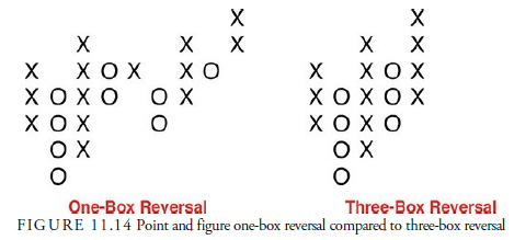
The other variable in a point and figure chart is the reversal amount. In our previous example, we used one point for both the box plot and the reversal amount. We could have expanded that reversal amount to three or five boxes, however. In other words, we could keep the one-point box scale but only record a reversal to the next column when the price reversed by three boxes. This also cuts down on the noise in price action and lengthens the time over which price action is recorded. Figure 11.14 shows a hypothetical increase in the number of boxes necessary for a reversal. Again, it reduces the noise and condenses the chart. One other attribute is that, unlike the one-box reversal, a complete data stream of prices is unnecessary, and the plot can be accomplished from data in the morning paper. It is for this reason that the three-box reversal became popular; it eliminated the tedious necessity of looking at every trade.
As an example, Figure 11.15 shows a one-point, three-box reversal chart of AAPL prices from January 1, 2014, through May 29, 2015. The plot itself is a little different from the pure one-point, one-box reversal chart. Xs are used for the column in which prices are rising, and Os are used for the column in which prices are declining. This gives an easier-to-read picture of the price history.
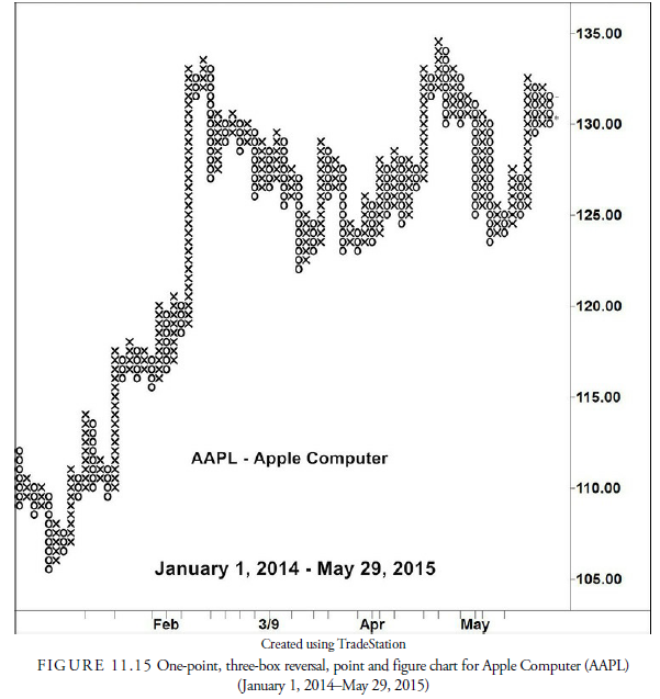
The three-box reversal method gained popularity when Abe Cohen and Earl Blumenthal of Chartcraft publicized it in the 1950s. More recently, Tom Dorsey has popularized this method in his book Point and Figure Charting, and the majority of point and figure analysts now use the three-box reversal method. Because the three-box reversal method is less concerned about small, intraday changes in prices, it is especially useful when daily summary (High, Low, & Close) price data is being used.
3. Time
In some point and figure charts, when a new price is first recorded for a new month, the first letter or the number of the month is plotted in place of the X or O. In other instances, the month is recorded at the bottom of the column in which a price is first recorded for that month. We can plot years, weeks, and days similarly, depending on how sensitive the chart may be to price changes. Both methods can be used concurrently. Often, when years and months are the principal periods recorded, the year will be plotted on the bottom of the column and the month number (1 for January, 2 for February, and so on) will be plotted instead of the X or O. Time is of little importance in point and figure chart analysis. In many cases, time is plotted only to see how long it takes for a formation or pattern to form.
4. Arithmetic Scale
Scale becomes a problem in plotting point and figure charts, especially when the price rises or falls a significant distance. Obviously, when a stock is trading at $70, a one-point move is less significant than if it was trading at $7. Blumenthal first introduced the solution to this problem in three-box reversal charts. He suggested that the chart scale be one point per box for prices between $20 and $100, one-half point per box for prices between $5 and $19.50, one-quarter point per box for stocks trading below $5, and two points per box for stocks trading above $100. This scale has since become standard in most three-box reversal charts. However, depending on the behavior of the stock price, the scale can be adjusted, and of course, it is useless in the futures markets where prices are considerably different.
5. Logarithmic Scale
As in bar charts, when long periods of trading activity are plotted, distortion arises from the fact that most charts are plotted on an arithmetic scale. Low-price action does not look as active as high-price action. Logarithmic scale changes the plot to include percentage change rather than absolute price change. Thus, the low-price action in percentage terms may appear more variable than the high-price action, and it often is. To account for percentage change in point and figure charts, prices are converted into their logarithmic equivalent and plotted as a logarithmic number. This makes immediate interpretation difficult unless a table of logarithmic equivalents is immediately handy because most analysts cannot convert the logarithmic number into the actual price in their heads.
This scale, however, should be used only for long periods of price data in which considerable volatility has made an arithmetic scale meaningless. For most investment and trading, the arithmetic scale is not only just as useful, but also easier to read and to convert to actual prices.
Source: Kirkpatrick II Charles D., Dahlquist Julie R. (2015), Technical Analysis: The Complete Resource for Financial Market Technicians, FT Press; 3rd edition.
Its superb as your other posts : D, thankyou for posting.