The interpretation of one-box charts is obviously difficult and takes considerable skill and experience. A more user-friendly method is the three-box reversal chart. It had the advantages of being plotted from prices in the newspaper and required the knowledge of only a few basic patterns. It appealed to academia because the patterns could be identified and tested, and it appealed to nontechnicians because it was easy.
The method for plotting three-box reversal charts became standardized to the point at which the Chartcraft price scale is now referred to as “traditional.” Price scales have also evolved, however, to account for percentage change rather than arithmetic change, and logarithmic scales are often a choice in the popular software programs that plot point and figure charts. Although the method has other peculiarities, such as trend lines at 45-degree slopes and odd-named patterns such as “high poles” and “long tails,” the various tests of its success rate, although few, have shown extremely good results from following the signals on a mechanical basis.
Professor Davis (1965) studied the results from each of the eight basic patterns over ten years and 1,100 stocks. His method was to act on a signal from one of the patterns and close the position when a simple reversal signal occurred. Sometimes theoretical positions would overlap, as when more than one signal occurred before the closing criteria was met, but the data was accrued for each signal as if it were independent. Davis’s results were tabulated by signal, and the percentage profitable as well as the average gain or loss was recorded.
Professor Anderson (2001) used the same method on eight years of S&P 500 futures prices, by year, and tabulated the gains, losses, and percent profit from each of the eight standard patterns adjusted for different box sizes ($100 and $200) and reversal numbers (three, four, and five boxes). Unfortunately, Professor Anderson used a $100 commission rate for round-turn trades when a more accurate commission would have been closer to $5. His results show worse performance than would be expected today but even with the high commission are still largely positive. We have adjusted the overall profitability of his results, but not knowing the details of each trade, we could not adjust the profitability percentage for each signal. In both studies, Davis and Anderson, the results show favorable results for all eight signals.
Trend lines in three-box reversal charts are drawn at 45-degree angles, as demonstrated in Figure 16.8. This method is somewhat spurious. There is little reason for drawing trend lines in this manner, but regardless, it has become the convention for these charts.
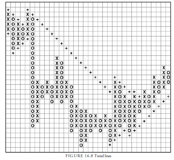
Because the method only allows one upward and one downward trend line, each has a separate name. The upward trend line, drawn one box below the last observable column (always an O column) after a buy signal from a base, is called the bullish support line. The opposite, the down trend line drawn one box above the latest top column (always an X column) after a sell signal from a top, is called the bearish resistance line. Each is treated equivalently relative to its direction.
The general rule for these lines is that one should never buy unless prices are above the bullish support line and, conversely, should never sell unless prices are below the bearish resistance line. The initial lines may last for years, depending on the slope of the subsequent advance or decline. When a price penetrates a trend line by one box at the same time that a pattern signal occurs, the signal has added importance. Unfortunately, the tests on signals did not include this qualification.
Another, even more questionable, line is drawn on three-box reversal charts. This is a line similar to the channel line in a bar chart in that it runs parallel to the trend line through the opposite extreme prices. Thus, a bullish support line that travels upward beginning at the bottom of the base can have several bullish resistance lines drawn through successive peaks in the price rise. These lines are considered to be levels at which future rallies will halt, similar again to the standard channel line.
1. The Count Using Three-Box Reversal Charts
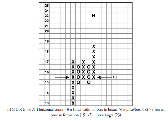
Analysts use two methods of determining a target price on three-box reversal charts—the vertical and the horizontal count. However, because the three-box reversal method eliminates much of the price action that might occur within the three boxes and often does not include the continuous stream of prices, the counts are not as accurate as in the one-box method. Nevertheless, they do provide an approximate target—one that can be more confidently accepted if both the vertical and horizontal counts agree.
2. Calculating Horizontal Count
The horizontal count is similar to the count in a one-box chart. The walls on either side of the base are the starting points, and the distance in boxes is measured between them. In Figure 16.9, the width of the base is 5. The distance is then multiplied by the dollars per box. In Figure 16.9, the price per box is 0.5 at the point where the base is formed. The base of 5 is multiplied by the price per box of .5 to get 2.5. Next, an adjustment is made to account for the approximate loss in price action using a three-box reversal; in our example, 2.5 is multiplied by 3 because the reversal amount is three boxes, resulting in 7.5. This figure is then added to the lowest point in the formation, which in our example is 15 1/2, giving a price target on a bullish signal of 23 (15 1/2 + 7 1/2). The fact that at 23, the box sizes are one point per box is irrelevant. Remember that this is different from the count in a one-box chart, where all boxes are the same size.
3. Calculating Vertical Count
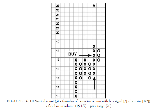
The vertical count is unique to the three-box reversal. It is calculated by taking the number of boxes in the column in which an action signal has occurred, multiplying it by 3, and adding the product to the lowest box price in the column. If the box values are different because of scale changes during the column’s formation, the value of the column boxes must be adjusted. In the example (see Figure 16.10), the scale does not change over the relevant range. Thus, the prices are all 1/2 point per box for seven boxes in the column in which the buy signal occurred, multiplied by 3 to adjust for the three-box reversal, which equals 10 1/2, which is then added to the lowest box price of 15 1/2 to get a vertical count of 26. In some cases, the initial signal is only a three- box column. If the base is sufficiently large, the two columns coming out of the base at the signal can be used. A special situation exists in short sales from a top. In these cases, the downward projection is a function of multiplying by 2 instead of by 3.
4. The Eight Standard Patterns for Three-Box Reversal Charts
There are eight standard patterns used with three-box reversal charts. They are as follows:
- Double top or double bottom
- Rising bottom or declining top
- Triple top or triple bottom
- Ascending triple top or descending triple bottom
- Spread triple top or spread triple bottom
- Bullish or bearish triangle
- Above bullish resistance line or bearish support line
- Below bearish resistance line or bearish support line
Let us look at each of these eight patterns. Then we will look at a few additional minor three-box reversal formations.
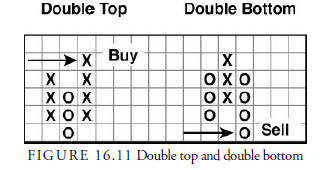
5. Double Top and Double Bottom
Double tops and bottoms are the simplest of all patterns. The double pattern consists of only three columns: two X columns and one O column for the double top or two O columns and one X column for the double bottom. The nomenclature is different from both bar charts and one-box point and figure charts in that “top” designates the point at which a breakout occurs rather than a description of the pattern formation as being bearish. Indeed, a top—double or triple—is a bullish formation once the upward breakout occurs. The signal comes when the third column breaks above or below the first column, as shown in Figure 16.11. All other standard formations with the exception of lines have a double top or bottom within them. Davis found the double top to be profitable 80.3% of the time and the double bottom to be profitable 82.1% of the time. Anderson found their combined profitability to be tied for third best of the eight patterns, returning $1,371,810 in 18,278 trades over nine years.
6. Rising Bottom and Declining Top
The rising bottom and declining top are variations of the double top and double bottom. Four columns are required for these formations. The rising bottom is formed by an initial X column, followed by an O column, a second X column, and then a second O column. For the pattern to be a rising bottom, the first column of Os in the double top must have a lower low than the most recent column of Os. The rising bottom pattern is pictured in Figure 16.12.
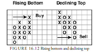
Usually the first column of lows declines from a much higher level than shown in Figure 16.12. One possible variation is for the prior column of Xs to be stronger. The declining top pattern is just the opposite of the rising bottom pattern. Figure 16.12 also shows a diagram for a declining top formation.
Davis claimed that the rising bottom was profitable 80.4% of the time, and the declining top was
profitable 88.6% of the time. In the Anderson study, these patterns combined tied for third best. They produced a $666,635 gain over nine years and 8,433 trades.
7. Triple Top and Triple Bottom
The triple top and bottom patterns require that prices break above or below two prior highs or lows. It, thus, provides more confirmation that a change in trend has occurred. As a result, it tends to be more profitable than the double top and bottom but occurs less frequently. Figure 16.13 shows a triple top and a triple bottom.
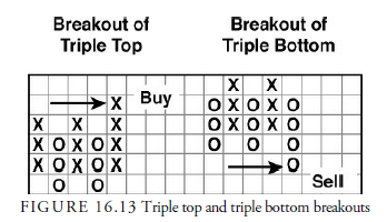
Davis reported that the triple top formation was profitable 87.9% of the time and that the triple bottom was profitable 93% of the time. Anderson found the pattern to be the second best of the eight standard patterns and produced $320,795 over nine years and 2,201 trades for an average profit per trade of $145.70.
Ascending Triple Top and Descending Triple Bottom (Also Bottom)
Ascending triple tops and descending triple bottoms are varieties of the triple top and bottoms. In the ascending triple top, three rows of Xs occur, with the second row of Xs breaking through the top of the first and the third row of Xs breaking through the top of the second. This is really two double top formations right after each other, denoting a strong upward price trend. An ascending triple top is shown in Figure 16.14.
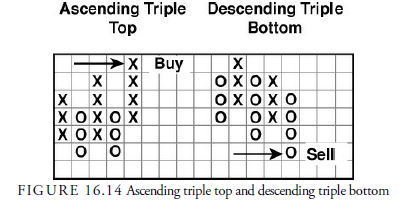
The descending triple bottom is the opposite of the top. In this formation, the three rows of Os show progressively lower levels. Figure 16.14 also shows this bottom formation.
Davis reported that the ascending triple top was profitable 79.5% of the time, and the descending triple bottom was profitable 83.3% of the time. Anderson reported that this pattern produced profits but at a level below the average of the other eight standard patterns.
8. Spread Triple Top and Spread Triple Bottom
The spread triple top (bottom) is a special case of the triple top (bottom). Spread triple tops and bottoms are a little more complicated, and, thus, occur less frequently. The pattern requires at least six columns and usually more. It is somewhat similar to the fulcrum pattern in the one-box chart because it has a congestion area followed by a premature breakout and then another congestion area. The signal comes when the premature breakout is exceeded, just as in the fulcrum pattern.
Thus, in a spread triple top, there are three tops to be exceeded, with one or more lesser tops between the major ones. A breakout must rise above all. Figure 16.15 provides a graph of a spread triple top and the spread triple bottom. You will notice that in the spread triple bottom, three major bottoms occur, with lesser bottoms between the major ones.
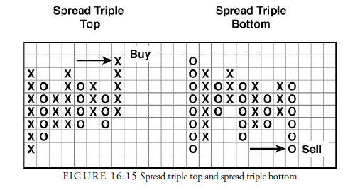
Davis reported that the spread triple tops were profitable 85.7% of the time, and spread triple bottoms were profitable 86.5% of the time. Anderson’s results were not as favorable. His report showed small profits (only $37.9 per trade) and rare occurrences (429 over nine years). Thus, they were patterns that probably should be eliminated from the list of useful three-box reversal patterns.
9. Bullish Triangle and Bearish Triangle
The triangle in three-box reversal charts is similar to the symmetrical triangle we saw in bar chart patterns in Chapter 15. Figure 16.16 depicts both a bullish and bearish three-box reversal triangle. The triangle is rare in three-box reversals, however, because it is relatively complicated and because three-box reversals cover a longer period of time than it takes for most bar chart triangles to form. The three-box reversal, therefore, only picks up those triangles that form over a longer period and that are uncommon. The pattern requires that columns converge by having successively lower highs and higher lows, as depicted in Figure 16.16. It is important to note that a signal is not generated until a breach of a previous column occurs, rather than simply on the break of a trend line as would occur with bar chart symmetrical triangles.
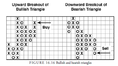
The patterns studied by Davis and Anderson were continuation patterns because the breakout was required in the direction of the previous trend. As we know, triangles can be reversal patterns also, but these have not been analyzed for performance.
Davis reported that the upward breaking bullish triangle was profitable 71.4% of the time and the downward breaking bearish triangle was profitable 87.5% of the time. Anderson could only find a combined 70 examples of these formations, and their performance was a miserable $11.70 per trade. This is another pattern that could easily be disregarded.
10. Rising and Declining Trend Lines
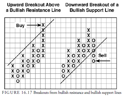
In a rising trend, a trend line is usually drawn below the lows of each smaller correction within the trend. In three-box reversal charts, the trend line is drawn at a 45-degree angle from the bottom and is labeled the bullish support line. Another parallel line, similar to a channel line, is often drawn through the earliest peak in the upward trend, again at a 45-degree angle, and is called the bullish resistance line.
Prices can penetrate these lines in only two ways. Prices can break below the bullish support line, traditionally considered a major change in the long-term trend and called a “bullish reversed pattern” without the trend line, or they can break above the bullish resistance line, suggesting that the upward trend has accelerated.
The upward breakout through a bullish resistance line, as shown in Figure 16.17, comes at the end of a strong move. This type of breakout is likely the last gasp in the trend direction. Jumping on the trend at this late time is dangerous and likely wrong. On the other hand, the break of the underlying bullish support line has more validity because it signals a potential reversal in trend, just as breaking a trend line in a bar chart would imply.
These breakouts are not specifically a pattern in the sense that a pattern usually is defined by two boundaries, but because of the peculiar nature of the trend being drawn at 45 degrees with little supporting evidence, the breaks have been evaluated for performance. In truth, the results from these two combinations of trend lines should not have been combined as they were. Instead, it would have been more informative to combine the channel lines together and the trend lines together. For this reason, the results from both studies are likely flawed and not good guides as to the success or failure of any of these techniques.
Nevertheless, Davis reported that the upward break profited 82.6% of the time, and the downward break profited 85.7% of the time. Anderson found only 49 examples in nine years, but these examples produced a profit per trade of $219, the highest per-trade profit of all the eight patterns. It’s too bad they occur so infrequently.
Declining trend lines are just the opposite of the rising trend lines except that they appear in declining trends. There is an upper line, the bearish resistance line, and a lower line, the bearish support line. Both the bearish resistance line and the bearish support line are pictured in Figure 16.18.
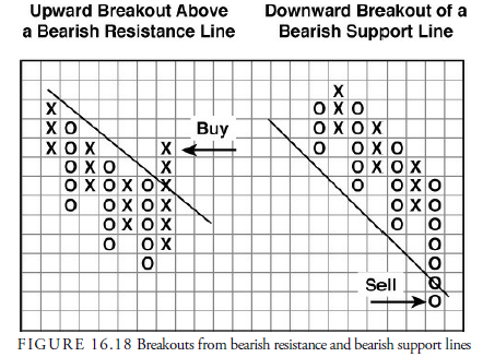
Davis claimed a profit an extraordinarily high 92.0% of the time for breaking upward through the bearish resistance line, what is also called a bearish reversed pattern without the trend line. Zweig and Kaufman did not provide statistics from Davis’s work on the profitability of a downward break. Anderson, however, found that the combination of breaks lost money. This makes sense. A 45-degree downward trend line is not usually steep enough during a decline to capture the price movement. Declines tend to occur more quickly and at a steeper slope than advances. Thus, a number of premature breakouts downward would not be surprising and seem to be what occurred in the S&P futures that Anderson monitored. The number of occurrences he noticed was only a paltry 63 over nine years.
11. Other Patterns
In addition to the eight standard three-box reversal chart patterns, several other formations are of interest to the technical analyst. Three such formations to be aware of are the catapult, the spike, and the shakeout.
12. Catapult
Dorsey calls the catapult a “confirming” formation. It results from the pullback or throwback after the breakout from a triple top or bottom formation. Cohen maintained that a catapult would occur in roughly 50% of triple formations. As such, it is just a combination of a triple formation and a double formation.
Figure 16.19 depicts a bullish catapult. In this chart, the triple breaks out in the third column of Xs. A column of Os follows, in a throwback. As the next column of Xs occurs, a double formation then occurs.
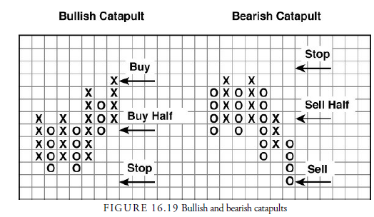
As a formation, the bullish catapult is powerful, but it also provides a chance to enter at a slightly more favorable price. The time to enter is on the throwback, perhaps only a half position. Place a stop outside of the reversal point prior to the throwback. In the bullish catapult (see Figure 16.19), the throwback enters the triple top formation and provides a better buying price than when it originally broke out. In addition, the bottom at which a protective stop should be placed is closer, giving better risk-reward odds. Another buy order can be placed when there is a breakout from the double top.
A bearish catapult is also pictured in Figure 16.19. It is the same thing as the bullish version except in reverse. Sell orders should be handled in the same manner that buy orders were handled with the bullish catapult.
13. Spike (Also “Long Tail”)
Occasionally, a price change continues in a straight line for a considerable distance on a three-box reversal chart, leading to a tall column of Xs or Os. This often occurs at a climax after an accelerated trend has reached its climax. In Figure 16.20, the long column of Os forms what looks like a long tail.
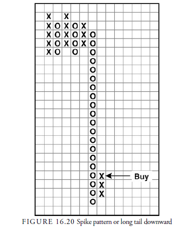
How should trading be handled when a long tail or spike occurs? Using traditional signals, the next reversal (the X column) would have to travel the entire distance back to the starting point before a signal is given. It would be fairly obvious that prices are in an uptrend, and an uptrend that the investor would want to be riding, before prices made it all the way back up the length of the tail. Therefore, different authors have tried to develop rules for trading when these tails and spikes occur.
The main question to be resolved is how far the straight line run in prices has to travel before it is considered a spike. Cohen argued that 10 boxes were sufficient to establish a spike; Blumenthal argued for 20 boxes; and Burke reported that 17-20 would be sufficient. Dorsey mentions a “long tail down,” using a decline of 20 boxes without a reversal as his criterion; at the first reversal, he suggests a buy for a short trade on the long side. In summary, however, the answer is not clear as what the best number of boxes is, but the principle is valid especially if the overall market is at a long-term extreme.
14. Shakeout
The shakeout pattern is a deceptive one that plays on traders and investors who sell on the first sign of difficulty in an uptrend. It is displayed in Figure 16.21. The first column of Xs indicates a strong upward trend. Then the two columns of Os form a double bottom. This double bottom breakdown in a strong rising market often “shakes out” a number of traders and investors who have profited and want to exit the position. Under normal circumstances, the double bottom pattern would be a signal to sell, but in this case, it pays to buy instead of sell. The reason is that the trend is still upward, and the first correction is just temporary within a trend that will soon resume upward.
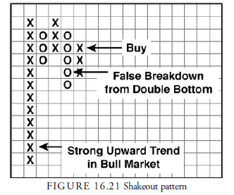
Trading in this situation can be tricky. It is important to remember that this pattern occurs early during a strong uptrend. Dorsey provides several rules to make sure the pattern is used correctly:
- The stock and market must be in an uptrend.
- The stock should be trading above its bullish support line.
- The stock price must form two tops at the same price.
- The reversal from these two tops gives a double bottom sell signal.
- This sell signal is the first that has occurred in the uptrend.
- The relative strength chart must be showing Xs in the recent column or be on a buy signal.
The signal to buy is on the reversal back upward from the double bottom sell signal, as shown in Figure 16.21. A protective stop can then be placed just below the prior low.
Source: Kirkpatrick II Charles D., Dahlquist Julie R. (2015), Technical Analysis: The Complete Resource for Financial Market Technicians, FT Press; 3rd edition.
Heya i’m for the first time here. I found this board and I find It truly useful & it helped me out much. I hope to give something back and aid others like you aided me.