Conventional wave-filtering mathematics has gone through tremendous growth and development in the past 50 years. Data transmission, voice and image transmission, electronic signaling, and other developments in the electronic age necessitated more sophisticated mathematics to recognize and understand waveforms. Now we have bandpass filters, digital signal processing (DSP), wavelet modeling, nonlinear spectral analysis, higher order spectral analysis (HOSA), and derivatives of each. For our purposes, however, this sophistication is unnecessary. Because waveforms in prices, if they exist, are not based on constant parameters, we need only to make initial estimates of a cycle period to satisfy our requirements. Once we have an estimate of period, we have information that is useful for projection and useful for determining the “window” or moving average length in indicators that best represents the trading period of interest.
1. Fourier Analysis (Spectral Analysis)
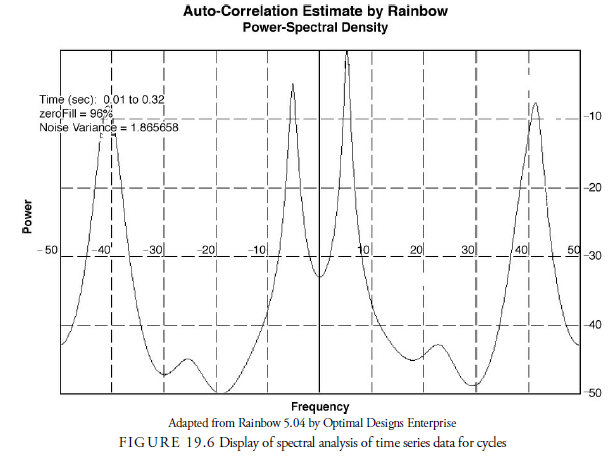
The most common and simplest method of wave analysis in a time series data is Fourier analysis. Fourier analysis, available in most mathematics software programs, has many variations. It has specific problems, however, in that it requires a large amount of data. For market forecasting, the more data that is involved, the more the waves can change and neutralize the calculations of parameters. Thus, Fourier analysis should be used only as a basic method of analyzing cycles in market time series data. A faster method, called Fast Fourier Transforms (FFTs), reduces the computation time of the analysis. A second problem with Fourier analysis is that it does not maintain the phase relationships between cycles. In other words, if one cycle crosses the horizontal axis after or before another, the difference in these phases is not recorded. This makes projection of the combination of the cycles difficult. Figure 19.6 displays an example of spectral analysis.
In the early 1980s, John Ehlers (2002) developed a method that attempts to solve the problems of Fourier analysis without compromising the accuracy of the results. His method, using Maximum Entropy Spectral Analysis (MESA), is available through his software company, MESA Software. The method requires only a short time series to determine the inherent cycles in the data. It determines the most recent and most relevant waves for projection and records the different phases of each cycle recognized.
2. Simpler (and More Practical) Methods
Fourier analysis and MESA provide methods for determining cycles but depend upon complex mathematics. Often, simpler tools, such as detrending, envelopes, or centered moving averages, can help identify cycles. At times, even the naked eye can observe cycles without the aid of complicated mathematics and sophisticated computer software.
2.1. Observation
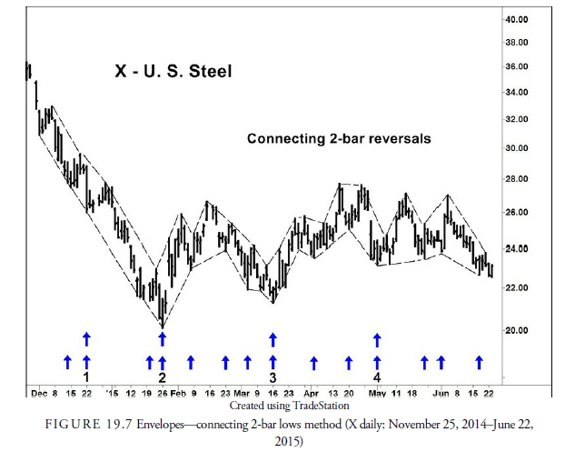
In many cases, the low points of dominant cycles in market data are obvious to the eye. The exact cyclical low can often be difficult to determine, but the general oscillation of the cycle is plain. In his book The Profit Magic of Stock Transaction Timing, Hurst, the father of cycle analysis in the stock market, used a method of envelopes that he traced along the major highs and lows in a price chart. These envelopes were not predetermined like a filter but were drawn freehand on the chart. When prices touched the upper and lower edges of the band, Hurst drew an arrow at the bottom of the price chart for later inspection. When he was done with the freehand estimates, he looked at the arrows drawn and determined if any obvious stable period separated the arrows. Rather than draw freehand, we prefer to connect 2-bar reversals (see Chapter 12); the results are about the same but more precise. Figure 19.7 shows what this method might look like.
Of course, such methods are fraught with danger. The human mind often imagines cycles where they do not exist or invents turning points to fit a preconceived notion of an existing cycle. Hurst’s method was just the beginning observation of the potential for cycles in financial data. If it appeared reasonable that cycles existed in the data, he would then use more sophisticated methods, such as Fourier analysis and moving averages, to find the specifics.
Oscillators are another method of determining with the eye if cycles exist in financial data. Many of the indicators in Chapter 18, “Confirmation,” show oscillations about a central horizontal line. By observing the lows especially, because cycles tend to synchronize at lows, one can observe if the times separating each low are at regular intervals. If so, a cycle is suspected to exist in the data.
If a cycle is suspected, one way of quantifying it more accurately is to mark a dot on the bottom of the chart page just below each low. Then, using a blank piece of paper, mark a line on the edge of the paper, move the paper such that the line is placed on the first dot on the chart, and draw another line on the paper at the point where the next dot lies. This gives a measured distance between the two dots on the paper. Then move the first paper line to the second dot and draw a line on the paper where the third dot occurs on the chart. This second line should be near the earlier line for the second dot but is rarely exactly on it. Now two cycle lengths have been measured, and the difference in period can be seen immediately. Continue to move the paper across the dots, making lines to mark the length between each subsequent cycle bottom. When you’re done, the paper will show the range of periods between dots and thus give an estimate of the cycle period. By placing the first line on the last dot, the range of lines from previous cycles will give an estimate of the range in which to expect the next cyclical bottom.
The eyeball measurement of cycle lengths can also be done with a ruler or a drafting divider. In this case, the distance between the first and second dot is measured and recorded; then the distance between the second and third dot is measured and recorded; and so on. Once imported into a spreadsheet, the mean, standard deviation, and other statistical measures can be determined for all the intervals.
2.2. Detrending
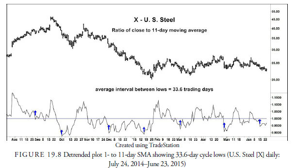
Because specific cycle behavior is highly dependent on the direction of the next higher order cycle, the first step in recognizing if a cycle exists in the data is to “detrend” it. Detrending is done merely by dividing the current prices by a moving average of those prices. The resulting plot will oscillate above and below a zero line, and the lows of the plot will correspond to the lows in the cycle being analyzed.
Figure 19.8 shows an example of this detrending method. The detrended line is constructed by dividing the current closing price by an 11-day, centered SMA. The cycle with a 33.6-day period (slightly shorter than the ideal 40 days) shows up clearly in the plot.
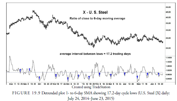
As a further example, Figure 19.9 shows detrending using a six-day SMA, roughly half the length of the SMA used in Figure 19.8. The plot in Figure 19.9 shows more clearly the cycle lows 17.2 days apart, the halfcycle of the 34-day cycle shown in Figure 19.8.
When prices are detrended using the daily closing price as the numerator, especially as we lengthen the denominator, the plot becomes erratic and difficult to interpret. The solution is to use a moving average in the numerator as well, but this presents some problems that must first be addressed.
2.3. Centered Moving Averages
…the time relationship between the moving average and the data it smoothes is not the one that is always shown on stock price charts. In fact, the moving average data point plotted in association with the last price datum should be associated with price datum one-half the time span of the average in the past. (Hurst, 1970, p. 65)
What Hurst was saying is that a moving average is an average of both price and time. Most plots take into account the average in price but incorrectly plot that average at the time the last price of the average occurs. For example, an 11-day moving average of prices of Days 1-11 is frequently plotted at Day 11. Instead, because the moving average is also an average of the time over which the average price occurred, it should be plotted at the mean point or center of the time span of the average. In other words, the moving average of Days 1-11 should be plotted at Day 6. This plot is called a centered moving average. Figure 19.10 shows an 11- day centered moving average versus an 11-day moving average plotted the usual way. We use a centered moving average for the remainder of our discussion on cycles.
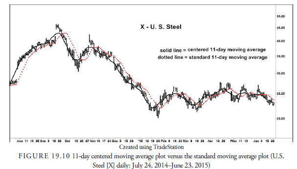
Notice in Figure 19.10 that the centered moving average better reflects the price action than the conventional plot. It runs through the center of all the price oscillations and is not skewed to the right of prices, as is the conventional method. The problem of skewing to the right becomes even more noticeable as the moving average span increases. The centered moving average plot is a better representation of prices but, of course, lags behind prices and by itself cannot be used as a signaling method. It is used to identify cycles but not to predict them.
2.4. Envelopes
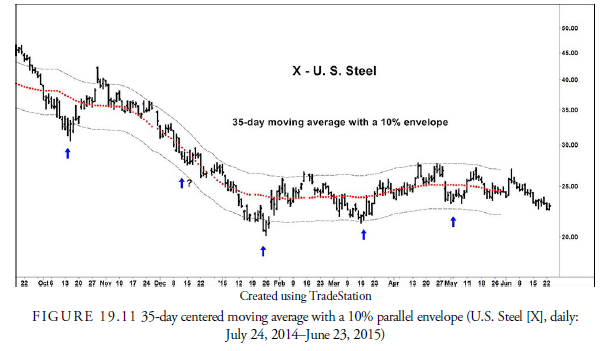
As we saw in Figure 19.7, an approximation of Hurst’s hand-drawn envelope about prices can be used to get a rough estimate of the potential cycle period in the price data. Once that period has been estimated, moving averages can be used to quantify the cycle more definitively.
Moving averages dampen or smooth data. In terms of cycles, a moving average represents price oscillations greater than the period of the moving average and effectively cancels out price action or oscillations less than the moving average period. Figure 19.11 includes a centered 35-day moving average overlay. The large price deviations below and above the moving average appear roughly 35 days apart. To quantify the range of price movement about this moving average, we draw an envelope parallel with the moving average. Notice that prices touch the lower envelope band about every 35 days.
The next step is to draw a half-cycle centered moving average with an envelope, as shown in Figure 19.12. A half-cycle moving average in this example is 18 days. This moving average smoothes out all waves shorter than 18 days and includes waves 18 days or longer. When subtracted from the 35-day moving average, it reflects the waves that exist between 18 and 35 days, or the 35-day cycle we are investigating.
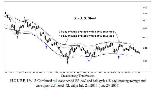
The points at which the 18-day envelope touches, or comes close to, the 35-day envelope and turns upward are the low points of the 35-day cycle. It is pure chance that the analysis results in exactly 35 days. Normally it would be close but not exact. To be more confident of the cyclicality, we should use a minimum of seven examples. We now have a well-defined 35-day cycle, and we know the days on which it bottomed and turned upward. When we later discuss the projection of cycles, we will use this data to predict when the next 35-day cycle should occur in the future.
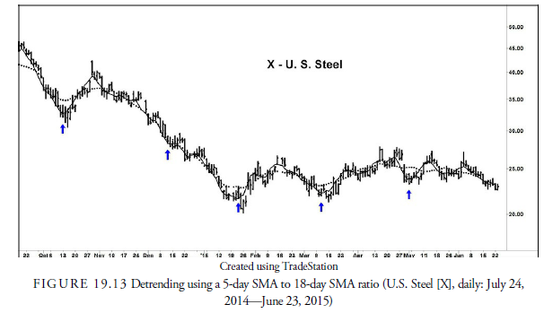
Somehow we have lost precision with envelopes. This is likely because higher-order cycles are trending so strongly that the shorter cycles are being dampened out. To counter this, we return to the detrending method. Because we want to pinpoint the 35-day cycle and cycle of lesser period, we detrend the price data by plotting a line of the ratio of a 5-day SMA to the 18-day. We use the 5-day to smooth out short-term daily fluctuations and the 18-day because it should represent cycles above 18 days—namely the 34-day.
Figure 19.13 shows this detrended line with the 34-day lows clearly marked by the vertical lines exactly 34 days apart. On every line, a slight valley occurs that represents the 34-day low. This is fairly conclusive evidence that a periodicity of 34 days exists in the price data.
Let us go down one more period and see if any cycle appears less than 34 days. We suspect, from Figure 19.9, the detrending exercise, that a 17-day cycle exists, but we cannot pinpoint it because we did not use a centered moving average. Remember that a moving average of roughly half the period of a cycle represents that cycle. Now we will calculate a detrended line based on the 18-day SMA, which should represent the 34-day cycle and all others longer. It will screen out the motion from those longer cycle and give us more precise data for any shorter cycle than 34 days. Figure 19.14 is a plot of the ratio of the closing price to the 18-day centered SMA.

Visual inspection of Figure 19.14 shows vertical lines at exact 17-day intervals beginning at the major low in October. At each of the ten dashed lines, a dip in the ratio shows that a cycle low of some nature occurred within one day of each vertical line. The two exceptions out of the ten shown are the inversions in late December and February. We now have some convincing evidence that an event, usually a low, occurs in U.S. Steel stock roughly every 17 and 34 days.
We also notice that the phase of the short cycle is out of synchronization with the 34-day cycle. This is why the actual lows in the 34-day cycles are rounded rather than sharp. If the two cycles synchronized at the lows, they would bottom at the same time and create a “V” type bottom pattern.
The process we just went through of deducing the cycles shorter than a known dominant cycle is called nesting downward. We could equally as well have nested upward by again taking the dominant cycle of 34 days and deducing cycles with longer periods. This would have taken considerably more data, but it is an exercise that should be done before any trading or investing is initiated using cyclical data. When investors decide upon the period of investment, they should understand at least the next longer and shorter cycle period because these cycles will affect the behavior of the cycle of interest. In addition, the analysis should be repeated every time a cycle has completed just to be sure that the original assumptions as to cycle periods are still correct.
The preceding analysis, and all the analysis in this chapter, can be used in any time series data regardless of the bar interval—daily, weekly, monthly, or minute-by-minute. However, as explained in Chapter 14, “Moving Averages,” analysis of cycles shorter than a day must be limited to securities that trade over the complete 24 hours because the data that is shorter than daily does not account for the time between the close of one day and the open of the next day.
Source: Kirkpatrick II Charles D., Dahlquist Julie R. (2015), Technical Analysis: The Complete Resource for Financial Market Technicians, FT Press; 3rd edition.
a outstanding world wide web
Wohh exactly what I was searching for, thankyou for posting.