After anova , the followup command predict calculates predicted values, residuals or standard errors and diagnostic statistics. One use for such statistics is in drawing graphical representations of the model results, such as an error-bar chart. For a simple illustration, we return to the oneway ANOVA of drink by year: . anova drink year

To calculate predicted means from the recent anova, type a command with form predict newvarl, where “newvarl” can be any name you want to give these means. predict newvar2, stdp creates a second new variable containing standard errors of the predicted means.
. predict drinkmean
. predict SEdrink, stdp
Using new variables drinkmean and SEdrink, we calculate approximate 95% confidence intervals as the means plus or minus 2 standard errors. The error-bar chart in Figure 6.3 consists of a range plot with capped spikes (rcap) for the error bars, overlaid by a connected-line plot (connect) for the means.

Drawing Figure 6.3 in this fashion provided an introduction to the predict command, which has broad applications in statistical modeling. An alternative way to draw error-bar charts makes use of two other commands, margins and marginsplot. The margins command calculates marginal means or predictive margins after a modeling command. marginsplot displays these
graphically. In the example below, margins year obtainsmean values of drink for each year. Then marginsplot simply graphs these means with their confidence intervals. Figure 6.4 is a plain version, but we could apply many of the standard twoway options to marginsplot if desired.

For a two-way factorial ANOVA, error-bar charts help us to visualize main and interaction effects. For this example we use the aggressive-behavior scale aggress as our dependent variable, in a factorial ANOVA with gender, year and the interaction term gender#year as predictors. In light of the nonlinear year effects seen in Figure 6.3/6.4, for this analysis we accept the default treatment of year as a categorical rather than a continuous variable. F tests show that gender, year and gender#year all have significant effects.
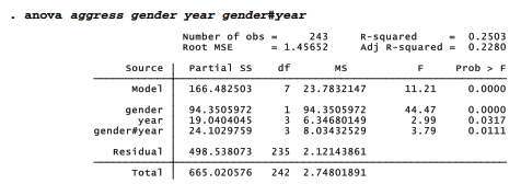
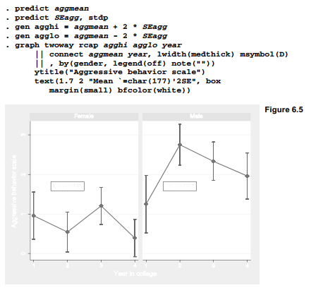
We use predict to calculate a new variable holding the predicted means, and predict, stdp to calculate standard errors. Approximate high and low confidence limits equal the means plus or
minus two standard errors. To represent the gender#year interaction, the graph command for Figure 6.5 employs a by(gender) option that draws separate plots for males and females. Some other options illustrate control of secondary details such as marker symbols (large Diamonds), suppressed legend and suppressed note. We also draw small-margin boxes with white background around the “Mean ±2SE” text, which is carefully placed so it does not interfere with the data in either sub-plot,
A basic but similar error-bar chart could have been created quickly using margins and marginsplot. The command margins gender#year calculates predicted values or means of drink for every combination of gender and year. marginsplot, by(gender) then plots these means with their confidence intervals separately by gender (Figure 6.6).
. margins gender#year . marginsplot, by(gender)
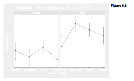
Substantively, Figure 6.5 or 6.6 add details about the gender and interaction effects seen by anova. Female means on the aggressive-behavior scale fluctuate at comparatively low levels during the four years of college. Male means are higher throughout, with a second-year peak that resembles the pattern seen earlier for drinking (Figures 6.2 and 6.3). Thus, the relationship between aggress and year is different for males and females. Error-bar charts visually complement the anova or regress tables they are based on. While the tables confirm which effects are significant and give numerical details, the charts help to picture what these effects mean.
Source: Hamilton Lawrence C. (2012), Statistics with STATA: Version 12, Cengage Learning; 8th edition.
3 Oct 2022
23 Sep 2022
3 Oct 2022
28 Sep 2022
24 Sep 2022
3 Oct 2022