Much of the success of a paper-based self-completion survey depends on the appearance of the questionnaire and the ease with which respondents can use it. An unattractive questionnaire that is difficult to follow will reduce the response rate, increasing the risk of an unacceptably low level of response. An unattractive or shoddily produced questionnaire suggests to the respondents that you don’t really care about the project, so why should they?
1. Making it attractive
There are many ideas about how to make a questionnaire attractive to potential respondents. However, it is almost certainly true that time, effort and money spent on improving the appearance are rarely wasted.
Printing should be of good quality and it is preferable for the paper to be a slightly heavier weight than for an interviewer-administered questionnaire. The paper should always be of sufficient quality that the printing on one side cannot be seen from the other side through the paper. Using different colours in the printing can increase the attractiveness if used sparingly. Colour can be used to distinguish instructions from questions, or to provide borders to questions. Coloured paper, though, should be used with care. Pale or pastel colours can be used, particularly if there are different versions of a questionnaire that have to be easily distinguishable. Darker colours and gloss-finish paper, either of which makes the print difficult to read, should always be avoided.
If the budget allows, the questionnaire may be presented in the form of a booklet. This looks more professional and is easier for respondents to follow. With a questionnaire printed on both sides of the paper and stapled in one corner it is easy for respondents to miss the reverse pages, and it is possible that some back pages will become detached or inadvertently torn off. The booklet format avoids both of these potential problems. It does, however, create its own problem of forcing the number of sides to be four or a multiple of four. When the questions fit neatly on to five pages, this means that the researcher has to decide whether to use a less optimal question layout, or to drop some questions, or to accept a significantly greater printing cost.

To help make the respondents feel that the survey is worthwhile, the study should have a title, clearly displayed on the front page of the questionnaire, together with the name of the organization conducting it. The address of the organization should also be included. Even if a return envelope is provided, it may get mislaid by respondents, so an address on the questionnaire gives them an opportunity to return it.
2. Use of space
Little is more daunting for potential respondents than to be confronted with pages crammed full of print that they have to struggle to find their way through. Lay the questions out sparingly.
Dividing the questions into sections with a clear heading to each section helps respondents understand the flow of the questionnaire and focuses their attention on the topic of each section. It also helps give them a small sense of achievement when a section is completed, particularly if the questionnaire is long. Vertical listing of responses should be used in preference to horizontal listing, as it is easier to follow and creates a more open appearance. However, it does require more space.
Figures 8.7 and 8.8 show the same questions with responses listed horizontally and vertically, respectively. The original questionnaire used the horizontal listing.The vertical listing uses more space on the page but is easier to see, and makes the page more attractive.
Never allow questions to go over two pages, or over two columns if the page is columnated. If a response list continues on another page it may not be seen. Avoid, if possible, a short question being placed at the bottom of a page, preceded by a question with a large response grid. The short question is likely to be overlooked.

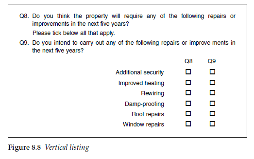
In Figure 8.8 the response codes are evenly spaced vertically. If, however, one of the response codes had been so long that it had had to go on two lines, this would have resulted in uneven spaces between the boxes (Figure 8.9)
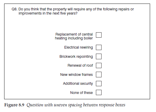
It has been shown (Christian and Dillman, 2004) that uneven spacing of the category responses can significantly bias the response to the category that is visually isolated. This effect is likely to be greater for attitudinal questions than for behavioural questions, or where there is an ordinal scale. However, for all questions it is good practice to avoid the possibility of this bias by ensuring that the response boxes are equally spaced (Figure 8.10).
3. Open-ended questions
Open-ended questions can be a deterrent to respondents, depending on their interest in the subject matter. If the level of interest is low then open- ended questions tend to be at best poorly completed and at worst can damage the response rate. If possible, keep open-ended questions until the latter part of the interview. The questionnaire can be read through before being completed, so the respondents must be assumed to be prompted by any information that is on the questionnaire. There is thus no issue of having to ask an open-ended question before one that shows pre-codes that might prompt the open responses.
As with interviewer-administered questionnaires, the more space that can be left for respondents to write in, the fuller the response they are likely to give.

Avoid, if possible, starting the interview with an open-ended question, as this can be a deterrent for many people even to start to complete it.
4. Routeing instructions
Routeing should be kept to a minimum. Where they are necessary, route- ing instructions must be clear and unambiguous. If the questions can be ordered such that any routeing only takes respondents either to the following question or to the next section, both of which are easy to find, errors of omission are more likely to be avoided.
Often, some respondents are asked to skip one or more questions, depending on their answer to a filtering or branching question. The routeing instruction (which tells them where they should skip to) should be placed after the response codes of the branching question. This makes it less likely that respondents will read the routeing instruction before answering and so it is less likely to affect how, or whether, they answer the branching question. It has been shown (Christian and Dillman, 2004) that placing the routeing instruction before the response codes (as in Version 1 in Figure 8.11) can increase the number of non-responses to the question, probably because respondents believe that if they meet the branching criterion, they should skip directly to the later question without having to answer this one. When the instruction follows the response codes (Version 2), nearly all respondents complete the question before moving on to the next one.

5. Covering letter
When the questionnaire is to be completed unsupervised or if it is a postal or mail survey, a covering letter and instructions will be required. The covering letter may be printed on the front page of the questionnaire if the layout allows sufficient space. There is then no danger of it becoming separated from the questionnaire. This also simplifies the production process if you wish to print a respondent identifier (eg customer type) on the questionnaire, as this can be printed on to the latter page, avoiding the need to match the letter to the questionnaire when mailing out.
6. Data entry
With a paper questionnaire, data entry will be required. Data entry instructions and codes should be kept as unobtrusive as possible. Where numeric codes are used to identify the responses, there is a danger of suggesting to respondents that there is a hierarchy of responses, which have been numbered from one onwards. For this reason circling of codes, in the way that is often used with interviewer-administered questionnaires, should be avoided. Ticking or checking boxes should always be preferred to avoid any such bias, and response codes should be kept as small as is possible while still compatible with accurate data entry.
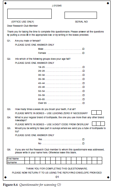
Where data are read by optical scanning, data entry codes can often be completely removed or confined to the margins of the questionnaire. This has the benefit of removing some of the visual clutter from the page, so making it more attractive to the respondent. It also removes any concerns that the responses may be biased by the data entry number codes.
Source: Brace Ian (2018), Questionnaire Design: How to Plan, Structure and Write Survey Material for Effective Market Research, Kogan Page; 4th edition.
20 Aug 2021
20 Aug 2021
20 Aug 2021
20 Aug 2021
20 Aug 2021
20 Aug 2021