Tables and figures, if used effectively, can provide a large amount of data in an informative way, as well as reduce the burden of describing all of this information within the text (though you should not omit key findings from the text just because they are also displayed in tables or figures). In this section, I describe some approaches to presenting meta-analytic results in tables and in figures. I supplement description of each approach I describe by considering the relative frequencies of their use in a recent survey of metaanalyses published from 2000 to 2005 by Borman and Grigg (2009).2
1. Tables
There are two general types of tables used to summarize results of metaanalytic reviews: tables presenting summary information such as mean effect sizes, and tables summarizing coded aspects of the individual studies included in the meta-analysis. The use of both tables is common; in the survey by Borman and Grigg (2009), these tables were included in 74% and 89%, respectively, of published meta-analyses.
1.1. Summary Tables
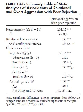
Summary tables can be used to report aggregate information obtained from meta-analytic combination and comparison of multiple studies. This information can include information about the central tendency of effect sizes (e.g., mean, median), the distribution of these effect sizes (range, heterogeneity tests, indices of heterogeneity such as I2), and results of moderator analyses. If your review contains a single meta-analysis (i.e., all studies included in a single meta-analysis), this table will likely be rather narrow, so you should consider if such a table is worth the space beyond summarizing such information in the text. However, if your review includes several meta-analyses (i.e., a series of meta-analyses of separate effect sizes), this table will be wider and contain a wealth of information more concisely summarized than can be done in text. Summary tables are especially useful in these latter situations.
Table 13.1 illustrates one of many ways (and not the only way) you might organize a summary table. Here, I summarize results for the ongoing example meta-analysis used throughout this book involving associations between relational aggression and peer rejection. The first two rows display results of the heterogeneity test and its significance (denoted by asterisks) and the I2 index to quantify the magnitude of heterogeneity. The next two rows display the random-effects mean effect size (with significance level) and confidence intervals around these means. The remaining rows display the results of two moderator analyses: the categorical moderator “reporter” and the continuous moderator age. After reporting the omnibus test (Qbetween) of the categorical moderator, I report the mean associations within each group (type of reporter),3 denoting significant differences between groups with alphabetic subscripts. For the continuous moderator variable (age), I report its signifi-cance (Qregression), followed by the unstandardized regression coefficient and predicted correlations at various meaningful values of the moderator. This table could be expanded in various ways, such as by including additional rows to report the results of more moderator analyses (including comparisons of published vs. unpublished studies to evaluate publication bias), or by adding additional columns to report the results of other meta-analyses (e.g., Card et al., 2008, also reported results involving associations of overt forms of aggression with peer rejection, as well as associations of relational aggression with various other aspects of adjustment).
1.2. Tables of Individual Studies
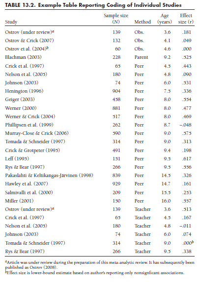
It is very useful—and arguably even necessary—to provide a detailed listing of the values you coded for each of the studies included in your meta-analytic review. This sort of table should report, for each of the studies included in your meta-analytic review, basic citation information for the study (e.g., authors, year), sample size, your coding for all of the study characteristics used in your review (for either descriptive purposes or in moderator analyses), and effect sizes. If you performed any artifact adjustments (see Chapter 6), the artifact information (e.g., reliability estimates, dichotomizations) should also be reported.
The most common order of studies within this type of table is to list studies either alphabetically by author names or else chronologically by year of publication. Although such ordering is useful for readers to find a particular study or to see if any studies were excluded, it is not necessarily the most informative approach (Borman & Grigg, 2009). A preferable way to organize these tables is likely according to some important characteristics of studies, such as by moderator variables found to be important in your metaanalyses.
To illustrate this sort of table, Table 13.2 presents coded details of the studies used in the meta-analysis on relational aggression and peer rejection. Here, I have organized studies first by reporter (one of the moderator variables) and then by age (another moderator variable). You can see that this table contains a row for each study,4 columns for each study characteristic coded, and the coded effect size.
2. Figures
The statement “a picture is worth a thousand words” is a cliche but nevertheless, it is true: Thoughtful use of figures to present meta-analytic results is an efficient way to present a large amount of information, including information about central tendency and variability in effect sizes, moderator effects, publication bias, and potential outlier studies. I next describe three types of figures that you can consider in presenting results of your meta-analysis, considering the type of information that is conveyed in each type of figure.
2.1. Forest Plots
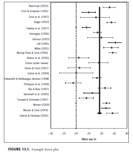
These plots are rarely used in social sciences, though they are common in research syntheses of medical trials (Borman & Grigg, 2009). These plots, such as those illustrated in Figure 13.1, are formed by listing the studies included in the meta-analysis down the left side of the figure. The area to the right of each study displays information about the mean (filled circles) and 95% confidence intervals (horizontal lines) for each study in the metaanalysis. The thick vertical line represents the (weighted) mean of these effect sizes. Although it is not done in every instance, I have also included a vertical (dashed) line to indicate the null result of r = .00 to illustrate which studies yield significant effect sizes.
Forrest plots portray a range of information. First, they present information regarding both the point estimate and uncertainty of effect sizes from every study in your meta-analysis, serving a useful summary function similar to tables of individual studies. Second, the inclusion of the vertical line for the mean effect size makes this information apparent. Third, this plot provides visual information regarding the heterogeneity of studies. Observing that several (more than the approximately 1 in 20 expectable by chance) of the study confidence intervals do not contain the common mean effect size (vertical line) serves as visual evidence of significant heterogeneity, and the range of these study-specific effect sizes around this vertical provides some indication of the variability in these effect sizes. Although not apparent in Figure 13.1, this forest plot would also be useful for detecting studies with extreme effect sizes (far to the left or right of other studies with confidence intervals not approaching the rest of the studies).
The basic forest plot such as the one I have shown in Figure 13.1 can be extended in several ways (see Borman & Grigg, 2009). For instance, the studies could be ordered in some meaningful way rather than alphabetically, such as by a key study characteristic (i.e., moderator). If order is by a categorical moderator, then you might consider adding multiple vertical lines to denote different mean values within moderator groups. The sizes of the circles for study effect sizes could be larger or smaller to denote, for instance, their relative weighting. It would also be possible to change the shapes or other characteristics (e.g., color, if presenting in color) of these study-specific effect sizes to indicate other features, such as values on a second moderator of interest. Finally, you might consider merging the information of a table of individual studies (e.g., sample sizes, coded scores on various moderators) and the forest plot by creating a hybrid table and figure. This would display a tremendous amount of information, though it might be rather large if you have a large (in terms of numbers of studies and coded study characteristics) meta-analysis.
2.2. Stem-and-Leaf Plots
These plots are commonly used and convey considerable information, including information about central tendency, variability, and distributional form (e.g., skewness, modality) of a set of effect size, as well as pointing to potential outlier studies with extreme effect sizes. Stem-and-leaf plots consist of two parts. The “stem” is the vertical array of “bins” of possible effect sizes (e.g., correlations between .70 and .79, between .60 and .69, etc.), and each “leaf” is a single-digit number representing the effect size from a single study. These effect sizes can be either in the original metric (e.g., r, o) or in a transformed metric (e.g., Zr, ln(o)); the original metric is more intuitive for readers, but the transformed metric is more useful for assessing potential skew in the distribution of effect sizes.5 Figure 13.2 presents a stem-and-leaf plot for the 22 studies in the example meta-analysis. The numbers to the left of the vertical line comprise the stem, scaled in intervals of .1 with a range one value higher and one value lower than the most extreme effect sizes found among these 22 studies. To the right of the vertical line are the leaves, with each digit representing a single study. For example, the highest leaf is the value 2 connected to the stem at .6 to represent a study that found a correlation of .62 between relational aggression and peer rejection. The five digits (leaves) connected to the .5 stem denote five studies finding associations between .50 and .59 (specifically, .53, .55, .56, .57, and another .57; note that the leaves are arranged from lowest to highest values moving away from the stem).
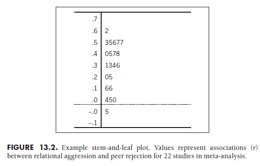
Visual inspection of this figure provides a variety of information. First, the visual spacing of the leaves provides information about the number of studies finding effect sizes of approximate values (e.g., you can see that more studies find correlations in the .50 to .59 range than the .60 to .69 range; note that it is preferable to use a font that is uniform in width for all values so that the size of the rightward-extending bar represents the number of studies on that stem). Second, this sort of plot gives an approximate, though not precise, idea about central tendency. Recalling that the weighted mean r = .37 among these studies, you can see that this is near an approximate “balancing point” of the distribution of these effect sizes (though be aware that visual inspection of the funnel plot does not take into account differential weighting of studies). Third, stem-and-leaf plots visually display the heterogeneity of effect sizes across studies. In this example, there is considerable dispersion among the effect sizes, which is consistent with quantitative findings of significant heterogeneity and a large I2. Fourth, stem-and-leaf plots provide visual information about the distribution of effect sizes. In this example, it appears that the effect sizes are somewhat skewed to have a longer tail toward the lower/negative values. Finally, it can be useful to study stem-and-leaf plots of studies with outlying effect sizes; in this example, no study dramatically departs from the others.
Stem-and-leaf plots are commonly used in reports of meta-analytic findings (about 30% of reports surveyed by Borman & Grigg, 2009). You can also extend the basic stem-and-leaf plot to provide more sophisticated information. For example, it is possible to provide multiple sets of leaves to represent studies with different study characteristics (i.e., different values of categorical moderators). By orienting these multiple sets of leaves side by side, scaled along a common vertical axis (i.e., stem), readers can gain an appreciation for the differences in central tendency, variability, distributional form, and possible outlier studies within each group of studies.
2.3. Funnel Plots
As seen in Chapter 11, funnel plots are a way of graphically evaluating potential publication bias (or other biases leading to censoring of nonsignificant results). As you recall, these plots are scatterplots of the studies in your metaanalysis, with one axis representing some function of sample sizes (or standard errors) and the other representing effect sizes. Because I described these plots in Chapter 11, I will not discuss them here.
The main purpose of funnel plots is to identify potential publication bias. However, these plots also display information about the mean effect size (which can be shown as a line through the scatterplot) and about heterogeneity (i.e., the width of the funnel). According to the survey of published metaanalyses by Borman and Grigg (2009), these plots are modestly frequently used (12.5% of meta-analyses considered). My own impression is that the value of funnel plots is primarily in terms of detecting publication bias. For other information (e.g., mean effect sizes, heterogeneity), other figures are more effective or as effective while using less space.
2.4. Other Figures
My consideration of forest plots, stem-and-leaf plots, and funnel plots only touches on the many options available. These other options include schematic plots (a.k.a. box-and-whisker plots, which provide clear information about means, heterogeneity, and outliers); normal quantile plots (which are useful in evaluating publication bias); and radial plots (which are fairly technical plots of studies’ mean effect sizes and precisions) described by Borman and Grigg (2009). This variety of potential graphical displays is valuable in providing a wide range of tools for presenting the results of your meta-analysis. When choosing a method of displaying your results, however, you should always keep in mind what information is most important to convey.
Source: Card Noel A. (2015), Applied Meta-Analysis for Social Science Research, The Guilford Press; Annotated edition.
25 Aug 2021
25 Aug 2021
24 Aug 2021
25 Aug 2021
24 Aug 2021
24 Aug 2021