A scatterplot is a plot or graph of two variables that shows how the score for an individual on one variable associates with his or her score on the other variable. If the correlation is high positive, the plotted points will be close to a straight line (the linear regression line) from the lower left corner of the plot to the upper right. The linear regression line will slope downward from the upper left to the lower right if the correlation is high negative. For correlations near zero, the regression line will be flat with many points far from the line, and the points form a pattern more like a circle or random blob than a line or oval.
Doing a scatterplot with this program is somewhat cumbersome, as you will see, but it provides a visual picture of the correlation. Each dot or circle on the plot represents a particular individual’s score on the two variables, with one variable being represented on the X axis and the other on the Y axis. The plot also allows you to see if there are bivariate outliers (circles/dots that are far from the regression line, indicating that the way that person’s score on one variable relates to his/her score on the other is different from the way the two variables are related for most of the other participants), and it may show that a better fitting line would be a curve rather than a straight line. In this case the assumption of a linear relationship is violated and a Pearson correlation would not be the best choice.
- What are the scatterplots and linear regression line for (a) math achievement and grades in h.s. and for (b) math achievement and mosaic pattern score?
To develop a scatterplot of math achievement and grades, follow these commands:
- Graphs → Legacy Dialogs → Scatter/Dot. This will give you Fig. 8.1.
- Click on Simple Scatter.

Fig. 8.1. Scatterplot.
- Click on Define, which will bring you to Fig. 8.2.
- Now, move math achievement to the Y Axis and grades in h.s. to the X Axis. Note: the presumed outcome or dependent variable goes on the Y axis. However, for the correlation itself there is no distinction between the independent and dependent variable.
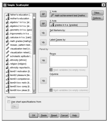
Fig. 8.2. Simple scatterplot
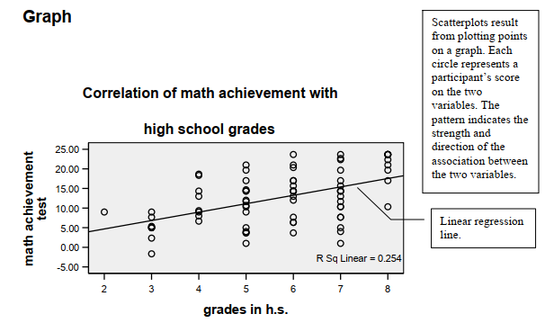
- Next, click on Titles (in Fig. 8.2). Type Correlation of math achievement with high school grades (see Fig. 8.3). Note we put the title on two lines.
- Click on Continue, then on You will get Output 8.1a, the scatterplot. You will not print this now because we want to add the regression line first in order to get a better sense of the relationship and how much scatter or deviation there is.
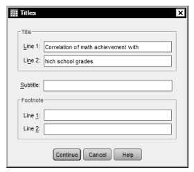
Fig. 8.3. Titles.
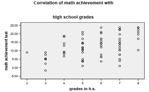
Output 8.1a: Scatterplot Without Regression Line
GRAPH
/SCATTERPLOT(BIVAR)=grades WITH mathach
/MISSING=LISTWISE
/TITLE= ‘Correlation of math achievement with’ ‘high school grades’.
- Double click on the scatterplot in Output 8.1a. The Chart Editor (Fig. 8.4) will appear.
- Click on a circle in the scatterplot in the Chart Editor; all the circles will be highlighted in yellow.
- Click on the button circled in Fig. 8.4 to create a Fit Line. The Properties window (see Fig. 8.5) will appear as well as a blue fit line in the Chart Editor.
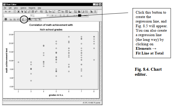
- Be sure that Linear is checked (see Fig. 8.5).
- Click on Close in the Properties window and click File ^ Close to close the Chart Editor in order to return to the Output window (Output 8.1b).
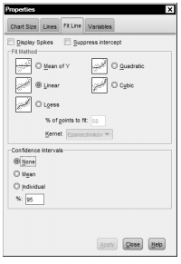
Fig. 8.5. Properties.
- Now add a new scatterplot to Output 8.1b by doing the same steps that you used for Problem 8.1a for a new pair of variables: math achievement (Y-Axis) with mosaic (X- Axis).
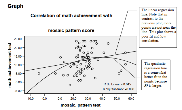
- Don’t forget to click on Titles and change the second line before you run the scatterplot so that the title reads: Correlation of math achievement with (1st line) mosaic pattern score (2nd line).
- Then add the linear regression line as you did earlier using Figs. 8.4 and 8.5.
- Now, double click once more on the chart you just created. We want to add a quadratic regression line. The Chart Editor (similar to Fig. 8.4) should appear.
- Again, click on the button circled in Fig. 8.4 to bring up the Properties
- In the Properties window (Fig. 8.5), click on Quadratic instead of
- Click Apply and then Close. You will see that a curved line was added to the second scatterplot in Output 8.1b below.
Do your scatterplots look like the ones in Output 8.1b?
Output 8.1b: Three Scatterplots With Regression Lines
GRAPH
/SCATTERPLOT(BIVAR)=grades WITH mathach
/MISSING=LISTWISE
/TITLE= ‘Correlation of math achievement with’ ‘high school grades’.
Interpretation of Output 8.1b
Both scatterplots shown in Output 8.1b show the best fit of a straight or linear regression line (i.e., it minimizes the squared differences between the points and the line). Note that for the first scatterplot (grades in h.s.), the points fit the line pretty well; r2 = .25 and thus r is .50. The second scatterplot shows that mosaic and math achievement are only weakly correlated; the points do not fit the line very well, r2 = .05, and r is .21. Note that in the second scatterplot we asked the program to fit a quadratic (one bend) curve as well as a linear line. It seems to fit the points better; r2 = .10. If so, the linear assumption would be violated and a Pearson correlation may not be the most appropriate statistic.
Source: Morgan George A, Leech Nancy L., Gloeckner Gene W., Barrett Karen C.
(2012), IBM SPSS for Introductory Statistics: Use and Interpretation, Routledge; 5th edition; download Datasets and Materials.
15 Sep 2022
28 Mar 2023
31 Mar 2023
15 Sep 2022
20 Sep 2022
30 Mar 2023