As mentioned earlier, the logistic regression influence and diagnostic statistics obtained by predict refer not to individual observations, as do the OLS regression diagnostics of Chapter 7. Rather, logistic diagnostics refer to x patterns. In the space shuttle data, however, each x pattern is unique — no two flights share the same combination of date and temp (naturally, because no two were launched the same day). Before using predict, we quietly refit the recent model:
. quietly logistic any date temp . predict Phat3
. label variable Phat3 “Predicted probability”
. predict dX2, dx2
. label variable dX2 “Change in Pearson chi-squared”
. predict dB, dbeta . label variable dB “Influence”
. predict dD, ddeviance
. label variable dD “Change in deviance”
Hosmer and Lemeshow (2000) suggest plots that help in reading these diagnostics. To graph change in Pearson %2 versus probability of distress (Figure 9.4), type:

Two poorly fit x patterns, at upper right and left in Figure 9.4, stand out. We can visually identify the flights with high dX2 values by adding marker labels (flight numbers, in this case) to the scatterplot. In Figure 9.5, only those flights with dX2 > 2 have been labeled by adding a second overlaid scatterplot. (If we had instead labeled all of the data points, the bottom of the graph would become an unreadable mess.)
. graph twoway scatter dX2 Phat3
|| scatter dX2 Phat3 if dX2 > 2, mlabel(flight) mlabsize(medsmall)
|| , legend(off)

Flight STS 51-A experienced no thermal distress, despite a late launch date and cool temperature (see Figure 9.2). The model predicts a .84 probability of distress for this flight. All points along the up-to-right curve in Figure 9.5 experienced no thermal distress (any = 0). Atop the up-to-left (any = 1) curve, flight STS-2 experienced thermal distress despite being one of the earliest flights, and launched in slightly milder weather. The model predicts only a .109 probability of distress. Because Stata views missing values as large numbers, it lists the two missing-values flights, including Challenger, among those with dX2 > 2.
Similar findings result from plotting dD versus predicted probability, as seen in Figure 9.6. Again, flights STS-2 (top left) and STS 51-A (top right) stand out as poorly fit. Figure 9.6 illustrates a variation on the labeled-marker scatterplot. Instead of putting the flight-number labels near the markers, as done in Figure 9.5 above, we make the markers themselves invisible, msymbol(i), and place labels where the markers would have been, mlabposition(O), for every data point in Figure 9.6.

dB measures an x pattern’s influence in logistic regression. Figure 9.7 has the same design as Figure 9.6, but with marker symbols proportional to influence. The two worst-fit observations are also the most influential.
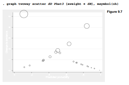
Poorly fit and influential observations deserve special attention because they both contradict the main pattern of the data and pull model estimates in their contrary direction. Of course, simply removing such outliers allows a better fit with the remaining data, but this is circular reasoning. A more thoughtful reaction would be to investigate what makes the outliers unusual. Why did shuttle flight STS-2, but not STS 51-A, experience booster joint damage? Seeking an answer might lead investigators to previously overlooked variables.
Source: Hamilton Lawrence C. (2012), Statistics with STATA: Version 12, Cengage Learning; 8th edition.
28 Sep 2022
30 Sep 2022
3 Oct 2022
23 Sep 2022
23 Sep 2022
28 Sep 2022