Confirmation is concerned with determining whether a price trend is continuing or coming to an end. One group of indicators uses measures based upon the movement of price itself to confirm the trend. Generally, these indicators are based on the concept of momentum.
1. What Is Momentum?
Momentum deals with the rate at which prices are changing. For example, in an uptrend, prices are rising and the trend line slopes upward. Momentum measures how quickly the prices are rising or how steeply the trend line is sloping. In high school calculus, you probably learned that the slope of a line is called the first derivative and that the change in that slope is called the second derivative. Momentum is, thus, the second derivative of price action over some period.
Momentum is similar to acceleration and deceleration. For example, let us assume that a car is initially traveling at a constant speed of 30 miles per hour; at this point, the car has a constant travel slope of 30. When the car starts accelerating, it is gaining momentum, and its travel slope is increasing. At some point, the car cannot maintain the level of acceleration, and the rate of increase in speed begins to decline. The car is then said to be decelerating, even though it is still traveling at an increasing rate of speed. The speed itself is not increasing as fast as earlier, so momentum is falling.
The same principle applies to markets. Speed is equivalent to the slope of the price trend—the number of points gained per day, for instance. Momentum is equivalent to the car’s acceleration and deceleration and is the measure of the price trend’s changing slope. Trend can be thought of as direction and momentum can be thought of as the rate of speed of the price change. For example, suppose that a stock is originally selling for $25 a share. If the same stock is selling for $30 a share five days later, then the stock price has increased by $5 in five days. The momentum would be $5 in five days (or $1 per day). If, over the next five days, the price continues to increase to $34, the trend is still upward. However, the rate of change (or momentum) has slowed to $4 in five days. A peak in momentum, therefore, is not equivalent to a peak in price. It leads a peak and is thus useful as a warning of a possible peak in the immediate future.
Technical analysts have developed many indicators to measure momentum, and these measures have become leading signal generators or confirmation gauges, telling us whether the trend slope is changing. When momentum is confirming the price trend, a convergence or confirmation occurs; when momentum is failing to confirm the price trend slope by giving a warning signal, a divergence occurs. As a sign of price trend change then, the technical analyst often looks for a divergence.
Confirmation also is used to identify overbought and oversold conditions. Remember that prices never follow a trend in an absolute straight line. Prices oscillate about a central trend, deviating above and below the trend. When prices are considerably above the trend, the expectation is that prices will return down to the central trend and perhaps even fall below the trend line. When prices are noticeably above the central trend, an overbought condition exists. When prices are considerably below the trend, they are to be oversold and are likely to return up to the central trend and, perhaps, above.
Analysts have developed many types of oscillators to measure what is overbought and oversold. These oscillators usually are based on price but can also be based on volume or other data. Mathematically, these oscillators eliminate the trend and look only at the oscillations about the trend.
Suppose that you are watching a particular stock and notice a breakout occurring. An oscillator can be useful in determining the validity of the breakout. If an oscillator is oversold, this breakout is more likely to be valid than if the oscillator were overbought. However, in some instances, buy signals are generated from an overbought oscillator accompanied by other indicators (as we will see with the popsteckle later in this chapter).
A word of warning about using oscillators, however, is warranted. Traders often incorrectly use oscillators to generate signals without respect for the underlying trend direction. This will result in many false signals. Remember, profits are made from anticipating and riding the trend. Indicators and oscillators should only be used as secondary evidence to confirm the trend; otherwise, the analyst is likely in for trouble.
To combat the tendency to focus on overbought/oversold signals while ignoring the underlying trend, analysts have developed a number of adjustments and filters to account for trend more mechanically. Adjustments include altering the oscillator parameters, such as the period over which the oscillator is calculated and the signal levels. Other adjustments are even more sophisticated, using digital filters or other mathematical means of filtering and smoothing. The bottom line, however, is that by and large the results are the same. In fact, some analysts argue that increasing the complexity of the calculations only produces a false confidence. They also argue that complexity breeds an increase in the possibility for error when one of the parameters changes and does not allow the analyst the opportunity to gain practical experience. The indicator or oscillator becomes too mechanical. Whatever the arguments, however, even in their simplest forms, indicators and oscillators are useful as confirmation of price behavior, once the quirks are understood and the dependence upon them is secondary.
2. How Successful Are Momentum Indicators?
Momentum indicators are based on price information. Most academic studies of technical indicators attempt to demonstrate whether price action is random and, if not, whether this apparent nonrandomness violates some of the principles of the Efficient Markets Hypothesis. As such, these studies are usually of little use to practicing technical analysts who introduce many more variables into trading or investment decisions.
It is difficult for academics to construct tests that take into account all the intricacies of real trading. When studying moving averages, for example, how would the requirement for protective stops around support and resistance be integrated? What kind of exit strategy should be used?
The trader must account for risk, as well as return, when considering the usefulness of an indicator. The academic concept of risk is considerably different from that which the practical investor must consider. Therefore, as we will see in Chapter 22, “System Design and Testing,” when we look at testing methods, the measurements of risk provided in academic studies are not the same measures that a practitioner would use.
Finally, we will note that any method tested by academia has likely already been discarded by the technical analysis world as outdated. By its nature, academia will always be behind the advances made in the more practical world. Nevertheless, academic studies are useful in determining the direction in which to look for means of profiting from technical analysis. For example, if a particular indicator shows no advantage over the random hypothesis, it should be treated with considerably more skepticism than one that does show some statistically relevant results.
Most academic studies of price indicators, so far, have focused exclusively on moving averages. Interestingly, there have been few studies of standard technical indicators. The two most recent studies of indicators are Bauer and Dahlquist (1999a, 1999b) and Thomas (2003). The Bauer and Dahlquist study covered 60 technical signals, including popular oscillators, for 878 stocks over the period from 1985 through 1996, a period of generally rising stock prices. The Thomas study included price and volume oscillators for 1,750 stocks over the five-year period from 1995 through July 2001, a time during which the stock market had a significant advance and decline.
3. Specific Indexes and Oscillators
Remember that because momentum indexes and oscillators are based on price data, they do not add new information to the analysis. They are simply manipulations of the same data. This means that they are less informative than other indicators, such as volume, that provide new and different information. The analyst, therefore, must be careful when using price indicators because confirmation may be more redundant than informative. This is not to say that a different manipulation of the data cannot be helpful, only that the base data itself is the same. For example, watching several price oscillators calculated over the same period is silly because by their nature, they will be providing roughly the same results. Watching several price oscillators over different periods or including volume or some other different information would be more productive.
We describe the most common price momentum oscillators next. There are many ways of calculating momentum, but because all of them arrive at essentially the same result, we describe only the most common and most popular.
4. Moving Average Convergence-Divergence (MACD)
Gerald Appel, publisher of Systems and Forecasts, developed the Moving Average Convergence/Divergence (MACD) oscillator. A variation of the moving average crossover, the MACD is calculated using the difference between two exponential moving averages. Traditionally, a 26-period EMA is subtracted from a 12-period EMA, but these times are adjustable for shorter and longer period analysis. This calculation results in a value that oscillates above and below zero. A positive MACD indicates that the average price during the past 12 periods exceeds the average price over the past 26 periods.
The MACD line is plotted at the bottom of a price chart along with another line—the signal line. The signal line is an exponential moving average of the MACD; a nine-period EMA is the most common. A histogram of the difference between the MACD and the signal line often appears at the bottom of the chart. You can see this type of plot in Figure 18.14. The chart displays the MACD (thin black line), the signal line (thick gray line), and the histogram of the difference between the MACD and its signal line for Apple Computer over the same period as the other charts in this chapter.
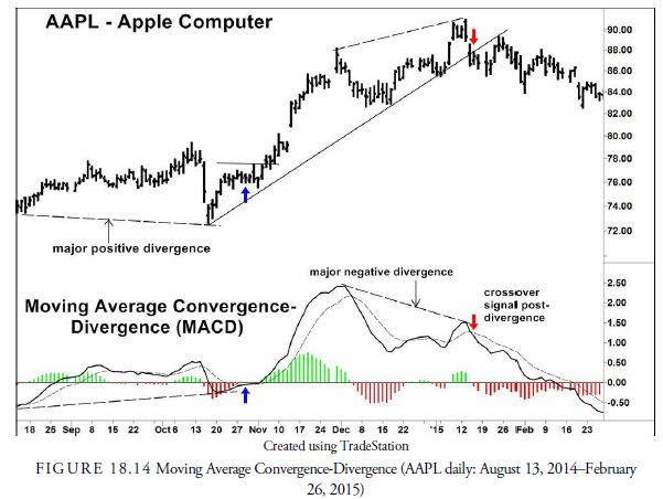
The MACD is useful in a trending market because it is unbounded. Crude signals occur when the MACD crosses the zero line, but these are just the same signals as would be generated from a moving average crossover. Other information can be gleaned from the MACD, however. For example, when the MACD is above zero, suggesting an upward trend, buy signals occur when the MACD crosses from below to above the signal line. Downward crossings are not at all reliable while the trend is upward. Through experimentation to determine overbought and oversold levels, analysts can use these levels as places to generate signals for price reversion to the central trend. These extremes showed good performance results in the Thomas study of oscillators.
Additionally, some analysts compare the peaks and valleys in the MACD with the price line in a divergence analysis. Bauer and Dahlquist suggest that divergences can be useful, especially in a downward trending market. The peaks and valleys in the histogram provide two useful sets of information. They can be used for divergence analysis, and because they are sensitive to price directional change over short periods, they can also be used to signal shorter price trend changes within the longer trend.
Let us look a little more closely at Figure 18.14. The first observation is the two major divergences between the AAPL price and the MACD. Beginning on the left of the chart through mid-October, the price oscillated with only a slight upward trend and then collapsed to a lower low. Meanwhile, the MACD also advanced, but at the time of the collapse, the MACD failed to break below its previous low. This constituted a positive divergence and a warning of an upcoming advance. When the MACD (solid line) crossed above its signal line (dashed line), a buy signal was generated. Four days later the price closed above resistance, and the upward trend began. In early January another divergence occurred—this time a negative one where the price reached a new high but the MACD did not. This was a warning of a price decline that was triggered when the MACD crossed below its signal line. The crossover and close below the trend line were coincident, and the price began its decline. Notice the many times that the MACD crosses its signal line. These crossovers usually produce whipsaws unless other evidence supports their signals. This action is thus similar to our earlier discussion about moving average crossovers and how a filter of some nature is necessary to reduce the false crossovers.
5. Rate of Change (ROC)
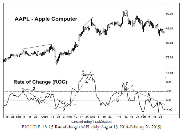
Rate of change (ROC) is the simplest of all oscillators. It is a measure of the amount a security’s price has changed over a given number (N) of past periods. The formula for calculating ROC is as follows:
ROC = {(Ptoday — PN periods ago) / PN periods ago} x 100
With this calculation, ROC is zero if the price today is the same as it was N periods ago. It shows on a continuous basis how the current price relates to the past price.
It is simple to calculate, but the ROC has many problems as an indicator. Although economists often calculate ROC using macroeconomic data, usually on an annual basis to minimize seasonality, it suffers from the drop-off effect. Only two prices, Ptoday and Pn periods ago, appear in the calculation, and these two prices are equally weighted. Therefore, the older price that occurred N periods ago has the same effect on the oscillator as the current, more relevant, price. The ROC can, thus, have a current rise or fall based solely on what number drops off in the past. Some analysts will smooth the ROC with a moving average to dampen this effect.
Analysts use the ROC in the standard four ways. Its position relative to zero can indicate the underlying trend; it can be a divergence oscillator showing when the momentum relative to the past is changing; it can be an overbought/oversold indicator; and it can generate a signal when it crosses over its zero line.
Figure 18.15 shows a graphical representation of a 14-day ROC for Apple Computer. The following observations are marked with numbers: 1) downward sloping trend line upward break, 2) negative divergence, 3) small symmetrical triangle upward break, 4) upward trend line downward break, 5) negative divergence, 6) upward trend line downward break, 7) negative divergence, and 8) downward trend line no breaks yet. We didn’t include the signals of moving out from overbought or oversold. Most of these signals proved worthwhile when confirmed by price action.
6. Relative Strength Index (RSI)
In June 1978, J. Welles Wilder introduced the relative strength index (RSI) in an article in Commodities (now known as Futures) magazine. The RSI measures the strength of an issue against its history of price change by comparing “up” days to “down” days. Wilder based his index on the assumption that overbought levels generally occur after the market has advanced for a disproportionate number of days, and that oversold levels generally follow a significant number of declining days.
Be careful to understand that the RSI measures a security’s strength relative to its own price history, not to that of the market in general. Because of its name, a common misconception is that this indicator compares one security with other securities.
To construct the RSI, several calculations must be made, as follows:
UPS = (Sum of gains over N periods) / N
DOWNS = (Sum of losses over N periods) / N
RS = UPS / DOWNS
RSI = 100 – [100 / (1 + RS)]
The RSI can range from a low of 0 (indicating no up days) to a high of 100. In his original calculations, Wilder used 14 days as the relevant period. Although some analysts have attempted to use a time-weighted period, these methods have not been well accepted, and the 14-day period remains the most commonly used.
After calculating the RSI for the first 14 days, Wilder used a smoothing method to calculate RSI for future days. This process dampens the oscillations. For day 15 and after
![]()
![]()
These measures for UPS and DOWNS are used to calculate RS and RSI. This method of smoothing the averages is now called the “Wilder exponential moving average” and is used in many other indicator formulas. We saw, for example, in the section on volume oscillators earlier in this chapter that the Money Flow oscillator uses the RSI formula.
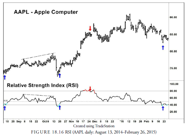
The RSI has many characteristics that can generate signals. For example, when the RSI is above 50, the midpoint of the bounded range, the underlying trend in prices is usually upward. Conversely, it is downward when the RSI is below 50.
Overbought and oversold warnings are the same as with many other indicators. Wilder considered, for example, an RSI above 70 to indicate an overbought situation and an RSI below 30 to indicate an oversold condition. Analysts will often adjust these levels based on the underlying trend. Chuck LeBeau, for example, uses 75 and 25 as the overbought and oversold extremes, and Brown (1999) uses 90 and 40 in an upward trend and 60 and 10 in a downward trend. She calls these new levels trend IDs. Because the trend in Figure 18.15 is upward, we have drawn, in addition to the conventional overbought and oversold levels, the trend ID of 80 and 40. This gives us an oversold buy signal in August and in mid-October that would not have been available using the conventional method.
Similar to other oscillators, RSI divergences with price often give warning of trend reversal. The RSI also appears to have patterns similar to price charts. Triangles, pennants, flags, and even head-and-shoulders patterns occur, and support and resistance levels become signal levels. The rules for breakouts from these formations are used for signals from the RSI.
Another method of signaling is failure swings. A failure swing occurs when the oscillator exceeds an overbought or oversold level, corrects, reverses back toward the overbought or oversold, doesn’t reach it, and then turns back beyond the correction. The oversold in August and in February are almost failure swings except the second swing in both cases did reach oversold. Nevertheless, they should be treated as a failure swing signal. Another short-term trading method using the RSI is to place a buy stop above the daily high when the RSI declines 10 points from a recent peak above 70. This should only be used when the trend is upward and never when a downward failure swing develops. The buy stop can be adjusted each day until either it is triggered for a day or two trade or the RSI continues to decline, suggesting that the trend is reversing downward.
There is also the method called the “RSI is wrong.” In Figure 18.16, the RSI remains above or near the overbought level for a substantial period from early November onward, during which the AAPL price continued to rise. This method suggests that rather than looking for a top when the overbought level is penetrated, it would be better to buy the issue and use a sell stop. Active Trader Magazine (August 2004, p. 64-65) tested an “RSI is wrong” system, not optimized, on 19 futures from 1994 through 2003 with the following rules: buy when 14-day RSI penetrates above 75; sell when RSI penetrates 25 or after 20 days. The opposite rules apply for sells using a break below the RSI 25 level as the initial short sale. The results showed a steady, straight equity curve especially for long positions.
Thomas (2003), in his testing of the RSI, found that none of the conventional signals had value except the positioning opposite from the conventional overbought/oversold levels of 70 and 30. His testing showed promise for the “RSI is wrong” thesis. Bauer and Dahlquist found that the conventional use, called a “crossover” system, of selling on a break below the overbought 70 and buying on a break above the oversold 30 had marginal returns during the period tested. They also found that using peaks above 70 and below 30 had marginal returns, and that the opposite buying at peaks outperformed all signals. Their testing method, however, judged against the percentage of time in a position and did not account for the reduction in risk when in cash. Nevertheless, the results were “disappointing.”
As the many warnings and signals that occur in Figure 18.16 suggest, the RSI cannot be interpreted mechanically and is, perhaps, why it does not test well. However, the action is informative and useful to many traders. In a survey of traders taken in 2002 (Charlton and Earl), the most popular indicator was the RSI. In short, traders have developed many methods. If you want to use the RSI as a confirming indicator, you must learn these methods, experiment with them, and always be sure of the underlying price trend.
7. Stochastic Oscillator
All oscillators use a specific time over which they are calculated. The traditional periods for the MACD are 26 and 12 bars; the RSI traditionally uses 14 bars for its calculation. These oscillators depend on smoothing techniques that tend to dampen the most recent price action. The stochastic takes another tack. It looks at the most recent close price as a percentage of the price range (high to low) over a specified past “window” of time. This makes it sensitive to recent action. Analysts use the stochastic for trading or investing when the most recent close is the most important price.
It is not absolutely clear who was the inventor of stochastics. George Lane is known for promoting the concept since 1954 (Lane, 1985), and the concept is sometimes referred to as Lane’s Stochastic (Colby, 2003), but others apparently preceded him. Two names mentioned are Ralph Dystant and a dentist friend of his and Richard Redmont. Dystant introduced the indicator as part of an Elliott wave course through his Investment Educators, and Lane, who lectured for that firm, took it over on Dystant’s death in 1978.
Not only is the inventor of stochastics unknown, the origin of the term stochastics is not clear. The name of this oscillator has nothing to do with the scientific term stochastic, which means random or nondeterministic. Of course, traders would hope that this indicator did not produce random results. So, how did the name stochastic become associated with this indicator? According to Gibbons Burke (www.io.com/gibbonsb/trading/stochastic.html), Tim Slater, founder and president of CompuTrac, Inc., included this indicator in the company’s software analysis program in 1978. He needed a name to attach to the indicator other than the %K and %D we will see in the indicator calculation. Slater saw a notation of “stochastic process” handwritten on the original Investment Educators literature he was using. The name stuck. Regardless of who the actual inventor might be or how it got its name, the stochastic oscillator is one of the most popular, both for long- and short-term momentum signals.
The formula for the stochastic is as follows:

Where:
W is the time window (that is, 14 bars)
H is the high for the window period (w)
L is the low for the window period (w)
C is the most recent bar close (w)
The “fast” stochastic, as seen in most trading software, refers to the raw stochastic number (%K) compared with a three-period simple moving average of that number (fast %D). This number is extremely sensitive to price changes. Because of the erratic volatility of the fast %D, many false signals occur with rapidly fluctuating prices. To combat this problem, analysts have created the “slow” stochastic. The slow stochastic is designed to smooth the original %D again with a three-period simple moving average. In other words, the slow stochastic is a doubly smoothed moving average, or a moving average of the moving average of %K.
Analysts often create their own variations of the stochastics formula. Lane, for example, smoothed the numerator separately from the denominator in the %K formula and then divided each rather than smoothing the %K itself (Merrill, 1986). He also used only five days in the time window.
The question of how many periods to use in the window is problematic. The volatility and cyclical nature of the issue traded, as well as the tendency for these factors to vary, are integral to choosing a window period. Larry Williams uses a composite of different time window periods and the True Range rather than the high and low for his “Ultimate Oscillator.” Others adjust the window period, as well as the number of bars used in smoothing the %K based on their interpretation of the dominant cycle in prices. Many analysts just test the results of signals over different windows to see which works best.
As in most oscillators, the stochastic works better in a trading range market but can still give valuable information in a trending market. In a trending market, divergences, trend line breaks, and swing failures generate signals. During trading ranges, crossovers and swing failures generate signals when the stochastic reaches overbought or oversold, traditionally 80 and 20. Crossovers occur when the fast stochastic crosses over the slow stochastic. Following crossovers without other confirming evidence, however, can cause whipsaws.
As in the RSI and many other oscillators, chart patterns, such as triangles and pennants, can also evolve in the stochastic oscillator. Support and resistance levels, even without swing failures, can be useful signals or warnings, and trend lines often appear to warn of potential changes in momentum. All standard technical rules apply to oscillators. However, oscillators by themselves should never be used strictly for signals. The analyst must confirm any oscillator signal with price action—a breakout or a pattern.
Academic testing of standard stochastic signals has had the same mediocre results as with other oscillators. This is not surprising, of course, because the determination of trend or trading range is rarely included in academic studies. Indeed, the fact that some positive results have occurred is encouraging, considering the primitive definitions of signals and circumstances used. Thomas (2003) found that extreme levels of overbought and oversold were somewhat predictive of future price direction but that most standard overbought/oversold interpretations failed. Bauer and Dahlquist (1999a) found that acting at peaks and troughs above and below overbought and oversold respectively had better results on the long side than the short side. Unfortunately, trend was not a consideration in the testing, and the period tested (1985-1996) was one of a historically large upward trend when short signals would be expected to fail. Thus, the positive results for long signals were encouraging, considering that the signals had to keep up with the values in a generally rising market.
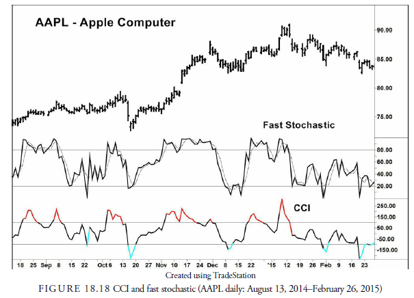
Figure 18.17 shows a 14-3-3 slow stochastic. This means that a 14-day time window was used; %D was smoothed once using a 3-day SMA and again using another 3-day SMA. Confirmed signals are shown on the price chart, and stochastic overbought/oversold and failure swing signals are shown on the stochastic chart.

AAPL is in a trending mode during the period considered but swinging in wide swings. In this case, the use of overbought and oversold levels is fruitful. Each time a buy or sell signal occurs from breaking toward the midpoint from oversold or overbought, an exit and reentry signal is given at the opposite extreme. This is not always the case. In a strong upward trend as developed during the later months of the period in Figure 18.17, the oscillator did not return to oversold. Thus, overbought breakdown sell signals in a rising trend must be suspect. They can signal the time to get out of a long trade, but they do not necessarily signal the time to enter a short trade.
In addition to the overbought/oversold signals, three failure swings occurred in late November, late December, and late January. The downward signal in late November was timely, as was the upward failure swing signal in December. The January sell signal was less profitable.
Finally, we see that before the declines in late October and early January, negative divergences developed at the peaks when the stochastic failed to confirm the new price highs.
8. Other Oscillators, Similar to the Stochastics
Some analysts use oscillators that are similar to the stochastic oscillator. In particular, the Williams %R and the Commodity Channel Index are comparable indicators.
8.1. Williams %R
The Williams %R oscillator is almost identical to the stochastic. It can be thought of as an inverted stochastic. Instead of comparing the current close with the low that occurred during the time window, the Williams %R compares the current close with the high that occurred during the time window. Thus, the formula for the Williams %R is as follows:
%R = [(H – C) / (H – L)] x 100
The Williams %R tells whether a stock is at a relatively high point in its trading range, whereas the stochastic indicates whether a stock is at a relatively low point in its trading range.
Commodity Channel Index (CCI)
The Commodity Channel Index (CCI) is also similar to the stochastic. Donald Lambert developed this indicator, describing it in the October 1980 issue of Commodities (now known as Futures) magazine. Do not be fooled by the name of the indicator; it can be used in any market, not just commodity markets. The CCI measures the deviations of a security’s price from a moving average. This gives a slightly different picture than the stochastic, and in some cases, the signals are more reliable. However, the difference between the CCI and the stochastic is so miniscule that using both would be a duplication of effort and liable to create false confidence. Figure 18.18 shows how similar the CCI and the stochastic are.
The CCI is not bounded—that is, it can rise above +100 and fall below -100—as is the stochastic, and this bothers some analysts. To avoid this problem, some analysts use a stochastic calculation on the CCI, bounding the CCI to 0 to 100 and smoothing the CCI at the same time. Barbara Star reports in Active Trader Magazine (2004) that in trending markets, this bounded, smoothed CCI is often useful for entries in the trend direction, but not in a countertrend direction, and in trading markets, it often gives overbought and oversold signals.
8.2. Similarities Between Oscillators
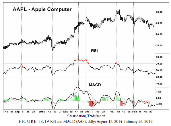
Figure 18.19 shows a standard 14-day RSI compared with a 3-day to 10-day MACD. See how the two lines follow almost identical paths. It is, thus, redundant and nonproductive to use many oscillators that essentially tell the same story. This is why most analysts prefer to use just one, or perhaps two, oscillators and learn their complexities and intricacies well rather than depend on mechanical signals from many.
9. Combinations—Determining Trend and Trading Range: The ADX
In Chapter 14, “Moving Averages,” we discussed trends, moving averages, and especially the use of the ADX and its component parts, the DMI+ and DMI-. We found that moving averages were only profitable in trending markets, just as we have found in this chapter that oscillators are more profitable in trading markets. The problem, then, is to be able to determine whether a particular market is trending or trading. Usually markets rotate from one to the other, but the signals generated by moving averages and indicators are not always quick to decipher the change. Because most profits come from trending markets, analysts focus on moving averages and oscillators to determine when a trend is beginning; the sooner they recognize the trend, the better.
The most common solution is the use of Wilder’s ADX. Because it is smoothed through averaging, the ADX is a lagging indicator. However, its peaks and troughs give us important information. A peak in the ADX almost invariably occurs at a trend peak up or down. It is thus useful as an indicator to close a position established during the trend. A trough in the ADX occurs when a trend has begun and is beginning to accelerate. The period between a trough and a peak is a period of generally trending prices, and a period between a peak and a trough is a period of decelerating trend that can either be trending roughly with small oscillations or be trading in a range. In Figure 18.20, the up arrows in the ADX chart denote peaks. They are extended up to the AAPL price chart to show how they occurred at each peak in prices, thus making them possible sell points. They work equally well pinpointing price troughs during a downward trend. The downward-pointing arrows in the ADX chart at ADX troughs. You can see in the price chart directly above each down arrow how the trend accelerates, upward or downward, once an ADX trough is formed. These are excellent entry points for several reasons: first, by the time of the trough, you know the trend direction and how to play it, and second, you know that once a trough has occurred, a peak must follow at some time that will tell you when to close the position.

Some analysts place importance on the level of the ADX rather than its trend, believing that they are constant across all securities. For example, an advancing ADX above 45 suggests the price will top soon. We know that is likely, but 45 is not a magic number. In Figure 18.20, for example, two of the three price peaks occurred when the ADX was below 45. However, it seems to be true that very low levels of ADX are periods of no trend and a high possibility of whipsaws. Indeed, we have seen trading models where a low ADX, determined through testing, is a time to stop trading entirely until the ADX begins to advance.
When developing trading systems, use of the ADX is helpful in switching between trending formulas and trading-range formulas. It defines the internal strength of direction and thus what formulas should be put into play.
Analysts have developed numerous methods of utilizing the ADX with oscillators and moving averages. Let us look at two of them: David Steckler’s popsteckle and Linda Raschke’s Holy Grail.
9.1. Popsteckle
In a 2000 article, appearing in Stocks and Commodities, David Steckler described a method of identifying stocks that are ready to “pop” upward using all three indicators. The name “popsteckle” is a contraction of “pop” and “Steckler,” but Jake Bernstein (1993) is the originator of the method. Steckler’s setup rules are as follows:
- Recent price action shows low volatility (dull action).
- 14-day ADX is below 20 (no trend).
- Eight-day stochastic %K is greater than the day before and above 70 (upward trend beginning).
- Eight-week stochastic %K is greater than the week before and above 50 (upward longer trend beginning).
- Bullish market conditions exist (could be determined by market price above long-term moving average).
- Stock breaks upward out of congestion on volume 50% above its 50-day simple moving average.
The popsteckle method monitors a low-volatility stock in a horizontal trading range for signs of positive trending action as displayed by changes in the various stochastics. No history of back testing this method is available, but the logic of the variables and indicators is consistent.
9.2. Holy Grail
Unlike the popsteckle, which looks for the beginning of a new trend, Linda Raschke’s Holy Grail method takes advantage of an existing trend and uses the ADX in combination with a moving average. First, a 14-day ADX must be above 30 to indicate an existing trend. The primary trend is displayed by a 20-period EMA. An initial downturn in the ADX suggests a correction to the primary trend. When this occurs, enter in the direction of the trend when the price touches or comes close to that EMA. On the long side, the entry trigger would be a break above the high of the most recent declining bar, and it would be the opposite on the short side. The initial target that Raschke uses is the old price extreme, high or low, at which point the analyst must make a decision as to whether the price will continue in the primary trend direction or not.
Source: Kirkpatrick II Charles D., Dahlquist Julie R. (2015), Technical Analysis: The Complete Resource for Financial Market Technicians, FT Press; 3rd edition.
I’ve read several good stuff here. Definitely worth bookmarking for revisiting. I surprise how much effort you put to create such a magnificent informative website.
Hi there! I simply want to give a huge thumbs up for the nice info you have right here on this post. I will likely be coming again to your weblog for extra soon.