As defined in Section 2.1, a frequency distribution is a tabular summary of data showing the number (frequency) of observations in each of several nonoverlapping categories or classes. This definition holds for quantitative as well as categorical data. However, with quantitative data we must be more careful in defining the nonoverlapping classes to be used in the frequency distribution.
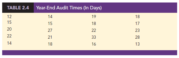
For example, consider the quantitative data in Table 2.4. These data show the time in days required to complete year-end audits for a sample of 20 clients of Sanderson and Clifford, a small public accounting firm. The three steps necessary to define the classes for a frequency distribution with quantitative data are
- Determine the number of nonoverlapping classes.
- Determine the width of each class.
- Determine the class limits.
Let us demonstrate these steps by developing a frequency distribution for the audit time data in Table 2.4.
Number of Classes Classes are formed by specifying ranges that will be used to group the data. As a general guideline, we recommend using between 5 and 20 classes. For a small number of data items, as few as five or six classes may be used to summarize the data. For a larger number of data items, a larger number of classes are usually required. The goal is to use enough classes to show the variation in the data, but not so many classes that some contain only a few data items. Because the number of data items in Table 2.4 is relatively small (n = 20), we chose to develop a frequency distribution with five classes.
Width of the Classes The second step in constructing a frequency distribution for quantitative data is to choose a width for the classes. As a general guideline, we recommend that the width be the same for each class. Thus the choices of the number of classes and the width of classes are not independent decisions. A larger number of classes means a smaller class width, and vice versa. To determine an approximate class width, we begin by identifying the largest and smallest data values. Then, with the desired number of classes specified, we can use the following expression to determine the approximate class width.
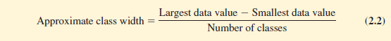
The approximate class width given by equation (2.2) can be rounded to a more convenient value based on the preference of the person developing the frequency distribution. For example, an approximate class width of 9.28 might be rounded to 10 simply because 10 is a more convenient class width to use in presenting a frequency distribution.
For the data involving the year-end audit times, the largest data value is 33 and the smallest data value is 12. Because we decided to summarize the data with five classes, using equation (2.2) provides an approximate class width of (33 – 12)/5 = 4.2. We therefore decided to round up and use a class width of five days in the frequency distribution.
In practice, the number of classes and the appropriate class width are determined by trial and error. Once a possible number of classes is chosen, equation (2.2) is used to find the approximate class width. The process can be repeated for a different number of classes. Ultimately, the analyst uses judgment to determine the combination of the number of classes and class width that provides the best frequency distribution for summarizing the data.
For the audit time data in Table 2.4, after deciding to use five classes, each with a width of five days, the next task is to specify the class limits for each of the classes.
Class limits Class limits must be chosen so that each data item belongs to one and only one class. The lower class limit identifies the smallest possible data value assigned to the class. The upper class limit identifies the largest possible data value assigned to the class.
In developing frequency distributions for categorical data, we did not need to specify class limits because each data item naturally fell into a separate class. But with quantitative data, such as the audit times in Table 2.4, class limits are necessary to determine where each data value belongs.
Using the audit time data in Table 2.4, we selected 10 days as the lower class limit and 14 days as the upper class limit for the first class. This class is denoted 10-14 in Table 2.5. The smallest data value, 12, is included in the 10-14 class. We then selected 15 days as the lower class limit and 19 days as the upper class limit of the next class. We continued defining the lower and upper class limits to obtain a total of five classes: 10-14, 15-19, 20-24, 25-29, and 30-34. The largest data value, 33, is included in the 30-34 class. The difference between the lower class limits of adjacent classes is the class width. Using the first two lower class limits of 10 and 15, we see that the class width is 15 – 10 = 5.
With the number of classes, class width, and class limits determined, a frequency distribution can be obtained by counting the number of data values belonging to each class. For example, the data in Table 2.4 show that four values—12, 14, 14, and 13—belong to the 10-14 class. Thus, the frequency for the 10-14 class is 4. Continuing this counting process for the 15-19, 20-24, 25-29, and 30-34 classes provides the frequency distribution in Table 2.5. Using this frequency distribution, we can observe the following:
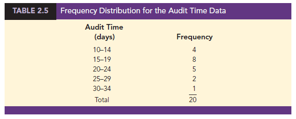
- The most frequently occurring audit times are in the class of 15-19 days. Eight of the 20 audit times belong to this class.
- Only one audit required 30 or more days.
Other conclusions are possible, depending on the interests of the person viewing the frequency distribution. The value of a frequency distribution is that it provides insights about the data that are not easily obtained by viewing the data in their original unorganized form.
Class Midpoint In some applications, we want to know the midpoints of the classes in a frequency distribution for quantitative data. The class midpoint is the value halfway between the lower and upper class limits. For the audit time data, the five class midpoints are 12, 17, 22, 27, and 32.
1. Relative Frequency and Percent Frequency Distributions
We define the relative frequency and percent frequency distributions for quantitative data in the same manner as for categorical data. First, recall that the relative frequency is the proportion of the observations belonging to a class. With n observations,
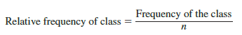
The percent frequency of a class is the relative frequency multiplied by 100.
Based on the class frequencies in Table 2.5 and with n = 20, Table 2.6 shows the relative frequency distribution and percent frequency distribution for the audit time data. Note that .40 of the audits, or 40%, required from 15 to 19 days. Only .05 of the audits, or 5%, required 30 or more days. Again, additional interpretations and insights can be obtained by using Table 2.6.

2. Dot Plot
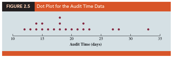
One of the simplest graphical summaries of data is a dot plot. A horizontal axis shows the range for the data. Each data value is represented by a dot placed above the axis. Figure 2.5 is the dot plot for the audit time data in Table 2.4. The three dots located above 18 on the horizontal axis indicate that an audit time of 18 days occurred three times. Dot plots show the details of the data and are useful for comparing the distribution of the data for two or more variables.
3. Histogram
A common graphical display of quantitative data is a histogram. This graphical display can be prepared for data previously summarized in either a frequency, relative frequency, or percent frequency distribution. A histogram is constructed by placing the variable of interest on the horizontal axis and the frequency, relative frequency, or percent frequency on the vertical axis. The frequency, relative frequency, or percent frequency of each class is shown by drawing a rectangle whose base is determined by the class limits on the horizontal axis and whose height is the corresponding frequency, relative frequency, or percent frequency.
Figure 2.6 is a histogram for the audit time data. Note that the class with the greatest frequency is shown by the rectangle appearing above the class of 15-19 days. The height of the rectangle shows that the frequency of this class is 8. A histogram for the relative or percent frequency distribution of these data would look the same as the histogram in Figure 2.6 with the exception that the vertical axis would be labeled with relative or percent frequency values.

As Figure 2.6 shows, the adjacent rectangles of a histogram touch one another. Unlike a bar graph, a histogram contains no natural separation between the rectangles of adjacent classes. This format is the usual convention for histograms. Because the classes for the audit time data are stated as 10-14, 15-19, 20-24, 25-29, and 30-34, one-unit spaces of 14 to 15, 19 to 20, 24 to 25, and 29 to 30 would seem to be needed between the classes. These spaces are eliminated when constructing a histogram. Eliminating the spaces between classes in a histogram for the audit time data helps show that all values between the lower limit of the first class and the upper limit of the last class are possible.
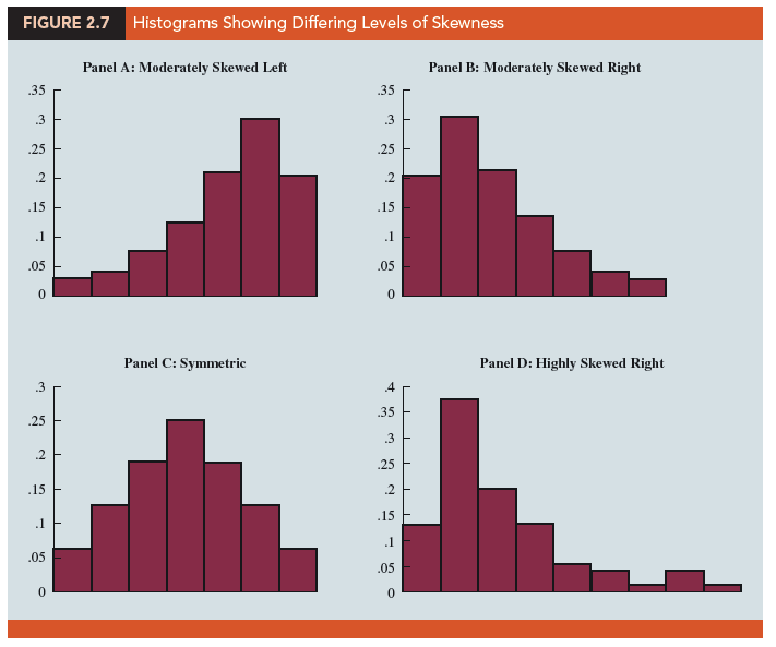
One of the most important uses of a histogram is to provide information about the shape, or form, of a distribution. Figure 2.7 contains four histograms constructed from relative frequency distributions. Panel A shows the histogram for a set of data moderately skewed to the left. A histogram is said to be skewed to the left if its tail extends farther to the left. This histogram is typical for exam scores, with no scores above 100%, most of the scores above 70%, and only a few really low scores. Panel B shows the histogram for a set of data moderately skewed to the right. A histogram is said to be skewed to the right if its tail extends farther to the right. An example of this type of histogram would be for data such as housing prices; a few expensive houses create the skewness in the right tail.
Panel C shows a symmetric histogram. In a symmetric histogram, the left tail mirrors the shape of the right tail. Histograms for data found in applications are never perfectly symmetric, but the histogram for many applications may be roughly symmetric. Data for SAT scores, heights and weights of people, and so on lead to histograms that are roughly symmetric. Panel D shows a histogram highly skewed to the right. This histogram was constructed from data on the amount of customer purchases over one day at a women’s apparel store. Data from applications in business and economics often lead to histograms that are skewed to the right. For instance, data on housing prices, salaries, purchase amounts, and so on often result in histograms skewed to the right.
4. Cumulative Distributions
A variation of the frequency distribution that provides another tabular summary of quantitative data is the cumulative frequency distribution. The cumulative frequency distribution uses the number of classes, class widths, and class limits developed for the frequency distribution. However, rather than showing the frequency of each class, the cumulative frequency distribution shows the number of data items with values less than or equal to the upper class limit of each class. The first two columns of Table 2.7 provide the cumulative frequency distribution for the audit time data.
To understand how the cumulative frequencies are determined, consider the class with the description “less than or equal to 24.” The cumulative frequency for this class is simply the sum of the frequencies for all classes with data values less than or equal to 24. For the frequency distribution in Table 2.5, the sum of the frequencies for classes 10-14, 15-19, and 20-24 indicates that 4 + 8 + 5 = 17 data values are less than or equal to 24. Hence, the cumulative frequency for this class is 17. In addition, the cumulative frequency distribution in Table 2.7 shows that four audits were completed in 14 days or less and 19 audits were completed in 29 days or less.
As a final point, we note that a cumulative relative frequency distribution shows the proportion of data items, and a cumulative percent frequency distribution shows the percentage of data items with values less than or equal to the upper limit of each class. The cumulative relative frequency distribution can be computed either by summing the relative frequencies in the relative frequency distribution or by dividing the cumulative frequencies by the total number of items. Using the latter approach, we found the cumulative relative frequencies in column 3 of Table 2.7 by dividing the cumulative frequencies in column 2 by the total number of items (n = 20). The cumulative percent frequencies were again computed by multiplying the relative frequencies by 100. The cumulative relative and percent frequency distributions show that .85 of the audits, or 85%, were completed in 24 days or less, .95 of the audits, or 95%, were completed in 29 days or less, and so on.
5. Stem-and-Leaf Display
A stem-and-leaf display is a graphical display used to show simultaneously the rank order and shape of a distribution of data. To illustrate the use of a stem-and-leaf display, consider the data in Table 2.8. These data result from a 150-question aptitude test given to 50 individuals recently interviewed for a position at Haskens Manufacturing. The data indicate the number of questions answered correctly.
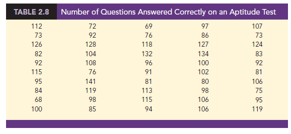
To develop a stem-and-leaf display, we first arrange the leading digits of each data value to the left of a vertical line. To the right of the vertical line, we record the last digit for each data value. Based on the top row of data in Table 2.8 (112, 72, 69, 97, and 107), the first five entries in constructing a stem-and-leaf display would be as follows:
For example, the data value 112 shows the leading digits 11 to the left of the line and the last digit 2 to the right of the line. Similarly, the data value 72 shows the leading digit 7 to the left of the line and last digit 2 to the right of the line. Continuing to place the last digit of each data value on the line corresponding to its leading digit(s) provides the following:
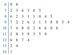
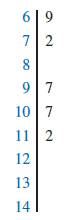
With this organization of the data, sorting the digits on each line into rank order is simple. Doing so provides the stem-and-leaf display shown here.
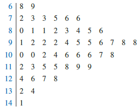
The numbers to the left of the vertical line (6, 7, 8, 9, 10, 11, 12, 13, and 14) form the stem, and each digit to the right of the vertical line is a leaf. For example, consider the first row with a stem value of 6 and leaves of 8 and 9.
![]()
This row indicates that two data values have a first digit of 6. The leaves show that the data values are 68 and 69. Similarly, the second row
![]()
indicates that six data values have a first digit of 7. The leaves show that the data values are 72, 73, 73, 75, 76, and 76.
To focus on the shape indicated by the stem-and-leaf display, let us use a rectangle to contain the leaves of each stem. Doing so, we obtain the following:
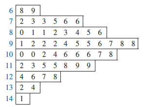
Rotating this page counterclockwise onto its side provides a picture of the data that is similar to a histogram with classes of 60-69, 70-79, 80-89, and so on.
Although the stem-and-leaf display may appear to offer the same information as a histogram, it has two primary advantages.
- The stem-and-leaf display is easier to construct by hand.
- Within a class interval, the stem-and-leaf display provides more information than the histogram because the stem-and-leaf shows the actual data.
Just as a frequency distribution or histogram has no absolute number of classes, neither does a stem-and-leaf display have an absolute number of rows or stems. If we believe that our original stem-and-leaf display condensed the data too much, we can easily stretch the display by using two or more stems for each leading digit. For example, to use two stems for each leading digit, we would place all data values ending in 0, 1, 2, 3, and 4 in one row and all values ending in 5, 6, 7, 8, and 9 in a second row. The following stretched stem-and-leaf display illustrates this approach.
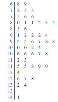
Note that values 72, 73, and 73 have leaves in the 0-4 range and are shown with the first stem value of 7. The values 75, 76, and 76 have leaves in the 5-9 range and are shown with the second stem value of 7. This stretched stem-and-leaf display is similar to a frequency distribution with intervals of 65-69, 70-74, 75-79, and so on.
The preceding example showed a stem-and-leaf display for data with as many as three digits. Stem-and-leaf displays for data with more than three digits are possible. For example, consider the following data on the number of hamburgers sold by a fast-food restaurant for each of 15 weeks.
1565 1852 1644 1766 1888 1912 2044 1812
1790 1679 2008 1852 1967 1954 1733
A stem-and-leaf display of these data follows.
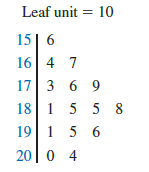
Note that a single digit is used to define each leaf and that only the first three digits of each data value have been used to construct the display. At the top of the display we have specified Leaf unit = 10. To illustrate how to interpret the values in the display, consider the first stem, 15, and its associated leaf, 6. Combining these numbers, we obtain 156. To reconstruct an approximation of the original data value, we must multiply this number by 10, the value of the leaf unit. Thus, 156 X 10 = 1560 is an approximation of the original data value used to construct the stem-and-leaf display. Although it is not possible to reconstruct the exact data value from this stem-and-leaf display, the convention of using a single digit for each leaf enables stem-and-leaf displays to be constructed for data having a large number of digits. For stem-and-leaf displays where the leaf unit is not shown, the leaf unit is assumed to equal 1.
Source: Anderson David R., Sweeney Dennis J., Williams Thomas A. (2019), Statistics for Business & Economics, Cengage Learning; 14th edition.
30 Aug 2021
28 Aug 2021
28 Aug 2021
30 Aug 2021
30 Aug 2021
30 Aug 2021