1. Frequency Distribution
We begin the discussion of how tabular and graphical displays can be used to summarize categorical data with the definition of a frequency distribution.
FREQUENCY DISTRIBUTION
A frequency distribution is a tabular summary of data showing the number (frequency) of observations in each of several nonoverlapping categories or classes.
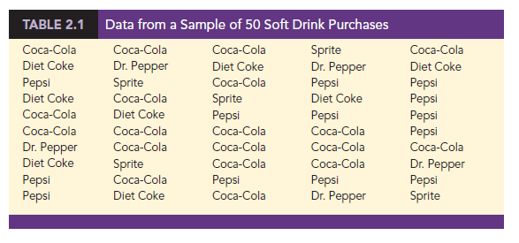
Let us use the following example to demonstrate the construction and interpretation of a frequency distribution for categorical data. Coca-Cola, Diet Coke, Dr. Pepper, Pepsi, and Sprite are five popular soft drinks. Assume that the data in Table 2.1 show the soft drink selected in a sample of 50 soft drink purchases.
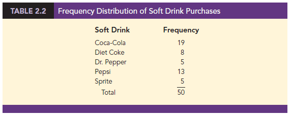
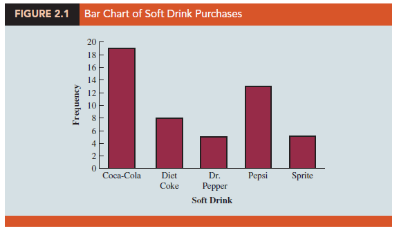
To develop a frequency distribution for these data, we count the number of times each soft drink appears in Table 2.1. Coca-Cola appears 19 times, Diet Coke appears 8 times, Dr. Pepper appears 5 times, Pepsi appears 13 times, and Sprite appears 5 times. These counts are summarized in the frequency distribution in Table 2.2.
This frequency distribution provides a summary of how the 50 soft drink purchases are distributed across the five soft drinks. This summary offers more insight than the original data shown in Table 2.1. Viewing the frequency distribution, we see that Coca- Cola is the leader, Pepsi is second, Diet Coke is third, and Sprite and Dr. Pepper are tied for fourth. The frequency distribution summarizes information about the popularity of the five soft drinks.
2. Relative Frequency and Percent Frequency Distributions
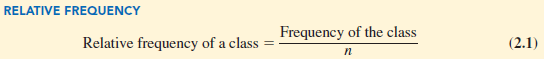
A frequency distribution shows the number (frequency) of observations in each of several nonoverlapping classes. However, we are often interested in the proportion, or percentage, of observations in each class. The relative frequency of a class equals the fraction or proportion of observations belonging to a class. For a data set with n observations, the relative frequency of each class can be determined as follows:
The percent frequency of a class is the relative frequency multiplied by 100.
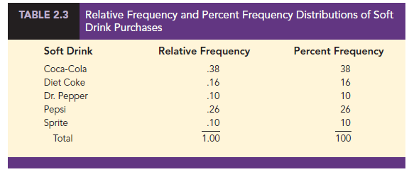
A relative frequency distribution gives a tabular summary of data showing the relative frequency for each class. A percent frequency distribution summarizes the percent frequency of the data for each class. Table 2.3 shows a relative frequency distribution and a percent frequency distribution for the soft drink data. In Table 2.3 we see that the relative frequency for Coca-Cola is 19/50 = .38, the relative frequency for Diet Coke is 8/50 = .16, and so on. From the percent frequency distribution, we see that 38% of the purchases were Coca-Cola, 16% of the purchases were Diet Coke, and so on. We can also note that 38% + 26% + 16% = 80% of the purchases were for the top three soft drinks.
3. Bar Charts and Pie Charts
A bar chart is a graphical display for depicting categorical data summarized in a frequency, relative frequency, or percent frequency distribution. On one axis of the chart (usually the horizontal axis), we specify the labels that are used for the classes (categories). A frequency, relative frequency, or percent frequency scale can be used for the other axis of the chart (usually the vertical axis). Then, using a bar of fixed width drawn above each class label, we extend the length of the bar until we reach the frequency, relative frequency, or percent frequency of the class. For categorical data, the bars should be separated to emphasize the fact that each category is separate. Figure 2.1 shows a bar chart of the frequency distribution for the 50 soft drink purchases. Note how the graphical display shows Coca-Cola, Pepsi, and Diet Coke to be the most preferred brands. We can make the brand preferences even more obvious by creating a sorted bar chart as shown in Figure 2.2. Here, we sort the soft drink categories: highest frequency on the left and lowest frequency on the right.
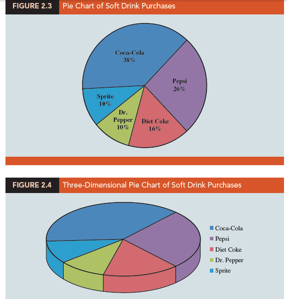
The pie chart provides another graphical display for presenting relative frequency and percent frequency distributions for categorical data. To construct a pie chart, we first draw a circle to represent all the data. Then we use the relative frequencies to subdivide the circle into sectors, or parts, that correspond to the relative frequency for each class. For example, because a circle contains 360 degrees and Coca-Cola shows a relative frequency of .38, the sector of the pie chart labeled Coca-Cola consists of .38(360) = 136.8 degrees. The sector of the pie chart labeled Diet Coke consists of .16(360) = 57.6 degrees. Similar calculations for the other classes yield the pie chart in Figure 2.3. The numerical values shown for each sector can be frequencies, relative frequencies, or percent frequencies. Although pie charts are common ways of visualizing data, many data visualization experts do not recommend their use because people have difficulty perceiving differences in area. In most cases, a bar chart is superior to a pie chart for displaying categorical data.
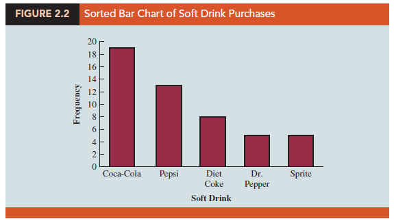
Numerous options involving the use of colors, shading, legends, text font, and three-dimensional perspectives are available to enhance the visual appearance of bar and pie charts. However, one must be careful not to overuse these options because they may not enhance the usefulness of the chart. For instance, consider the three-dimensional pie chart for the soft drink data shown in Figure 2.4. Compare it to the charts shown in Figures 2.1-2.3. The three-dimensional perspective shown in Figure 2.4 adds no new understanding. The use of a legend in Figure 2.4 also forces your eyes to shift back and forth between the key and the chart. Most readers find the sorted bar chart in Figure 2.2 much easier to interpret because it is obvious which soft drinks have the highest frequencies.
In general, pie charts are not the best way to present percentages for comparison. In Section 2.5 we provide additional guidelines for creating effective visual displays.
Source: Anderson David R., Sweeney Dennis J., Williams Thomas A. (2019), Statistics for Business & Economics, Cengage Learning; 14th edition.
Thought I would comment and say awesome theme, did you create it yourself? Looks superb!