Thus far in this chapter, we have focused on using tabular and graphical displays to summarize the data for a single categorical or quantitative variable. Often a manager or decision maker needs to summarize the data for two variables in order to reveal the relationship—if any—between the variables. In this section, we show how to construct a tabular summary of the data for two variables.
1. Crosstabulation
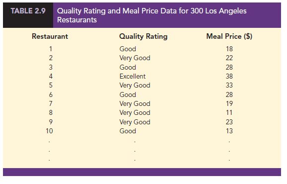
A crosstabulation is a tabular summary of data for two variables. Although both variables can be either categorical or quantitative, crosstabulations in which one variable is categorical and the other variable is quantitative are just as common. We will illustrate this latter case by considering the following application based on data from Zagat’s Restaurant Review. Data showing the quality rating and the typical meal price were collected for a sample of 300 restaurants in the Los Angeles area. Table 2.9 shows the data for the first 10 restaurants. Quality rating is a categorical variable with rating categories of good, very good, and excellent. Meal price is a quantitative variable that ranges from $10 to $49.
A crosstabulation of the data for this application is shown in Table 2.10. The label shown in the margins of the table define the categories (classes) for the two variables. In the left margin, the row labels (good, very good, and excellent) correspond to the three rating categories for the quality rating variable. In the top margin, the column labels ($10-19, $20-29, $30-39, and $40-49) show that the meal price data have been grouped into four classes. Because each restaurant in the sample provides a quality rating and a meal price, each restaurant is associated with a cell appearing in one of the rows and one of the columns of the crosstabulation. For example, Table 2.9 shows restaurant 5 as having a very good quality rating and a meal price of $33. This restaurant belongs to the cell in row 2 and column 3 of the crosstabulation shown in Table 2.10. In constructing a crosstabulation, we simply count the number of restaurants that belong to each of the cells.

Although four classes of the meal price variable were used to construct the crosstabulation shown in Table 2.10, the crosstabulation of quality rating and meal price could have been developed using fewer or more classes for the meal price variable. The issues involved in deciding how to group the data for a quantitative variable in a crosstabulation are similar to the issues involved in deciding the number of classes to use when constructing a frequency distribution for a quantitative variable. For this application, four classes of meal price were considered a reasonable number of classes to reveal any relationship between quality rating and meal price.
In reviewing Table 2.10, we see that the greatest number of restaurants in the sample (64) have a very good rating and a meal price in the $20-29 range. Only two restaurants have an excellent rating and a meal price in the $10-19 range. Similar interpretations of the other frequencies can be made. In addition, note that the right and bottom margins of the crosstabulation provide the frequency distributions for quality rating and meal price separately. From the frequency distribution in the right margin, we see that data on quality ratings show 84 restaurants with a good quality rating, 150 restaurants with a very good quality rating, and 66 restaurants with an excellent quality rating. Similarly, the bottom margin shows the frequency distribution for the meal price variable.
Dividing the totals in the right margin of the crosstabulation by the total for that column provides a relative and percent frequency distribution for the quality rating variable.
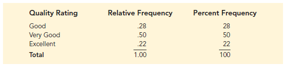
From the percent frequency distribution we see that 28% of the restaurants were rated good, 50% were rated very good, and 22% were rated excellent.
Dividing the totals in the bottom row of the crosstabulation by the total for that row provides a relative and percent frequency distribution for the meal price variable.
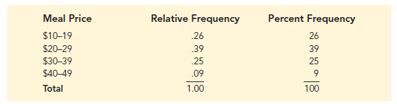
Note that the values in the relative frequency column do not add exactly to 1.00 and the values in the percent frequency distribution do not add exactly to 100; the reason is that the values being summed are rounded. From the percent frequency distribution we see that 26% of the meal prices are in the lowest price class ($10-19), 39% are in the next higher class, and so on.
The frequency and relative frequency distributions constructed from the margins of a crosstabulation provide information about each of the variables individually, but they do not shed any light on the relationship between the variables. The primary value of a crosstabulation lies in the insight it offers about the relationship between the variables. A review of the crosstabulation in Table 2.10 reveals that restaurants with higher meal prices received higher quality ratings than restaurants with lower meal prices.
Converting the entries in a crosstabulation into row percentages or column percentages can provide more insight into the relationship between the two variables. For row percentages, the results of dividing each frequency in Table 2.10 by its corresponding row total are shown in Table 2.11. Each row of Table 2.11 is a percent frequency distribution of meal price for one of the quality rating categories. Of the restaurants with the lowest quality rating (good), we see that the greatest percentages are for the less expensive restaurants (50% have $10-19 meal prices and 47.6% have $20-29 meal prices). Of the restaurants with the highest quality rating (excellent), we see that the greatest percentages are for the more expensive restaurants (42.4% have $30-39 meal prices and 33.4% have $40-49 meal prices). Thus, we continue to see that restaurants with higher meal prices received higher quality ratings.
Crosstabulations are widely used to investigate the relationship between two variables.
In practice, the final reports for many statistical studies include a large number of crosstabulations. In the Los Angeles restaurant survey, the crosstabulation is based on one categorical variable (quality rating) and one quantitative variable (meal price). Crosstabulations can also be developed when both variables are categorical and when both variables are quantitative. When quantitative variables are used, however, we must first create classes for the values of the variable. For instance, in the restaurant example we grouped the meal prices into four classes ($10-19, $20-29, $30-39, and $40-49).
2. Simpson’s Paradox
The data in two or more crosstabulations are often combined or aggregated to produce a summary crosstabulation showing how two variables are related. In such cases, conclusions drawn from two or more separate crosstabulations can be reversed when the data are aggregated into a single crosstabulation. The reversal of conclusions based on aggregate and unaggregated data is called Simpson’s paradox. To provide an illustration of Simpson’s paradox we consider an example involving the analysis of verdicts for two judges in two different courts.

Judges Ron Luckett and Dennis Kendall presided over cases in Common Pleas Court and Municipal Court during the past three years. Some of the verdicts they rendered were appealed. In most of these cases the appeals court upheld the original verdicts, but in some cases those verdicts were reversed. For each judge a crosstabulation was developed based upon two variables: Verdict (upheld or reversed) and Type of Court (Common Pleas and Municipal). Suppose that the two crosstabulations were then combined by aggregating the type of court data. The resulting aggregated crosstabulation contains two variables: Verdict (upheld or reversed) and Judge (Luckett or Kendall). This crosstabulation shows the number of appeals in which the verdict was upheld and the number in which the verdict was reversed for both judges. The following crosstabulation shows these results along with the column percentages in parentheses next to each value.
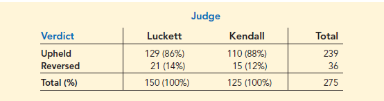
A review of the column percentages shows that 86% of the verdicts were upheld for Judge Luckett, while 88% of the verdicts were upheld for Judge Kendall. From this aggregated crosstabulation, we conclude that Judge Kendall is doing the better job because a greater percentage of Judge Kendall’s verdicts are being upheld.
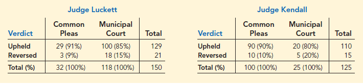
The following unaggregated crosstabulations show the cases tried by Judge Luckett and Judge Kendall in each court; column percentages are shown in parentheses next to each value.
From the crosstabulation and column percentages for Judge Luckett, we see that the verdicts were upheld in 91% of the Common Pleas Court cases and in 85% of the Municipal Court cases. From the crosstabulation and column percentages for Judge Kendall, we see that the verdicts were upheld in 90% of the Common Pleas Court cases and in 80% of the Municipal Court cases. Thus, when we unaggregate the data, we see that Judge Luckett has a better record because a greater percentage of Judge Luckett’s verdicts are being upheld in both courts. This result contradicts the conclusion we reached with the aggregated data crosstabulation that showed Judge Kendall had the better record. This reversal of conclusions based on aggregated and unaggregated data illustrates Simpson’s paradox.
The original crosstabulation was obtained by aggregating the data in the separate crosstabulations for the two courts. Note that for both judges the percentage of appeals that resulted in reversals was much higher in Municipal Court than in Common Pleas Court. Because Judge Luckett tried a much higher percentage of his cases in Municipal Court, the aggregated data favored Judge Kendall. When we look at the crosstabulations for the two courts separately, however, Judge Luckett shows the better record. Thus, for the original crosstabulation, we see that the type of court is a hidden variable that cannot be ignored when evaluating the records of the two judges.
Because of the possibility of Simpson’s paradox, realize that the conclusion or interpretation may be reversed depending upon whether you are viewing unaggregated or aggregated crosstabulation data. Before drawing a conclusion, you may want to investigate whether the aggregated or unaggregated form of the crosstabulation provides the better insight and conclusion. Especially when the crosstabulation involves aggregated data, you should investigate whether a hidden variable could affect the results such that separate or unaggregated crosstabulations provide a different and possibly better insight and conclusion.
Source: Anderson David R., Sweeney Dennis J., Williams Thomas A. (2019), Statistics for Business & Economics, Cengage Learning; 14th edition.
31 Aug 2021
30 Aug 2021
31 Aug 2021
31 Aug 2021
30 Aug 2021
31 Aug 2021