Dataset Greenland temperature.dta contains a famous time series of temperature estimates reconstructed from the GISP2 ice core in central Greenland, covering time from about 50,000 years ago up through 1855 (Alley 2004). In scientific publications on these data, time has been represented by the variable age, in units of thousands of years before present. “Present” had been conventionally defined by the ice researchers to mean 1950. The most recent age in their data is .095, or 95 years before present — in other words, 1855. Ice and snow from more recent years had not consolidated enough to apply the temperature reconstruction method. To keep our example more more intuitive for non-paleoclimatologists, however, a new time variable, year, was generated. year can be read as “calendar years” from -48,000 to 1999. The variable gisptemp contains temperatures reconstructed from the GISP2 ice core. shutemp contains the average annual temperature at the same Greenland location directly measured by scientists over 1987-1999 (Shuman et al. 2001).
Figure 12.6 is a spike plot of the GISP2 temperature data. Spikes are drawn from a baseline equal to the longterm mean, with warmer-than-average temperatures indicated by reddish spikes, and cooler-than-average temperatures by bluish spikes. Because the data are much denser for more recent years, an appropriate baseline for the whole series is calculated from the average of thousand-year periods, rather than the average of individual measurements.
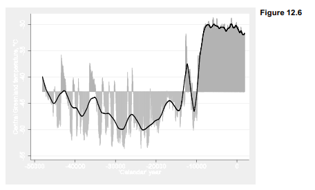
This graph clearly shows the transition from Ice Age to warmer conditions. Reconstructed Greenland temperatures rose by about 20 °C, from below -50 to around -30 °C. The transition was interrupted, however, by a brief return to near-Ice Age conditions called the Younger Dryas, occurring between about 12,900 and 11,500 years before present (calendar years -10,900 to -9,500 in our graph, the final downward spike). The onset and end of the Younger Dryas each happened over a few decades or less, spurring new research on possible causes and future potential for abrupt climate change (e.g., White et al. 2010).
The moving-average or nonlinear smoothing techniques illustrated in the previous section work best when observations are equally spaced in time, and when much variation occurs over relatively short time spans. The GISP2 ice core measurements have uneven spacing, however, becoming farther apart in time as they descend into deeper (older) and more compressed layers of ice. For time series with uneven spacing, or for smoothing over long spans, lowess regression such as the curve in Figure 12.6 provides a practical alternative.
Figure 12.7 graphs a recent segment of the data in Figure 12.6, depicting GISP2 temperatures for the past 11,000 years only. Graphs much like this particular time plot have been a source of remarkable confusion.
. graph twoway line gisptemp year if year > -9000, lwidth(medthick)
xlabel(-9000(1000)2000, grid gmax gmin) title(“Greenland ice core only”)
ytitle(“Central Greenland temperature, ‘=char(176)’C”)
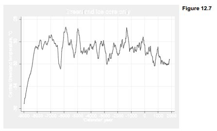
One can find many deceptive variations of Figure 12.7 on the Internet, in which the final data point (actually 1855) is implied or labeled to be the “present.” If that were indeed the present temperature, then we might conclude that Greenland remains cooler than average compared with the past 10,000 years, and recent warming has been trivial — which is the point such graphs are drawn to convey. Some are constructed using a baseline plotting method similar to Figure 12.6, but with the baseline defined from that 1855 endpoint to make the “cold now” message even more visually striking. Other variants hide the fact that these are central Greenland temperatures, suggesting instead that they represent the globe.
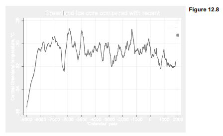
In 1855, however, Greenland was barely warming from a cold period called the Little Ice Age. Recent temperatures have been warmer, leading to declining ice sheet mass as well as reductions in sea ice around the coast. Even in the 1990s, direct measurements from the summit of the ice sheet reported an average annual temperature of -29.26 °C (Shuman et al. 2001). Figure 12.8 re-draws Figure 12.7 but with a final data point showing the 1987-1999 temperature, overlaid as a scatterplot. Two lines of text centered at y coordinate -28.80, x coordinate 1500 label the scatterplot marker, in the same color as the marker itself.
. graph twoway line gisptemp year, lwidth(medthick)
|| scatter shutemp year, msymbol(S) mcolor(red)
|| if year > -9000, xlabel(-9000(1000)2000, grid gmax gmin)
title(“Greenland ice core compared with recent”) legend(off)
ytitle(“Central Greenland temperature, `=char(176)’C”)
text(-28.80 1500 “1987`=char(150)'” “1999”, color(red))
Source: Hamilton Lawrence C. (2012), Statistics with STATA: Version 12, Cengage Learning; 8th edition.
23 Oct 2019
29 Sep 2022
29 Sep 2022
30 Sep 2022
3 Oct 2022
23 Sep 2022