Frequency Tables
Now we expand our discussion of frequency distributions to include frequency tables, which are constructed in very similar ways for all four types of measurement. A difference is that with nominal data, the order in which the categories are listed is arbitrary.
In Fig. 3.3, the frequency table listed protestant, catholic, and then not religious. However, protestant could be put after or between catholic and not religious because the categories are not ordered. In ordinal and approximately normal data, the order cannot vary (e.g., medium always should be between low and high).
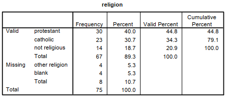
Fig 3.3. A frequency table for religion, a nominal variable.
Fig. 3.3 is a table that shows religious affiliation from the hsbdata that we are using in this book. In this example, there is a Frequency column that shows the numbers of students who checked each type of religion (e.g., 30 said protestant and 4 left it blank). Notice that there is a total (67) for the three responses considered Valid and a total (8) for the two types of responses considered to be Missing as well as an overall total (75). The Percent column indicates that 40.0% are protestant, 30.7% are catholic, 18.7% are not religious, 5.3% had one of several other religions, and 5.3% left the question blank. The Valid Percent column excludes the eight missing cases and is often the column that you would use. Given this data set, it would be accurate to say that of those not coded as missing, 44.8% were protestant, 34.3%, catholic, and 20.9% were not religious.
To get Fig. 3.3, select:
- Analyze → Descriptive Statistics → Frequencies → move religion to the Variable(s): box → OK (make sure that the Display frequency tables box is checked.
When the variable has ordered levels (i.e., is ordinal or approximately normal), the procedure is the same and the frequency table has the same structure. However, when the variable is ordinal or approximately normal, the Cumulative Percent column is useful. With a nominal variable, the cumulative percent column is not useful. From Fig. 3.4, we can say that 22.7% of the students had grades that were mostly Cs or less and that 64% had mostly Bs or less.
To create Fig. 3.4, select:
- Analyze → Descriptive Statistics → Frequencies → move grades in h.s. to the Variable(s): box → OK.
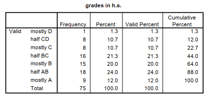
Fig. 3.4 A frequency table for an ordered variable: grades in h.s.
As mentioned earlier, frequency distributions indicate how many participants are in each category, giving you a feel for the distribution of scores. If one wants to make a diagram of a frequency distribution, there are several choices, four of which are bar charts, frequency polygons, histograms, and box and whisker plots.
Bar Charts
With nominal data, you should not use a graphic that connects adjacent categories because with nominal data there is no necessary ordering of the categories or levels. Thus, it is better to make a bar graph or chart of the frequency distribution of variables like religion, ethnic group, or other nominal variables; the points that happen to be adjacent in your frequency distribution are not by necessity adjacent.
- is a bar chart created by selecting:
- Analyze → Descriptive Statistics → Frequencies → move religion → Charts→ Bar charts → Continue → OK.
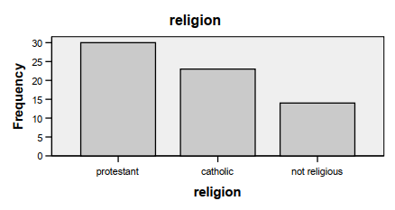
Fig. 3.5.Sample frequency distribution bar chart for the nominal variable of religion.
Histograms
As we can see if we compare Fig. 3.5 to the histograms in Fig. 3.1 and 3.2, histograms look much like bar charts except in histograms there is no space between the boxes, indicating that there is theoretically a continuous variable underlying the scores (i.e., scores could theoretically be any point on a continuum from the lowest to highest score). Histograms can be used even if data, as measured, are not continuous, if the underlying variable is conceptualized as continuous. For example, the competence scale items were rated on a 4-point scale, but one could, theoretically, have any amount of competence.
Frequency Polygons
Figure 3.6 is a frequency polygon; it connects the points between the categories and is best used with approximately normal data, but it can be used with ordinal data.
To create Fig. 3.6, select:
- Graphs →Legacy Dialogs → (be sure that Simple and Summaries for groups of cases are checked) → Define → motivation scale to Category Axis box → OK.
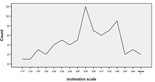
Fig. 3.6. Sample frequency polygon showing approximately normal data.
Box and Whiskers Plot
For ordinal and normal data, the box and whiskers plot is useful; it should not be used with nominal data because then there is no necessary ordering of the response categories. The box and whiskers plot is a graphic representation of the distribution of scores and is helpful in distinguishing between ordinal and normally distributed data, as we will see.
Using our hsbdata set, you can see how useful this graphic analysis technique is for comparing frequency distributions of different groups. Fig. 3.7 compares genders on scores from the math section of the SAT.
This box and whiskers plot was created by selecting:
- Analyze → Descriptive Statistics→ Explore → scholastic aptitude test – math to Dependent List box → gender to Factor List → under Display select Plots → OK
Fig. 3.7 shows two box plots, one for males and one for females. The box represents the middle 50% of the cases (i.e., those between the 25th and 75th percentiles). The whiskers indicate the expected range of scores. Scores outside of this range are considered unusually high or low. Such scores, called outliers, are shown above and/or below the whiskers with circles or asterisks (for very extreme scores) and with the Data View line number for that participant. Note there are no outliers for the 34 males, but there is a low (#6) and a high (#54) female outlier. (Note this number will not be the participant’s ID unless you specify that the program should report this by ID number or the ID numbers correspond exactly to the line numbers.)
We will come back to Fig. 3.7 in several later sections of this chapter.
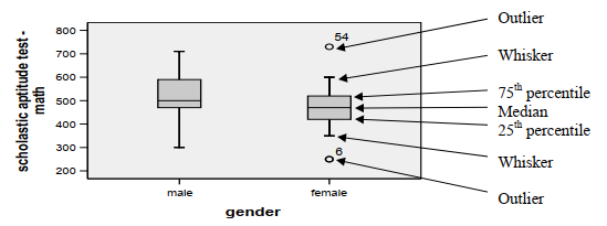
Fig. 3.7. A box and whiskers plot for ordinal or normal data.
Measures of Central Tendency
Three measures of the center of a distribution are commonly used: mean, median, and mode. Any of them can be used with normally distributed data. With ordinal data, the mean of the raw scores is not appropriate, but the mean of the ranked scores provides useful information. With nominal data, the mode is the only appropriate measure.
Mean. The arithmetic average or mean takes into account all of the available information in computing the central tendency of a frequency distribution. Thus, it is usually the statistic of choice, assuming that the data are normally distributed data. The mean is computed by adding up all the raw scores and dividing by the number of scores (M = EX/N).
Median. The middle score or median is the appropriate measure of central tendency for ordinal level raw data. The median is a better measure of central tendency than the mean when the frequency distribution is skewed. For example, the median income of 100 mid-level workers and one millionaire reflects the central tendency of the group better (and is substantially lower) than the mean income. The average or mean would be inflated in this example by the income of the one millionaire. For normally distributed data, the median is in the center of the box and whiskers plot. Notice that in Fig. 3.7 the median for males is not in the center of the box.
Mode. The most common category, or mode, can be used with any kind of data but generally provides the least precise information about central tendency. Moreover, if one’s data are continuous, there often are multiple modes, none of which truly represents the “typical” score. In fact, if there are multiple modes, this program provides only the lowest one. One would use the mode as the measure of central tendency if the variable is nominal or you want a quick noncalculated measure. The mode is the tallest bar in a bar graph or histogram (e.g., in Fig. 3.5, protestant, category 1, is the mode).
You also can compute the Mean, Median, and Mode, plus other descriptive statistics, with this program by using the Frequencies command.
To get Fig 3.8, select:
- Analyze → Descriptive Statistics → Frequencies → move scholastic aptitude test – math → Statistics → Mean, Median, and Mode → Continue → OK.
Note in Fig. 3.8 that the mean and median are very similar, which is in agreement with our conclusion from Fig. 3.1 that SATM is approximately normally distributed. Note that the mode is 500, as shown in Fig. 3.1 by the highest bars.
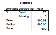
Fig. 3.8. Central tendency measures using the Frequencies command.
Measures of Variability
Variability tells us about the spread or dispersion of the scores. If all of the scores in a distribution are the same, there is no variability. If the scores are all different and widely spaced apart, the variability will be high. The range (highest minus lowest score) is the crudest measure of variability but does give an indication of the spread in scores if they are ordered.
Standard deviation. This common measure of variability is most appropriate when one has normally distributed data, although the standard deviation of ranked ordinal data may also be useful in some cases. The standard deviation is based on the deviation (x) of each score from the mean of all the scores. Those deviation scores are squared and then summed (Ex2). This sum is divided by N– 1, and, finally, the square root is taken ![]() .
.
We can use the Descriptives command to get measures of central tendency and variability. Figure 3.9 is a printout from the hsbdata set for the scholastic aptitude test – math scores. We can easily see that of the 75 people in the data set, the Minimum (low) score was 250 and the Maximum (high) score was 730. The Range is 480 (730-250). (Remember the two female outliers in Fig. 3.7, the box and whiskers plot.) The mean score was 490.53 and std (standard deviation) 94.55. A rough estimate of the standard deviation is the range divided by 5 (e.g., 480/5 = 96).
To get Fig. 3.9, select:
- Analyze → Descriptives Statistics → Descriptive → move scholastic aptitude test – math → Options → Mean, Std Deviation, Range, Minimum, Maximum, and Skewness → Continue → OK.
We discuss Skewness later in the chapter.
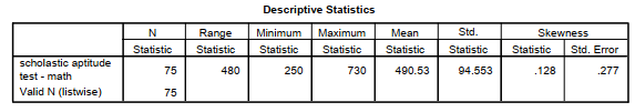
Fig. 3.9. Descriptive statistics for the scholastic aptitude test – math (SATM).
Interquartile range. For ordinal data, the interquartile range, seen in the box plot (Fig. 3.7) as the distance between the top and bottom of the box, is a useful measure of variability. Note that the whiskers indicate the expected range, and scores outside that range are shown as outliers.
With nominal data, none of the previous variability measures (range, standard deviation, or interquartile range) is appropriate. Instead, for nominal data, one would need to ask how many different categories there are and what the percentages or frequency counts are in each category to get some idea of variability. Minimum and maximum frequency may provide some indication of distribution as well.
Measurement and Descriptive Statistics
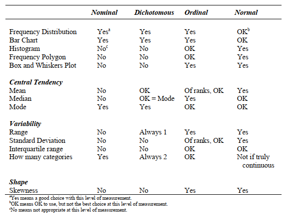
Table 3.3 summarizes much of the previous information about the appropriate use of various kinds of descriptive statistics given nominal, dichotomous, ordinal, or normal data.
Table 3.3. Selection of Appropriate Descriptive Statistics and Plots
Conclusions About Measurement and the Use of Statistics
Statistics based on means and standard deviation are valid for normally distributed or normal data. Typically, these data are used in the most powerful tests called parametric statistics. However, if the data are ordered but grossly non-normal (i.e., ordinal), means and standard deviations of the raw data may not provide accurate information about central tendency and variability. Then the median and a nonparametric test would be preferred. Nonparametric tests typically have somewhat less power than parametric tests (they are less able to demonstrate significant effects even if a real effect exists), but the sacrifice in power for nonparametric tests based on ranks usually is relatively minor. If the data are nominal, one would have to use the mode or counts.
Source: Morgan George A, Leech Nancy L., Gloeckner Gene W., Barrett Karen C.
(2012), IBM SPSS for Introductory Statistics: Use and Interpretation, Routledge; 5th edition; download Datasets and Materials.
20 Sep 2022
19 Sep 2022
28 Mar 2023
29 Mar 2023
20 Sep 2022
16 Sep 2022