Having analysed the data that you collected through either quantitative or qualitative method(s), the next task is to present your findings to your readers. The main purpose of using data display techniques is to make the findings easy and clear to understand, and to provide extensive and comprehensive information in a succinct and effective way. There are many ways of presenting information. The choice of a particular method should be determined primarily by your impressions/knowledge of your likely readership’s familiarity with the topic and with the research methodology and statistical procedures. If your readers are likely to be familiar with ‘reading’ data, you can use complicated methods of data display; if not, it is wise to keep to simple techniques. Although there are many ways of displaying data, this chapter is limited to the more commonly used ones. There are many computer programs that can help you with this task.
Broadly, there are four ways of communicating and displaying the analysed data. These are:
- text;
- tables;
- graphs; and
- statistical measures.
Because of the nature and purpose of investigation in qualitative research, text becomes the dominant and usually the sole mode of communication. In quantitative studies the text is very commonly combined with other forms of data display methods, the extent of which depends upon your familiarity with them, the purpose of the study and what you think would make it easier for your readership to understand the content and sustain their interest in it. Hence as a researcher it is entirely up to you to decide the best way of communicating your findings to your readers.
1. Text
Text, by far, is the most common method of communication in both quantitative and qualitative research studies and, perhaps, the only method in the latter. It is, therefore, essential that you know how to communicate effectively, keeping in view the level of understanding, interest in the topic and need for academic and scientific rigour of those for whom you are writing. Your style should be such that it strikes a balance between academic and scientific rigour and the level that attracts and sustains the interest of your readers. Of course, it goes without saying that a reasonable command of the language and clarity of thought are imperative for good communication.
Your writing should be thematic: that is, written around various themes of your report; findings should be integrated into the literature citing references using an acceptable system of citation; your writing should follow a logical progression of thought; and the layout should be attractive and pleasing to the eye. Language, in terms of clarity and flow, plays an important role in communication. According to the Commonwealth of Australia Style Manual (2002: 49):
The language of well-written documents helps to communicate information effectively. Language is also the means by which writers create the tone or register of a publication and establish relationships with their readers. For these relationships to be productive, the language the writer uses must take full account of the diversity of knowledge, interests and sensitivities within the audience.
2. Tables
2.1. Structure
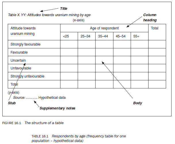
Other than text, tables are the most common method of presenting analysed data. According to The Chicago Manual of Style (1993: 21), ‘Tables offer a useful means of presenting large amounts of detailed information in a small space.’ According to the Commonwealth of Australia Style Manual (2002: 46), ‘tables can be a boon for readers. They can dramatically clarify text, provide visual relief, and serve as quick point of reference.’ It is, therefore, essential for beginners to know about their structure and types. Figure 16.1 shows the structure of a table. A table has five parts:
- Title – This normally indicates the table number and describes the type of data the table contains. it is important to give each table its own number as you will need to refer to the tables when interpreting and discussing the data. the tables should be numbered sequentially as they appear in the text. the procedure for numbering tables is a personal choice. if you are writing an article, simply identifying tables by number is sufficient. In the case of a dissertation or a report, one way to identify a table is by the chapter number followed by the sequential number of the table in the chapter – the procedure adopted in this book. The main advantage of this procedure is that if it becomes necessary to add or delete a table when revising the report, the table numbers for that chapter only, rather than for the whole report, will need to be changed.
The description accompanying the table number must clearly specify the contents of that table. in the description identify the variables about which information is contained in the table, for example ‘Respondents by age’ or ‘Attitudes towards uranium mining’. if a table contains information about two variables, the dependent variable should be identified first in the title, for example ‘Attitudes towards uranium mining [dependent variable] by gender [independent variable]’.
- Stub – The subcategories of a variable, listed along the y-axis (the left-hand column of the table). According to The McGraw-Hill Style Manual (Long year 1983: 97), ‘The stub, usually the first column on the left, lists the items about which information is provided in the horizontal rows to the right.’ The Chicago Manual of Style (1993: 331) describes the stub as: ‘a vertical listing of categories or individuals about which information is given in the columns of the table’.
- Column headings – The subcategories of a variable, listed along the x-axis (the top of the table). in univariate tables (tables displaying information about one variable) the column heading is usually the ‘number of respondents’ and/or the ‘percentage of respondents’ (Tables 16.1 and 16.2). in bivariate tables (tables displaying information about two variables) it is the subcategories of one of the variables displayed in the column headings (Table 16.3).
- Body – The cells housing the analysed data.
- Supplementary notes or footnotes – There are four types of footnote: source notes; other general notes; notes on specific parts of the table; and notes on the level of probability (The Chicago Manual of Style 1993; 333). if the data is taken from another source, you have an obligation to acknowledge this. The source should be identified at the bottom of the table, and labelled by the word ‘Source:’ as in Figure 16.1. Similarly, other explanatory notes should be added at the bottom of a table.
2.2. Types of tables
Depending upon the number of variables about which information is displayed, tables can be categorised as:
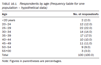
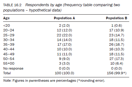
- univariate (also known as frequency tables) – containing information about one variable, for example Tables 16.1 and 16.2;
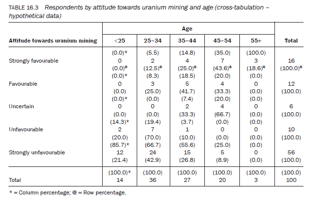
- bivariate (also known as cross-tabulations) – containing information about two variables, for example Table 16.3; and
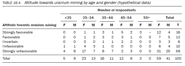
- polyvariate or multivariate – containing information about more than two variables, for example Table 16.4.
2.3. Types of percentages
The abilities to interpret data accurately and to communicate findings effectively are important skills for a researcher. For accurate and effective interpretation of data, you may need to calculate measures such as percentages, cumulative percentages or ratios. It is also sometimes important to apply other statistical procedures to data. The use of percentages is a common procedure in the interpretation of data. There are three types of percentage: ‘row’, ‘column’ and ‘total’. It is important to understand the relevance, interpretation and significance of each. Let us take some examples.
Tables 16.1 and 16.2 are univariate or frequency tables. In any univariate table, percentages calculate the magnitude of each subcategory of the variable out of a constant number (100). Such a table shows what would have been the expected number of respondents in each subcategory had there been 100 respondents. Percentages in a univariate table play a more important role when two or more samples or populations are being compared (Table 16.2). As the total number of respondents in each sample or population group normally varies, percentages enable you to standardise them against a fixed number (100). This standardisation against 100 enables you to compare the magnitude of the two populations within the different subcategories of a variable.
In a cross-tabulation such as in Table 16.3, the subcategories of both variables are examined in relation to each other. To make this table less congested, we have collapsed the age categories shown in Table 16.1. For such tables you can calculate three different types of percentage, row, column and total, as follows:
- Row percentage – Calculated from the total of all the subcategories of one variable that are displayed along a row in different columns, in relation to only one subcategory of the other variable. For example, in Table 16.3 figures in parentheses marked with @ are the row percentages calculated out of the total (16) of all age subcategories of the variable age in relation to only one subcategory of the second variable (i.e. those who hold a strongly favourable attitude towards uranium mining) – in other words, one subcategory of a variable displayed on the stub by all the subcategories of the variable displayed on the column heading of a table. Out of those who hold a strongly unfavourable attitude towards uranium mining, 21.4 per cent are under the age of 25 years, none is above the age of 55 and the majority (42.9 per cent) are between 25 and 34 years of age (Table 16.3). This row percentage has thus given you the variation in terms of age among those who hold a strongly unfavourable attitude towards uranium mining. It has shown how the 56 respondents who hold a strongly unfavourable attitude towards uranium mining differ in age from one another. Similarly, you can select any other subcategory of the variable (attitude towards uranium mining) to examine its variation in relation to the other variable, age.
- Column percentage – In the same way, you can hold age at a constant level and examine variations in attitude. For example, suppose you want to find out differences in attitude among 25-34-year-olds towards uranium mining. The age category 25-34 (column) shows that of the 36 respondents, 24 (66.7 per cent) hold a strongly unfavourable attitude while only two (5.5 per cent) hold a strongly favourable attitude towards uranium mining. You can do the same by taking any subcategory of the variable age, to examine differences with respect to the different subcategories of the other variable (attitudes towards uranium mining).
- Total percentage – This standardises the magnitude of each cell; that is, it gives the percentage of respondents who are classified in the subcategories of one variable in relation to the subcategories of the other variable. For example, what percentage do those who are under the age of 25 years, and hold a strongly unfavourable attitude towards uranium mining, constitute of the total population?
It is possible to sort data for three variables. Table 16.4 (percentages not shown) examines respondents’ attitudes in relation to their age and gender. As you add more variables to a table it becomes more complicated to read and more difficult to interpret, but the procedure for interpreting it is the same.
The introduction of the third variable, gender, helps you to find out how the observed association between the two subcategories of the two variables, age and attitude, is distributed in relation to gender. In other words, it helps you to find out how many males and females constitute a particular cell showing the association between the other two variables. For example, Table 16.4 shows that of those who have a strongly unfavourable attitude towards uranium mining, 24 (42.9 per cent) are 25—34 years of age. This group comprises 17 (70.8 per cent) females and 7 (29.2 per cent) males. Hence, the table shows that a greater proportion of female than male respondents between the ages of 25 and 34 hold a strongly unfavourable attitude towards uranium mining. Similarly, you can take any two subcategories of age and attitude and relate these to either subcategory (male/female) of the third variable, gender.
3. Graphs
Graphic presentations constitute the third way of communicating analysed data. Graphic presentations can make analysed data easier to understand and effectively communicate what it is supposed to show. One of the choices you need to make is whether a set of information is best presented as a table, a graph or as text. The main objective of a graph is to present data in a way that is easy to understand and interpret, and interesting to look at. Your decision to use a graph should be based mainly on this consideration: ‘A graph is based entirely on the tabled data and therefore can tell no story that cannot be learnt by inspecting a table. However, graphic representation often makes it easier to see the pertinent features of a set of data’ (Minium 1978: 45).
Graphs can be constructed for every type of data — quantitative and qualitative — and for any type of variable (measured on a nominal, ordinal, interval or ratio scale). There are different types of graph, and your decision to use a particular type should be made on the basis of the measurement scale used in the measurement of a variable. It is equally important to keep in mind the measurement scale when it comes to interpretation. It is not uncommon to find people misinterpreting a graph and drawing wrong conclusions simply because they have overlooked the measurement scale used in the measurement of a variable. The type of graph you choose depends upon the type of data you are displaying. For categorical variables you can construct only bar charts, histograms or pie charts, whereas for continuous variables, in addition to the above, line or trend graphs can also be constructed. The number of variables shown in a graph are also important in determining the type of graph you can construct.
When constructing a graph of any type it is important to be acquainted with the following points:
- A graphic presentation is constructed in relation to two axes: horizontal and vertical. The horizontal axis is called the ‘abscissa’ or, more commonly, the x-axis, and the vertical axis is called the ‘ordinate’ or, more commonly, the y-axis (Minium 1978: 45).
- if a graph is designed to display only one variable, it is customary, but not essential, to represent the subcategories of the variable along the x-axis and the frequency or count of that subcategory along the y-axis. The point where the axes intersect is considered as the zero point for the y-axis. When a graph presents two variables, one is displayed on each axis and the point where they intersect is considered as the starting or zero point.
- a graph, like a table, should have a title that describes its contents. the axes should be labelled also.
- A graph should be drawn to an appropriate scale. it is important to choose a scale that enables your graph to be neither too small nor too large, and your choice of scale for each axis should result in the spread of axes being roughly proportionate to one another. Sometimes, to fit the spread of the scale (when it is too spread out) on one or both axes, it is necessary to break the scale and alert readers by introducing a break (usually two slanting parallel lines) in the axes.
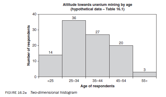
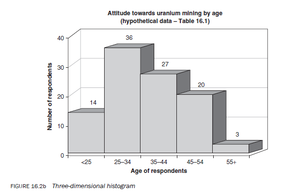
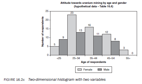
3.1. The histogram
A histogram consists of a series of rectangles drawn next to each other without any space between them, each representing the frequency of a category or subcategory (Figures, 16.2a,b,c). Their height is in proportion to the frequency they represent. The height of the rectangles may represent the absolute or proportional frequency or the percentage of the total. As mentioned, a histogram can be drawn for both categorical and continuous variables. When interpreting a histogram you need to take into account whether it is representing categorical or continuous variables. Figures 16.2a, b and c provide three examples of histograms using data from Tables 16.1 and 16.4. The second histogram is effectively the same as the first but is presented in a three-dimensional style.
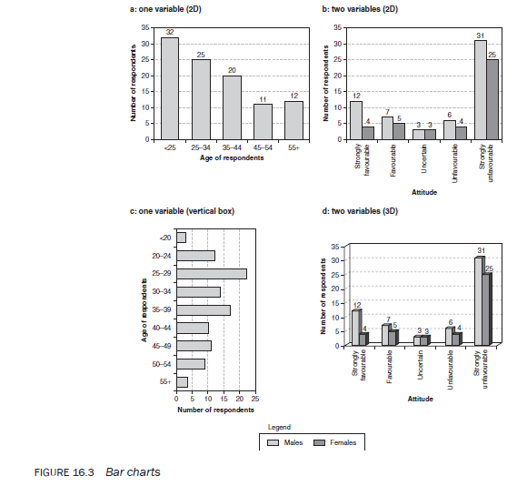
3.2. The bar chart
The bar chart or diagram is used for displaying categorical data (Figure 16.3). A bar chart is identical to a histogram, except that in a bar chart the rectangles representing the various frequencies are spaced, thus indicating that the data is categorical. The bar chart is used for variables measured on nominal or ordinal scales. The discrete categories are usually displayed along the x-axis and the number or percentage of respondents on the y-axis. However, as illustrated, it is possible to display the discrete categories along the y-axis. The bar chart is an effective way of visually displaying the magnitude of each subcategory of a variable.
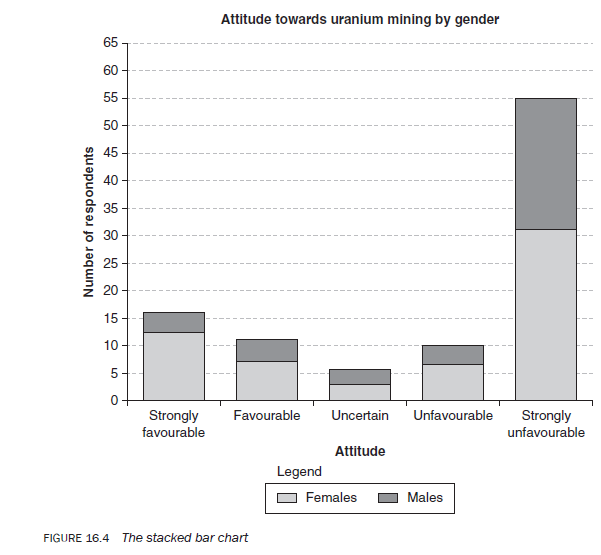
3.3. The stacked bar chart
A stacked bar chart is similar to a bar chart except that in the former each bar shows information about two or more variables stacked onto each other vertically (Figure 16.4). The sections of a bar show the proportion of the variables they represent in relation to one another.
The stacked bars can be drawn only for categorical data.
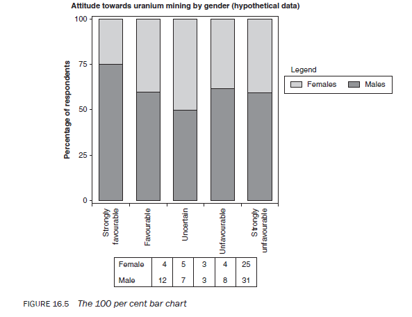
3.4. The 100 per cent bar chart
The 100 per cent bar chart (Figure 16.5) is very similar to the stacked bar chart. In this case, the subcategories of a variable are converted into percentages of the total population. Each bar, which totals 100, is sliced into portions relative to the percentage of each subcategory of the variable.
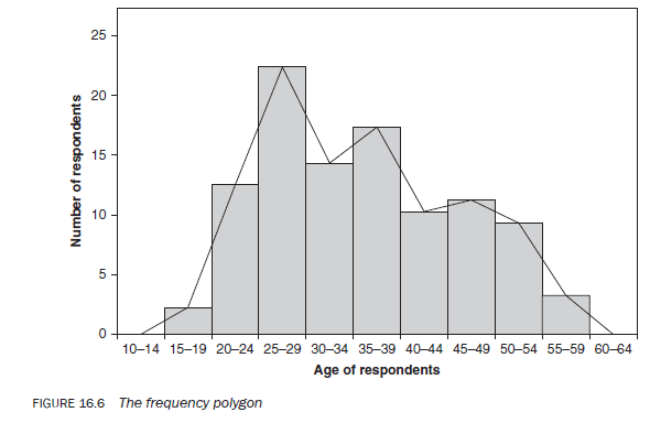
3.5. The frequency polygon
The frequency polygon is very similar to a histogram. A frequency polygon is drawn by joining the midpoint of each rectangle at a height commensurate with the frequency of that interval (Figure 16.6). One problem in constructing a frequency polygon is what to do with the two categories at either extreme. To bring the polygon line back to the x-axis, imagine that the two extreme categories have an interval similar to the rest and assume the frequency in these categories to be zero. From the midpoint of these intervals, you extend the polygon line to meet the x-axis at both ends. A frequency polygon can be drawn using either absolute or proportionate frequencies.
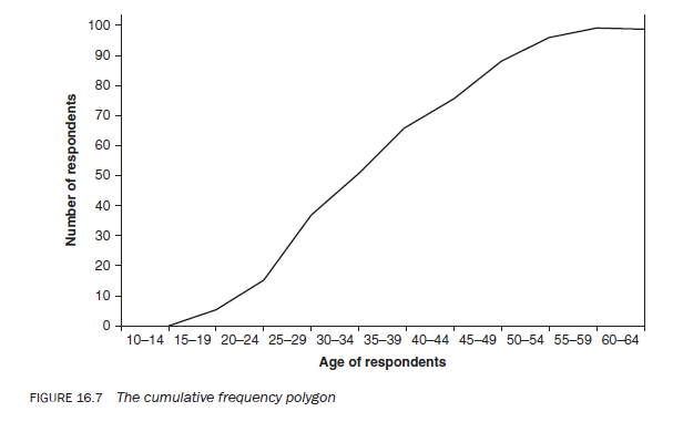
3.6. The cumulative frequency polygon
The cumulative frequency polygon or cumulative frequency curve (Figure 16.7) is drawn on the basis of cumulative frequencies. The main difference between a frequency polygon and a cumulative frequency polygon is that the former is drawn by joining the midpoints of the intervals, whereas the latter is drawn by joining the end points of the intervals because cumulative frequencies interpret data in relation to the upper limit of an interval. As a cumulative frequency distribution tells you the number of observations less than a given value and is usually based upon grouped data, to interpret a frequency distribution the upper limit needs to be taken.
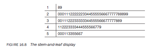
3.7. The stem-and-leaf display
The stem-and-leaf display is an effective, quick and simple way of displaying a frequency distribution (Figure 16.8). The stem-and-leaf diagram for a frequency distribution running into two digits is plotted by displaying digits 0 to 9 on the left of the y-axis, representing the tens of a frequency. The figures representing the units of a frequency (i.e. the right-hand figure of a two-digit frequency) are displayed on the right of the y-axis. Note that the stem-and-leaf display does not use grouped data but absolute frequencies. If the display is rotated 90 degrees in an anti-clockwise direction, it effectively becomes a histogram. With this technique some of the descriptive statistics relating to the frequency distribution, such as the mean, the mode and the median, can easily be ascertained; however, the procedure for their calculation is beyond the scope of this book. Stem-and-leaf displays are also possible for frequencies running into three and four digits (hundreds and thousands).
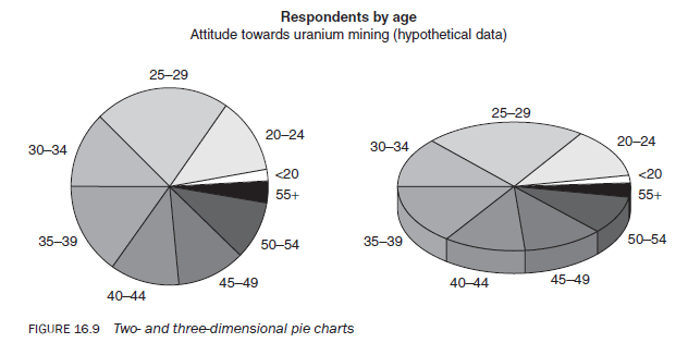
3.8. The pie chart
The pie chart is another way of representing data graphically (Figure 16.9), this time as a circle. There are 360 degrees in a circle, and so the full circle can be used to represent 100 per cent, or the total population. The circle or pie is divided into sections in accordance with the magnitude of each subcategory, and so each slice is in proportion to the size of each subcategory of a frequency distribution. The proportions may be shown either as absolute numbers or as percentages. Manually, pie charts are more difficult to draw than other types of graph because of the difficulty in measuring the degrees of the pie/circle. They can be drawn for both qualitative data and variables measured on a continuous scale but grouped into categories.
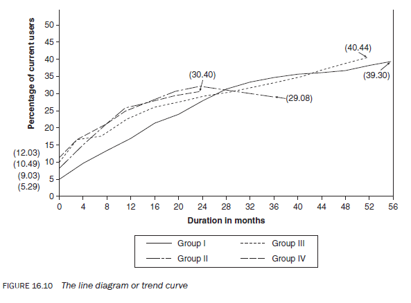
3.9. The line diagram or trend curve
A set of data measured on a continuous interval or a ratio scale can be displayed using a line diagram or trend curve. A trend line can be drawn for data pertaining to both a specific time (e.g. 1995, 1996, 1997) or a period (e.g. 1985—1989, 1990—1994, 1995—). If it relates to a period, the midpoint of each interval at a height commensurate with each frequency — as in the case of a frequency polygon — is marked as a dot. These dots are then connected with straight lines to examine trends in a phenomenon. If the data pertains to exact time, a point is plotted at a height commensurate with the frequency. These points are then connected with straight lines. A line diagram is a useful way of visually conveying the changes when long-term trends in a phenomenon or situation need to be studied, or the changes in the subcategory of a variable are measured on an interval or a ratio scale (Figure 16.10). Trends plotted as a line diagram are more clearly visible than in a table. For example, a line diagram would be useful for illustrating trends in birth or death rates and changes in population size.
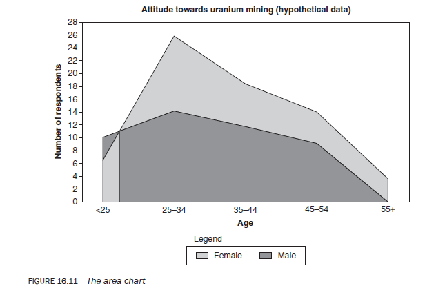
2.10. The area chart
For variables measured on an interval or a ratio scale, information about the subcategories of a variable can also be presented in the form of an area chart. This is plotted in the same way as a line diagram but with the area under each line shaded to highlight the total magnitude of the subcategory in relation to other subcategories. For example, Figure 16.11 shows the number of male and female respondents by age.
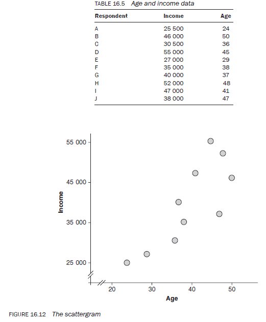
3.11. The scattergram
When you want to show visually how one variable changes in relation to a change in the other variable, a scattergram is extremely effective.
For a scattergram, both the variables must be measured either on interval or ratio scales and the data on both the variables needs to be available in absolute values for each observation — you cannot develop a scattergram for categorical variables. Data for both variables is taken in pairs and displayed as dots in relation to their values on both axes. Let us take the data on age and income for 10 respondents of a hypothetical study in Table 16.5. The relationship between age and income based upon hypothetical data is shown in Figure 16.12.
4. Statistical measures
Statistical measures are extremely effective in communicating the findings in a precise and succinct manner. Their use in certain situations is desirable and in some it is essential, however, you can conduct a perfectly valid study without using any statistical measure.
There are many statistical measures ranging from very simple to extremely complicated. On one end of the spectrum you have simple descriptive measures such as mean, mode, median and, on the other; there are inferential statistical measures like analysis of variance, factorial analysis, multiple regressions.
Because of its vastness, statistics is considered a separate academic discipline and before you are able to use these measures, you need to learn about them.
Use of statistical measures is dependent upon the type of data collected, your knowledge of statistics, the purpose of communicating the findings, and the knowledge base in statistics of your readership.
Before using statistical measures, make sure the data lends itself to the application of statistical measures, you have sufficient knowledge about them, and your readership can understand them.
Source: Kumar Ranjit (2012), Research methodology: a step-by-step guide for beginners, SAGE Publications Ltd; Third edition.
29 Jul 2021
30 Jul 2021
30 Jul 2021
30 Jul 2021
29 Jul 2021
30 Jul 2021