In Problem 7.3 we will graph the slopes using the data from the output from Problem 7.2.
- What do the slopes look like when previous experience (months) is moderating the relationship between beginning salary and current salary?
Follow these steps:
- Open a new and blank SPSS data file by going to File → Data → New.
- Click on Variable View in the lower left corner.
- Under Name enter the variable name salbegin and then hit the return button.
- In the second row under Name enter
- In the third row under Name, enter currentsal.
- Next, click on Data View in the lower left corner.
- Get the data from Problem 7.2 listed under Data for visualizing conditional effect of X of Y.
As you can see from the data, in the first column under salbegin there are three distinct values of 7870.6382, .0000, and –7870.6382. These values represent high, medium, and low values for beginning salary. Instead of entering these values, we will enter 1 for low (whenever –7870.6382 is listed), 2 for medium (whenever .0000 is listed), and 3 for high (whenever 7870.6382 is listed).
We will repeat this procedure for the prevexp data. For the values –95.8608 we will enter a 1 for low, .0000 we will enter 2 for medium, and 95.8608 we will enter 3 for high.
- Enter the data as described above for salbegin and
- Click on Label and label these variables with 1 = low, 2 = medium, and 3 = high. See Appendix A if you need help with this step.
- Next, enter the data as it is shown in the output for yhat, which we have renamed
- Click on Graph → Chart Builder. The Chart Builder window will open.
- On the bottom left of the window, be sure the Gallery tab is highlighted.
- Under Choose from: click on Line. Two pictures of line graphs will appear to the right of this box.
- Click on the picture with three lines and drag it to the large white space where it says Drag a Gallery chart here to use it as your starting point OR Click on the Basic elements tab to build a chart element by element.
- From the variable list under Variables: click on currentsal and drag it to the large white space with the box Y-Axis?.
- Click on the variable beginingsal and drag it to the box X-Axis?.
- Click on the variable prevexp and drag it to the box Set color. Note that the lines in the graph use example data: this is not what our graph will look like!
- Click on Continue.
- Click on OK.
Compare your output and syntax to Output 7.3.
Output 7.3: Graphing the Simple Slopes for a Moderation Analysis
* Chart Builder.
GGRAPH
/GRAPHDATASET NAME=”graphdataset” VARIABLES=beginsal
MEAN(currentsal)[name=”MEAN_currentsal”] prevexp MISSING=LISTWISE REPORTMISSING=NO
/GRAPHSPEC SOURCE=INLINE.
BEGIN GPL
SOURCE: s=userSource(id(“graphdataset”))
DATA: beginsal=col(source(s), name(“beginsal”), unit.category())
DATA: MEAN_currentsal=col(source(s), name(“MEAN_currentsal”))
DATA: prevexp=col(source(s), name(“prevexp”), unit.category()) GUIDE: axis(dim(1), label(“beginsal”))
GUIDE: axis(dim(2), label(“Mean currentsal”))
GUIDE: legend(aesthetic(aesthetic.color.interior), label(“prevexp”))
SCALE: cat(dim(1), include(“1.00”, “2.00”, “3.00”))
SCALE: linear(dim(2), include(0))
SCALE: cat(aesthetic(aesthetic.color.interior), include(“1.00”, “2.00”, “3.00”)) ELEMENT: line(position(beginsal*MEAN_currentsal), color.interior(prevexp), missing.wings()) END GPL.
Graph
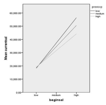
Interpretation of Output 7.3
The graph represents how previous experience moderates the relationship between beginning salary and current salary. The graph shows what we found in Problem 7.2: when previous experience is low, there is a statistically significant positive relationship between beginning salary and current salary, when previous experience is at the mean, there is a statistically significant positive relationship between beginning salary and current salary, and when previous experience is high, there is a statistically significant positive relationship between beginning salary and current salary.
Example of How to Write About Output 7.2 and 7.3
Results
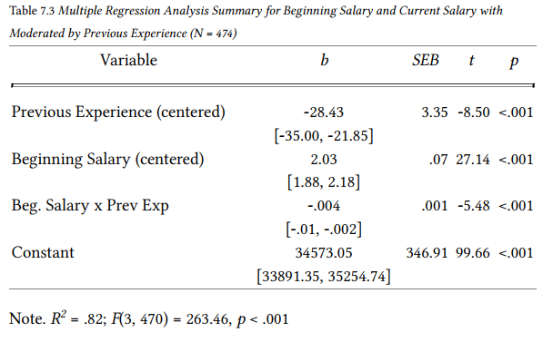
Multiple regression was conducted to determine if previous experience (in months) moderates the relationship between beginning salary and current salary. (Assumptions of linearity, normally distributed errors, and uncorrelated errors were checked and met.) A statistically significant interaction was found, F(3, 470) = 263.46, p < .001, R squared = .82. According to Cohen (1988) this is a large effect size. It was found that there is a statistically significant positive relationship between beginning salary and current salary, b = 2.43, 95% CI [2.18, 2.67], t = 19.77, p < .001. When previous experience is at the mean, there is a statistically significant positive relationship between beginning salary and current salary, b = 2.03, 95% CI [1.88, 2.18], t = 27.14, p < .001. Finally, when previous experience is high, there is a statistically significant positive relationship between beginning salary and current salary, b = 1.60, 95% CI [1.43, 1.76], t = 18.79, p < .001.
Source: Leech Nancy L. (2014), IBM SPSS for Intermediate Statistics, Routledge; 5th edition;
download Datasets and Materials.
20 Sep 2022
27 Mar 2023
16 Sep 2022
29 Mar 2023
27 Mar 2023
14 Sep 2022