The basic model of supply and demand is the workhorse of microeconomics. It helps us understand why and how prices change, and what happens when the government intervenes in a market. The supply-demand model combines two important concepts: a supply curve and a demand curve. It is important to under- stand precisely what these curves represent.
1. The Supply Curve
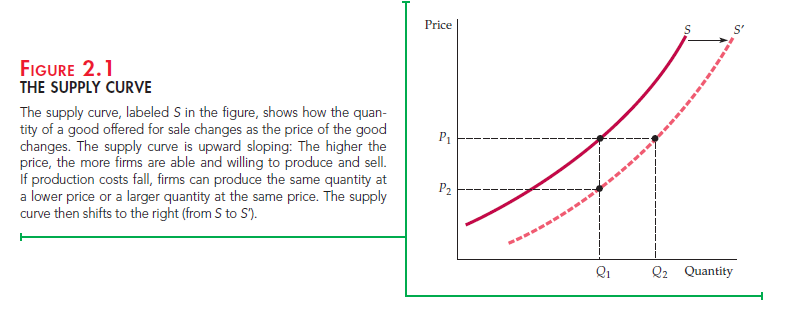
The supply curve shows the quantity of a good that producers are willing to sell at a given price, holding constant any other factors that might affect the quantity supplied. The curve labeled S in Figure 2.1 illustrates this. The vertical axis of the graph shows the price of a good, P, measured in dollars per unit. This is the price that sellers receive for a given quantity supplied. The horizontal axis shows the total quantity supplied, Q, measured in the number of units per period.
The supply curve is thus a relationship between the quantity supplied and the price. We can write this relationship as an equation:
QS = QS(P)
Or we can draw it graphically, as we have done in Figure 2.1.
Note that the supply curve in Figure 2.1 slopes upward. In other words, the higher the price, the more that firms are able and willing to produce and sell. For example, a higher price may enable current firms to expand production by hir-ing extra workers or by having existing workers work overtime (at greater cost to the firm). Likewise, they may expand production over a longer period of time by increasing the size of their plants. A higher price may also attract new firms to the market. These newcomers face higher costs because of their inex- perience in the market and would therefore have found entry uneconomical at a lower price.

OTHER VARIABLES THAT AFFECT SUPPLY The quantity supplied can depend on other variables besides price. For example, the quantity that produc- ers are willing to sell depends not only on the price they receive but also on their production costs, including wages, interest charges, and the costs of raw materi- als. The supply curve labeled S in Figure 2.1 was drawn for particular values of these other variables. A change in the values of one or more of these variables translates into a shift in the supply curve. Let’s see how this might happen.
The supply curve S in Figure 2.1 says that at a price P1, the quantity produced and sold would be Q1. Now suppose that the cost of raw materials falls. How does this affect the supply curve?
Lower raw material costs—indeed, lower costs of any kind—make production more profitable, encouraging existing firms to expand production and enabling new firms to enter the market. If at the same time the market price stayed con- stant at P1, we would expect to observe a greater quantity supplied. Figure 2.1 shows this as an increase from Q1 to Q2. When production costs decrease, output increases no matter what the market price happens to be. The entire supply curve thus shifts to the right, which is shown in the figure as a shift from S to S’.
Another way of looking at the effect of lower raw material costs is to imag- ine that the quantity produced stays fixed at Q1 and then ask what price firms would require to produce this quantity. Because their costs are lower, they would accept a lower price—P2. This would be the case no matter what quantity was produced. Again, we see in Figure 2.1 that the supply curve must shift to the right.
We have seen that the response of quantity supplied to changes in price can be represented by movements along the supply curve. However, the response of supply to changes in other supply-determining variables is shown graphically as a shift of the supply curve itself. To distinguish between these two graphical depictions of supply changes, economists often use the phrase change in supply to refer to shifts in the supply curve, while reserving the phrase change in the quantity supplied to apply to movements along the supply curve.
2. The Demand Curve
The demand curve shows how much of a good consumers are willing to buy as the price per unit changes. We can write this relationship between quantity demanded and price as an equation:
QD = QD(P)
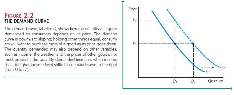
or we can draw it graphically, as in Figure 2.2. Note that the demand curve in that figure, labeled D, slopes downward: Consumers are usually ready to buy more if the price is lower. For example, a lower price may encourage consumers who have already been buying the good to consume larger quantities. Likewise, it may allow other consumers who were previously unable to afford the good to begin buying it.
Of course the quantity of a good that consumers are willing to buy can depend on other things besides its price. Income is especially important. With greater incomes, consumers can spend more money on any good, and some con- sumers will do so for most goods.

SHIFTING THE DEMAND CURVE Let’s see what happens to the demand curve if income levels increase. As you can see in Figure 2.2, if the market price were held constant at P1, we would expect to see an increase in the quan- tity demanded—say, from Q1 to Q2, as a result of consumers’ higher incomes. Because this increase would occur no matter what the market price, the result would be a shift to the right of the entire demand curve. In the figure, this is shown as a shift from D to D’. Alternatively, we can ask what price consumers would pay to purchase a given quantity Q1. With greater income, they should be will- ing to pay a higher price—say, P2 instead of P1 in Figure 2.2. Again, the demand curve will shift to the right. As we did with supply, we will use the phrase change in demand to refer to shifts in the demand curve, and reserve the phrase change in the quantity demanded to apply to movements along the demand curve.1
SUBSTITUTE AND COMPLEMENTARY GOODS Changes in the prices of related goods also affect demand. Goods are substitutes when an increase in the price of one leads to an increase in the quantity demanded of the other. For example, copper and aluminum are substitute goods. Because one can often be substituted for the other in industrial use, the quantity of copper demanded will increase if the price of aluminum increases. Likewise, beef and chicken are substi- tute goods because most consumers are willing to shift their purchases from one to the other when prices change.
Goods are complements when an increase in the price of one leads to a decrease in the quantity demanded of the other. For example, automobiles and gasoline are complementary goods. Because they tend to be used together, a decrease in the price of gasoline increases the quantity demanded for automobiles. Likewise, computers and computer software are complementary goods. The price of com- puters has dropped dramatically over the past decade, fueling an increase not only in purchases of computers, but also purchases of software packages.
We attributed the shift to the right of the demand curve in Figure 2.2 to an increase in income. However, this shift could also have resulted from either an increase in the price of a substitute good or a decrease in the price of a complementary good. Or it might have resulted from a change in some other variable, such as the weather. For example, demand curves for skis and snow- boards will shift to the right when there are heavy snowfalls.
Source: Pindyck Robert, Rubinfeld Daniel (2012), Microeconomics, Pearson, 8th edition.

16 Apr 2021
15 Apr 2021
22 Apr 2021
17 Apr 2021
19 Apr 2021
15 Apr 2021