The graph bar command, unlike graph twoway bar, works well to display relationships involving one or more categorical variables. Such graphs prove particularly useful with survey data, as will be shown in Chapter 4. This section serves just to introduce the command, with an example using variables from the cross-national dataset Nations_2.dta.
. use C:\data\Nations2.dta, clear
. describe region gdp pop

Variable gdp, per capita Gross Domestic Product, has values ranging from 279.8 to 74,906 dollars per person. Five-digit numbers often look unwieldy as axis labels, so we start by generating a new variable, gdp1000, expressing Gross Domestic Product in thousands of dollars. Figure 3.20 depicts the mean and median of gdp1000 over values of region, using graph bar.

Figure 3.20 includes labels giving the height of each bar, displayed in numerical format(%3.1f) — which means a fixed format with three digits, one of them right of the decimal. graph bar can display not only means or medians but also other statistics including various percentiles, minimum, maximum or count. It also could show these statistics for more than one variable, if they have similar scales.
The legend in Figure 3.20 is placed within the data region at 11 o’clock: ring(0) position(11). It has two columns to parallel the side-by-side arrangement of bars. symxsize(*.5) causes the horizontal (x) dimension of the symbols in the legend to appear at half their default size, which saves space and also makes the symbols more similar to the widths of the bars themselves.
The graph bar example above specifies a blue color for bar 1 and orange for bar 2. Blue and orange may not show on this page, but even converted to black and white the blue and orange bars look quite different. As Nicholas Cox has pointed out, blue and orange form a noteworthy pair because they appear visually distinct to readers with most types of color vision deficiencies, unlike (for example) red and green. Analysts might take this consideration into account when designing graphs where distinguishing between colors is critical.
Bar charts can provide clear visualizations of relationships involving many categories and two or more variables. Pie charts, on the other hand, rarely clarify the analysis but are popular for some public presentations. Figure 3.21 illustrates Stata’s graph pie command, showing the breakdown of world population by region. The variable pop ranges from just under 10,000 to 1.32 billion (1.32e+09, meaning 1.32*109 = 1,320,000,000). To make our pie chart readable it helps to create a new variable, popmil or population in millions.
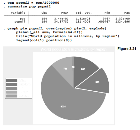
The pie(2, explode) option “explodes” the second pie slice (Americas) for emphasis. plabel(_all sum, format(%4.0f) requests labels for all of the pie slices, giving the sum ofpopmil (that is, the total population in millions) for each region. The pie labels are have format(%4.0f), meaning a fixed numerical format with four digits, none right of the decimal.
Type help graph pie to see other pie chart options, including methods for differently-organized data. One interesting variation uses the by( ) option to create an image containing multiple small pie charts that can be visually compared.
Source: Hamilton Lawrence C. (2012), Statistics with STATA: Version 12, Cengage Learning; 8th edition.
26 Sep 2022
3 Oct 2022
24 Sep 2022
28 Sep 2022
23 Sep 2022
29 Sep 2022