Box plots, bar charts and histograms summarize measurement variable distributions, hiding individual data points to clarify overall patterns. Symmetry and quantile plots, on the other hand, include points for every observation. They take more effort to read than summary graphs, because they convey more detailed information.
A histogram of the ratio of females to males in the labor forces of 177 countries, from Nations2.dta, appears in Figure 3.22. A superimposed normal (Gaussian) curve indicates that femlab has a heavier-than-normal left tail (countries with relatively few females in the labor force), and a lighter-than-normal right tail — the definition of negative skew.
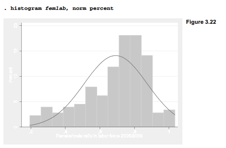
Figure 3.23 depicts this distribution as a symmetry plot. It plots the distance of the ith observation above the median (vertical) against the distance of the ith observation below the median. All points would lie on the diagonal line if this distribution were symmetrical. Instead, we see that distances below the median grow steadily larger than corresponding distances above the median, a symptom of negative skew.

Quantiles are values below which a certain fraction of the data lie. For example, a .3 quantile is that value higher than 30% of the data (similar to the 30th percentile). If we sort n observations in ascending order, the ith value forms the (i-.5)/n quantile. Quantile plots automatically calculate what fraction of the observations lie below each data value, and display the results graphically as in Figure 3.24. Quantile plots provide a reference for someone who does not have the original data at hand. From well-labeled quantile plots, we can estimate order statistics such as median (.5 quantile) or deciles (.1, .2, .3 quantiles and so forth). We could also read a quantile plot to estimate the fraction of observations falling below a given value.

Quantile-normal plots, also called normal probability plots, compare quantiles of a variable’s distribution with quantiles of a theoretical normal distribution having the same mean and standard deviation. They allow visual inspection for departures from normality in every part of a distribution, which can help guide decisions regarding normality assumptions and efforts to find a normalizing transformation. Figure 3.25, a quantile-normal plot offemlab, confirms the negative skew noticed earlier. The grid option calls for a set of lines marking the .05, .10, .25 (first quartile), .50 (median), .75 (third quartile), .90, and .95 quantiles of both distributions. The .05, .50, and .95 quantile values are displayed along the top and right-hand axes.

Quantile-quantile plots (not shown) resemble quantile-normal plots, but compare quantiles (ordered data points) of two empirical distributions instead of comparing one empirical distribution with a theoretical normal distribution. Regression with Graphics (Hamilton 1992a) includes an introduction to reading these and other quantile-based plots. Chambers et al. (1983) provide more details. Related Stata commands include pnorm (standard normal probability plot), pchi (chi-squared probability plot) and qchi (quantile-chi-squared plot). Type help quantile for details on this graphical family.
Source: Hamilton Lawrence C. (2012), Statistics with STATA: Version 12, Cengage Learning; 8th edition.
28 Sep 2022
26 Sep 2022
28 Sep 2022
30 Sep 2022
29 Sep 2022
3 Oct 2022