Edward Tufte, in his elegant and influential books about graphing data (1990, 1997, 2001, 2006), calls for more effort at designing clear, information-packed graphics. Presenting a rich collection of impressively good or humorously awful examples, Tufte shows how successful graphics allow viewers to draw their own comparisons and examine details of relationships between variables. Stata users form a natural audience for these suggestions. Stata provides flexible tools for visualizing patterns in complex data, allowing basic plots to be enhanced or rearranged creatively in new images.
One of Tufte’s themes is the value of small multiples, sets of thumbnail-sized graphics that add dimensions for comparison. A graph command with by( ) option can draw these nicely. Figure 3.32 illustrates with time plots of winter snow depth at two locations: a town in New Hampshire’s White Mountains, and the city of Boston, 225 kilometers to its south (dataset whitemtl.dta). Snow depth was measured daily at both locations; these data cover nine consecutive winters, 1997-98 through 2005-2006. Variable dayseason counts days since November 1 each winter season. mtdepth and bosdepth are snow depths in centimeters at the White Mountains location and in Boston, respectively. Variable season identifies the winter seasons, 1997-98 through 2005-06. The following command specifies a twoway area graph of mtdepth and bosdepth against dayseason, using lighter and darker gray (gs11 and gs5) for colors, in a 3*3 layout by season, and with a one-column legend positioned at 3 o’clock. symxsize(*.3) saves space by making the legend’s symbols only 30% as wide as their default.

Figure 3.32 visualizes daily conditions through nine New England winters, showing how snow depth varies at two different places and on two different time scales. 2000-01 and 2003-04 stand out as heavy snow seasons in the mountains, with several significant storms in Boston. 1998-99 was much lighter in the mountains, with periods of no snow on the ground.
The data behind Figure 3.32 were assembled for research on how weather and climate affect attendance at ski areas (Hamilton et al. 2003, 2007). As New England’s winter climate warmed in recent decades, low-snow winters became more common. That warming is troublesome from environmental and other perspectives, including that of winter recreation. Ski areas can feel not only the effects of local snow conditions, but also a “backyard effect” of snow conditions in distant cities such as Boston, where many skiers live. The next graph, Figure 3.33, focuses on the single season of 1999-2000 (dataset whitemt2.dta). It begins with the same snow-depth shadow mountains that formed the top right plot in Figure 3.32.
Figure 3.33 overlays these shadow mountains (the twoway area plot) with a line plot showing the number of skier and snowboarder visits each day, at one ski area in the White Mountains close to where the snow-depth measurements were made. Both the observed visits (visits) and the number of visits predicted by a time series model (model) are graphed. The model, described
in Hamilton et al. (2007), predicts daily attendance as a function of weekly cyclical factors together with weather and snow conditions, both in the mountains and in Boston. The graph command creating Figure 3.33 assigns the left-hand y axis to snow depth in centimeters (mtdepth and bosdepth), and the right-hand y axis to observed and modeled number of visitors (visits and model).
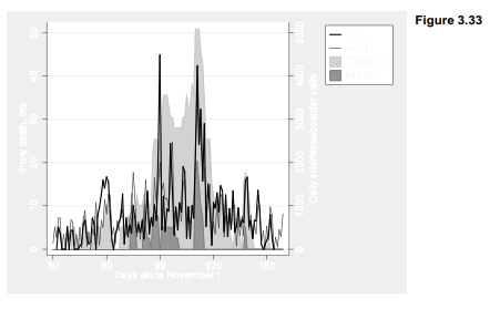
Note that by carefully setting the yscale(range( )) and ylabel( ) options for each of the two overlaid plots in Figure 3.33, we managed to align their scales so that the same horizontal grid lines work for both. This is not practical to do with all data, but can definitely improve the readability of graphs involving differently-scaled y variables.
. graph twoway area mtdepth bosdepth dayseason, yaxis(1)
ytitle(“Snow depth, cm”, axis(1)) bcolor(gs12 gs6)
ylabel(0(10)60, axis(1))
|| line model visits dayseason, yaxis(2)
lwidth(medthin medthick)
ylabel(0(1)3, axis(2)) lcolor(gs1 gs0)
|| if dayseason>29 & dayseason<160,
r2(“Daily skier/snowboarder visits”) xlabel(30(30)150)
xtitle(“Days since November 1”)
legend(rows(4) position(2) order(4 3 1 2) label(1 “White Mt”)
label(2 “Boston”) label(3 “model”) label(4 “attend”)
symxsize(*.3))
yscale(range(0,51) axis(1)) ylabel(0(10)50, axis(1) grid)
yscale(range(0,5100) axis(2)) ylabel(0(1000)5000, axis(2))
The two highest spikes in ski-area visits were school holiday periods that happened to coincide with snow in Boston. The original study tested and confirmed the significance of this backyard effect. Graphically, it would be a simple step (not shown) from Figure 3.33 to a new set of small-multiples plots like Figure 3.32, visualizing the ski business together with the snow.
Population pyramids, widely used by demographers to represent the age-sex structure of populations, are not among Stata’s plot types. They can, however, be constructed from horizontal bar charts, through creative use of graph hbar. There are several ways to do so. Figure 3.34 illustrates one approach, with a pyramid for the Greenland-born, predominantly Inuit, population of Greenland in 2006 (Hamilton and Rasmussen 2010). The number of females at each age is indicated by a bar to the right of center, and the number of males that same age by a bar to the left. The 90 one-year age groups seen here are too many to label individually, so they are marked off instead by gray bands every 20 years (0-19 years, 20-39 years, etc.). The graph indicates, for example, that in 2006 the Greenland-born population included almost 600 40-year-old males but fewer than 500 40-year-old females, reflecting sex differences in net outmigration. The central bulge in this pyramid marks a baby boom of adults now ages 35-49 (born in the 1950s and 60s), followed by much smaller cohorts of younger adults. We also see an echo boom of children, born in the 1980s and 90s to adults from the first baby boom. Ages 10-14 comprise the most numerous cohort among children.

There are several tricks behind Figure 3.34. The raw data (greenpopl.dta) contain counts of the number of males andfemales at each age. In order to graph males on the left, we generate a new variable equal to the negative of the number of males,
. gen negmales = -males
A basic unlabeled pyramid could then be drawn by a command such as
. graph hbar (sum) negmales females if year==2006,
over(age, descending gap(0) label(nolabel))
To place gray bands in the background, marking off 20-year groups, we define fake variables maleGRAYandfemGRAYjust to fill in the graph to plus or minus 700:
. gen maleGRAY = -(700-males) if (age>=20 & age<40)
| (age>=60 & age<80)
. gen femGRAY = 700-females if (age>=20 & age<40)
| (age>=60 & age<80)
Figure 3.34 now can be drawn by stacking negmales, females, maleGRAY and femGRAY in a horizontal bar chart, with text to label the gray bands. We also apply labels such as “600” for -600 on the y axis so that the counts for males do not appear negative.
. graph hbar (sum) negmales females malGRAY femGRAY if year==2006,
over(age, descending gap(0) label(nolabel))
ylabel(-600 “600” -400 “400” -200 “200” 0 200 400 600)
ytick(-700(100)700, grid) legend(off) stack
ytitle(“Greenland-born males (left) and females (right)”)
bar(1, color(emidblue)) bar(2, color(maroon)) bar(3, color(gs14))
bar(4, color(gs14)) text(550 97 “2006”, size(large)) text(-550 11 “Age 0 to 19”)
text(-550 33 “Age 20 to 39”)
text(-550 53 “Age 40 to 59”)
text(-550 76 “Age 60 to 79”)
text(-550 95 “Age 80+”)
Figure 3.35 takes this idea a step further by showing similar age pyramids for 1977, 1986, 1996 and 2006. In this sequence we can follow the rise of the large cohort born following improvements in Greenlanders’ health and living standards in the 1950s and 60s. This baby boom shows up as teenagers in the 1977 pyramid. As the boom generation enters adulthood by the 1986 pyramid, we see the echo boom of their children. By 2006, this echo boom is waning
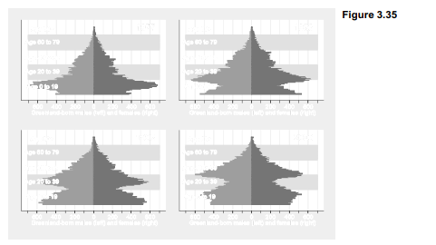
Although Figure 3.35 (constructed using separate images and graph combine) follows a small- multiples idea similar to Figure 3.32, these pyramids can be displayed in a more interesting way. For a live presentations I drew a set of 30 annual pyramids, 1977 to 2006, using a do-file. These 30 Stata graphs (in .emf format) were then pasted onto one PowerPoint slide each, with
automatic transitions at 1-second intervals, producing a 30-second animation of Greenland’s demographic change. Another animation showed how the population of non-Greenlanders living in Greenland had changed over the same years, an interconnected but quite different demographic tale (Hamilton and Rasmussen 2010).
Figure 3.36 is less dynamic, but combines five simple plots with text to form an image having some properties ofboth an illustration and a table. The resulting Stata graphic depicts population changes 1990-2000 among different ethnic groups living in rural counties of the U.S. South (based on U.S. Census data assembled by Voss et al. 2005). The left side of Figure 3.36 is a twoway area graph. To achieve the ramped effect showing population change, the variables graphed for each ethnic group (popwbho, popwbh etc.) actually represent sums calculated as that group’s population plus all the other populations that are graphically “below” it (dataset southmigl.dta). Important additional information, not evident from the area plot itself, is conveyed by two lines of labeling for each group in the legend. For example, readers can see from the legend that the Hispanic population of the rural South grew by 61% over this decade, from roughly 800,000 to 1.3 million people, and make their own visual or numerical comparisons with other populations.
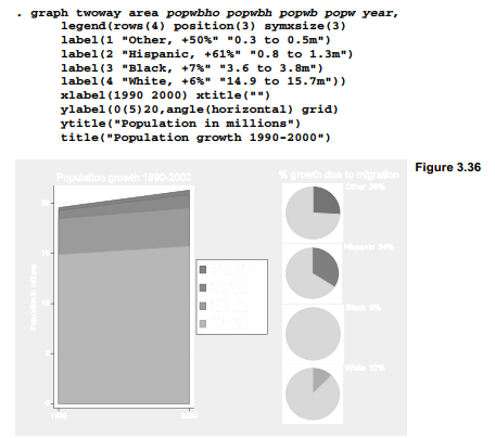
The right-hand part of Figure 3.36 consists of four pie charts showing the percentage of population growth due to net in-migration. Each pie chart was drawn separately using dataset southmig2.dta. For example, the bottom pie chart shows that 12% of the white population growth reflects net migration. Variables graphed are net migration (netmig_w, the total number of in-migrants minus out-migrants) and the remainder of population growth due to natural increase (nonmig_w, number of births minus deaths).
. graph pie nonmig_w netmig_w,
legend(off) pie(1, color(dkorange)) pie(2, color(gs13))
title(“White 12% “, position(2))
Each individual pie chart was saved with a file name such as pie white.gph. After drawing and saving four such pie charts, they were brought together using graph combine.
. graph combine ple_other.gph
pie_hisp.gph pie_black.gph pie_white.gph,
imargin(tiny) rows(4)
title(“% growth due to migration”) fxsize(40)
An fxsize(40) option forces this four-pie-chart image to use only 40% of the width available. Consequently, when they are combined with the left-hand area plot to make Figure 3.36, the pie charts take up less than half of the total width.
These examples illustrate some of the potential for designing new graphics in Stata, by combining standard elements in fresh ways.
Source: Hamilton Lawrence C. (2012), Statistics with STATA: Version 12, Cengage Learning; 8th edition.
3 Oct 2022
3 Oct 2022
3 Oct 2022
3 Oct 2022
26 Sep 2022
28 Sep 2022