In Section 2.5 we provided an introduction to data visualization, a term used to describe the use of graphical displays to summarize and present information about a data set. The goal of data visualization is to communicate key information about the data as effectively and clearly as possible. One of the most widely used data visualization tools is a data dashboard, a set of visual displays that organizes and presents information that is used to monitor the performance of a company or organization in a manner that is easy to read, understand, and interpret. In this section we extend the discussion of data dashboards to show how the addition of numerical measures can improve the overall effectiveness of the display.
The addition of numerical measures, such as the mean and standard deviation of key performance indicators (KPIs) to a data dashboard is critical because numerical measures often provide benchmarks or goals by which KPIs are evaluated. In addition, graphical displays that include numerical measures as components of the display are also frequently included in data dashboards. We must keep in mind that the purpose of a data dashboard is to provide information on the KPIs in a manner that is easy to read, understand, and interpret. Adding numerical measures and graphs that utilize numerical measures can help us accomplish these objectives.
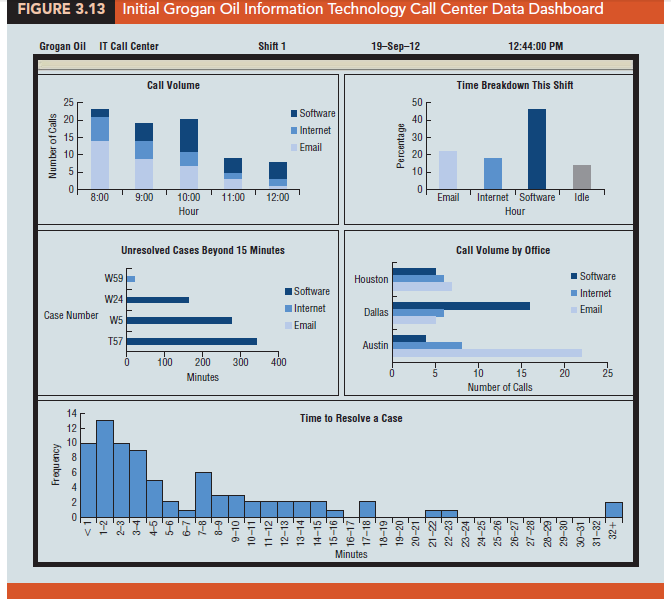
To illustrate the use of numerical measures in a data dashboard, recall the Grogan Oil Company application that we used in Section 2.5 to introduce the concept of a data dashboard. Grogan Oil has offices located in three Texas cities: Austin (its headquarters), Houston, and Dallas. Grogan’s Information Technology (IT) call center, located in the Austin office, handles calls regarding computer-related problems (software, Internet, and email) from employees in the three offices. Figure 3.13 shows the data dashboard that Grogan developed to monitor the performance of the call center. The key components of this dashboard are as follows:
- The stacked bar chart in the upper left corner of the dashboard shows the call volume for each type of problem (software, Internet, or email) over time.
- The bar chart in the upper right-hand corner of the dashboard shows the percentage of time that call center employees spent on each type of problem or were idle (not working on a call).
- For each unresolved case that was received more than 15 minutes ago, the bar chart shown in the middle left portion of the dashboard shows the length of time that each of these cases has been unresolved.
- The bar chart in the middle right portion of the dashboard shows the call volume by office (Houston, Dallas, and Austin) for each type of problem.
- The histogram at the bottom of the dashboard shows the distribution of the time to resolve a case for all resolved cases for the current shift.
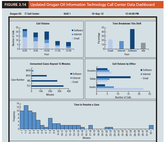
In order to gain additional insight into the performance of the call center, Grogan’s IT manager has decided to expand the current dashboard by adding boxplots for the time required to resolve calls received for each type of problem (email, Internet, and software). In addition, a graph showing the time to resolve individual cases has been added in the lower left portion of the dashboard. Finally, the IT manager added a display of summary statistics for each type of problem and summary statistics for each of the first few hours of the shift.
The updated dashboard is shown in Figure 3.14.
The IT call center has set a target performance level or benchmark of 10 minutes forthe mea n time to resolve a case. Furthermore, the center has decided it is undesirable for the time to resolve a case to exceed 15 minutes. To reflect these benchmarks, a black horizontal line at the mean target value of 10 minutes and a red horizontal line at the maximum acceptable level of 15 minutes have been added to both the graph showing the time to resolve cases and the boxplots of the time required to resolve calls received for each type of problem.
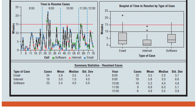
The summary statistics in the dashboard in Figure 3.21 show that the mean time to resolve an email case is 5.8 minutes, the mean time to resolve an Internet case is 3.0 minutes, and the mean time to resolve a software case is 5.4 minutes. Thus, the mean time to resolve each type of case is better than the target mean (10 minutes).
Reviewing the boxplots, we see that the box associated with the email cases is “larger” than the boxes associated with the other two types of cases. The summary statistics also show that the standard deviation of the time to resolve email cases is larger than the standard deviations of the times to resolve the other types of cases. This leads us to take a closer look at the email cases in the two new graphs. The boxplot for the email cases has a whisker that extends beyond 15 minutes and an outlier well beyond 15 minutes. The graph of the time to resolve individual cases (in the lower left position of the dashboard) shows that this is because of two calls on email cases during the 9:00 hour that took longer than the target maximum time (15 minutes) to resolve. This analysis may lead the IT call center manager to further investigate why resolution times are more variable for email cases than for Internet or software cases. Based on this analysis, the IT manager may also decide to investigate the circumstances that led to inordinately long resolution times for the two email cases that took longer than 15 minutes to resolve.
The graph of the time to resolve individual cases shows that most calls received during the first hour of the shift were resolved relatively quickly; the graph also shows that the time to resolve cases increased gradually throughout the morning. This could be due to a tendency for complex problems to arise later in the shift or possibly to the backlog of calls that accumulates over time. Although the summary statistics suggest that cases submitted during the 9:00 hour take the longest to resolve, the graph of time to resolve individual cases shows that two time-consuming email cases and one time-consuming software case were reported during that hour, and this may explain why the mean time to resolve cases during the 9:00 hour is larger than during any other hour of the shift. Overall, reported cases have generally been resolved in 15 minutes or less during this shift.
Dashboards such as the Grogan Oil data dashboard are often interactive. For instance, when a manager uses a mouse or a touch screen monitor to position the cursor over the display or point to something on the display, additional information, such as the time to resolve the problem, the time the call was received, and the individual and/or the location that reported the problem, may appear. Clicking on the individual item may also take the user to a new level of analysis at the individual case level.
Source: Anderson David R., Sweeney Dennis J., Williams Thomas A. (2019), Statistics for Business & Economics, Cengage Learning; 14th edition.
31 Aug 2021
30 Aug 2021
28 Aug 2021
30 Aug 2021
30 Aug 2021
30 Aug 2021