Thus far we have examined numerical methods used to summarize the data for one variable at a time. Often a manager or decision maker is interested in the relationship between two variables. In this section we present covariance and correlation as descriptive measures of the relationship between two variables.
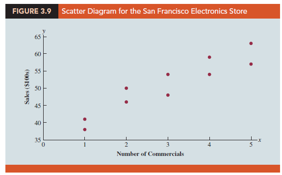
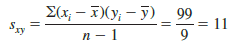
We begin by reconsidering the application concerning an electronics store in San Francisco as presented in Section 2.4. The store’s manager wants to determine the relationship between the number of weekend television commercials shown and the sales at the store during the following week. Sample data with sales expressed in hundreds of dollars are provided in Table 3.6. It shows 10 observations (n = 10), one for each week. The scatter diagram in Figure 3.9 shows a positive relationship, with higher sales (y) associated with a greater number of commercials (x). In fact, the scatter diagram suggests that a straight line could be used as an approximation of the relationship. In the following discussion, we introduce covariance as a descriptive measure of the linear association between two variables.
1. Covariance
This formula pairs each xt with a yt. We then sum the products obtained by multiplying the deviation of each xt from its sample mean X by the deviation of the corresponding yt from its sample mean y; this sum is then divided by n – 1.
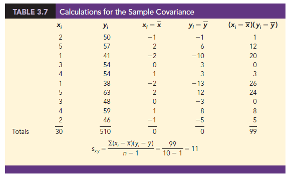
To measure the strength of the linear relationship between the number of commercials x and the sales volume y in the San Francisco electronics store problem, we use equation (3.13) to compute the sample covariance. The calculations in Table 3.7 show the computation of S(x – X)(yt – y). Note that X = 30/10 = 3 and y = 510/10 = 51. Using equation (3.13), we obtain a sample covariance of
The formula for computing the covariance of a population of size N is similar to equation (3.13), but we use different notation to indicate that we are working with the entire population.
In equation (3.14) we use the notation mx for the population mean of the variable x and my for the population mean of the variable y. The population covariance sxy is defined for a population of size N.
2. Interpretation of the Covariance
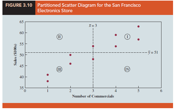
To aid in the interpretation of the sample covariance, consider Figure 3.10. It is the same as the scatter diagram of Figure 3.9 with a vertical dashed line at X = 3 and a horizontal dashed line at y = 51. The lines divide the graph into four quadrants. Points in quadrant I correspond to xt greater than X and yt greater than y, points in quadrant II correspond to xt less than x and yt greater than y, and so on. Thus, the value of (xt – x)(yt – y) must be positive for points in quadrant I, negative for points in quadrant II, positive for points in quadrant III, and negative for points in quadrant IV.
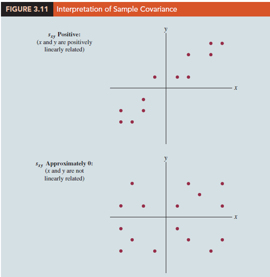
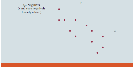
If the value of sxy is positive, the points with the greatest influence on sxy must be in quadrants I and III. Hence, a positive value for sxy indicates a positive linear association between x and y; that is, as the value of x increases, the value of y increases. If the value of sxy is negative, however, the points with the greatest influence on sxy are in quadrants II and IV. Hence, a negative value for sxy indicates a negative linear association between x and y; that is, as the value of x increases, the value of y decreases. Finally, if the points are evenly distributed across all four quadrants, the value of sxy will be close to zero, indicating no linear association between x and y. Figure 3.11 shows the values of sxy that can be expected with three different types of scatter diagrams.
Referring again to Figure 3.10, we see that the scatter diagram for the San Francisco electronics store follows the pattern in the top panel of Figure 3.11. As we should expect, the value of the sample covariance indicates a positive linear relationship with sxy = 11.
From the preceding discussion, it might appear that a large positive value for the covariance indicates a strong positive linear relationship and that a large negative value indicates a strong negative linear relationship. However, one problem with using covariance as a measure of the strength of the linear relationship is that the value of the covariance depends on the units of measurement for x and y. For example, suppose we are interested in the relationship between height x and weight y for individuals. Clearly the strength of the relationship should be the same whether we measure height in feet or inches. Measuring the height in inches, however, gives us much larger numerical values for (x; – X) than when we measure height in feet. Thus, with height measured in inches, we would obtain a larger value for the numerator S(xt – X)
(y – y) in equation (3.13)—and hence a larger covariance—when in fact the relationship does not change. A measure of the relationship between two variables that is not affected by the units of measurement for x and y is the correlation coefficient.
3. Correlation Coefficient
For sample data, the Pearson product moment correlation coefficient is defined as follows.
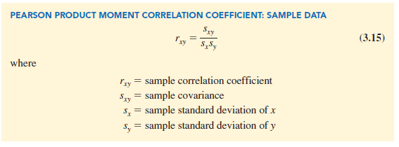
Equation (3.15) shows that the Pearson product moment correlation coefficient for sample data (commonly referred to more simply as the sample correlation coefficient) is computed by dividing the sample covariance by the product of the sample standard deviation of x and the sample standard deviation of y.
Let us now compute the sample correlation coefficient for the San Francisco electronics store. Using the data in Table 3.6, we can compute the sample standard deviations for the two variables:
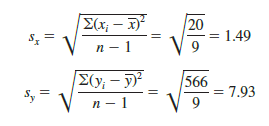
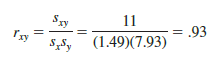
Now, because s = 11, the sample correlation coefficient equals
The formula for computing the correlation coefficient for a population, denoted by the Greek letter p(rho, pronounced “row”), follows.
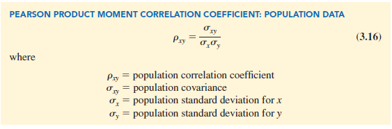
The sample correlation coefficient rxy provides an estimate of the population correlation coefficient pxy.
4. Interpretation of the Correlation Coefficient
First let us consider a simple example that illustrates the concept of a perfect positive linear relationship. The scatter diagram in Figure 3.12 depicts the relationship between x and y based on the following sample data.
The straight line drawn through each of the three points shows a perfect linear relationship between x and y. In order to apply equation (3.15) to compute the sample correlation we must first compute s, sx, and sy. Some of the computations are shown in Table 3.8. Using the results in this table, we find
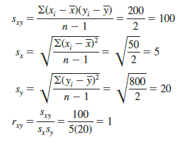

Thus, we see that the value of the sample correlation coefficient is 1.
In general, it can be shown that if all the points in a data set fall on a positively sloped straight line, the value of the sample correlation coefficient is +1; that is, a sample correlation coefficient of +1 corresponds to a perfect positive linear relationship between x and y. Moreover, if the points in the data set fall on a straight line having negative slope, the value of the sample correlation coefficient is — 1; that is, a sample correlation coefficient of — 1 corresponds to a perfect negative linear relationship between x and y.
Let us now suppose that a certain data set indicates a positive linear relationship between x and y but that the relationship is not perfect. The value of rxy will be less than 1, indicating that the points in the scatter diagram are not all on a straight line. As the points deviate more and more from a perfect positive linear relationship, the value of rxy becomes smaller and smaller. A value of rxy equal to zero indicates no linear relationship between x and y, and values of rxy near zero indicate a weak linear relationship.
For the data involving the San Francisco electronics store, rxy = .93. Therefore, we conclude that a strong positive linear relationship occurs between the number of commercials and sales. More specifically, an increase in the number of commercials is associated with an increase in sales.
In closing, we note that correlation provides a measure of linear association and not necessarily causation. A high correlation between two variables does not mean that changes in one variable will cause changes in the other variable. For example, we may find that the quality rating and the typical meal price of restaurants are positively correlated. However, simply increasing the meal price at a restaurant will not cause the quality rating to increase.
Source: Anderson David R., Sweeney Dennis J., Williams Thomas A. (2019), Statistics for Business & Economics, Cengage Learning; 14th edition.
Hi it’s me, I am also visiting this web page regularly, this site is really
good and the viewers are genuinely sharing nice
thoughts.
Hello, I believe your blog could possibly be having
internet browser compatibility problems. When I take a look at your website in Safari, it looks fine however when opening in I.E., it has some overlapping issues.
I merely wanted to give you a quick heads up! Aside from that, excellent blog!