Data visualization is a term used to describe the use of graphical displays to summarize and present information about a data set. The goal of data visualization is to communicate as effectively and clearly as possible, the key information about the data. In this section, we provide guidelines for creating an effective graphical display, discuss how to select an appropriate type of display given the purpose of the study, illustrate the use of data dashboards, and show how the Cincinnati Zoo and Botanical Garden uses data visualization techniques to improve decision making.
1. Creating Effective Graphical Displays
The data presented in Table 2.16 show the forecasted or planned value of sales ($1000s) and the actual value of sales ($1000s) by sales region in the United States for Gustin Chemical for the past year. Note that there are two quantitative variables (planned sales and actual sales) and one categorical variable (sales region). Suppose we would like to develop a graphical display that would enable management of Gustin Chemical to visualize how each sales region did relative to planned sales and simultaneously enable management to visualize sales performance across regions.
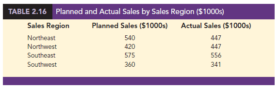
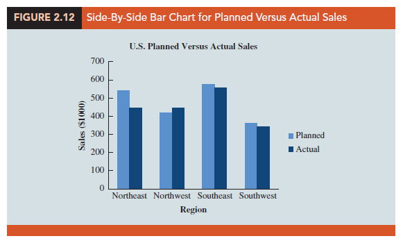
Figure 2.12 shows a side-by-side bar chart of the planned versus actual sales data. Note how this bar chart makes it very easy to compare the planned versus actual sales in a region, as well as across regions. This graphical display is simple, contains a title, is well labeled, and uses distinct colors to represent the two types of sales. Note also that the scale of the vertical axis begins at zero. The four sales regions are separated by space so that it is clear that they are distinct, whereas the planned versus actual sales values are side-by-side for easy comparison within each region. The side-by-side bar chart in Figure 2.12 makes it easy to see that the Southwest region is the lowest in both planned and actual sales and that the Northwest region slightly exceeded its planned sales.
Creating an effective graphical display is as much art as it is science. By following the general guidelines listed below you can increase the likelihood that your display will effectively convey the key information in the data.
- Give the display a clear and concise title.
- Keep the display simple. Do not use three dimensions when two dimensions are sufficient.
- Clearly label each axis and provide the units of measure.
- If color is used to distinguish categories, make sure the colors are distinct.
- If multiple colors or line types are used, use a legend to define how they are used and place the legend close to the representation of the data.
2. Choosing the Type of Graphical Display
In this chapter we discussed a variety of graphical displays, including bar charts, pie charts, dot plots, histograms, stem-and-leaf plots, scatter diagrams, side-by-side bar charts, and stacked bar charts. Each of these types of displays was developed for a specific purpose. In order to provide guidelines for choosing the appropriate type of graphical display, we now provide a summary of the types of graphical displays categorized by their purpose. We note that some types of graphical displays may be used effectively for multiple purposes.
2.1. Displays Used to Show the Distribution of Data
- Bar Chart—Used to show the frequency distribution and relative frequency distribution for categorical data
- Pie Chart—Used to show the relative frequency and percent frequency for categorical data; generally not preferred to the use of a bar chart
- Dot Plot—Used to show the distribution for quantitative data over the entire range of the data
- Histogram—Used to show the frequency distribution for quantitative data over a set of class intervals
- Stem-and-Leaf Display—Used to show both the rank order and shape of the distribution for quantitative data
2.2. Displays Used to Make Comparisons
- Side-by-Side Bar Chart—Used to compare two variables
- Stacked Bar Charts—Used to compare the relative frequency or percent frequency of two categorical variables
2.3. Displays Used to Show Relationships
- Scatter diagram—Used to show the relationship between two quantitative variables
- Trendline—Used to approximate the relationship of data in a scatter diagram
3. Data Dashboards
One of the most widely used data visualization tools is a data dashboard. If you drive a car, you are already familiar with the concept of a data dashboard. In an automobile, the car’s dashboard contains gauges and other visual displays that provide the key information that is important when operating the vehicle. For example, the gauges used to display the car’s speed, fuel level, engine temperature, and oil level are critical to ensure safe and efficient operation of the automobile. In some new vehicles, this information is even displayed visually on the windshield to provide an even more effective display for the driver. Data dashboards play a similar role for managerial decision making.
A data dashboard is a set of visual displays that organizes and presents information that is used to monitor the performance of a company or organization in a manner that is easy to read, understand, and interpret. Just as a car’s speed, fuel level, engine temperature, and oil level are important information to monitor in a car, every business has key performance indicators (KPIs) that need to be monitored to assess how a company is performing. Examples of KPIs are inventory on hand, daily sales, percentage of on-time deliveries, and sales revenue per quarter. A data dashboard should provide timely summary information (potentially from various sources) on KPIs that is important to the user, and it should do so in a manner that informs rather than overwhelms its user.
To illustrate the use of a data dashboard in decision making, we will discuss an application involving the Grogan Oil Company. Grogan has offices located in three cities in Texas: Austin (its headquarters), Houston, and Dallas. Grogan’s Information Technology (IT) call center, located in the Austin office, handles calls from employees regarding computer-related problems involving software, Internet, and email issues. For example, if a Grogan employee in Dallas has a computer software problem, the employee can call the IT call center for assistance.
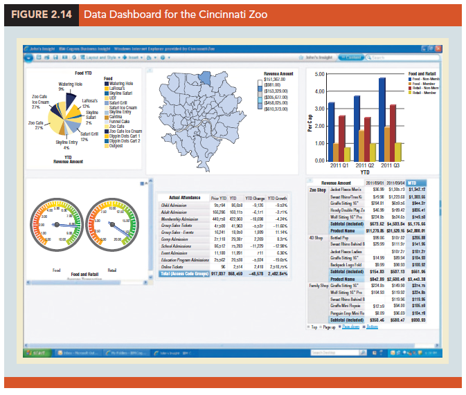
The data dashboard shown in Figure 2.13 was developed to monitor the performance of the call center. This data dashboard combines several displays to monitor the call center’s KPIs. The data presented are for the current shift, which started at 8:00 a.m. The stacked bar chart in the upper left-hand corner shows the call volume for each type of problem (software, Internet, or email) over time. This chart shows that call volume is heavier during the first few hours of the shift, calls concerning email issues appear to decrease over time, and volume of calls regarding software issues are highest at midmorning.

The bar chart in the upper right-hand corner of the dashboard shows the percentage of time that call center employees spent on each type of problem or were idle (not working on a call). These top two charts are important displays in determining optimal staffing levels. For instance, knowing the call mix and how stressed the system is, as measured by percentage of idle time, can help the IT manager make sure that enough call center employees are available with the right level of expertise.
The side-by-side bar chart titled “Call Volume by Office” shows the call volume by type of problem for each of Grogan’s offices. This allows the IT manager to quickly identify if there is a particular type of problem by location. For example, it appears that the office in Austin is reporting a relatively high number of issues with email. If the source of the problem can be identified quickly, then the problem for many might be resolved quickly. Also, note that a relatively high number of software problems are coming from the Dallas office. The higher call volume in this case was simply due to the fact that the Dallas office is currently installing new software, and this has resulted in more calls to the IT call center. Because the IT manager was alerted to this by the Dallas office last week, the IT manager knew there would be an increase in calls coming from the Dallas office and was able to increase staffing levels to handle the expected increase in calls.
For each unresolved case that was received more than 15 minutes ago, the bar chart shown in the middle left-hand side of the data dashboard displays the length of time that each of these cases has been unresolved. This chart enables Grogan to quickly monitor the key problem cases and decide whether additional resources may be needed to resolve them. The worst case, T57, has been unresolved for over 300 minutes and is actually left over from the previous shift. Finally, the histogram at the bottom shows the distribution of the time to resolve the problem for all resolved cases for the current shift.
The Grogan Oil data dashboard illustrates the use of a dashboard at the operational level. The data dashboard is updated in real time and used for operational decisions such as staffing levels. Data dashboards may also be used at the tactical and strategic levels of management. For example, a logistics manager might monitor KPIs for on-time performance and cost for its third-party carriers. This could assist in tactical decisions such as transportation mode and carrier selection. At the highest level, a more strategic dashboard would allow upper management to quickly assess the financial health of the company by monitoring more aggregate financial, service level, and capacity utilization information.
The guidelines for good data visualization discussed previously apply to the individual charts in a data dashboard, as well as to the entire dashboard. In addition to those guidelines, it is important to minimize the need for screen scrolling, avoid unnecessary use of color or three-dimensional displays, and use borders between charts to improve readability. As with individual charts, simpler is almost always better.
4. Data Visualization in Practice: Cincinnati Zoo and Botanical Garden
The Cincinnati Zoo and Botanical Garden, located in Cincinnati, Ohio, is the second oldest zoo in the world. In order to improve decision making by becoming more data- driven, management decided they needed to link together the different facets of their business and provide nontechnical managers and executives with an intuitive way to better understand their data. A complicating factor is that when the zoo is busy, managers are expected to be on the grounds interacting with guests, checking on operations, and anticipating issues as they arise or before they become an issue. Therefore, being able to monitor what is happening on a real-time basis was a key factor in deciding what to do. Zoo management concluded that a data visualization strategy was needed to address the problem.
Because of its ease of use, real-time updating capability, and iPad compatibility, the Cincinnati Zoo decided to implement its data visualization strategy using IBM’s Cognos advanced data visualization software. Using this software, the Cincinnati Zoo developed the data dashboard shown in Figure 2.14 to enable zoo management to track the following key performance indicators:
- Item Analysis (sales volumes and sales dollars by location within the zoo)
- Geo Analytics (using maps and displays of where the day’s visitors are spending their time at the zoo)
- Customer Spending
- Cashier Sales Performance
- Sales and Attendance Data versus Weather Patterns
- Performance of the Zoo’s Loyalty Rewards Program
An iPad mobile application was also developed to enable the zoo’s managers to be out on the grounds and still see and anticipate what is occurring on a real-time basis. The Cincinnati Zoo’s iPad data dashboard, shown in Figure 2.15, provides managers with access to the following information:
- Real-time attendance data, including what “types” of guests are coming to the zoo
- Real-time analysis showing which items are selling the fastest inside the zoo
- Real-time geographical representation of where the zoo’s visitors live
Having access to the data shown in Figures 2.14 and 2.15 allows the zoo managers to make better decisions on staffing levels within the zoo, which items to stock based upon weather and other conditions, and how to better target its advertising based on geodemographics.
The impact that data visualization has had on the zoo has been significant. Within the first year of use, the system has been directly responsible for revenue growth of over $500,000, increased visitation to the zoo, enhanced customer service, and reduced marketing costs.
Source: Anderson David R., Sweeney Dennis J., Williams Thomas A. (2019), Statistics for Business & Economics, Cengage Learning; 14th edition.
30 Aug 2021
28 Aug 2021
31 Aug 2021
31 Aug 2021
30 Aug 2021
30 Aug 2021