Summary statistics and easy-to-draw graphs based on summary statistics can be used to quickly summarize large quantities of data. In this section we show how five-number summaries and boxplots can be developed to identify several characteristics of a data set.
1. Five-Number Summary
In a five-number summary, five numbers are used to summarize the data:
- Smallest value
- First quartile (Q1)
- Median (Q2)
- Third quartile (Q3)
- Largest value
To illustrate the development of a five-number summary, we will use the monthly starting salary data shown in Table 3.1. Arranging the data in ascending order, we obtain the following results.
5710 5755 5850 5880 5880 5890 5920 5940 5950 6050 6130 6325
The smallest value is 5710 and the largest value is 6325. We showed how to compute the quartiles (Q1 = 5857.5; Q2 = 5905; and Q3 = 6025) in Section 3.1. Thus, the five-number summary for the monthly starting salary data is
5710 5857.5 5905 6025 6325
The five-number summary indicates that the starting salaries in the sample are between 5710 and 6325 and that the median or middle value is 5905; and, the first and third quartiles show that approximately 50% of the starting salaries are between 5857.5 and 6025.
2. Boxplot
A boxplot is a graphical display of data based on a five-number summary. A key to the development of a boxplot is the computation of the interquartile range, IQR = Q3 – Q1. Figure 3.6 shows a boxplot for the monthly starting salary data. The steps used to construct the boxplot follow.
- A box is drawn with the ends of the box located at the first and third quartiles. For the salary data, Q1 = 5857.5 and Q2 = 6025. This box contains the middle 50% of the data.
- A vertical line is drawn in the box at the location of the median (5905 for the salary data).
- By using the interquartile range, IQR = Q3 – Q1, limits are located at 1.5(IQR) below Q1 and 1.5(IQR) above Q3. For the salary data, IQR = Q3 – Q1 = 6025 – 5857.5 = 167.5. Thus, the limits are 5857.5 – 1.5(167.5) = 5606.25 and 6025 + 1.5(167.5) = 6276.25. Data outside these limits are considered
- The horizontal lines extending from each end of the box in Figure 3.6 are called The whiskers are drawn from the ends of the box to the smallest and largest values inside the limits computed in step 3. Thus, the whiskers end at salary values of 5710 and 6130.
- Finally, the location of each outlier is shown with a small asterisk. In Figure 3.6 we see one outlier, 6325.
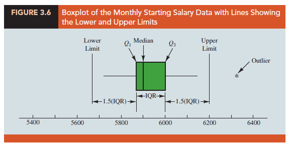
In Figure 3.6 we included lines showing the location of the upper and lower limits. These lines were drawn to show how the limits are computed and where they are located. Although the limits are always computed, generally they are not drawn on the boxplots. Figure 3.7 shows the usual appearance of a boxplot for the starting salary data.
3. Comparative Analysis Using Boxplots
Boxplots can also be used to provide a graphical summary of two or more groups and facilitate visual comparisons among the groups. For example, suppose the placement office decided to conduct a follow-up study to compare monthly starting salaries by the graduate’s major: accounting, finance, information systems, management, and marketing. The major and starting salary data for a new sample of 111 recent business school graduates are shown in the data set in the file MajorSalaries, and Figure 3.8 shows the boxplots corresponding to each major. Note that major is shown on the horizontal axis, and each boxplot is shown vertically above the corresponding major. Displaying boxplots in this manner is an excellent graphical technique for making comparisons among two or more groups.
What interpretations can you make from the boxplots in Figure 3.8? Specifically, we note the following:
- The higher salaries are in accounting; the lower salaries are in management and marketing.
- Based on the medians, accounting and information systems have similar and higher median salaries. Finance is next, with management and marketing showing lower median salaries.
- High salary outliers exist for accounting, finance, and marketing majors.
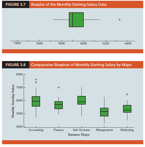
Can you think of additional interpretations based on these boxplots?
Source: Anderson David R., Sweeney Dennis J., Williams Thomas A. (2019), Statistics for Business & Economics, Cengage Learning; 14th edition.
28 Aug 2021
28 Aug 2021
30 Aug 2021
30 Aug 2021
28 Aug 2021
30 Aug 2021