As we have seen, government policy sometimes seeks to raise prices above market-clearing levels, rather than lower them. Examples include the former regulation of the airlines by the Civil Aeronautics Board, the minimum wage law, and a variety of agricultural policies. (Most import quotas and tariffs also have this intent, as we will see in Section 9.5.) One way to raise prices above market-clearing levels is by direct regulation—simply make it illegal to charge a price lower than a specific minimum level.
Look again at Figure 9.5 (page 324). If producers correctly anticipate that they can sell only the lower quantity Q3, the net welfare loss will be given by triangles B and C. But as we explained, producers might not limit their output to Q3. What happens if producers think they can sell all they want at the higher price and produce accordingly? That situation is illustrated in Figure 9.7, where Pmin denotes a minimum price set by the government. The quantity supplied is now Q2 and the quantity demanded is Q3, the difference representing excess, unsold supply. Now let’s determine the resulting changes in consumer and pro- ducer surplus.
Those consumers who still purchase the good must now pay a higher price and so suffer a loss of surplus, which is given by rectangle A in Figure 9.7. Some
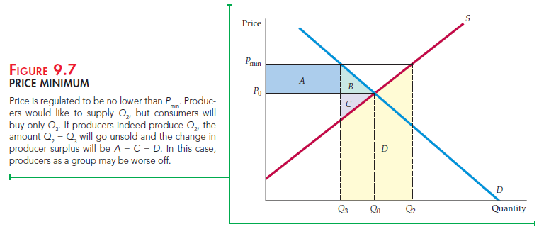 consumers have also dropped out of the market because of the higher price, with a corresponding loss of surplus given by triangle B. The total change in consumer surplus is therefore
![]()
Consumers clearly are worse off as a result of this policy.
What about producers? They receive a higher price for the units they sell, which results in an increase of surplus, given by rectangle A. (Rectangle A represents a transfer of money from consumers to producers.) But the drop in sales from Q0 to Q3 results in a loss of surplus, which is given by triangle C. Finally, consider the cost to producers of expanding production from Q0 to Q2. Because they sell only Q3, there is no revenue to cover the cost of producing Q2 – Q3. How can we measure this cost? Remember that the supply curve is the aggregate marginal cost curve for the industry. The supply curve therefore gives us the additional cost of producing each incremental unit. Thus the area under the supply curve from Q3 to Q2 is the cost of producing the quantity Q2 – Q3. This cost is represented by the shaded trapezoid D. So unless producers respond to unsold output by cutting production, the total change in producer surplus is
![]()
Given that trapezoid D can be large, a minimum price can even result in a net loss of surplus to producers alone! As a result, this form of government intervention can reduce producers’ profits because of the cost of excess production.
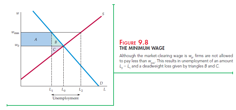
Another example of a government-imposed price minimum is a minimum wage law. The effect of this policy is illustrated in Figure 9.8, which shows the supply and demand for labor. The wage is set at wmin, a level higher than the market-clearing wage w0. As a result, those workers who can find jobs obtain a higher wage. However, some people who want to work will be unable to. The policy results in unemployment, which in the figure is L2 – L1. We will examine the minimum wage in more detail in Chapter 14.
Source: Pindyck Robert, Rubinfeld Daniel (2012), Microeconomics, Pearson, 8th edition.
Nice response in return of this matter with real arguments and telling the whole thing on the topic of
that.
terrific and also incredible blog site. I truly wish to thanks, for providing us much better
details.
I have found excellent blog posts right here. I love the way you define it.
Great!
Hi there, this weekend is nice for me, as this moment i am reading this fantastic educational
post here at my residence.
Quality articles or reviews is the important to attract the viewers to go to
see the site, that’s what this website is providing.