1. STATISTICAL PROCESS CONTROL DEFINED
Although SPC is normally thought of in industrial applications, it can be applied to virtually any process. Everything done in the workplace is a process. All processes are affected by multiple factors. For example, in the workplace a process can be affected by the environment and the machines employed, the materials used, the methods (work instructions) provided, the measurements taken, and the manpower (people) who operate the process—the Five M’s. If these are the only factors that can affect the process output, and if all of these are perfect—meaning the work environment facilitates quality work; there are no misadjustments in the machines; there are no flaws in the materials; and there are totally accurate and precisely followed work instructions, accurate and repeatable measurements, and people who work with extreme care, following the work instructions perfectly and
concentrating fully on their work—and if all of these factors come into congruence, then the process will be in statistical control. This means that there are no special causes adversely affecting the process’s output. Special causes are (for the time being, anyway) eliminated. Does that mean that 100% of the output will be perfect? No, it does not. Natural variation is inherent in any process, and it will affect the output. Natural variation is expected to account for roughly 2,700 out-oflimits parts in every 1 million produced by a 3-sigma process ( ± 3s variation), 63 out-of-limits parts in every 1 million produced by a 4-sigma process, and so on. Natural variation, if all else remains stable, will account for 2 out-of-limits parts per billion produced by a true 6-sigma process.
SPC does not eliminate all variation in the processes, but it does something that is absolutely essential if the process is to be consistent and if the process is to be improved. SPC allows workers to separate the special causes of variation (e.g., environment and the Five M’s) from the natural variation found in all processes. After the special causes have been identified and eliminated, leaving only natural variation, the process is said to be in statistical control (or simply in control). When that state is achieved, the process is stable, and in a 3-sigma process, 99.73% of the output can be counted on to be within the statistical control limits. More important, improvement can begin. From this, we can develop a definition of statistical process control:
Statistical process control (SPC) is a statistical method of separating variation resulting from special causes from variation resulting from natural causes in order to eliminate the special causes and to establish and maintain consistency in the process, enabling process improvement.
Note: As explained in Chapter 1, the 6-sigma numbers given in this section differ from the Motorola Six Sigma numbers (2 parts per billion vs. 3.4 parts per million).
2. RATIONALE FOR SPC
The rationale for SPC is much the same as that for total quality. It should not be surprising that the parallel exists because it was Walter Shewhart’s work that inspired the Japanese to invite W. Edwards Deming to help them get started in their quality program in 1949 to 1950. SPC was the seed from which the Japanese grew total quality.
The rationale for the Japanese to embrace SPC in 1950 was simple: a nation trying to recover from the loss of a costly war needed to export manufactured goods so that it could import food for its people. The Asian markets once enjoyed by Japan had also been rendered extinct by the war. The remaining markets, principally North America, were unreceptive to Japanese products because of poor quality. If the only viable markets rejected Japanese products on the basis of quality, then Japanese manufacturers had to do something about their quality problem. This is why Shewhart’s work interested them. This also is why they called on Deming, and later Joseph Juran, to help them. That the effort was successful is well documented and manifestly evident all over the world. Deming told the Japanese industrialists in 1950 that if they would follow his teaching, they could become active players in the world markets within five years. They actually made it in four years.
The Western world may not be in the same crisis Japan experienced following World War II, but the imperative for SPC is no less crucial. When one thinks of quality products today, Japan still comes to mind first. Many of the finest consumer products in the world come from Japan. That includes everything from electronics and optical equipment to automobiles, although U.S., European, and Korean car manufacturers have effectively eliminated the quality gap as of 2010.2 They have done this by adopting such total quality strategies as SPC.
As we approached the twenty-first century, the Japanese were the quality leaders in every level of the automobile market. Cars made by Toyota, Nissan, Honda, and Mazda (including those produced in their North American factories) were of consistently excellent quality. But manufacturers outside of Japan also adopted SPC and other total quality strategies, and the outcome of the race for quality leadership can no longer be predicted for each new product year. For example, in J. D. Power and Associates 2010 Initial Quality Study, the top-rated cars in its ten car-type segments were four from Japan, three from the United States, two from Europe, and one from Korea.
Automakers know that consumers pay close attention to these and other quality ratings and that there is an impact, positive or negative, on sales. Thus, the rationale for automakers to embrace SPC has not only been to improve product quality and simultaneously reduce costs, but also to improve product image in order to compete successfully in the world’s markets. The same is true for virtually all industries.
To comprehend how SPC can help accomplish this, it is necessary to examine five key points and understand how SPC comes into play in each one: control of variation, continual improvement, predictability of processes, elimination of waste, and product inspection. These points are discussed next.
2.1. Rationale: Control of Variation
The output of a process that is operating properly can be graphed as a bell-shaped curve, as in Figure 18.1. The horizontal x-axis represents some measurement, such as weight or dimension, and the vertical y-axis represents the frequency count of the measurements, that is, the number of times that particular measurement value is repeated. The desired measurement value is at the center of the curve, and any variation from the desired value results in displacement to the left or right of the center of the bell. With no special causes acting on the process, 99.73% of the process output will be between the ± 3s limits. (This is not a specification limit, which may be tighter or looser.) This degree of variation about the center is the result of natural causes. The process will be consistent at this performance level as long as it is free of special causes of variation.
When a special cause is introduced, the curve will take a new shape, and variation can be expected to increase, lowering output quality. Figure 18.2 shows the result of a machine no longer capable of holding the required tolerance, or an improper work instruction. The bell is flatter, meaning that fewer parts produced by the process are at, or close to, the target, and more fall outside the original 3s limits. The result is more scrap, higher cost, and inconsistent product quality.

The curve of Figure 18.3 could be the result of input material from different vendors (or different batches) that is not at optimal specification. Again, a greater percentage of the process output will be displaced from the ideal, and more will be outside the original 3s limits. The goal should be to eliminate the special causes so the process operates in accordance with the curve shown in Figure 18.1 and then to improve the process, thereby narrowing the curve (see Figure 18.4).
When the curve is narrowed, more of the process output is in the ideal range, and less falls outside the original 3s limits. Actually, each new curve will have its own 3s limits. In the case of Figure 18.1, they will be much narrower than the original ones. If the original limits resulted in 2,700 pieces out of 1 million being scrapped, the improved process illustrated by Figure 18.4 might reduce that to 270 pieces, or even less, scrapped. Viewed from another perspective, the final product will be more consistently of high quality, and the chance of a defective product going to a customer is reduced by an order of magnitude.


Variation in any process is the enemy of quality. As we have already discovered, variation results from two kinds of causes: special causes and natural causes. Both kinds can be treated, but they must be separated so that the special causes—those associated with environment and the Five M’s—can be identified and eliminated. After that is done, the processes can be improved, never eliminating the natural variation but continually narrowing its range and approaching perfection. It is important to understand why the special causes must first be eliminated. Until that happens, the process will not be stable, and the output will include too much product that is unuseable, therefore wasted. The process will not be dependable in terms of quantity or quality. In addition, it will be pointless to attempt improvement of the process because one can never tell whether the improvement is successful—the results will be masked by the effect of any special causes that remain.
In this context, elimination of special causes is not considered to be process improvement, a point frequently lost on enthusiastic improvement teams. Elimination of special causes simply lets the process be whatever it will be in keeping with its natural variation. It may be good or bad or anything in between.
When thinking of SPC, most people think of control charts. If we wish to include the elimination of special causes as a part of SPC, as we should, then it is necessary to include more than the control chart in our set of SPC tools because the control chart has limited value until the process is purged of special causes. If one takes a broad view of SPC, all of the statistical tools discussed in Chapter 15 should be included. Pareto charts, cause-and-effect diagrams, stratification, check sheets, histograms, scatter diagrams, and run charts are all SPC tools. Although the flowchart is not a statistical device, it is useful in SPC. The SPC uses of these
techniques are highlighted later in this chapter. Suffice it to say that the flowchart is used to understand the process better, the cause-and-effect diagram is used to examine special causes and how they impact the process, and the others are used to determine what special causes are at play and how important they are. The use of such tools and techniques makes possible the control of variation in any process to a degree unheard of before the introduction of SPC.
2.2. Rationale: Continual Improvement
Continual improvement is a key element of total quality. One talks about improvement of products, whatever they may be. In most cases, it would be more accurate to talk about continual improvement in terms of processes than in terms of products and services. It is usually the improvement of processes that yields improved products and services. Those processes can reside in the engineering department, where the design process may be improved by adding concurrent engineering and design-for-manufac- ture techniques, or in the public sector, where customer satisfaction becomes a primary consideration. All people use processes, and all people are customers of processes. A process that cannot be improved is rare. We have not paid sufficient attention to our processes. Most people have only a general idea of what processes are, how they work, what external forces affect them, and how capable they are of doing what is expected of them. Indeed, outside the manufacturing industry, many people don’t realize that their work is made up of processes.
Before a process can be improved, it is necessary to understand it, identify the external factors that may generate special causes of variation, and eliminate any special causes that are in play. Then, and only then, can we observe the process in operation and determine its natural variation. Once a process is in this state of statistical control, it can be tracked, using control charts, for any trends or newly introduced special causes. Process improvements can be implemented and monitored. Without SPC, process improvement takes on a hit-or-miss methodology, the results of which are often obscured by variation stemming from undetected factors (special causes). SPC lets improvements be applied in a controlled environment, measuring results scientifically and with assurance.
2.3. Rationale: Predictability of Processes
A customer asks whether a manufacturer can produce 300 widgets within a month. If it can, the manufacturer will receive a contract to do so. The parts must meet a set of specifications supplied by the customer. The manufacturer examines the specifications and concludes that it can comply but without much margin for error. The manufacturer also notes that in a good month it has produced more than 300. So the order is accepted. Soon, however, the manufacturer begins having trouble with both the specifications and the production rate. By the end of the month, only 200 acceptable parts have been produced. What happened? The same units with the same specification have been made before, and at a higher production rate. The problem is unpredictable processes. If the same customer had approached a firm that was versed in SPC, the results would have been different. The managers would have known with certainty their capability, and it would have been clear whether the customer’s requirements could, or could not, be met. They would know because their processes are under control, repeatable, and predictable.
Few things in the world of manufacturing are worse than an undependable process. Manufacturing management spends half its time making commitments and the other half living up to them. If the commitments are made based on unpredictable processes, living up to them will be a problem. The only chance manufacturing managers have when their processes are not predictable is to be especially conservative when making commitments. Instead of keying on the best past performance, they look at the worst production month and base their commitments on that. This approach can relieve a lot of stress but can also lose a lot of business. In today’s highly competitive marketplace (whether for a manufactured product or a service), organizations must have predictable, stable, consistent processes. This can be achieved and maintained through SPC.
2.4. Rationale: Elimination of Waste
Only in recent years, many manufacturers have come to realize that production waste costs money. Scrap bins are still prominent in many factories. In the electronics industry, for example, it is not unusual to find that 25% of the total assembly labor cost in a product is expended correcting errors from preceding processes. This represents waste. Parts that are scrapped because they do not fit properly or are blemished represent waste. Parts that do not meet specifications are waste. To prevent defective products from going to customers, more is spent on inspection and reinspection. This, too, is waste. All of these situations are the result of some process not producing what was expected. In most cases, waste results from processes being out of control; processes are adversely influenced by special causes of variation. Occasionally, even processes that have no special causes acting on them are simply not capable of producing the expected result.
Two interesting things happen when waste is eliminated. The most obvious is that the cost of goods produced (or services rendered) is reduced—a distinct competitive advantage. At the same time, the quality of the product is enhanced.
Even when all manufactured parts are inspected, it is impossible to catch all the bad ones. When sampling is used, even more of the defective parts get through. When the final product contains defective parts, its quality has to be lower. By eliminating waste, a company reduces cost and increases quality. This suggests that Philip Crosby was too conservative when he said quality is free: quality is not just free;3 it pays dividends. This is the answer to the question of what happened to the Western industries that once led but then lost significant market share since the 1970s; total quality manufacturers simply built better products at competitive prices. These competitive prices are the result of the elimination of waste, not (as is often presumed) cheap labor. This was accomplished in Japan by applying techniques that were developed in the United States in the 1930s but ignored in the West after World War II. Specifically, through application of SPC and later the expansion of SPC to the broader concept of total quality, Japan went from a beaten nation to an economic superpower in just 30 years.
By concentrating on their production processes, eliminating the special causes as Shewhart and Deming taught, and bringing the processes into statistical control, Japanese manufacturers could see what the processes were doing and what had to be done to improve them. Once in control, a relentless process improvement movement was started, one that is still ongoing more than half a century later—indeed, it is never finished. Tightening the bell curves brought ever- increasing product quality and ever-diminishing waste (nonconforming parts). For example, while U.S. automakers were convinced that to manufacture a more perfect transmission would be prohibitively expensive, the Japanese not only did it but also reduced its cost. In the early 1980s, the demand for a particular Ford transmission was such that Ford second-sourced a percentage of them from Mazda. Ford soon found that the transmissions manufactured by Mazda (to the same Ford blueprints) were quieter, smoother, and more reliable than those produced in North America. Ford customers with Mazda transmissions were a lot happier than the others, as well. Ford examined the transmissions, and while it found that both versions were assembled properly with parts that met all specifications, the component parts of the Mazda units had significantly less variation piece to piece. Mazda employed SPC, and the domestic supplier did not. This demonstrated to Ford that the same design, when held to closer tolerances, resulted in a noticeably superior transmission that did not cost more. Shortly thereafter, Ford initiated an SPC program. To Ford’s credit, its effort paid off. In 1993, the roles were reversed, and Ford began producing transmissions for Mazda, and in 2010 only Porsche, Acura, Mercedes Benz, and Lexus automobiles were ranked higher than Ford for initial quality. Twenty-eight nameplates ranked below Ford’s.4
Statistical process control is the key to eliminating waste in production processes. It can do the same in virtually any kind of process. The inherent nature of process improvement is such that as waste is eliminated, the quality of the process output is correspondingly increased.
2.5. Rationale: Product Inspection
It is normal practice to inspect products as they are being manufactured (in-process inspection) and as finished goods (final inspection). Inspection requires the employment of highly skilled engineers and technicians, equipment that can be very expensive, factory space, and time. If it were possible to reduce the amount of inspection required, while maintaining or even improving the quality of products, money could be saved and competitiveness enhanced.
Inspection can be done on every piece (100% inspection) or on a sampling basis. The supposed advantage of 100% inspection is, of course, that any defective or nonconforming product will be detected before it gets into the hands of a customer (external or internal). The term supposed advantage is used because even with 100% inspection, only 80% of the defects are found.5 Part of the problem with 100% inspection is that human inspectors can become bored and, as a result, careless. Machine inspection systems do not suffer from boredom, but they are very expensive, and for many applications, they are not a practical replacement for human eyes. It would be faster and less costly if it were possible to achieve the same level of confidence by inspecting only 1 piece out of 10 (10% sampling) or 5 out of 100 (5% sampling) or even less.
Such sampling schemes are not only possible but accepted by such critical customers as the U.S. government (see the U.S. government military standard, MIL-STD-1916) and the automobile industry, but there is a condition: for sampling to be accepted, processes must be under control. Only then will the processes have the consistency and predictability necessary to support sampling. This is a powerful argument for SPC.
After supplier processes are under control and being tracked with control charts, manufacturers can back off the customary incoming inspection of materials, resorting instead to the far less costly procedure of periodically auditing the supplier’s processes. SPC must first be in place, and the supplier’s processes must be shown to be capable of meeting the customer’s specifications.
This also applies internally. When a company’s processes are determined to be capable of producing acceptable products, and after they are in control using SPC, the internal quality assurance organization can reduce its inspection and process surveillance efforts, relying to a greater degree on a planned program of process audits. This reduces quality assurance costs and, with it, the cost of quality.
3. CONTROL CHART DEVELOPMENT
Just as there must be many different processes, so must there be many types of control charts. Figure 18.19 lists the seven most commonly used control chart types. You will note that the first three are associated with measured values or variables data. The other four are used with counted values or attributes data. It is important, as the first step in developing your control chart, to select the chart type that is appropriate for your data. The specific steps in developing control charts are different for variables data than for attributes data.
3.1. Control Chart Development for Variables Data (Measured Values)
Consider an example using x-charts and R-charts. These charts are individual, directly related graphs plotting the mean (average) of samples (x) over time and the variation in each sample (R) over time. The basic steps for developing a control chart for data with measured values are these:
- Determine sampling procedure. Sample size may depend on the kind of product, production rate, measurement expense, and likely ability to reveal changes in the process. Sample measurements are taken in subgroups of a specific size (n), typically from 3 to 10. Sampling frequency should be often enough that changes in the process are not missed but not so often as to mask slow drifts. If the object is to set up control charts for a new process, the number of subgroups for the initial calculations should be 25 or more. For existing processes that appear stable, that number can be reduced to 10 or so, and sample size (n) can be smaller, say, 3 to 5.
- Collect initial data of 100 or so individual data points in k subgroups of n measurements.
- The process must not be tinkered with during this time—let it run.
- Don’t use old data—they may be irrelevant to the current process.
- Take notes on anything that may have significance.
- Log data on a data sheet designed for control chart use.
- Calculate the mean (average) values of the data in each subgroup x.
- Calculate the data range for each subgroup (R).
- Calculate the average of the subgroup averages x. This is the process average and will be the centerline for the x-chart.
- Calculate the average of the subgroup ranges R. This will be the centerline for the R-chart.
- Calculate the process upper and lower control limits, UCL and LCL respectively (using a table of factors, such as the one shown in Figure 18.6). UCL and LCL represent the ± 3s limits of the process averages and are drawn as dashed lines on the control charts.
- Draw the control chart to fit the calculated values.
- Plot the data on the chart.
The following is a step-by-step example of control chart construction. First, we have to collect sufficient data with which to make statistically valid calculations. This means we will usually have to take at least 100 data measurements in at least ten subgroups, depending on the process, rate of flow, and so on. The measurements should be made on samples close together in the process to minimize variation between the data points within the subgroups. However, the subgroups should be spread out in time to make visible the variation that exists between the subgroups.
The process for this example makes precision spacers that are nominally 100 millimeters thick. The process operates on a two-shift basis and appears to be quite stable. Fifty spacers per hour are produced. To develop a control chart for the process, we will measure the first ten spacers produced after 9:00 a.m., 1:00 p.m., 5:00 p.m., and 9:00 p.m. We will do this for three days, for a total of 120 data points in 12 subgroups.
At the end of the three days, the data chart is as shown in Figure 18.5. The raw data are recorded in columns x1 through x10.
Next, we calculate the mean (average) values for each subgroup. This is done by dividing the sum of x1 through x10 by the number of data points in the subgroup.
![]()
where
n = the number of data points in the subgroup.
The x values are listed in the Mean Value column.
The average x of the subgroup average x is calculated by summing the values of x and dividing by the number of subgroups (k):

The range (R) for each subgroup is calculated by subtracting the smallest value of x from the largest value of x in the subgroup.
R = (maximum value ofx) — (minimum value of x)
Subgroup range values are listed in the final column of Figure 18.5.
From the R values, calculate the average of the subgroup ranges.
![]()
In this case,

Next we calculate the UCL and LCL values for the x-chart.
![]()

At this point, you know the origin of all the values in these formulas except A2. A2 (as well as D3 and D4, used later) is from a factors table that has been developed for control charts (see Figure 18.6). The larger the value of A2, the farther apart the upper and lower control limits (UCL x and LCLx) will be. A2 may be considered to be a confidence factor for the data. The table shows that the value of A2 decreases as the number of observations (data points) in the subgroup increases. It simply means that more data points make the calculations more reliable, so we don’t have to spread the control limits so much. This works to a point, but the concept of diminishing returns sets in around n = 15.
Applying our numbers to the UCL and LCL formulas, we have this:

Now calculate the UCL and LCL values for the R-chart.
![]()
Like factor A2 used in the x control limit calculation, factors D3 and D4 are found in Figure 18.6. Just as with A2, these factors narrow the limits with subgroup size. With n = 10 in our example, D3 = 0.22 and D4 = 1.78. Applying the numbers to the LCLR and UCLR formulas, we have this:
![]()
At this point, we have everything we need to lay out the x- and R-charts (see Figure 18.7).
The charts are laid out with y-axis scales set for maximum visibility consistent with the data that may come in the future. For new processes, it is usually wise to provide more y-axis room for variation and special causes. A rule of thumb is this:
- (Largest individual value — smallest individual value) , 2.
- Add that number to largest individual value to set the top of chart.
- Subtract it from the smallest individual value to set the bottom of chart. (If this results in a negative number, set the bottom at zero.)


Upper and lower control limits are drawn on both charts as dashed lines, and X and R centerlines are placed on the appropriate charts as solid lines. Then the data are plotted—subgroup averages (X) on the X-chart and subgroup ranges (R) on the R-chart. We have arbitrarily established the time axis as 21 subgroups. It could be more or less, depending on the application. Our example requires space for 20 subgroups for a normal five-day week.
Both charts in Figure 18.7 show the subgroup averages and ranges well within the control limits. The process seems to be in statistical control.
Suppose we had been setting up the charts for a new process (or one that was not as stable). We might have gotten a chart like the one in Figure 18.8.

Plotting the data shows that subgroup 7 was out of limits. This cannot be ignored because the control limits have been calculated with data that included a nonrandom, special-cause event. We must determine and eliminate the cause. Suppose we were using an untrained operator that day. The operator has since been trained. Having established the special cause and eliminated it, we must purge the data of subgroup 7 and recalculate the process average (X) and the control limits. Upon recalculating, we may find that one or more of the remaining subgroup averages penetrates the new, narrower limits (as in Figure 18.9). If that happens, another iteration of the same calculation is needed to clear the data of any special-cause effects. We want to arrive at an initial set of charts that are based on valid data and in which the data points are all between the limits, indicating a process that is in statistical control (Figure 18.10). If after one or two iterations, all data points are not between the control limits, then we must stop. The process is too unstable for control chart application and must be cleared of special causes.

Figure 18.9 The New, Narrower Limits are Penetrated.
3.2. Control Chart Development for Attributes Data (Counted Data)
The p-Chart Attributes data are concerned not with measurement but with something that can be counted. For example, the number of defects is attributes data. Whereas the X- and P-charts are used for certain kinds of variables data, where measurement is involved, the p-chart is used for certain attributes data. Actually, the p-chart is used when the data are the fraction defective of some set of process output. It may also be shown as percentage defective. The points plotted on a p-chart are the fraction (or percentage) of defective pieces found in the sample of n pieces. The “Run Charts and Control Charts” section of Chapter 15 began with the example of a pen manufacturer. Now let’s take that example to the next logical step and make a p-chart.

When we left the pen makers, they seemed to have gotten their defective pens down to 2% or less. If we pick it up from there, we will need several subgroup samples of data to establish the limits and process average for our chart. The p-chart construction process is very similar to that of the X- and P-charts discussed in the preceding section. For attributes data, the subgroup sample size should be larger. We need to have a sample size (n) large enough that we are likely to include the defectives. Let’s use n = 100. We want the interval between sample groups wide enough that if trends develop, we will see them. If the factory makes 2,000 pens of this type per hour and we sample the first 100 after the hour, in an eight-hour day we can obtain eight samples. Three days of sampling will give us sufficient data to construct our p-chart. After three days of collecting data, we have the data shown in Figure 18.11. To that data, we’ll apply the p-chart formulas shown in Figure 18.12.
Constructing the p-chart, we have several things to calculate: the fraction defective by subgroup (p), the process average (p), and the control limits (UCLp and LCLp).
Fraction Defective by Subgroup (p) The p values given in Figure 18.11 were derived by the formula p = np , n. For example, for subgroup 1, np = 1 (one pen was found defective from the first sample of 100 pens). Because p is the fraction defective,
p = 1 ÷ 100 = 0.01
For the second subgroup:
p = 2 ÷ 100 = 0.02
and so on.
Process Average (p) Calculate the process average by dividing the total number defective by the total number of pens in the subgroups:
p = (np1 + np2 + … + npk) ÷ (n + n2 + … nk)
= 42 , 2,400
= 0.0175
Control Limits (UCLp and LCLp) Because this is the first time control limits have been calculated for the process (as shown in Figure 18.13), they should be considered trial limits. If we find that there are data points outside the limits, we must identify the special causes and eliminate them. Then we can recalculate the limits without the special-cause data, similar to what we did in the series of Figure 18.8 through Figure 18.10 but using the p-chart formulas.
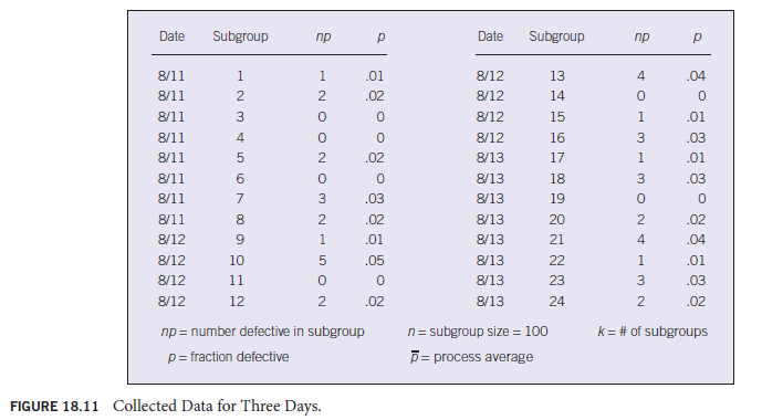

In Figure 18.13, LCLp is a negative number. In the real world, the fraction defective (p) cannot be negative, so we will set LCLp at zero.

No further information is needed to construct the p-chart. The y-axis scale will have to be at least 0 to 0.06 or 0.07 because UCLp = 0.0568. The p values in Figure 18.11 do not exceed 0.05, although a larger fraction defective could occur in the future. Use the following steps to draw a control chart:
- Label the x-axis and the y-axis.
- Draw a dashed line representing UCLp at 0.0568.
- Draw a solid line representing the process average (pQ) at 0.0175.
- Plot the data points representing subgroup fraction defective (p).
- Connect the points.
The p-chart (Figure 18.14) shows that there are no special causes affecting the process, so we can call it in statistical control.


3.3. Another Commonly Used Control Chart for Attributes Data
The c-Chart The c-charts are used when the data are concerned with the number of defects in a piece—for example, the number of defects found in a tire or an appliance.
In practice, the data are collected by inspecting sample tires or toasters, whatever the product may be, on a scheduled basis, and each time logging the number of defects detected. Defects may also be logged by type (blemish, loose wire, and any other kind of defect noted), but the c-chart data are the simple sum of all the defects found in each sample piece. Remember, with the c-chart, a sample is one complete unit that may have multiple defect characteristics. The following example illustrates the development of a c-chart.
A manufacturer makes power supplies for the computer industry. Rework to correct defects has been a significant expense. The power supply market is very competitive, and for the firm to remain viable, defects and rework must be reduced. As a first step, the company decides to develop a c-chart to help monitor the manufacturing process. To compile the initial data, the first power supply completed after the hour was chosen as a sample and closely inspected. This was repeated each hour for 30 hours. Defects were recorded by type and totaled for each power supply sample. To develop the initial c-chart, the formulas of Figure 18.15 are applied to the power supply defect data recorded in Figure 18.16.
Calculating the c-chart parameters from the data:


The c-chart of Figure 18.17 is constructed from these data. Notice that all data points fell within the control limits and there were no protracted runs of data points above or below the process average line, c. The process was “in control” and ready for SPC. Now, as the operators continue to inspect a sample power supply each hour, data will immediately be plotted directly on the control chart, which, of course, will have to be lengthened horizontally to accept the new data. This is done with “pages” rather than physically lengthening the chart. Each new page represents a new control chart for the period chosen (week, month, etc.). However, the control limits and the average lines must remain in the same position until they are recalculated with new data. As process improvements are implemented and verified, recalculating the average and limits will be necessary. That is because when a process is really improved, it will have less natural variation. The original average and control limits will no longer reflect the process, and hence their continued use will invalidate the control chart.


3.4. The Control Chart as a Tool for Continual Improvement
Control charts of all types are fundamental tools for continual improvement. They provide alerts when special causes are at work in the process, and they prompt investigation and correction. When the initial special causes have been removed and the data stay between the control limits (within ±3s), work can begin on process improvement. As process improvements are implemented, the control charts will either ratify the improvement or reveal that the anticipated results were not achieved. Whether the anticipated results were achieved is virtually impossible to know unless the process is under control. This is because there are special causes affecting the process; hence, one never knows whether the change made to the process was responsible for any subsequent shift in the data or if it was caused by something else entirely. However, once the process is in statistical control, any change you put into it can be linked directly to any shift in the subsequent data. You find out quickly what works and what doesn’t. Keep the favorable changes, and discard the others.
As the process is refined and improved, it will be necessary to update the chart parameters. The UCL, LCL, and process average will all shift, so you cannot continue to plot data on the original set of limits and process average. The results can look like the succession of charts in Figure 18.18.
An important thing to remember about control charts is that once they are established and the process is in statistical control, the charting does not stop. In fact, only then can the chart live up to its name, control chart. Having done the initial work of establishing limits and centerlines, plotting initial data, and eliminating any special causes that were found, we have arrived at the starting point. Data will have to be continually collected from the process in the same way they were for the initial chart.
The plotting of these data must be done as they become available (in real time) so that the person managing the process will be alerted at the first sign of trouble in the process. Such trouble signals the need to stop the process and immediately investigate to determine what has changed. Whatever the problem, it must be eliminated before the process is restarted. This is the essence of statistical process control. The control chart is the statistical device that enables SPC on the shop floor or in the office.
This discussion of control charts has illustrated only the x-chart, R-chart, p-chart, and c-chart. Figure 18.19 lists common control charts and their applications. The methods used in constructing the other charts are essentially the same as for the four we discussed in detail. Each chart type is intended for special application. You must determine which best fits your need.


3.5. Statistical Control Versus Capability
It is important to understand the distinction between a process that is in statistical control and a process that is capable. Asking the question “Is our process in control?” is different from asking “Is our process capable?” The first relates to the absence of special causes in the process. If the process is in control, you know that 99.7% of the output will be within the {3s limits. Even so, the process may not be capable of producing a product that meets your customer’s expectations.
Suppose you have a requirement for 500 shafts of 2 inch diameter with a tolerance of {0.02 inch. You already manufacture 2-inch diameter shafts in a stable process that is in control. The problem is that the process has control limits at 1.97 and 2.03 inches. The process is in control, but it is not capable of making the 500 shafts without a lot of scrap and the cost that goes with it. Sometimes, it is possible to adjust the machines or procedures, but if that could have been accomplished to tighten the limits, it already should have been done. It is possible that a different machine is needed.
There are many variations on this theme. A process may be in control but not centered on the nominal specification of the product. With attributes data, you may want your in-control process to make 99.95% (1,999 out of 2,000) of its output acceptable, but it may be capable of making only 99.9% (1,998 of 2,000) acceptable. (Don’t confuse that with ±3s’s 99.73%; they are two different things.)
The series of charts in Figure 18.20 illustrates how in statistical control and capable are two different issues, but the control chart can clearly alert you to a capability problem. You must eliminate all special causes and the process must be in control before process capability can be established.
4. MANAGEMENT’S ROLE IN SPC
As in other aspects of total quality, management has a definite role to play in SPC. First, as Deming pointed out, only management can establish the production quality level.6 Second, SPC and the continual improvement that results from it will transcend department lines, making it necessary for top management involvement. Third, budgets must be established and spent, something else that can be done only by management.
4.1. Commitment
As with every aspect of total quality, management commitment is an absolute necessity. To many organizations SPC and continual improvement represent a new and different way of doing business, a new culture. No one in any organization, except its management, can mandate such fundamental changes. One may ask why a production department cannot implement SPC on its own. The answer is that, providing management approves, it can. But the department will be prevented from reaping all the benefits that are possible if other departments are working to a different agenda. Suppose, for example, that through the use of SPC, a production department has its processes under control and it is in the continual improvement mode. Someone discovers that if an engineering change is made, the product will be easier to assemble, reducing the chance for mistakes. This finding is presented to the engineering department. However, engineering management has budgetary constraints and chooses not to use its resources on what it sees as a production department problem. Is this a realistic situation? Yes, it is not only realistic but also very common. Unless there is a clear signal from top management that the production department’s SPC program, with its continual improvement initiative, is of vital interest, other departments will continue to address their own agendas. After all, each separate department knows what is important to the top management, and this is what its employees focus on because this is what affects their evaluations most. If SPC and continual improvement are not perceived as priorities of top management, the department that implements SPC alone will be just that, alone.

4.2. Training
It is management’s duty to establish the policies and procedures under which all employees work and to provide the necessary training to enable them to carry out those policies and procedures. The minimum management involvement relative to SPC training involves providing sufficient funding. More often, though, management will actually conduct some of the training. This is a good idea. Not only will management be better educated in the subject as a result of preparing to teach it, but also employees will be more likely to get the message that SPC is a priority to management.
4.3. Involvement
When employees see management involved in an activity, they get a powerful message that the activity is important. Employees tend to align their efforts with the things they perceive as being important to management. If managers want their employees to give SPC a chance, they must demonstrate their commitment to it. This does not mean that managers should be on the floor taking and logging data, but they should make frequent appearances, learn about the process, probe, and insist on being kept informed.
A major part of SPC is the continual improvement of processes. Deming pointed out that special causes of variation can be eliminated without management intervention. This is essentially true when it comes to correcting a problem. But when it comes to process improvement, management must be involved. Only management can spend money for new machines or authorize changes to the procedures and processes. Without management involvement, neither process nor product improvement will happen.
Source: Goetsch David L., Davis Stanley B. (2016), Quality Management for organizational excellence introduction to total Quality, Pearson; 8th edition.
Some truly quality articles on this web site, saved to favorites.