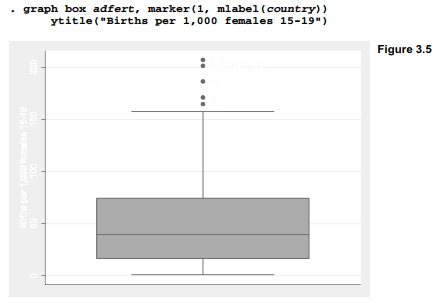
Box plots convey information about center, spread, symmetry and outliers at a glance. For example, Figure 3.4 is a simple box plot of adfert (adolescent fertility rate) obtained by typing

Figure 3.4 confirms the positive skew of this distribution, and shows five high outliers. The box in a box plot extends from approximate first to third quartiles, a distance called the interquartile range (IQR). It therefore contains roughly the middle 50% of the data. (Stata’s box plots define quartiles in the same manner as summarize, detail.) Outliers, defined as observations more than 1.5(IQR) beyond the first or third quartile, are plotted as individual points.
Figure 3.5 identifies the adfert outliers by labeling their markers with values of variable country (country names). It also specifies a non-default title for the y axis. The marker option can control the symbols and other properties denoting outliers as well. Specifying marker(1) in this example means that this option refers to the first-named y variable. There is only one y variable here, but in other cases we could have two or more, and mark their outliers in distinct ways.
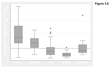
One of the most common applications for box plots involves comparing the distribution of one variable over categories of a second. Figure 3.6 compares the distribution of adfert across region. The overall median is indicated by a horizontal line placed by the yline(39.3) option.
. graph box adfert, marker(1, mlabel(country)) yline(39.3) over(region)
Box plots can have a horizontal orientation instead of vertical, via the graph hbox command. Figure 3.7 illustrates using per capita carbon dioxide emissions (co2), another variable from the Nations2.dta dataset. This example also shows off several title or labeling options, which could be applied to any type of graph. The note( ) and caption( ) options place text below the graph. In this figure, “Statistics with Stata” appears in bold, and “Example of horizontal box plots” in italics. In the ytitle (y axis title, which in a horizontal box plot refers to the horizontal axis), CO2 is given its proper subscript. Bold, italic, subscript and other text attributes are controlled within graphs using Stata markup and control language (SMCL) features. Type help graph text to see other possibilities and examples.
. graph hbox co2, over(region)
note(“note: {bf:Statistics with Stata}, version 12”)
caption(“caption: United Nations Human Development Report 2011”)
title(“title: {it:Example of horizontal box plots}”)
ytitle(“ytitle: Tons of CO{subscript:2} emitted per capita”)

Individual outliers are not labeled in Figure 3.7 because they would be hard to read in the horizontal format. The three outliers in the Americas are the U.S., Canada, and Trinidad and Tobago (the leading Caribbean oil and gas producer). Australia has the highest per capita CO2 in Oceania. Four oil-exporting nations comprise the very high outliers for Asia. Looking closer at outliers, which box plots make obvious, we often find that they are interesting observations in their own right and not just a statistical complication.
Numerous options control the appearance, shading and details of boxes in a box plot; type help graph box for a list. Axis labeling, tick marks, titles, and the by(varname) or by(varname, total) options work in a similar fashion with other Stata graphing commands. For example, by(region) would have drawn individual box plots in five small window panes, instead of five box plots in one graph as over(region) did in Figures 3.6 and 3.7.
Source: Hamilton Lawrence C. (2012), Statistics with STATA: Version 12, Cengage Learning; 8th edition.
29 Sep 2022
30 Sep 2022
3 Oct 2022
30 Sep 2022
28 Sep 2022
28 Sep 2022