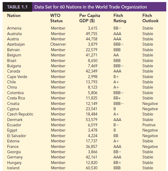
Data are the facts and figures collected, analyzed, and summarized for presentation and interpretation. All the data collected in a particular study are referred to as the data set for the study. Table 1.1 shows a data set containing information for 60 nations that participate in the World Trade Organization. The World Trade Organization encourages the free flow of international trade and provides a forum for resolving trade disputes.
1. Elements, Variables, and Observations
Elements are the entities on which data are collected. Each nation listed in Table 1.1 is an element with the nation or element name shown in the first column. With 60 nations, the data set contains 60 elements.
A variable is a characteristic of interest for the elements. The data set in Table 1.1 includes the following five variables:
- WTO Status: The nation’s membership status in the World Trade Organization; this can be either as a member or an observer.
- Per Capita Gross Domestic Product (GDP) ($): The total market value ($) of all goods and services produced by the nation divided by the number of people in the nation; this is commonly used to compare economic productivity of the nations.
- Fitch Rating: The nation’s sovereign credit rating as appraised by the Fitch Group1; the credit ratings range from a high of AAA to a low of F and can be modified by + or —.
- Fitch Outlook: An indication of the direction the credit rating is likely to move over the upcoming two years; the outlook can be negative, stable, or positive.
Measurements collected on each variable for every element in a study provide the data. The set of measurements obtained for a particular element is called an observation. Referring to Table 1.1, we see that the first observation (Armenia) contains the following measurements: Member, 3615, BB-, and Stable. The second observation (Australia) contains the following measurements: Member, 49755, AAA, and Stable and so on. A data set with 60 elements contains 60 observations.
2. Scales of Measurement
Data collection requires one of the following scales of measurement: nominal, ordinal, interval, or ratio. The scale of measurement determines the amount of information contained in the data and indicates the most appropriate data summarization and statistical analyses.
When the data for a variable consist of labels or names used to identify an attribute of the element, the scale of measurement is considered a nominal scale. For example, referring to the data in Table 1.1, the scale of measurement for the WTO Status variable is nominal because the data “member” and “observer” are labels used to identify the status category for the nation. In cases where the scale of measurement is nominal, a numerical code as well as a nonnumerical label may be used. For example, to facilitate data collection and to prepare the data for entry into a computer database, we might use a numerical code for the WTO Status variable by letting 1 denote a member nation in the World Trade Organization and 2 denote an observer nation. The scale of measurement is nominal even though the data appear as numerical values.
The scale of measurement for a variable is considered an ordinal scale if the data exhibit the properties of nominal data and in addition, the order or rank of the data is meaningful. For example, referring to the data in Table 1.1, the scale of measurement for the Fitch Rating is ordinal because the rating labels, which range from AAA to F, can be rank ordered from best credit rating (AAA) to poorest credit rating (F). The rating letters provide the labels similar to nominal data, but in addition, the data can also be ranked or ordered based on the credit rating, which makes the measurement scale ordinal. Ordinal data can also be recorded by a numerical code, for example, your class rank in school.
The scale of measurement for a variable is an interval scale if the data have all the properties of ordinal data and the interval between values is expressed in terms of a fixed unit of measure. Interval data are always numerical. College admission SAT scores are an example of interval-scaled data. For example, three students with SAT math scores of 620, 550, and 470 can be ranked or ordered in terms of best performance to poorest performance in math. In addition, the differences between the scores are meaningful. For instance, student 1 scored 620 – 550 = 70 points more than student 2, while student 2 scored 550 – 470 = 80 points more than student 3.
The scale of measurement for a variable is a ratio scale if the data have all the properties of interval data and the ratio of two values is meaningful. Variables such as distance, height, weight, and time use the ratio scale of measurement. This scale requires that a zero value be included to indicate that nothing exists for the variable at the zero point. For example, consider the cost of an automobile. A zero value for the cost would indicate that the automobile has no cost and is free. In addition, if we compare the cost of $30,000 for one automobile to the cost of $15,000 for a second automobile, the ratio property shows that the first automobile is $30,000/$15,000 = 2 times, or twice, the cost of the second automobile.
3. Categorical and Quantitative Data
Data can be classified as either categorical or quantitative. Data that can be grouped by specific categories are referred to as categorical data. Categorical data use either the nominal or ordinal scale of measurement. Data that use numeric values to indicate how much or how many are referred to as quantitative data. Quantitative data are obtained using either the interval or ratio scale of measurement.
A categorical variable is a variable with categorical data, and a quantitative variable is a variable with quantitative data. The statistical analysis appropriate for a particular variable depends upon whether the variable is categorical or quantitative. If the variable is categorical, the statistical analysis is limited. We can summarize categorical data by counting the number of observations in each category or by computing the proportion of the observations in each category. However, even when the categorical data are identified by a numerical code, arithmetic operations such as addition, subtraction, multiplication, and division do not provide meaningful results. Section 2.1 discusses ways of summarizing categorical data.
Arithmetic operations provide meaningful results for quantitative variables. For example, quantitative data may be added and then divided by the number of observations to compute the average value. This average is usually meaningful and easily interpreted. In general, more alternatives for statistical analysis are possible when data are quantitative.
Section 2.2 and Chapter 3 provide ways of summarizing quantitative data.
4. Cross-Sectional and Time Series Data
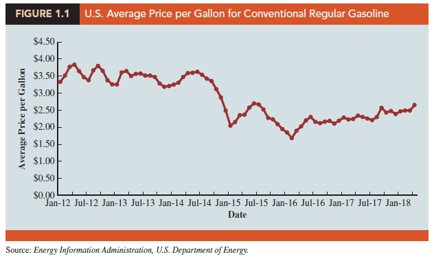
For purposes of statistical analysis, distinguishing between cross-sectional data and time series data is important. Cross-sectional data are data collected at the same or approximately the same point in time. The data in Table 1.1 are cross-sectional because they describe the five variables for the 60 World Trade Organization nations at the same point in time. Time series data are data collected over several time periods. For example, the time series in Figure 1.1 shows the U.S. average price per gallon of conventional regular gasoline between 2012 and 2018. From January 2012 until June 2014, prices fluctuated between $3.19 and $3.84 per gallon before a long stretch of decreasing prices from July 2014 to January 2015. The lowest average price per gallon occurred in January 2016 ($1.68). Since then, the average price appears to be on a gradual increasing trend.
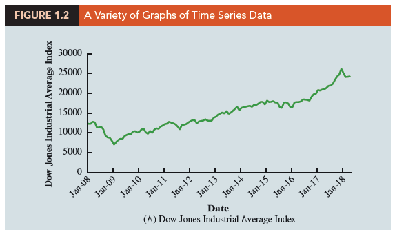
Graphs of time series data are frequently found in business and economic publications. Such graphs help analysts understand what happened in the past, identify any trends over time, and project future values for the time series. The graphs of time series data can take on a variety of forms, as shown in Figure 1.2. With a little study, these graphs are usually easy to understand and interpret. For example, Panel (A) in Figure 1.2 is a graph that shows the Dow Jones Industrial Average Index from 2008 to 2018. Poor economic conditions caused a serious drop in the index during 2008 with the low point occurring in February 2009 (7062). After that, the index has been on a remarkable nine-year increase, reaching its peak (26,149) in January 2018.
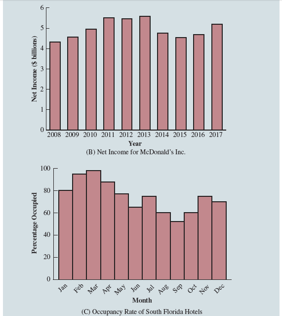
The graph in Panel (B) shows the net income of McDonald’s Inc. from 2008 to 2017. The declining economic conditions in 2008 and 2009 were actually beneficial to McDonald’s as the company’s net income rose to all-time highs. The growth in McDonald’s net income showed that the company was thriving during the economic downturn as people were cutting back on the more expensive sit-down restaurants and seeking less-expensive alternatives offered by McDonald’s. McDonald’s net income continued to new all-time highs in 2010 and 2011, decreased slightly in 2012, and peaked in 2013. After three years of relatively lower net income, their net income increased to $5.19 billion in 2017.
Panel (C) shows the time series for the occupancy rate of hotels in South Florida over a one-year period. The highest occupancy rates, 95% and 98%, occur during the months of February and March when the climate of South Florida is attractive to tourists. In fact, January to April of each year is typically the high-occupancy season for South Florida hotels. On the other hand, note the low occupancy rates during the months of August to October, with the lowest occupancy rate of 50% occurring in September. High temperatures and the hurricane season are the primary reasons for the drop in hotel occupancy during this period.
Source: Anderson David R., Sweeney Dennis J., Williams Thomas A. (2019), Statistics for Business & Economics, Cengage Learning; 14th edition.
30 Aug 2021
31 Aug 2021
31 Aug 2021
28 Aug 2021
30 Aug 2021
28 Aug 2021