In early markets, when the price for a security or good might be established only once or twice a day, the chart was extremely simple. It was merely a graph of closing prices connected by a line, sometimes directly connected, and sometimes connected by perpendicular lines. In Japan, this type of chart was called a “tome” chart from the word tomene, which means “close.” In the Western world, this type of chart is still used and is called a line chart.
When trades became more frequent, chart forms took two paths. The first and still most common style was borrowed from the bar graph or stick graph and portrayed the high and low with a “floating” vertical line not connected to the base line. These were called bar charts or vertical line charts. Interestingly, in Japan, where many chart types were developed, the original plotting of price data was from right to left rather than the now- universal method of plotting from left to right. This bar style then evolved into the candlestick chart, which uses the same information as the bar chart but has a more appealing appearance. The other path was called the price movement line, where prices were recorded as they occurred, and only the ones that deviated from earlier prices by a specified amount were graphed in a line. This method of price plotting is the forerunner to the modern point and figure chart.
Today, the three most common types of charts that record prices at given time intervals (such as hourly, daily, weekly, or monthly) are line charts, bar charts, and candlestick charts. Let us look at each of these charts and others to see how they differ.
1. Line Charts
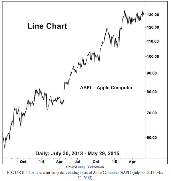
Figure 11.2 is an example of a line chart. These simple charts provide information about two variables: price and time. In the figure, the price variable is the daily closing price for AAPL (Apple Computer). A line chart has price data on the vertical, or y, axis. On the horizontal, or x, axis, it has a time measure (hours, days, weeks, and so on).

Simple line charts are especially useful when studying long-term trends. Because line charts display summary statistics, they are often used when information about several different variables is being plotted in the same graph. For example, in Figure 11.3, three line charts are used to plot the weekly close of the Dow Jones Industrial Average, the S&P 500, and Nasdaq for the past two years. Journalists often use line charts to give the reader a quick, concise picture of the variables being discussed.
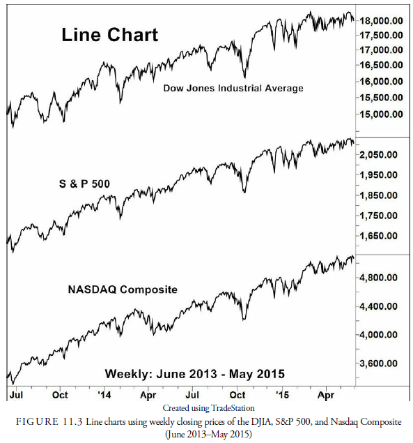
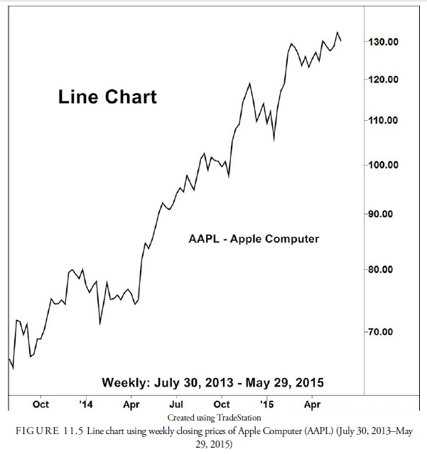
Figure 11.3 represents weekly data. Line charts, however, can be used to present data collected at any time interval. More frequent data collection will lead to a more detailed, but more cluttered, graphical presentation. Especially when studying long-term trends, these extra details muddy the picture and obscure basic trends. For example, compare Figures 11.4, 11.5, and 11.6. Each of these charts represents trading data for AAPL (Apple Computer) over the 22 months from July 2013 through May 2015. The first chart uses daily data, the second chart displays weekly data, and the third chart presents monthly data. See how broader, longer-term movements in the stock price are more easily discernible in the third graph, which relies on less frequent data observations.

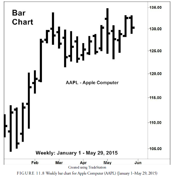
2. Bar Charts
Although the line chart visually displays one piece of information for each time interval, a bar chart shows at least three pieces of information: the high, the low, and the closing price for each time interval. Some bar charts also contain a fourth piece of price information: the opening price. Each time interval (that is, day, week, or five-minutes) is represented by one bar.
Figure 11.7 is an example of a daily bar chart. Each bar represents one day’s price action. Just as with the line chart, price data is placed on the vertical axis, and time is measured on the horizontal axis. A vertical line shows the trading range for that day. The top of this vertical line represents the highest price at which the security traded on that day; the bottom of the bar represents the lowest trading price of the day. A longer line denotes a wider trading range during the day. Likewise, a short bar means that the spread between the highest price during the day and the lowest price during the day was small. A small tick mark on the right side of the bar indicates the closing price for the day. If the opening price for the day is recorded on the bar chart, it is represented by a small tick mark to the left side of the bar.
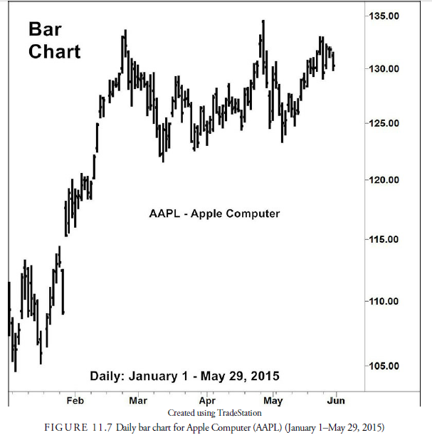
We see that the first bar in Figure 11.7 represents trading information for AAPL January 2, 2015. The lowest point of the bar is $107.35, which is the lowest price that a share of AAPL traded for on that day. The highest price anyone paid for a share of AAPL that day was $111.44, represented by the top of the bar. The difference between the high and low price in any bar is called the range. The opening price for AAPL was $111.39, represented by the left hash mark. The right hash mark at $109.33 represents the closing price.
We can glean a lot of information from a quick visual observation of the bar chart. For example, the bar for trading day 2 in Figure 11.7 closed lower than it opened, and it opened below the close of day 1, indicating the trend is downward. Another quick observation is that the bar for trading on day 5 has a lower high than the low of day 6. This space is called a gap. Thus, the bar chart makes it easy to spot changes in trend and price action from bar to bar, certainly more easily than the column of numbers in Table 11.1.
Just as with the line chart, bar charts can be constructed for various intervals of data collection. For example, Figure 11.8 presents a weekly bar chart for AAPL for the same period as Figure 11.7. When we use longer and longer intervals to gather information for our bar charts, we lose some of the details but will have a less cluttered chart that offers more of a broad-stroke picture of past price movement.
3. Candlestick Charts
As mentioned in Chapter 3, “History of Technical Analysis,” candlestick charts originated in Japan. This charting method was used as early as the mid-1600s to trade rice futures in the Japanese markets and continues to be the most popular form of technical analysis in Japan.
These techniques have been widely used in the Far East for many generations, but not until the publication of the book Japanese Candlestick Charting Techniques by Steve Nison in 1991 were Western traders introduced to candlestick charts. Before the publication of Nison’s book, few U.S. and European services offered candlestick charts. Today, almost every technical analysis software package and technical service offers candlestick charts. You can even create candlestick charts through the charting options in Excel.
Candlestick charts are similar to bar charts in their construction. Both charts use the high price, low price, and closing price, but candlestick charts always include the opening price. To construct a candlestick chart, the low and high prices are plotted on a thin bar, just as they would be for the bar chart we just discussed. A box is used to represent the opening and closing prices. To create this box, a horizontal mark is made at both the opening and closing prices; a rectangle is formed using these two horizontal marks. This rectangular box is called the real body of the candlestick. If the security closed at a higher price than it opened, the real body is white (gray in the charts here) or open. These white, or “open,” real body candlesticks indicate price advances from the opening. Conversely, if the closing price falls below the opening price, the real body of the candlestick is shaded black. These candlesticks with a “closed,” or black, real body designate price declines from the opening.
Figure 11.9 is a candlestick chart of daily prices from January 1 through May 29, 2015, the same as for Figure 11.7 and Figure 11.8, for AAPL. Much more colorful than the bar chart, the candlestick chart makes it immediately easy to spot days in which AAPL closed at a higher price than it opened. For example, the candle for the first trading day of the chart, January 2, has a black body, indicating that the stock closed at a lower price than it opened. The following day we see another black-bodied candlestick, indicating that the stock closed lower than it opened that day also. Not until the fourth day does a gray body appear showing that the close was higher than the opening.
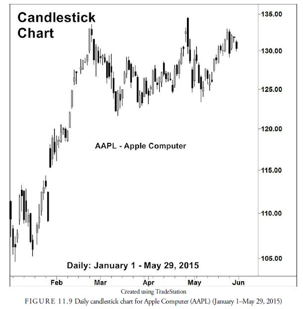
As you can see in Figure 11.9, candlesticks come in a variety of shapes and sizes. If the real body of the candlestick is tall, the opening price and closing price were relatively far apart. Shorter real bodies indicate opening and closing prices that were similar. In the extreme, the real body can be so short that it is just a horizontal line, indicating that the opening and closing prices were identical.
The thin vertical bars, representing the price extremes of the trading session, are called the shadows. The shadow above the real body is called the upper shadow; the shadow below the real body is called the lower shadow. You can easily see how the candlestick chart got its name; many times, the real body will look like a candle and the upper shadow will look like the wick.
Individual candlesticks can take on a variety of interesting sizes. Some have long shadows; others have short shadows. Some have tall boxes; other have short boxes. The color of the box, the lengths of the boxes and shadows, and where the box sits relative to the shadows tell something about the trading that occurred over the time period represented by the candlestick. Looking at the first candlestick in Figure 11.9, we see that this candlestick has almost no upper shadow; this, along with the black body, indicates that AAPL opened near the
high of the day. If the opening price had been the highest price of the bar, then no upper shadow would exist. The third candlestick in Figure 11.9 has a relative small black body; this indicates that the closing price was below, but close to, the opening price; the upper and lower shadows indicate that the price range throughout the bar was much greater than the difference between the opening and closing prices. On some bars, the opening and closing prices represent the entire trading range for the day, resulting in no upper or lower shadow, as we see with the tenth candlestick.
Because candlestick charts contain all the information that a bar chart contains, all of the technical tools that are used with bar charts can also be used with candlestick charts. In addition, some technical tools rely on the color and size of individual candlesticks to signal trades. We study the trading techniques that are peculiar to candlestick charts in Chapter 17, “Short-Term Patterns.”
Source: Kirkpatrick II Charles D., Dahlquist Julie R. (2015), Technical Analysis: The Complete Resource for Financial Market Technicians, FT Press; 3rd edition.
7 Jul 2021
7 Jul 2021
7 Jul 2021
7 Jul 2021
7 Jul 2021
8 Jul 2021