The simple moving average represents the center of a stock’s price trend. Actual prices tend to oscillate around that moving average. The price movement is centered on the moving average but falls within a band or envelope around the moving average. By determining the band within which prices tend to oscillate, the analyst is better able to determine the range in which price may be expected to fluctuate.
1. Percentage Envelopes
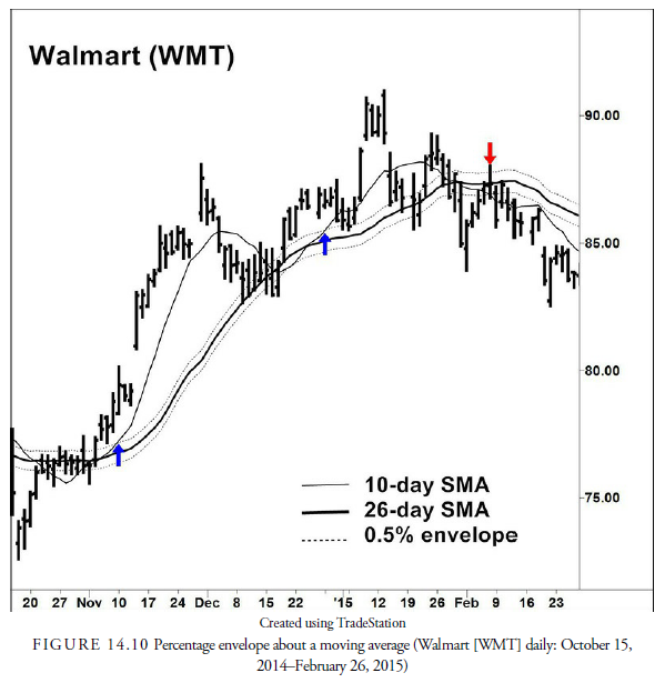
One way of creating this type of band is to use percentage envelopes. This method, also known as a percentage filter, was developed in an attempt to reduce the numerous unprofitable signals from crossing a moving average when the trend is sideways. This is a popular method used in most of the academic studies on moving average crossover systems. It is calculated by taking a percentage of the moving average and plotting it above and below the moving average (see Figure 14.10)—thus the term envelope. This plot creates two symmetrical lines: one above and one below the moving average.
This envelope then becomes the trigger for signals when it is crossed by the price rather than when the moving average is crossed. The percentage used in the calculation should be large enough that it encompasses most of the oscillations around the moving average during a sideways period and, thus, reduces the number of incorrect signals, yet it should be small enough to give signals early enough to be profitable once a trend has been established. This percentage must be determined through experiment because a slight difference in percentage can cause a considerable difference in performance.
One of the major problems with fixed-percentage envelopes is that they do not account for the changing volatility of the underlying price. During a sideways trend, when volatility usually declines, price action can be contained within a relatively narrow band. When the trend begins, however, volatility often expands and will then create false signals using a fixed-percentage envelope. To combat this problem, the concept of bands that are adjusted for volatility developed.
2. Bands
Bands are also envelopes around a moving average but, rather than being fixed in size, are calculated to adjust for the price volatility around the moving average. They, thus, shrink when prices become calm and expand when prices become volatile. The most widely used band is the Bollinger Band, named after John Bollinger (2002).
3. Bollinger Band
As we mentioned earlier, there are two principal ways to measure price volatility. One is the standard deviation about a mean or moving average, and the other is the ATR. Bollinger Bands use the standard deviation calculation.
To construct Bollinger Bands, first calculate a simple moving average of prices. Bollinger uses the SMA because most calculations using standard deviation use an SMA. Next, draw bands a certain number of standard deviations above and below the moving average. For example, Bollinger’s standard calculation, and the one most often seen in the public chart services, begins with a 20-period simple moving average. Two standard deviations are added to the SMA to plot an upper band. The lower band is constructed by subtracting two standard deviations from the SMA. The bands are self-adjusting, automatically becoming wider during periods of extreme price changes.
Figure 14.11 shows the standard Bollinger Band around the 20-period moving average with bands at two standard deviations. Of course, both the length of the moving average and the number of standard deviations can be adjusted. Theoretically, the plus or minus two standard deviations should account for approximately 95% of all the price action about the moving average. In fact, this is not quite true because price action is nonstationary and nonrandom and, thus, does not follow the statistical properties of the standard deviation calculation precisely. However, it is a good estimate of the majority of price action. Indeed, as the chart shows, the price action seems to oscillate between the bands quite regularly. This action is similar to the action in a congestion area or rectangle pattern (see Chapter 15, “Bar Chart Patterns”), except that prices also tend to oscillate within the band as the price trends upward and downward. This is because the moving average is replicating the trend of the prices and adjusting for them while the band is describing their normal upper and lower limits around the trend as price volatility changes.

4. Keltner Band
Chester Keltner (1960) introduced Keltner Bands in his book How to Make Money in Commodities. To construct these bands, first calculate the “Typical Price” (Close + High + Low) ^ 3, and calculate a ten-day SMA of the typical price. Next, calculate the band size by creating a ten-day SMA of High minus Low or bar range. The upper band is then plotted as the ten-day SMA of the typical price plus the ten-day SMA of bar range. The lower band is plotted as the ten-day SMA to the typical price minus the ten-day SMA of bar range. (When the calculation is rearranged, it is similar to the use of an ATR. These bands are sometimes referred to as ATR bands.)
As with most methods, different analysts prefer to modify the basic model to meet their specific needs and investment strategies. Although Keltner’s original calculation used ten-day moving averages, many analysts using this method have extended the moving averages to 20 periods. The 20-period calculation is more in line with the calculation for a Bollinger Band.
5. STARC Band
STARC is an acronym for Stoller Average Range Channel, invented by Manning Stoller. This system uses the ATR over five periods added to and subtracted from a five-period SMA of prices. It produces a band about prices that widens and shrinks with changes in the ATR or the volatility of the price. Just as with the Keltner Bands, the length of the SMA used with STARC can be adjusted to different trading or investing time horizons.
6. Trading Strategies Using Bands and Envelopes
In line with the basic concept of following the trend, bands and envelopes are used to signal when a trend change has occurred and to reduce the number of whipsaws that occur within a tight trading range. While looking at the envelopes or bands on a chart, one would think that the best use of them might be to trade within them from high extreme to low extreme and back, similar to strategies for rectangle patterns. However, the trading between bands is difficult. First, by definition, except for fixed envelopes, the bands contract during a sideways, dull trend and leave little room for maneuvering at a cost-effective manner and with profitable results. Second, when prices suddenly move on a new trend, they tend to remain close to the band in the direction of the trend and give many false exit signals. Third, when the bands expand, they show that volatility has increased, usually due to the beginning of a new trend, and any position entered in further anticipation of low volatility is quickly stopped out.
Bands, therefore, have become methods of determining the beginnings of trends and are not generally used for range trading between them. When the outer edge of a band is broken, empirical evidence suggests that the entry should be in the direction of the breakout, not unlike the breakout of a trend line or support or resistance level. A breakout from a band that contains roughly 90% of previous price action suggests that the general trend of the previous price action has changed in the direction of the breakout.
In Figure 14.11, a breakout buy signal occurs in early November, when the price breaks above the upper Bollinger Band, hinting that a strong upward trend is starting. The bands had become narrower during October. This band tightening, caused by shrinking volatility, is often followed by a sharp price move.
The only difference between a band breakout and a more conventional kind is that a band is generally more fluid. Because moving averages will often become support or resistance levels, the moving average in the Bollinger Band calculation should then become the trailing stop level for any entry that previously occurred from a breakout above or below the band. The ability of moving averages to be used as trailing stops is easily spliced into a system utilizing any kind of bands that adjust for volatility.
The other use for the moving average within a band is as a retracement level for additional entry in the trend established by the direction of the moving average and the bands. With a stop only slightly below the moving average using the rules we learned in the previous chapter for establishing stop levels, when the price retraces back into the area of the moving average while in a strong upward trend, an additional entry can be made where the retracement within the band is expected to halt.
In testing band breakouts, the longer the period, it seems, the more profitable the system. Very short-term volatility, because it is proportionally more active, causes many false breakouts. Longer-term periods with less volatility per period appear to remain in trends for longer periods and are not whipsawed as much as shortterm trends. The most profitable trend-following systems are long-term, and as short-term traders have learned, the ability of price to oscillate sharply is greater than when it is smoothed over longer periods. Thus, the inherent whipsaws in short-term data become reduced over longer periods, and trend-following systems tracking longer trends have fewer unprofitable signals. Bands are more successful in trending markets and are, therefore, more suitable for commodities markets than the stock market.
Another use for bands is to watch price volatility. Low volatility is generally associated with sideways to slightly slanted trends—ones where whipsaws are common and patterns fail. High volatility is generally associated with a strong trend, up or down. By watching volatility, especially for an increase in volatility, the analyst has a clue that a change in trend is forthcoming. To watch volatility, one should take a difference between the high band and low band and plot it as a line below the price action. Bollinger calls this line a Bandwidth Indicator. A rise in the bandwidth line, which results from increasing volatility, can be associated directly with price action. Any breakout from a pattern, support or resistance level, trend line, or moving average can be confirmed by the change in volatility. If volatility does not increase with a price breakout, the odds favor that the breakout is false. Volatility, therefore, can be used as confirmation for trend changes, or it can be used as a warning that things are about to change. This use of bands is more successful when combined with other methods of determining an actual trend change.
7. Channel
In discussing trend lines, we noted that a line can often be drawn parallel to a trend line that encompasses the price action in what was called a channel. For present purposes, that definition changes slightly by relaxing the requirement for a parallel line.
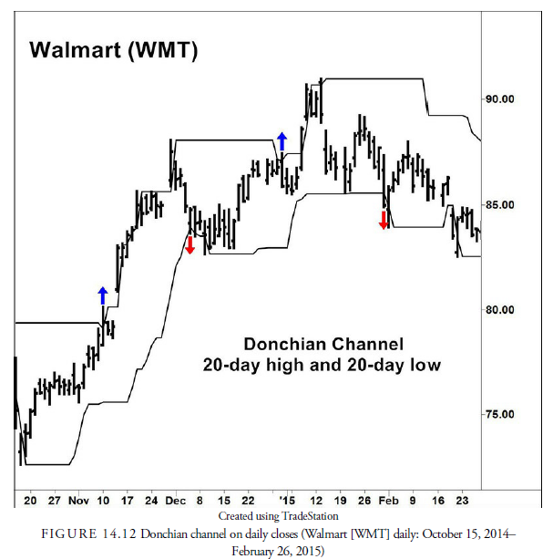
Channels have been described as something simpler than two parallel lines. For example, in Chapter 12, we mentioned the Donchian channel method that has been so successful even though it’s been widely known for many years. Signals occur with the Donchian channel when the breaking above or below a high or low over some past period occurs (see Figure 14.12). This method does not require the construction of a trend line; the only requirement is a record of the highs and lows over some past period. In the case of the Donchian channel method, the period was four weeks (20 days), and the rule was to buy when the price exceeded the highest level over the past four weeks and sell short when the price declined below the lowest low over the past four weeks. Such systems are usually “stop and reverse” systems that are always in the market, either long or short. As is likely imagined, the channel systems are more commonly used in the commodities markets where long and short positions are effortless and prices tend to trend much longer.
Source: Kirkpatrick II Charles D., Dahlquist Julie R. (2015), Technical Analysis: The Complete Resource for Financial Market Technicians, FT Press; 3rd edition.
7 Jul 2021
7 Jul 2021
7 Jul 2021
7 Jul 2021
8 Jul 2021
7 Jul 2021