We have just considered trading ranges in which successive peaks and troughs occur at roughly the same price level. This results in a flat or sideways trend in prices. Whenever reversal points are occurring at higher (lower levels) than the previous reversal points, price is trending upward (or downward).
1. What Is a Directional Trend?
When a peak and trough occur at higher price levels than the immediately previous peak and trough, the trend has turned upward. Conversely, for a peak and trough lower than their previous peak and trough, the trend has turned down. The angle of the trend, therefore, is determined by the amount by which the peaks and troughs are higher or lower than their previous levels. To see this more clearly, a chart is almost a necessity. Figure 12.2 at the beginning of this chapter shows an upward trend in AAPL daily from August 2014 through May 2015. The principles of trends are applicable regardless of direction.
Quite obviously, the steeper the angle of the trend, the more powerful is the buyer or seller group. It means that the one group is overwhelming the other group at a faster pace. In a decline, sellers are willing to receive lower and lower prices before becoming temporarily exhausted at a trough. In an advance, buyers are more and more anxious and willing to pay higher prices. This is the time when an investor who is long the security is happiest. It is a trend and is what the technician is looking for in indicators and charts. The corollary, however, is that the steeper the angle of ascent or descent, the less sustainable it becomes.
An uptrend, therefore, is a display of the eagerness of the buyers versus the eagerness of the sellers. It is similar to the concept of support and resistance except that the support and resistance are changing in a specific direction. Because all the stock desired by the buyers and sold by the sellers is not transacted at one time and at one price level but over a time as news leaks out and positive feedback affects other players, the price trend continues until it has reached a point of exhaustion. At that level, the price trend either flattens out in a congestion or consolidation area or reverses direction into a declining trend. Some analysts argue that an actual trend lasts only a short time—approximately 20% of the trading period—and during the remaining time, prices remain in a consolidation or pattern formation with an indefinite trend. No one has demonstrated the validity of this percentage, however. It was estimated only by counting the time that an ADX indicator (a measure of trending tendency—see Chapter 14, “Moving Averages”) shows that a trend exists in varying markets, periods, and circumstances.
It is undeniable, however, that the majority of profits come from correctly anticipating and acting upon a trend. For this reason, almost all technical study is devoted toward early anticipation of a trend.
2. How Is an Uptrend Spotted?
In retrospect, a trend is easy to spot, especially on a price chart. Without being specific, it is usually easy to see reversal points and the general direction of historical prices. The difficulty, from an analysis standpoint, comes in being specific enough to determine when the signs of a trend change are occurring. To do this, the technical analyst uses several tools: (1) the regression line, (2) the trend line, and (3) moving averages. In this chapter, we discuss the regression line but focus the majority of our attention on the trend line. We focus on the use of moving averages in Chapter 14.
3. Using a Regression Line
Mathematic formulas can fit two sets of data, such as price and time, to a straight line. This method is called linear regression, and the line derived from this formula is called a regression line. This line has two variables: its starting point and its slope. The technical analyst is interested in the regression line’s location on the chart and to some degree its slope. In the example in Figure 12.10, the regression line from the first closing price to the last closing price travels through a majority of the data. Indeed, the mathematical equation used to determine the line minimizes the distance between all the data points and the theoretical line. The line is said to be the “best fit” to the data.
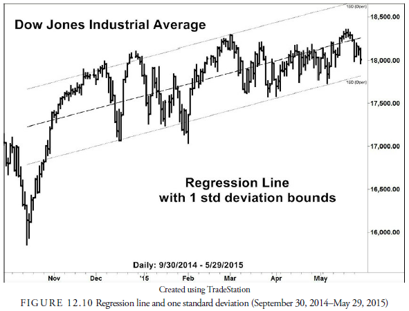
We can also calculate standard deviations about this best fit line that will encompass all the data. Outliers, those prices that occur outside of the standard deviation lines, are considered as either anomalies or, to the technical analyst, if they occur in the most recent data, signs that the trend may be changing. In Figure 12.10, the right-hand, most recent, price plots are inside the standard deviation of the line. These, having occurred recently, are a clue that the trend is still upward.
4. Using Trend Lines
The oldest and easiest method of determining the trend of prices is with a trend line. Trend lines are drawn with just a ruler and the use of one’s eyes rather than a fancy mathematical formula. All that is needed is two support reversal points or two resistance reversal points. A line is drawn between the reversal points, as shown in Figure 12.11.
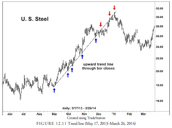
The important lesson to learn is that the lines are generally drawn between troughs (support) when the price is rising and between peaks (resistance) when the price is declining. The lines that connect the lows or highs extend into the future so that the analyst can tell when the trend line is broken. Remember, the purpose of the trend line is to provide a signal of a change in trend. For example, in Figure 12.11, price movement appeared to be in the upward direction. Therefore, a trend line was drawn that connected the major troughs in September, October, and November and at peaks in December and January. In early December, when prices broke below the trend line, analysts had a clue that the trend was changing, but it took a breakdown through a second trend line (not shown) drawn through the December trough to show that prices had reversed downward.
5. Scale and Trend Lines
The problem of scale sometimes arises in the plotting of trend lines as it does with prices. Generally, on an arithmetic scaled chart in which the prices are displayed within a 20%-40% range, a trend line can be drawn with accuracy. When price changes have occurred over a wider range, the logarithmic scaled chart is necessary. In this case, the trend line represents a percentage change in prices rather than a point change. Over long periods, this is the preferred method because it better represents how investors look at a stock price. Generally, over long periods, investors think in terms of percentages, whereas over shorter periods, they may think more in terms of points.
6. Accelerating Trend Lines
Another problem with trend lines is that they might not be straight lines. Often prices, especially in a speculative bubble or in a panic, will accelerate upward or downward and run away from a standard, straight trend line. In this case, the trend line must be adjusted continually to account for the price action’s acceleration. This phenomenon is shown graphically in Figure 12.12.
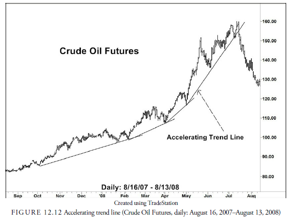
An accelerating trend line, of course, is unsustainable because eventually it would reach an infinite slope. If the acceleration can be calculated through mathematical means, the expected time for the infinite slope will be the time by which the price must reach its zenith. It is a means of determining when the latest time for the eventual reversal will occur. As we will see in the chapters on patterns, an accelerating price trend has profitable, as well as dangerous, implications.
7. Decelerating Trend Lines
The opposite of an accelerating trend line is the decelerating trend line. This is called a fan line. In the chart, the fan lines are shown as regular trend lines that are being broken without an obvious reversal in direction and then being redrawn to account for each new resistance level. Figure 12.13 shows the fanning effect that decelerating trend lines give.
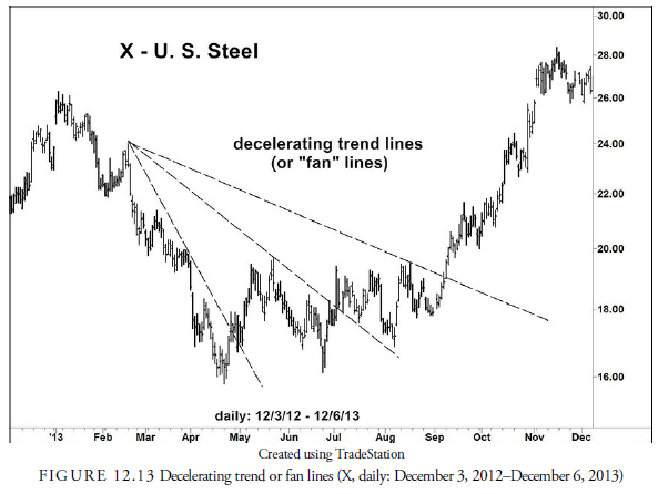
These lines can go on forever in theory, but practitioners have generally stated that the maximum to be expected is three fan lines before a reversal in direction is to be expected. These three fan lines often are accompanied by some kind of standard pattern. Of course, if an earlier resistance zone is broken as well as a trend, it is a stronger implication that the trend has reversed direction.
8. General Rules for Trend Lines
Several standard rules have been developed about trend lines. One is that the longer and the more times that the drawn line is touched by prices, the more significant it is when the line is finally broken. Another is that the steeper the trend line, the sooner it will be broken. This is obvious in an accelerating trend line but is equally true in a steep, straight trend line.
Sometimes a trend line is broken slightly by intraday price action, as shown in Figure 12.14. In this case, the trend line is adjusted downward because the breakdown of trend #1 was an anomaly arising from bad news the previous week. The trend line #2 is then drawn through the trough of the earlier correction, and the breakdown through it in November is real. Obviously, this kind of action provides a problem for the analyst who must determine whether the break is permanent and indicative of a trend change or whether it is an anomaly. Should it be ignored, or should the trend line be adjusted slightly to accommodate the new level? The question here is whether the break of the trend line is significant or just minor. Trend lines should never be considered exact, largely because price action within a bar may be influenced for a short time by exogenous factors that have nothing to do with the trend. Some analysts, for example, draw trend lines between peak and trough closing prices rather than intraday highs and lows. They argue that because intraday traders usually must close their positions by day’s end and are out of the market by then, the closing price represents longer-term players’ determination of supply and demand and is, thus, a truer figure for drawing longer trend lines. By using the closing prices, the number of false breakouts is usually reduced. We discuss these issues regarding the rules for breakouts more thoroughly in the next chapter.

9. Channels
Remember that uptrend lines should be plotted between support troughs, and downtrend lines should be plotted between resistance peaks. In other words, when prices are trending upward, the trend line will lie below the price action, and when prices are trending downward, the trend line will appear above the price action.
Sometimes, as in Figure 12.15, prices appear to travel in a “channel.” A line is plotted through resistance reversal points and is parallel to the underlying uptrend line. This forms a channel. These channels often contain price motion just as the congestion area or rectangle formation contains prices when the trend is sideways. Remember that a trend is a direction of supply and demand. In an uptrend, the lower line represents the increasing demand for the security, and often the supply of the security is traveling parallel but above the demand. Thus, prices tend to “bounce” off this rising upper channel line as if supply were present at these moving intervals and rising at the same rate as demand. Indeed, when we see that a resistance reversal point is no longer parallel on the channel line but beginning to close closer to the underlying trend line, we know that supply is getting just a little more anxious and that the price is likely approaching a reversal point. Final proof that the channel has ended is when the price breaks the trend line. The same channel rules apply in downtrends.

A channel line can be drawn almost immediately after two troughs and their intervening peaks are recognized. A line is drawn parallel to the trend line through the intervening peak and projected into the future. This line now becomes a target line for subsequent rallies within the channel. In Figure 12.15, for example, the channel line (dashed line) could have been drawn as soon as the second trough in October had been recognized, by drawing a parallel line through the June peak. Projected into the future, that channel line was a level at which subsequent rallies would be expected to reach, just as the next one did at the peak in July.
Another potential signal with channel lines is when, in an uptrend, for example, the price breaks above the channel line rather than being contained by it as it was in November in Figure 12.15. This is a sign that the underlying trend is accelerating and that its end is nearing. In Figure 12.15, the subsequent correction declines all the way to the distance trend line where it halted. Such occurrences also occur during a downtrend and signal that a major price bottom is not far ahead. Any kind of acceleration is a sign of pure emotionalism and, thus, a potential sign of an impending reversal. Practically speaking, however, the investor or trader should never attempt to anticipate the reversal. A change in direction may occur soon, but because the price is changing so rapidly, an attempt to anticipate the actual price reversal can be disastrous. It is much wiser to watch for the actual reversal and then act with the comfort of trading with the new trend rather than against the old one.
10. Internal Trend Lines
There is also what is called an internal trend line. This line is more difficult to recognize and has only limited value. Generally, it is a line drawn through trending price action such that a large number of minor reversals touch the line both from above and below. An example of an internal trend line is shown in Figure 12.16. In some ways, it appears similar to a regression line that travels through the majority of prices, and in some ways, it appears like a midpoint line between the two boundaries of a channel. In any case, although it is interesting and occurs often, its use for trading or investing is limited. The observation that prices often bounce off an internal trend line may be somewhat useful for short-term trading, but moving averages provide a better means of measuring the midpoint in prices as they travel through time.

Source: Kirkpatrick II Charles D., Dahlquist Julie R. (2015), Technical Analysis: The Complete Resource for Financial Market Technicians, FT Press; 3rd edition.
Very efficiently written article. It will be beneficial to everyone who employess it, as well as myself. Keep up the good work – can’r wait to read more posts.