Histograms, displaying the distribution of measurement variables, are most easily produced with their own command histogram. For examples, we return to the data on 194 nations seen earlier in Chapter 2, containing human-development indicators gathered by the United Nations.

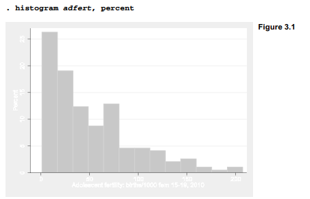
Figure 3.1 shows a simple histogram of adfert, the adolescent fertility rate. It was produced by the following command:
Under the Prefs > Graph Preferences menus, we have the choice of several pre-designed schemes for the default colors and shading of our graphs. Custom schemes can be defined as well. Most examples in this book employ the s2color scheme, which among other things calls for shaded margins around each graph. Experimenting with the different monochrome and color schemes helps to determine which works best for a particular purpose. A graph drawn and saved under one scheme can subsequently be retrieved and re-saved under a different one, as described later.
Options can be listed in any order following the comma in a graph command. Figure 3.1 illustrates one option: percent (instead of density, the default) is shown on the vertical axis. Once a graph is onscreen, menu choices provide the easiest way to print it, save it to disk, or copy and paste it into another program such as a word processor.
Figure 3.1 reveals the positive skew of this distribution, with a mode not far above 0 and an upper limit around 200. It is hard to describe the graph more specifically because the bars do not line up with x-axis tick marks. Figure 3.2 contains a version of the same histogram but with some optional improvements:
frequency Frequencies are shown on the vertical (y) axis.
start(0) The histogram’s first bar (bin) starts at 0.
width(10) The width of each bar (bin) is 10.
xlabel(0(20)200) The x axis is labeled from 0 to 200, in increments of 20.
xtick(10(20)210) The x axis has tick marks from 10 to 210, in increments of 20. ylabel(0(2)12, grid gmax)
ylabel(0(2)12, grid gmax) The y axis is labeled from 0 to 35, in increments of 5. A grid of horizontal lines is drawn, including a line at the maximum value.
title(“Adolescent fertility rate in 194 nations”) The graph has a title at top.
The command below is shown as four lines to make it easier to read. To make this four-line command work in a do-file, we could add /// to the ends of the first three lines, indicating the command continues on the next physical line.
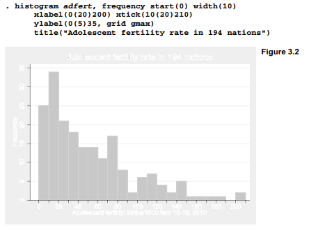
Figure 3.2 helps us to describe the distribution more specifically. For example, we now see that in 34 nations, the adolescent fertility rates are between 10 and 20. Type help histogram to see a complete list of options and syntax for this command. There also exists a separate command, twoway histogram, that draws histograms allowing other options common to the twoway family of graphs discussed later. You can learn about it by typing help twoway histogram.
One option that histogram shares with other graph types is the ability to create multiple small graphs for each value of a specified variable, using a by(varname) option. Figure 3.3 illustrates with histograms of adfert for each of the five regions, along with a sixth (total) histogram showing the distribution for all regions.

Source: Hamilton Lawrence C. (2012), Statistics with STATA: Version 12, Cengage Learning; 8th edition.
23 Oct 2019
30 Sep 2022
24 Sep 2022
3 Oct 2022
30 Sep 2022
29 Sep 2022