When the dependent variable’s categories are not ordinal, multinomial logit regression (also called polytomous logit regression) provides appropriate tools. If y has only two categories, mlogit (and ologit) both fit the same model as logistic. Otherwise, though, an mlogit model is more complex.
Multiple-category dependent variables occur often in survey data. The Granite State Poll provides a good illustration.

In Chapter 4 we saw that this poll includes three factual questions about climate, such as warmice:
Which of the following three statements do you think is more accurate?
Over the past few years, the ice on the Arctic Ocean in late summer …
covers less area than it did 30 years ago.
declined but then recovered to about the same area it had 30 years ago.
covers more area than it did 30 years ago.
These data have been svyset (see Chapter 4) declaring information about sampling and weights. Commands using the svy: prefix will automatically apply this information. For example, weighted response percentages for warmice are obtained as follows.
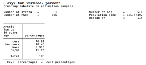
About 71% of respondents answered correctly that Arctic sea ice area has declined; only 12% said they did not know, or gave no answer.
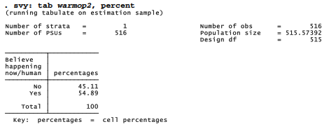
A second variable of interest indicates whether respondents personally believe that climate change is happening now, caused mainly by human activities (warmop2). About 55% believe this is true.
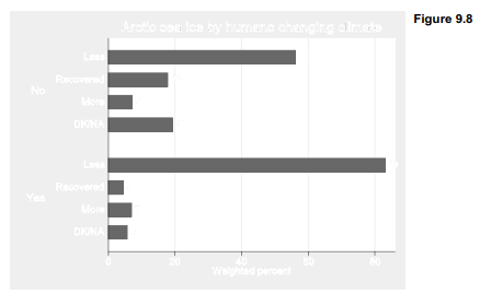
Answers to the warmice question correlate with climate-change beliefs, as seen below in a twoway table with percentages based on the row variable, warmop2. Accurate answers to warmice were given by 83% of those who believe humans are changing the climate, but only 56% of those who do not believe this. The counterfactual response that late-summer Arctic sea ice has recovered to the area it had 30 years ago was four times more common among those who don’t think humans are changing the climate. These differences are statistically significant (p » .0000).

Chapter 4 introduced the catplot command, helpful in graphing categorical variables. catplot is not supplied with Stata, but can be located by typing findit catplot. With catplot we can draw a bar chart corresponding to the two-way table above. Treating probability weight variable censuswt as analytical weights ([aw=censuswt]) results in bars that match the svy: tab percentages.
. catplot hbar warmice [aw=censuswt], over(warmop2) percent(warmop2)
blabel(bar, format(%2.0f)) ytitle(“Weighted percent”)
title(“Arctic sea ice by humans changing climate”)
In keeping with that hypothesis (termed “biased assimilation”) we could analyze warmice responses as a dependent variable. Possible predictors include age, gender, education and political outlook, all of which have often been found to correlate with environmental views. In these poll data, age is just age in years; sex is coded 0 for males, 1 for females; educ ranges from 1 for high school or less to 4 for postgraduate school; and political party is coded 1 for Democrats, 2 for Independents and 3 for Republicans.

How do these background factors affect response to the warmice question? Do climate change beliefs still predict responses, once we control for education and politics? mlogit results on the next page supply some answers.

This example employs survey weighting. The syntax would be identical (but without the svy: prefix) if we had non-survey data. base(1) specifies that category 1 (warmice = “less area”) should be the base outcome for comparison, so our table shows the predictors of three different wrong answers. The rrr option instructs mlogit to show relative risk ratios, which resemble the odds ratios given by logistic.
In general, the relative risk ratio for outcome j of y, and predictor x k , equals the amount by which predicted odds favoringy = j (compared withy = base) are multiplied, per 1-unit increase in x k , other things being equal. In other words, the relative risk ratio rrr j k is a multiplier such that, if all x variables except x k stay the same,
![]()
Relative risk ratios in the example above describe the multiplicative effect of a unit increase in each predictor on the odds of selecting a particular warmice response instead of the (correct) base category “less area.” We see that Republicans are significantly (p = .025) more likely to think ice has recovered, whereas those who believe in human-caused climate change are significantly (p = .002) less likely to do so. Other things being equal, the odds of a Republican
responding that Arctic ice has recovered (rather than covering less area) are 72% higher (multiplied by 1.72) compared with those of an Independent, and about 196% higher (multiplied by 1.722 = 2.96) than those of a Democrat. People who believe climate change is happening now due to humans have 76% lower odds (multiplied by 0.24) of saying that ice recovered instead of declined.
The second and third sub-tables in the mlogit output give relative risk ratios favoring each of the other warmice responses, compared with “less.” The response that Arctic ice covers more area than it did 30 years ago is favored only by less educated respondents. Odds of saying the ice covers more area decrease by 46% (multiplied by 0.54) with each 1-unit increase in educ, other things being equal. Thus, the “recovered” response has belief or political predictors, whereas “more” apparently reflects simple lack ofknowledge. The “don’t know” or “no answer” (DK/NA) response also has belief and political predictors, perhaps indicating a rejection of the question.
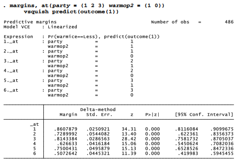
margins and marginsplot can visualize our results. The following commands produce a rough plot (Figure 9.9) showing predicted probabilities that warmice = “less area,” as a function of climate beliefs (warmop2) and political party, based on the previous mlogit model. By specifying predict(outcome(1)) in the margins command, we focus on the first outcome of our dependent variable, “less area.”

To graph the predicted probability for the second outcome, warmice = “recovered,” we repeat the margins command but with predict(outcome(2)). Figure 9.10 shows the result.
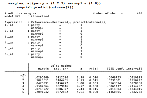

Figure 9.11 is a cleaned-up version of Figure 9.9, illustrating the use of some marginsplot options. We begin by quietly repeating margins for outcome 1 (less area), then issue a new marginsplot command with options that control details of the labeling, legend and lines. The x-axis range is made a little wider, from 1 to 3.1 instead of the default 1 to 3, in order to accommodate the label “Republican” at lower right.
. quietly margins, at(party = (1 2 3) warmop2 = (1 0)) predict(outcome(1))
. marginsplot, legend(position(7) ring(0) rows(1)
title(“Believe humans” “changing climate?”, size(medsmall)))
xscale(range(1 3.1)) ytitle(“Probability”)
plot1opts(lpattern(dash) lwidth(medthick) msymbol(O))
plot2opts(lpattern(solid) lwidth(medthick) msymbol(Sh))
title(“Predicted probability of ‘Artic ice area less’ response”)

Source: Hamilton Lawrence C. (2012), Statistics with STATA: Version 12, Cengage Learning; 8th edition.
26 Sep 2022
28 Sep 2022
24 Sep 2022
28 Sep 2022
23 Sep 2022
23 Sep 2022