Beyond point and figure charts being independent of time, several chart methods—mostly of Japanese derivation—ignore time. These are rarely used in investment technical analysis because they are more suited for short-term trading. They include Kagi, Renko, and Line-Break charts.
1. Kagi Chart
Similar to a point and figure chart in philosophy, the Kagi chart is an old Japanese version of charting that is independent of time and only plots when a change of direction occurs by a specific amount. Figure 11.17 shows a representation of Apple Computer (AAPL) over one week with a reversal amount of 0.5 points. This chart uses only high and low prices but can include just closes, usually in a longer-term chart. Reversal amounts traditionally were percentages, which can still be used, but today points or an average true range (ATR) (see Chapter 13, “Breakouts, Stops, and Retracements”) are the most common.
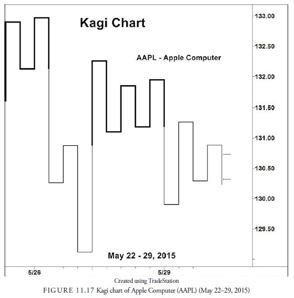
The Kagi chart is posted only when a reversal by the amount specified is recorded from a high or low. The trend direction is recorded by thick, called yang lines, or thin, called yin lines, similar to the X’s and O’s on a point and figure chart. For example, in Figure 11.17, the first closing price was 131.60 on May 22. The price rallied from that prior day’s close to 132.92, at which point a vertical yang line was drawn from the previous close. Because the trend was upward from the previous close, the line is dark. A reversal of more than 0.5 points then occurred to 132.14. Nothing is plotted until there is an upward reversal that establishes the low. When that reversal upward occurs, a horizontal line is drawn from the low point to the next column, and a vertical line is drawn from that point in the new column upward for at least the reversal amount and perhaps more until it also reverses downward and the process is repeated. When a reversal breaks a prior high (called a shoulder) or low (called a waist), the line thickness changes and makes the change in direction more easily seen by eye. Most signals come from changes in line thickness as the price breaks out up or down. Trend lines can be drawn, and support and resistance are shown at the shoulders and waists. Head-and-shoulders patterns, called 3 Buddha patterns, are frequent and easily recognized.
2. Renko Chart
The Renko chart, also of Japanese origin, avoids time and changes direction by specific amounts. Unlike point and figure or Kagi, the plot is composed of “bricks” plotted on end with only one brick per column. The brick is a standard width, and the height is based on the reversal amount specified. For example, as shown in Figure 11.18, the chart of Apple Computer again uses a 0.5 reversal amount. The first plot, on the closing plot from the day before, is 129.20. Every subsequent brick is then plotted based on 0.5 intervals from that 129.20. The following day, the first move of 0.5 points was downward, causing a downward brick that extended to 128.70. The price may have declined further, but not more than another 0.5 or another brick would have been drawn. At that point, the price can either continue downward and be recorded for every 0.5 amount it declines, or it can rise 0.5 above the top of the brick at 129.20. If it rises 0.5 above that level to 129.2, another brick is placed in the next column to the right.
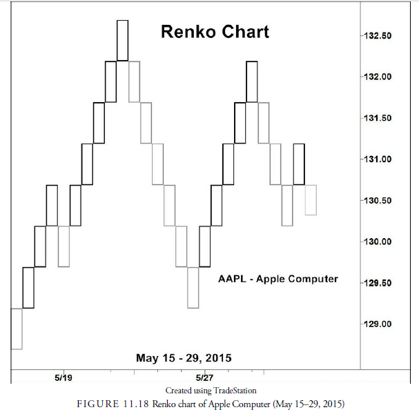
Trend lines can be plotted, as can moving averages. Some traders ignore one-block reversals and consider any larger reversal as a likely trend change. Short reversals are support and resistance levels, and the reversal interval can be either a percentage or an average true range.
3. Line-Break Chart (2 or 3 Lines)
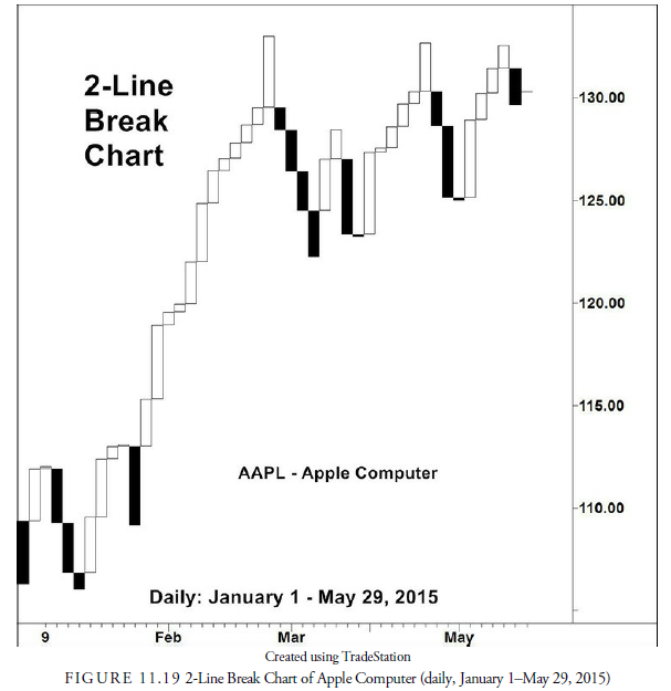
The line-break chart is just another Japanese method of avoiding the time interval in price action and focusing only on the price action itself. Like the others in this category, the plot depends on a reversal in price. Rather than use a specific price amount to distinguish the reversal, the 2-Line, Line-Break chart uses the previous two lines for its reference point. A line is a block-type bar similar to that used in a candlestick chart as the body. The width of the line is constant, based on the chart, and the height is based on the price change relative to the previous lines. Only closing prices are used. Thus, in Figure 11.19, the first bar is the close of the first day relative to the close of the earlier day. It was downward from the previous close and thus is colored black and marked on the chart as a black line. The next day the market rallied and a white line for “up” is recorded. From now on, only a close that has exceeded two block lows can be recorded as a reversal. If it is not a reversal, it is either within the range of the two prior lines and is thus not recorded, or it is up from the last close and is thus recorded as another white line. The fourth line is a black line because it closed below the lows of the prior two up lines. The trend is now downward, and only a cross above the most recent 2-line highs can cause a reversal upward. Thus, each day may or may not have a line drawn in it depending on its close versus the previous two lines if in the opposite direction or in addition to the line in the same direction. A 3-line break chart is constructed in the same manner but must break three previous lines to record a trend reversal. Signals can occur from conventional, classic patterns, support or resistance breaks, or reverses in direction.
Source: Kirkpatrick II Charles D., Dahlquist Julie R. (2015), Technical Analysis: The Complete Resource for Financial Market Technicians, FT Press; 3rd edition.
Hello my friend! I wish to say that this post is amazing, nice written and come with almost all important infos. I would like to see more posts like this .