In this section, we consider quality control procedures for a production process whereby goods are manufactured continuously. On the basis of sampling and inspection of production output, a decision will be made to either continue the production process or adjust it to bring the items or goods being produced up to acceptable quality standards.
Despite high standards of quality in manufacturing and production operations, machine tools will invariably wear out, vibrations will throw machine settings out of adjustment, purchased materials will be defective, and human operators will make mistakes. Any or all of these factors can result in poor quality output. Fortunately, procedures are available for monitoring production output so that poor quality can be detected early and the production process can be adjusted or corrected.
If the variation in the quality of the production output is due to assignable causes such as tools wearing out, incorrect machine settings, poor quality raw materials, or operator error, the process should be adjusted or corrected as soon as possible. Alternatively, if the variation is due to what are called common causes—that is, randomly occurring variations in materials, temperature, humidity, and so on, which the manufacturer cannot possibly control—the process does not need to be adjusted. The main objective of statistical process control is to determine whether variations in output are due to assignable causes or common causes.
Whenever assignable causes are detected, we conclude that the process is out of control. In that case, corrective action will be taken to bring the process back to an acceptable level of quality. However, if the variation in the output of a production process is due only to common causes, we conclude that the process is in statistical control, or simply in control; in such cases, no changes or adjustments are necessary.
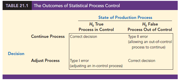
The null hypothesis H0 is formulated in terms of the production process being in control. The alternative hypothesis Ha is formulated in terms of the production process being out of control. Table 21.1 shows that correct decisions to continue an in-control process and adjust an out-of-control process are possible. However, as with other hypothesis testing procedures, both a Type I error (adjusting an in-control process) and a Type II error (allowing an out-of-control process to continue) are also possible.
1. Control Charts
A control chart provides a basis for deciding whether the variation in the output is due to common causes (in control) or assignable causes (out of control). Whenever an out-of-control situation is detected, adjustments or other corrective action will be taken to bring the process back into control.
Control charts can be classified by the type of data they contain. An x chart is used if the quality of the output of the process is measured in terms of a variable such as length, weight, temperature, and so on. In that case, the decision to continue or to adjust the production process will be based on the mean value found in a sample of the output. To introduce some of the concepts common to all control charts, let us consider some specific features of an X chart.
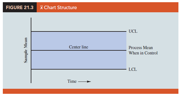
Figure 21.3 shows the general structure of an X chart. The center line of the chart corresponds to the mean of the process when the process is in control. The vertical line identifies the scale of measurement for the variable of interest. Each time a sample is taken from the production process, a value of the sample mean X is computed and a data point showing the value of X is plotted on the control chart.
The two lines labeled UCL and LCL are important in determining whether the process is in control or out of control. The lines are called the upper control limit and the lower control limit, respectively. They are chosen so that when the process is in control, there will be a high probability that the value of X will be between the two control limits. Values outside the control limits provide strong statistical evidence that the process is out of control and corrective action should be taken.
Over time, more and more data points will be added to the control chart. The order of the data points will be from left to right as the process is sampled. In essence, every time a point is plotted on the control chart, we are carrying out a hypothesis test to determine whether the process is in control.
In addition to the X chart, other control charts can be used to monitor the range of the measurements in the sample (R chart), the proportion defective in the sample (p chart), and the number of defective items in the sample (np chart). In each case, the control chart has a LCL, a center line, and an UCL similar to the X chart in Figure 21.3. The major difference among the charts is what the vertical axis measures; for instance, in a p chart the measurement scale denotes the proportion of defective items in the sample instead of the sample mean. In the following discussion, we will illustrate the construction and use of the X chart, R chart, p chart, and np chart.
2. x Chart: Process Mean and Standard Deviation Known
To illustrate the construction of an X chart, let us reconsider the situation at KJW Packaging. Recall that KJW operates a production line where cartons of cereal are filled. When the process is operating correctly—and hence the system is in control—the mean filling weight is m = 16.05 ounces, and the process standard deviation is σ = .10 ounces. In addition, the filling weights are assumed to be normally distributed. This distribution is shown in Figure 21.4.
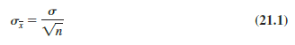
The sampling distribution of X, as presented in Chapter 7, can be used to determine the variation that can be expected in X values for a process that is in control. Let us first briefly review the properties of the sampling distribution of X. First, recall that the expected value or mean of X is equal to μ, the mean filling weight when the production line is in control. For samples of size n, the equation for the standard deviation of X, called the standard error of the mean, is
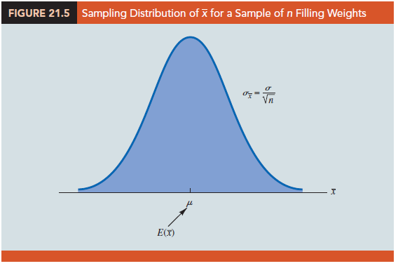
In addition, because the filling weights are normally distributed, the sampling distribution of X is normally distributed for any sample size. Thus, the sampling distribution of X is a normal distribution with mean m and standard deviation σX. This distribution is shown in Figure 21.5.
The sampling distribution of X is used to determine what values of X are reasonable if the process is in control. The general practice in quality control is to define as reasonable any value of X that is within 3 standard deviations, or standard errors, above or below the mean value. Recall from the study of the normal probability distribution that approximately 99.7% of the values of a normally distributed random variable are within ±3 standard deviations of its mean value. Thus, if a value of X is within the interval ![]() , we will assume that the process is in control. In summary, then, the control limits for an X chart are as follows:
, we will assume that the process is in control. In summary, then, the control limits for an X chart are as follows:

Reconsider the KJW Packaging example with the process distribution of filling weights shown in Figure 21.4 and the sampling distribution of x shown in Figure 21.5. Assume that a quality control inspector periodically samples six cartons and uses the sample mean filling weight to determine whether the process is in control or out of control. Using equation (21.1), we find that the standard error of the mean is σx = σ/√n = .10/√6 = .04. Thus, with the process mean at 16.05, the control limits are UCL = 16.05 + 3(.04) = 16.17 and LCL = 16.05 – 3(.04) = 15.93. Figure 21.6 is the control chart with the results of 10 samples taken over a 10-hour period. For ease of reading, the sample numbers 1 through 10 are listed below the chart.
Note that the mean for the fifth sample in Figure 21.6 shows there is strong evidence that the process is out of control. The fifth sample mean is below the LCL, indicating that assignable causes of output variation are present and that underfilling is occurring. As a result, corrective action was taken at this point to bring the process back into control. The fact that the remaining points on the X chart are within the upper and lower control limits indicates that the corrective action was successful.

3. x Chart: Process Mean and Standard Deviation Unknown
In the KJW Packaging example, we showed how an X chart can be developed when the mean and standard deviation of the process are known. In most situations, the process mean and standard deviation must be estimated by using samples that are selected from the process when it is in control. For instance, KJW might select a random sample of five boxes each morning and five boxes each afternoon for 10 days of in-control operation. For each subgroup, or sample, the mean and standard deviation of the sample are computed. The overall averages of both the sample means and the sample standard deviations are used to construct control charts for both the process mean and the process standard deviation.
In practice, it is more common to monitor the variability of the process by using the range instead of the standard deviation because the range is easier to compute. The range can be used to provide good estimates of the process standard deviation; thus it can be used to construct upper and lower control limits for the X chart with little computational effort. To illustrate, let us consider the problem facing Jensen Computer Supplies, Inc.
Jensen Computer Supplies (JCS) manufactures 3.5-inch-diameter solid-state drives; they just finished adjusting their production process so that it is operating in control. Suppose random samples of five drives were selected during the first hour of operation, five drives were selected during the second hour of operation, and so on, until 20 samples were obtained. Table 21.2 provides the diameter of each drive sampled as well as the mean Xj and range R for each of the samples.
The estimate of the process mean m is given by the overall sample mean.
For the JCS data in Table 21.2, the overall sample mean is X = 3.4995. This value will be the center line for the X chart. The range of each sample, denoted R, is simply the difference between the largest and smallest values in each sample. The average range for k samples is computed as follows:
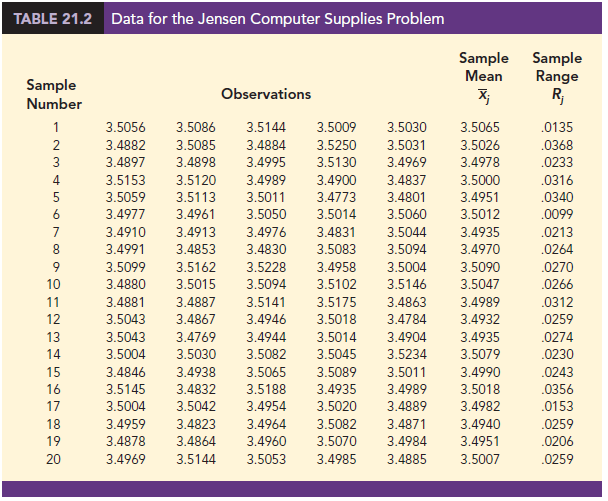
For the JCS data in Table 21.2, the average range is R = .0253.
In the preceding section we showed that the upper and lower control limits for the x chart are
![]()
Hence, to construct the control limits for the X chart, we need to estimate m and s, the mean and standard deviation of the process. An estimate of m is given by X. An estimate of s can be developed by using the range data.
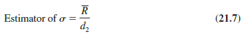
It can be shown that an estimator of the process standard deviation s is the average range divided by d2, a constant that depends on the sample size n. That is,
The American Society for Testing and Materials Manual on Presentation of Data and Control Chart Analysis provides values for d2 as shown in Table 21.3. For instance, when n = 5, d2 = 2.326, and the estimate of s is the average range divided by 2.326. If we substitute R/d2 for s in expression (21.6), we can write the control limits for the x chart as
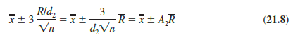
Note that A2 = 3/(d2Vn) is a constant that depends only on the sample size. Values for A2 are provided in Table 21.3. For n = 5, A2 = .577; thus, the control limits for the x chart are
3.4995 ± (.577)(.0253) = 3.4995 ± .0146
Hence, UCL = 3.514 and LCL = 3.485.
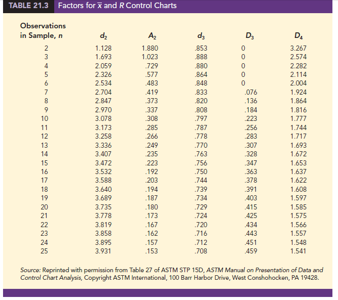
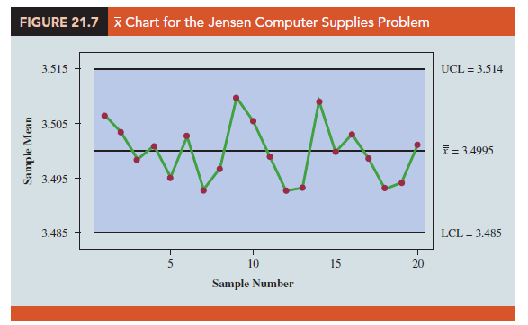
Figure 21.7 shows the X chart for the Jensen Computer Supplies problem. The center line is shown at the overall sample mean X = 3.4995. The upper control limit (UCL) is 3.514 and the lower control (LCL) is 3.485. The X chart shows the 20 sample means plotted over time. Because all 20 sample means are within the control limits, we confirm that the process mean was in control during the sampling period.
4. R Chart
Let us now consider a range chart (R chart) that can be used to control the variability of a process. To develop the R chart, we need to think of the range of a sample as a random variable with its own mean and standard deviation. The average range R provides an estimate of the mean of this random variable. Moreover, it can be shown that an estimate of the standard deviation of the range is
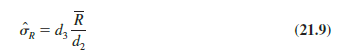
where d2 and d3 are constants that depend on the sample size; values of d2 and d3 are provided in Table 21.3. Thus, the UCL for the R chart is given by
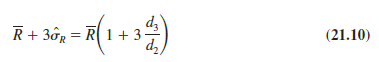
and the LCL is
If we let
we can write the control limits for the R chart as
Values for D3 and D4 are also provided in Table 21.3. Note that for n = 5, D3 = 0 and D4 = 2.114. Thus, with R = .0253, the control limits are
UCL = .0253(2.114) = .053
LCL = .0253(0) = 0
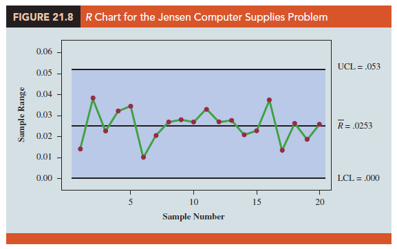
Figure 21.8 shows the R chart for the Jensen Computer Supplies problem. The center line is shown at the overall mean of the 20 sample ranges, R = .0253. The UCL is .053 and the LCL is .000. The R chart shows the 20 sample ranges plotted over time. Because all 20 sample ranges are within the control limits, we confirm that the process variability was in control during the sampling period.
5. p Chart
Let us consider the case in which the output quality is measured by either nondefective or defective items. The decision to continue or to adjust the production process will be based on p, the proportion of defective items found in a sample. The control chart used for proportion-defective data is called a p chart.
To illustrate the construction of a p chart, consider the use of automated mail-sorting machines in a post office. These automated machines scan the zip codes on letters and divert each letter to its proper carrier route. Even when a machine is operating properly, some letters are diverted to incorrect routes. Assume that when a machine is operating correctly, or in a state of control, 3% of the letters are incorrectly diverted. Thus p, the proportion of letters incorrectly diverted when the process is in control, is .03.
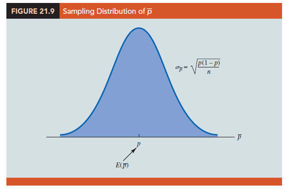
The sampling distribution of p can be used to determine the variation that can be expected in p values for a process that is in control. Recall that the expected value or mean of p is p, the proportion defective when the process is in control. With samples of size n, the formula for the standard deviation of p, called the standard error of the proportion, is
The sampling distribution of p can be approximated by a normal distribution whenever the sample size is large. With p, the sample size can be considered large whenever the following two conditions are satisfied.
In summary, whenever the sample size is large, the sampling distribution of p can be approximated by a normal distribution with mean p and standard deviation s-. This distribution is shown in Figure 21.9.
To establish control limits for a p chart, we follow the same procedure we used to establish control limits for an chart. That is, the limits for the control chart are set at 3 standard deviations, or standard errors, above and below the proportion defective when the process is in control. Thus, we have the following control limits.
With p = .03 and samples of size n = 200, equation (21.16) shows that the standard error is
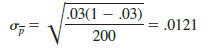
Hence, the control limits are UCL = .03 + 3(.0121) = .0663 and LCL = .03 — 3(.0121) = -.0063. Whenever equation (21.18) provides a negative value for LCL, LCL is set equal to zero in the control chart.
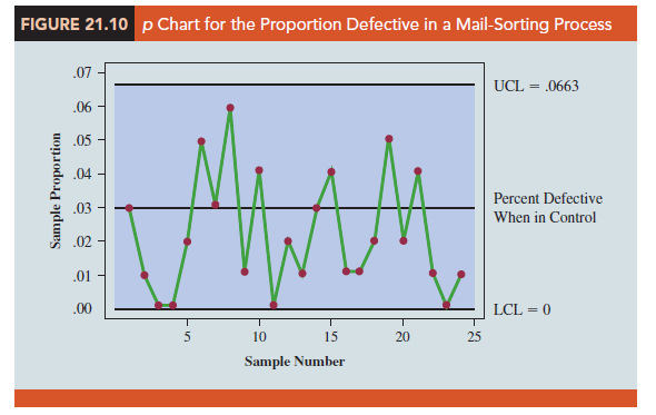
Figure 21.10 is the p chart for the mail-sorting process. The points plotted show the sample proportion defective found in samples of letters taken from the process. All points are within the control limits, providing no evidence to conclude that the sorting process is out of control.
If the proportion of defective items for a process that is in control is not known, that value is first estimated by using sample data. Suppose, for example, that k different samples, each of size n, are selected from a process that is in control. The fraction or proportion of defective items in each sample is then determined. Treating all the data collected as one large sample, we can compute the proportion of defective items for all the data; that value can then be used to estimate p, the proportion of defective items observed when the process is in control. Note that this estimate of p also enables us to estimate the standard error of the proportion; upper and lower control limits can then be established.
6. np Chart
An np chart is a control chart developed for the number of defective items in a sample. In this case, n is the sample size and p is the probability of observing a defective item when the process is in control. Whenever the sample size is large, that is, when np > 5 and n(l – p) > 5, the distribution of the number of defective items observed in a sample of size n can be approximated by a normal distribution with mean np and standard deviation V«p(1 – p). Thus, for the mail-sorting example, with n = 200 and p = .03, the number of defective items observed in a sample of 200 letters can be approximated by a normal distribution with a mean of 200(.03) = 6 and a standard deviation of V200(.03)(.97) = 2.4125.
The control limits for an np chart are set at 3 standard deviations above and below the expected number of defective items observed when the process is in control. Thus, we have the following control limits.
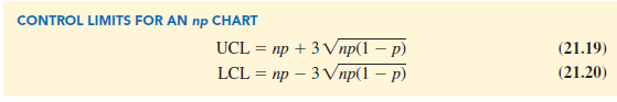
For the mail-sorting process example, with p = .03 and n = 200, the control limits are UCL = 6 + 3(2.4125) = 13.2375 and LCL = 6 – 3(2.4125) = -1.2375. When LCL is negative, LCL is set equal to zero in the control chart. Hence, if the number of letters diverted to incorrect routes is greater than 13, the process is concluded to be out of control.
The information provided by an np chart is equivalent to the information provided by the p chart; the only difference is that the np chart is a plot of the number of defective items observed, whereas the p chart is a plot of the proportion of defective items observed. Thus, if we were to conclude that a particular process is out of control on the basis of a p chart, the process would also be concluded to be out of control on the basis of an np chart.
7. Interpretation of Control Charts
The location and pattern of points in a control chart enable us to determine, with a small probability of error, whether a process is in statistical control. A primary indication that a process may be out of control is a data point outside the control limits, such as point 5 in Figure 21.6. Finding such a point is statistical evidence that the process is out of control; in such cases, corrective action should be taken as soon as possible.
In addition to points outside the control limits, certain patterns of the points within the control limits can be warning signals of quality control problems. For example, assume that all the data points are within the control limits but that a large number of points are on one side of the center line. This pattern may indicate that an equipment problem, a change in materials, or some other assignable cause of a shift in quality has occurred. Careful investigation of the production process should be undertaken to determine whether quality has changed.
Another pattern to watch for in control charts is a gradual shift, or trend, over time. For example, as tools wear out, the dimensions of machined parts will gradually deviate from their designed levels. Gradual changes in temperature or humidity, general equipment deterioration, dirt buildup, or operator fatigue may also result in a trend pattern in control charts. Six or seven points in a row that indicate either an increasing or decreasing trend should be cause for concern, even if the data points are all within the control limits. When such a pattern occurs, the process should be reviewed for possible changes or shifts in quality. Corrective action to bring the process back into control may be necessary.
Source: Anderson David R., Sweeney Dennis J., Williams Thomas A. (2019), Statistics for Business & Economics, Cengage Learning; 14th edition.
Good ?V I should certainly pronounce, impressed with your site. I had no trouble navigating through all tabs as well as related info ended up being truly easy to do to access. I recently found what I hoped for before you know it at all. Reasonably unusual. Is likely to appreciate it for those who add forums or something, website theme . a tones way for your client to communicate. Excellent task..